"R을 이용한 데이터 처리 & 분석 실무 - 서민구 지음" 정리 자료 #4
- https://thebook.io/006723/
- 첫번째 : goo.gl/FJjOlq
- 두번째 : goo.gl/Wdb90g
- 세번째 : goo.gl/80VGcn
- 네번째 : goo.gl/lblUsR
01. 산점도 (ScatterPlot)
plot() 함수 – Generic Function, Polymorphic Function in OOP
• 주어진 데이터 타입에 따라 다른 종류의 plot()함수 변형이 호출
산점도
• 직교좌표계를 이용하여 두 개 변수간의 관계를 표시
• plot(x, y)
> install.packages("mlbench")
> library("mlbench")
# Ozone은 1976년 LA지역의 오존 오염 데이터
> data(Ozone)
> plot(Ozone$V8, Ozone$V9)
x, y가 숫자인 경우 산점도를 그려줌
4.
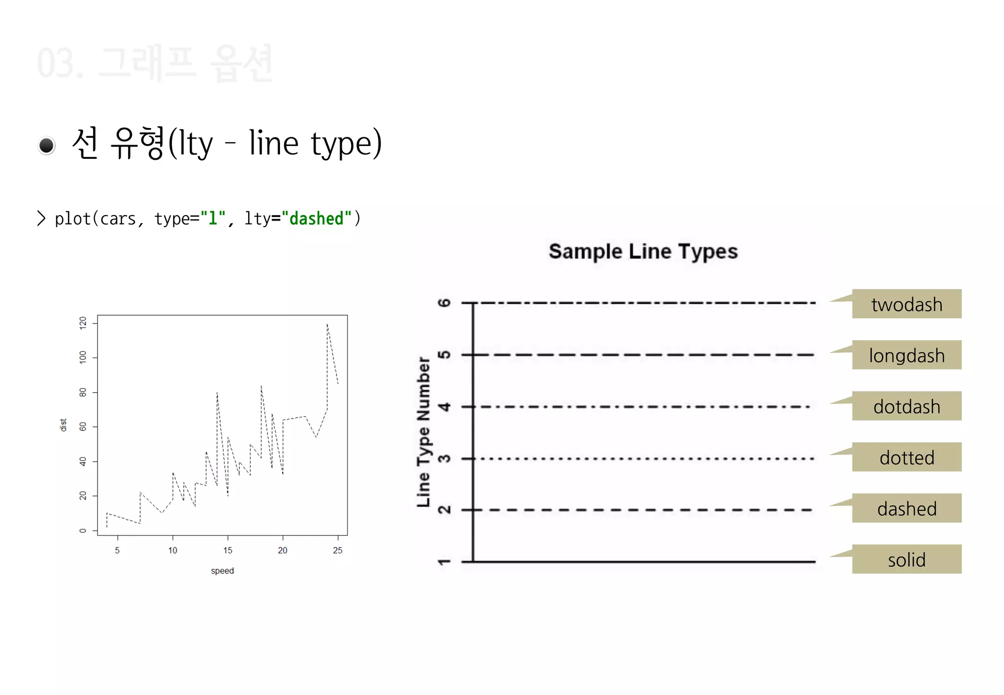
03. 그래프 옵션
>plot(Ozone$V8, Ozone$V9,
+ xlab="Sandburg Temperature",
+ ylab="El MOnte Temperature",
+ main="Ozone",
+ pch=20,
+ cex=1.5,
+ col="#FF0000",
+ xlim=c(0, 100),
+ ylim=c(0, 90)
+ )
xlab – X Label
ylab – Y Label
main - Title
col - Color
pch – Point
Character
xlim – min xlim – max
ylim – min
ylim – max
cex – pch 출력 scale
지정(점의 크기)
03. 그래프 옵션
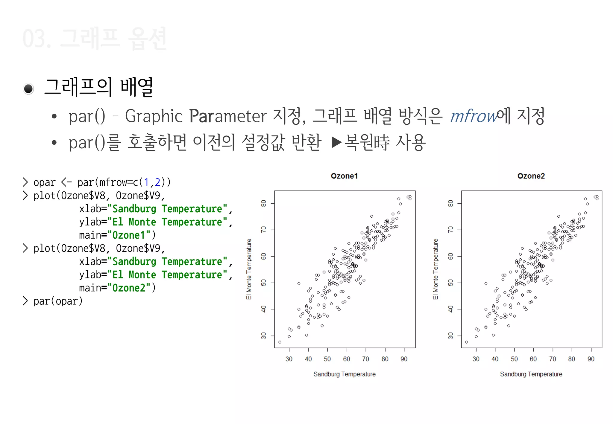
그래프의배열
• par() – Graphic Parameter 지정, 그래프 배열 방식은 mfrow에 지정
• par()를 호출하면 이전의 설정값 반환 복원時 사용
> opar <- par(mfrow=c(1,2))
> plot(Ozone$V8, Ozone$V9,
xlab="Sandburg Temperature",
ylab="El Monte Temperature",
main="Ozone1")
> plot(Ozone$V8, Ozone$V9,
xlab="Sandburg Temperature",
ylab="El Monte Temperature",
main="Ozone2")
> par(opar)
8.
03. 그래프 옵션
Jitter
•데이터에 노이즈를 추가 같은 값을 가지는 데이터가 그래프에 여러 번
겹쳐서 표시되는 현상을 막아준다.
데이터가 몰리는 지점의 파악이 용이
> par(mfrow=c(1,2))
> plot(Ozone$V6, Ozone$V7, xlab="Windspeed", ylab="Humidity", main="Ozone", pch=20, cex=.5)
> plot(jitter(Ozone$V6), jitter(Ozone$V7), xlab="Windspeed", ylab="Humidity", main="Ozone", pch=20, cex=.5)
지터 적용 후
9.
03. 기본그래프
점(points) –이미 그려진 그래프에 추가로 점을 표시
> plot(iris$Sepal.Width, iris$Sepal.Length, cex=.5, pch=20, xlab="width", ylab="length", main="iris")
> points(iris$Petal.Width, iris$Petal.Length, cex=.5, pch="+", col="#FF0000")
10.
03. 기본그래프
> with(iris,{
+ plot(NULL, xlim=c(0, 5), ylim=c(0, 10), xlab="width", ylab="length", main="iris", type="n")
+ points(Sepal.Width, Sepal.Length, cex=.5, pch=20)
+ points(Petal.Width, Petal.Length, cex=.5, pch="+", col="#FF0000")
+ })
>
초기 데이터가
없음
데이터 없이
plot 수행
plot(type=‚n‛)을
사용한 점짂적 그래프
그리기
11.
03. 기본그래프
꺾은선(lines) –기존 그래프에 꺾은선을 추가
• 시계열 데이터에서 추세를 표현
• 여러 범주의 데이터를 서로 다른 색상 또는 선 유형으로 표현
> x <- seq(0, 2*pi, 0.1)
> y <- sin(x)
> plot(x, y, cex=1.5, col="red")
> lines(x, y)
12.
03. 기본그래프
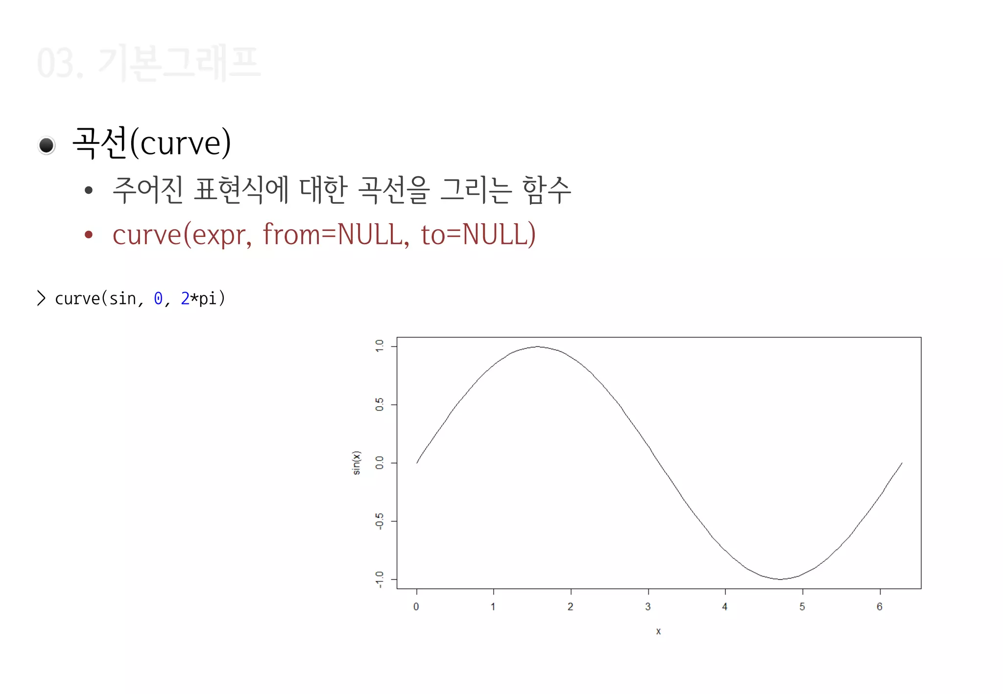
cars 데이터에LOWESS(locally weighted scatterplot smoothing) 적용 예제
• 데이터를 설명하는 일종의 추세선을 찾는 방법
• 데이터의 각 점을 y, 각 점의 주위에 위치한 점들을 x라고 했을 때, y를
x로부터 추정하는 다항식을 찾는다.
• y = ax + b, y = ax2 + bx + c와 같은 저차 다항식(low degree polynomial)
• 다항식을 찾을 때는 추정하고자 하는 y에 가까운 x일수로 가중치 부여
지역 가중 다항식 회귀(Locally Weighted Polynomial Regression)
• 결과는 각 점을 그 주변 점들로 설명하는 다항식들이 연결된 모양 각
점에서 찾아진 다항식들을 부드럽게연결하면 데이터의 추세를 보여주는 선
03. 기본그래프
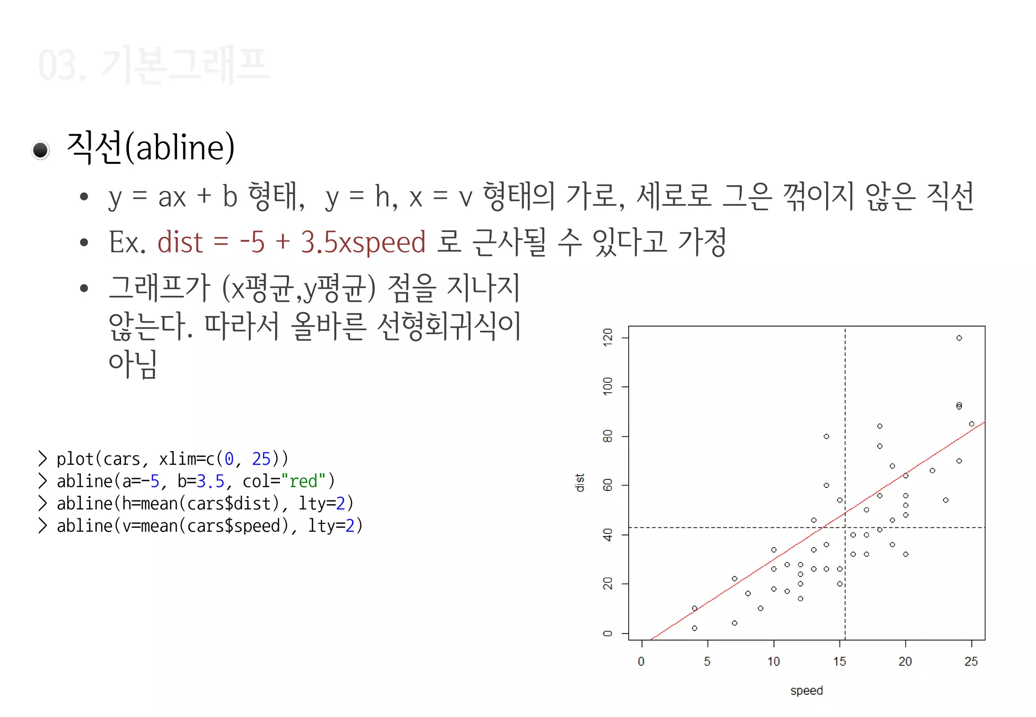
직선(abline)
• y= ax + b 형태, y = h, x = v 형태의 가로, 세로로 그은 꺾이지 않은 직선
• Ex. dist = -5 + 3.5xspeed 로 근사될 수 있다고 가정
• 그래프가 (x평균,y평균) 점을 지나지
않는다. 따라서 올바른 선형회귀식이
아님
> plot(cars, xlim=c(0, 25))
> abline(a=-5, b=3.5, col="red")
> abline(h=mean(cars$dist), lty=2)
> abline(v=mean(cars$speed), lty=2)
03. 기본그래프
다각형(polygon) –다각형을 그리는데 사용하는 함수
Ex. cars 데이터에 선형 회귀를 수행하고 신뢰구간을 polygon() 적용
• 선형회귀는 종속변수 y를 하나 또는 그 이상의 설명 변수 X로 설명하는 모델
• 선형회귀가 찾은 결과는 y = ax + e
• 선형회귀는 lm(), predict()를 사용해 수행
• lm(formula, data) – 데이터로부터 선형모델을 만든다.
• predict.lm(object, newdata, interval) – 예측을 수행
object – 선형 모델 객체
newdata – 예측을 수행할 새로운 데이터
Interval – 구간정보, none, confidence, prediction
• lm(dist ~ speed, data=cars)
dist = a + b x speed + e (e는 dist와 a + b x speed 사이의 차, 즉 오차)
04. 문자열(text)
text(x, y,labels, adj, pos)
• adj, pos는 텍스트의 위치를 지정
(1,0) (0,0)
(1,1) (0,1)
X
> plot(4:6, 4:6)
> text(5, 5, "X")
> text(5, 5, "00", adj=c(0,0))
> text(5, 5, "01", adj=c(0,1))
> text(5, 5, "10", adj=c(1,0))
> text(5, 5, "11", adj=c(1,1))
> plot(cars, cex=.5)
> text(cars$speed, cars$dist, pos=4)
labels 미적용시
seq_along(x)가 디폴트
데이터 번호로 점 표시
20.
05-06. 그래프 위의데이터 식별(identify), 범례(legend)
Identify(x, y, labels) – 마우스 클릭과 가장 가까운 데이터에 레이블
표시
legend(x, y, legend, …) – (x, y) 위치에 범례 표시
• (x, y) 좌표 대신에 bottomright, bottom, bottomleft, left 등의
predefined keyword 사용 가능
> plot(cars, cex=.5)
> identify(cars$speed, cars$dist)
> plot(iris$Sepal.Width, iris$Sepal.Length,
pch=20, xlab="width", ylab="length")
> points(iris$Petal.Width, iris$Petal.Length,
pch="+", col="#FF0000")
> legend("topright", legend=c("Sepal", "Petal"),
pch=c(20, 43), col=c("black", "red"), bg="gray")
Vector여 서
‚+‛ 대신 43 사용
legend
21.
07. 행렬 데이터그리기(matplot, matlines, matpoints)
plot(), lines(), points()와 동일 입력이 matrix로 주어짐
> x <- seq(-2*pi, 2*pi, 0.01)
> y <- matrix(c(cos(x), sin(x)), ncol=2)
> matplot(x, y, lty=c("solid", "dashed"), cex=.2, type="l")
> abline(h=0, v=0)
08. 응용그래프
• notch인자 지정 - 중앙값에 대한 신뢰구간 표시
> sv <- subset(iris, Species=="setosa" | Species=="versicolor")
> sv$Species <- factor(sv$Species)
> boxplot(Sepal.Width ~ Species, data=sv, notch=TRUE)
사용되지 않는 level을
제거하기 위해 factor
로 다시 변홖
두 그룹의 중앙값의 신뢰구갂이
겹치지 않으므로 중앙값이 서로
다르다고 결론을 내릴 수 있다.
신뢰구갂
중앙값의
신뢰구갂 표시
08. 응용그래프
밀도 그림(density)– 모든 점에서 데이터 밀도 추정, 커널 밀도 추정
> plot(density(iris$Sepal.Width))
> rug(jitter(iris$Sepal.Width))
> hist(iris$Sepal.Width, freq=FALSE)
> lines(density(iris$Sepal.Width))
rug – x 축에 데이터를 1차원
으로 표시, jitter로 데이터의
몰림을 명확화
density – 밀도에 대한
데이터 반홖
26.
08. 응용그래프
막대 그래프(barplot), 파이 그래프(pie) – 데이터의 비율 표현
> barplot(tapply(iris$Sepal.Width, iris$Species, mean))
> pie(table(cut(iris$Sepal.Width, breaks=10)))
Sepal.Width를 10개
구갂으로 나눔
나뉘어짂 구갂에 몇
개의 데이터가 있는지
세기 위한 용도
08. 응용그래프
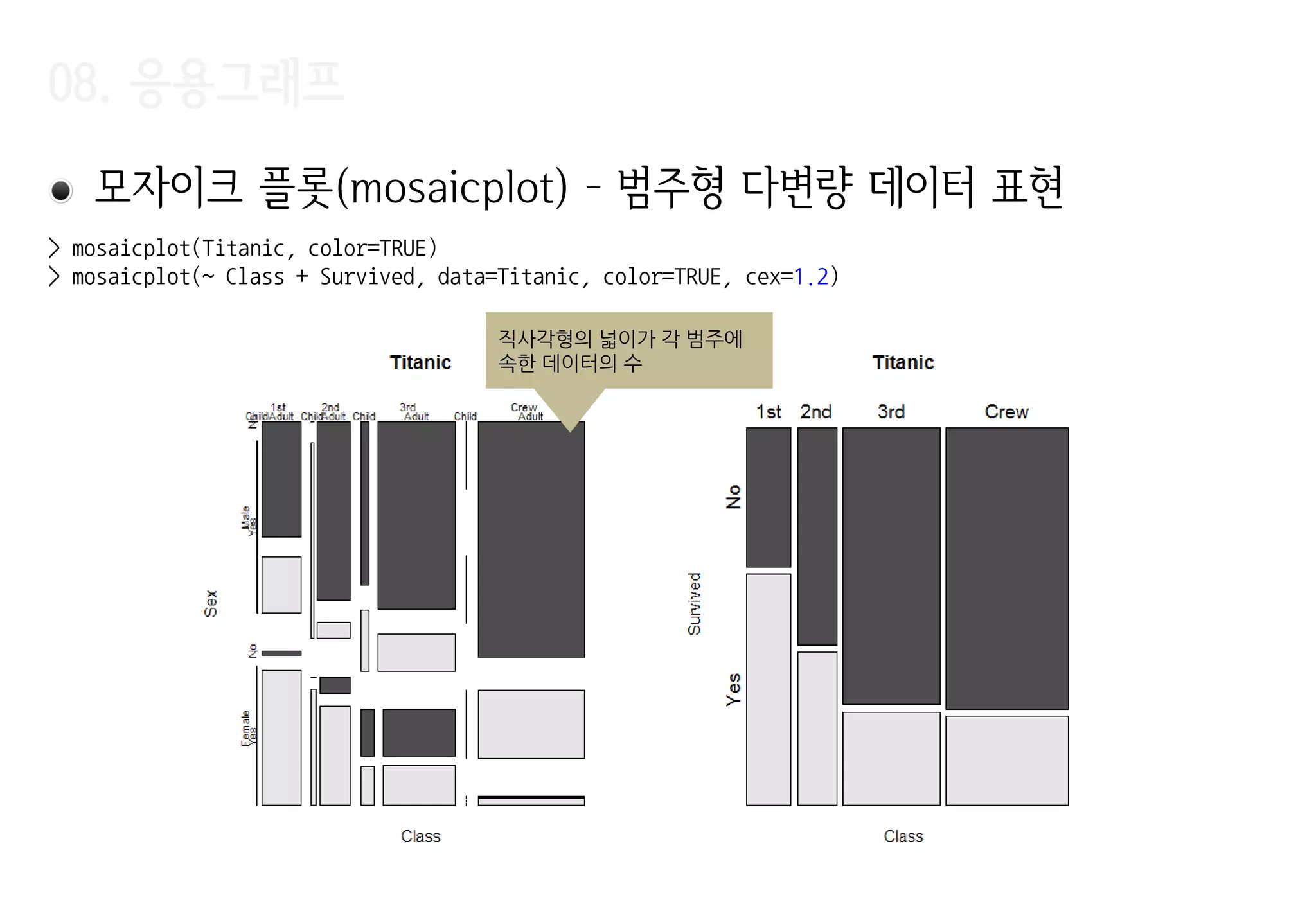
모자이크 플롯(mosaicplot)– 범주형 다변량 데이터 표현
직사각형의 넓이가 각 범주에
속한 데이터의 수
> mosaicplot(Titanic, color=TRUE)
> mosaicplot(~ Class + Survived, data=Titanic, color=TRUE, cex=1.2)
29.
08. 응용그래프
산점도 행렬(pairs)– 다변량 데이터에서 변수 쌍 간의 산점도를 표시
> pairs(~ Sepal.Width + Sepal.Length + Petal.Width + Petal.Length,
+ data = iris, pch=c(1, 2, 3)[iris$Species])
30.
08. 응용그래프
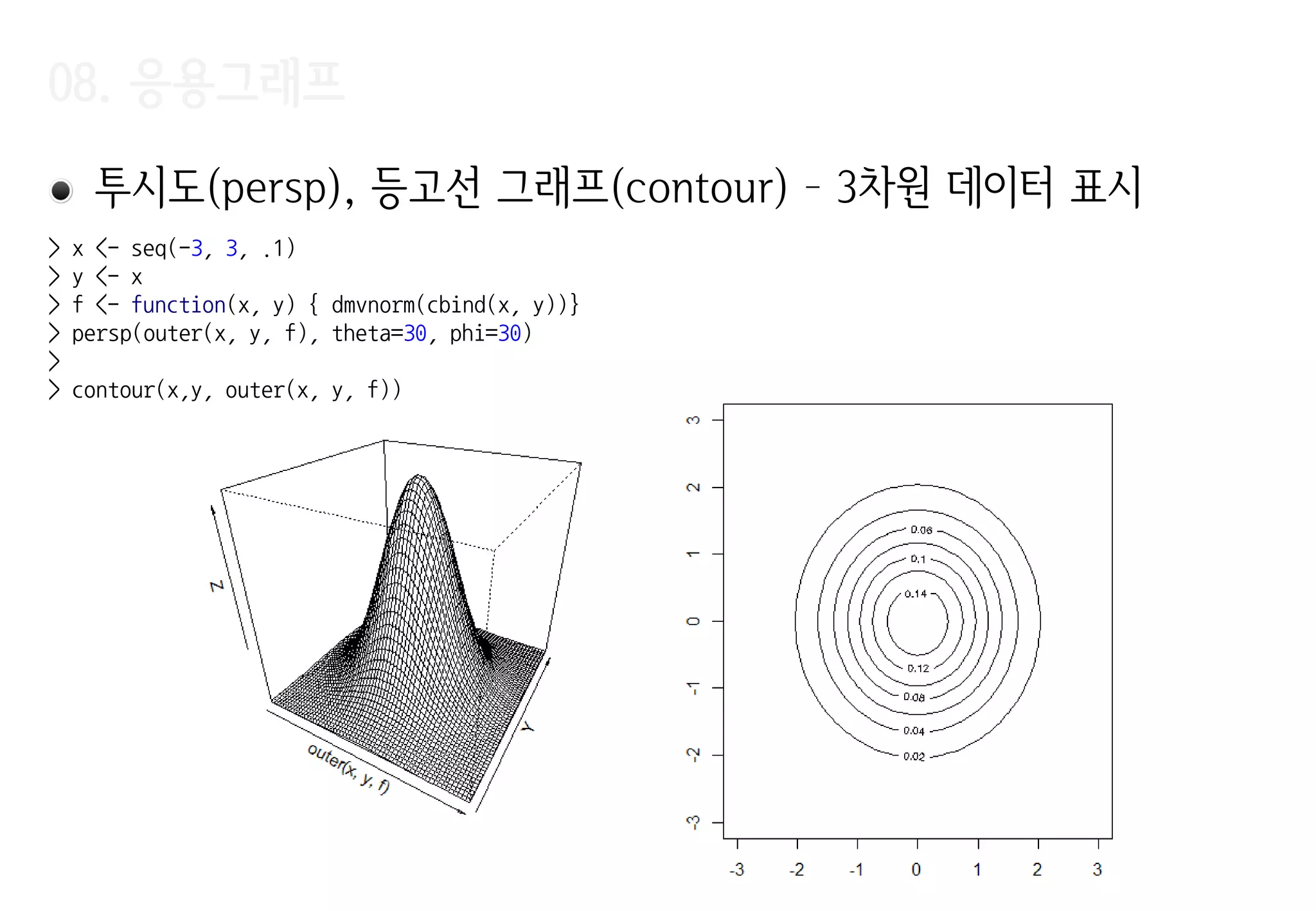
투시도(persp), 등고선그래프(contour) – 3차원 데이터 표시
> x <- seq(-3, 3, .1)
> y <- x
> f <- function(x, y) { dmvnorm(cbind(x, y))}
> persp(outer(x, y, f), theta=30, phi=30)
>
> contour(x,y, outer(x, y, f))


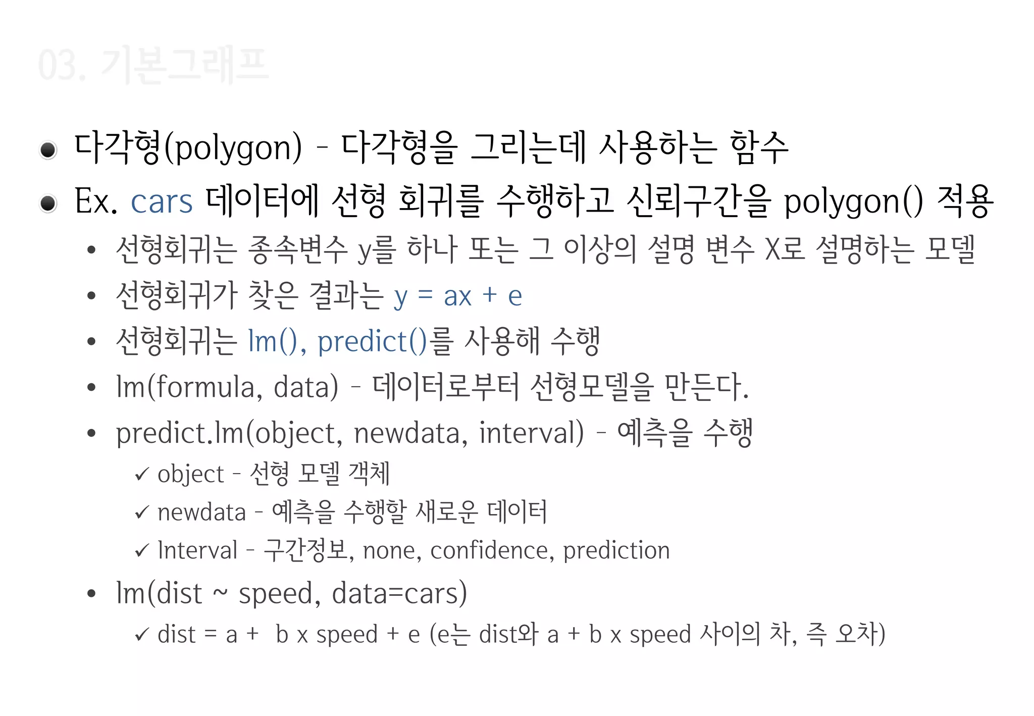

![03. 기본그래프
> m <- lm(dist ~ speed, data=cars)
> p <- predict(m, interval="confidence")
> x <- c( cars$speed,
tail(cars$speed, 1),
rev(cars$speed),
cars$speed[1])
> y <- c( p[, "lwr"],
tail(p[, "upr"], 1),
rev(p[, "upr"]),
p[, "lwr"][1])
> plot(cars)
> abline(m)
> polygon(x, y, col=rgb(.7, .7, .7, .5))
(cars$speed, p[, ‚lwr‛])
신뢰구갂을
polygon으로
(tail(cars$speed,1), tail(p[, ‚upr‛],1)
(car$speed, p[ ,‛upr‛])
rev()
(car$speed[1], p[, ‚lwr‛][1]](https://image.slidesharecdn.com/r-study-04-r1-160105132542/75/R-18-2048.jpg)


![08. 응용그래프
상자그림(boxplot)
> (boxstats <- boxplot(iris$Sepal.Width))
$stats
[,1]
[1,] 2.2
[2,] 2.8
[3,] 3.0
[4,] 3.3
[5,] 4.0
$n
[1] 150
$conf
[,1]
[1,] 2.935497
[2,] 3.064503
$out
[1] 4.4 4.1 4.2 2.0
$group
[1] 1 1 1 1
$names
[1] "1"
> text(boxstats$out, rep(1, NROW(boxstats$out)), labels=boxstats$out, pos=c(1,1,3,1))
lower whisker
‘중앙값 - 1.5 X IQR’
upper whisker
‘중앙값 + 1.5 X IQR’
IQR
25% 데이터 25% 25% 25% 데이터
크기순으로 정렬
제 1 사분위 제 3 사분위
중앙값
(median)
outlier
위
아래](https://image.slidesharecdn.com/r-study-04-r1-160105132542/75/R-22-2048.jpg)

![08. 응용그래프
히스토그램 (hist) – 값의 범위마다 빈도를 표시
> hist(iris$Sepal.Width)
> (x <- hist(iris$Sepal.Width, freq=FALSE))
$breaks
[1] 2.0 2.2 2.4 2.6 2.8 3.0 3.2 3.4 3.6 3.8 4.0 4.2 4.4
$counts
[1] 4 7 13 23 36 24 18 10 9 3 2 1
$density
[1] 0.13333333 0.23333333 0.43333333 0.76666667 1.20000000 0.80000000
[7] 0.60000000 0.33333333 0.30000000 0.10000000 0.06666667
$mids
[1] 2.1 2.3 2.5 2.7 2.9 3.1 3.3 3.5 3.7 3.9 4.1 4.3
$xname
[1] "iris$Sepal.Width“
$equidist
[1] TRUE
attr(,"class")
[1] "histogram"
> sum(x$density) * 0.2
[1] 1
빈도수
확률밀도
전체 면적의 합은 1
확률밀도
전체 면적의 합은 1 구갂 (bin) 의 너비에 따라
다른 모양의 그림이 나옴](https://image.slidesharecdn.com/r-study-04-r1-160105132542/75/R-24-2048.jpg)


![08. 응용그래프
• cut
• table – 분할표(contingency table, 교차표)
값의 빈도를 변수들의 값에 따라 나누어 그린 표
> cut(1:10, breaks=c(0, 5, 10))
[1] (0,5] (0,5] (0,5] (0,5] (0,5] (5,10] (5,10] (5,10] (5,10] (5,10]
Levels: (0,5] (5,10]
> cut(1:10, breaks=3)
[1] (0.991,4] (0.991,4] (0.991,4] (0.991,4] (4,7] (4,7] (4,7] (7,10] (7,10] (7,10]
Levels: (0.991,4] (4,7] (7,10]
> (tmp <- rep(c("a", "b", "c"), 1:3))
[1] "a" "b" "b" "c" "c" "c"
> table(tmp)
tmp
a b c
1 2 3](https://image.slidesharecdn.com/r-study-04-r1-160105132542/75/R-27-2048.jpg)
![08. 응용그래프
산점도 행렬(pairs) – 다변량 데이터에서 변수 쌍 간의 산점도를 표시
> pairs(~ Sepal.Width + Sepal.Length + Petal.Width + Petal.Length,
+ data = iris, pch=c(1, 2, 3)[iris$Species])](https://image.slidesharecdn.com/r-study-04-r1-160105132542/75/R-29-2048.jpg)


![[SOPT] 데이터 구조 및 알고리즘 스터디 - #01 : 개요, 점근적 복잡도, 배열, 연결리스트](https://cdn.slidesharecdn.com/ss_thumbnails/1-150824001021-lva1-app6892-thumbnail.jpg?width=640&height=640&fit=bounds)


![Simone[1]](https://cdn.slidesharecdn.com/ss_thumbnails/simone1-1213722838920685-9-thumbnail.jpg?width=640&height=640&fit=bounds)


![[PyCon KR 2018] 땀내를 줄이는 Data와 Feature 다루기](https://cdn.slidesharecdn.com/ss_thumbnails/pyconkr2018joeunparksweat-180820041651-thumbnail.jpg?width=640&height=640&fit=bounds)


