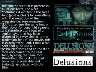
The combination of the main film products and ancillary texts was effective because they were closely linked through shared themes, fonts, color schemes, and emphasis on the main character. The trailer, poster, and magazine cover all used the film title and tagline. The same distinctive font was used across products for recognition, though the magazine adjusted it slightly. A teal/blue color scheme linked the visuals while allowing the magazine to stand out with orange. Each piece prominently featured the unstable main character through close-ups and expressions. The magazine title and featured articles also connected to the film's themes of insanity.