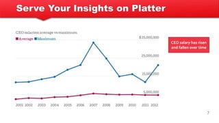
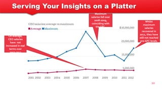
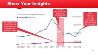
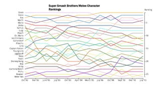
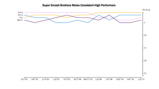
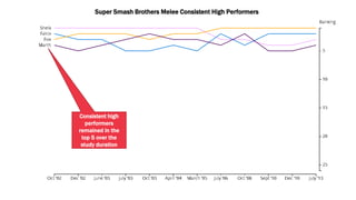
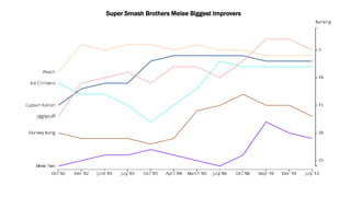
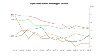
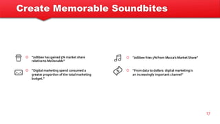
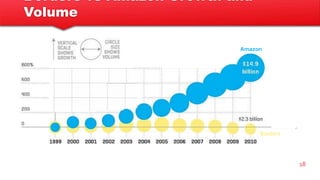
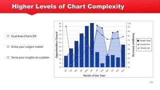
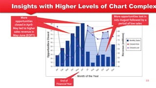
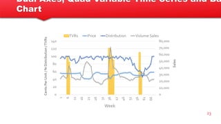
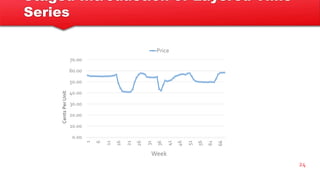
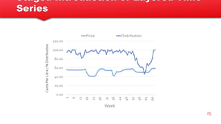
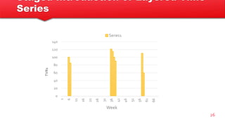
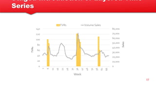
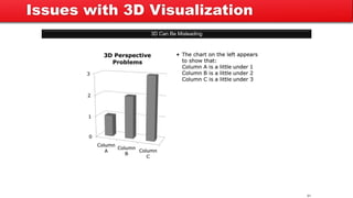
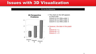
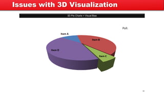
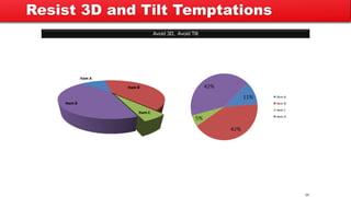
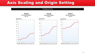
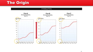
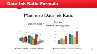
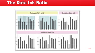
Presenting data visualizations
Datalicious, 17th December 2014
quantilicious
“The greatest value of a picture is when it
forces us to notice what we never expected
to see.” - John Tukey, 1977
Today
 Presenting visualizations in PowerPoint decks
 Dealing with graphical complexity
 Common visualization pitfalls
 Tufte’s data-ink ratio
3
Presenting Visualizations
in PowerPoint Decks
quantilicious
“The purpose of visualization is insight, not pictures”
― Ben Shneiderman
Presenting Visualizations in PowerPoint Decks
 Serve your insights on a platter
 Stay brief and to the point
 Know when to move on
 Be prepared to shift course
6
 Tell a consistent story
 Have supporting slides ready to go
 Do the cognitive work for your audience
 Provide memorable ‘takeaway’ sound bites
Serve Your Insights on Platter
7
CEO salary has risen
and fallen over time
Serve Your Insights on Platter
8
CEO salary has risen
and fallen over time
• Not clear whether the insight is referring
to Average Salaries or Maximum Salaries
• Forces the reader to do the work
• No time reference
• Does not tell the whole story (maximum
salary rose, then fell, then rose again)
Insight Generation Tips
 Point to the trend, outlier or feature
 Describe the trend, outlier or feature
 Refer to the greater context that may
not feature in the data
9
 Include a time reference
 Add value beyond what is obvious on the chart
 Leave no chart variable behind
Serving Your Insights on a Platter
10
Maximum
salaries fell over
2008-2009,
coinciding with
the GFC.
Whilst
maximum
salaries
recovered in
2012, they have
still not reached
pre-GFC levels.
On average,
CEO salaries
have not
increased in real
terms over
2007-2012
Show Your Insights
11
Maximum
salaries fell over
2008-2009,
coinciding with
the GFC.
Whilst
maximum
salaries
recovered in
2012, they have
still not reached
pre-GFC levels.
On average, CEO
salaries have not
increased in real
terms over the
previous 6 years
GFC
Super Smash Brothers Melee Character
Rankings
Super Smash Brothers Melee Consistent High Performers
Consistent high
performers
remained in the
top 5 over the
study duration
Super Smash Brothers Melee Biggest Improvers
Super Smash Brothers Melee Biggest Decliners
Create Memorable Soundbites
17
 “Jollibee has gained 5% market share
relative to McDonalds”
 “Digital marketing spend consumed a
greater proportion of the total marketing
budget.”
 “Jollibee fries 5% from Macca’s Market Share”
 “From data to dollars: digital marketing is
an increasingly important channel”
Borders vs Amazon Growth and
Volume
18
Amazon
Borders
Borders Has Drowned in the Amazon
19
Dealing with Graphical Complexity
Higher Levels of Chart Complexity
21
 Dual Axes Charts OK
 Know your subject matter
 Serve your insights on a platter
Insights with Higher Levels of Chart Complex
22
More
opportunities
closed in April-
May led to higher
sales revenue in
May-June (EOFY)
More opportunities lost in
July-August followed by a
period of low sales
End of
FinancialYear
Dual Axes, Quad Variable Time Series and Ba
Chart
23
0
10,000
20,000
30,000
40,000
50,000
60,000
70,000
80,000
0
20
40
60
80
100
120
140
1
6
11
16
21
26
31
36
41
46
51
56
61
66
Sales
CentsPerUnit/%Distribution/TVRs
Week
TVRs Price Distribution Volume Sales
Staged Introduction of Layered Time
Series
24
0.00
10.00
20.00
30.00
40.00
50.00
60.00
70.00
1
6
11
16
21
26
31
36
41
46
51
56
61
66
CentsPerUnit
Week
Price
Staged Introduction of Layered Time
Series
25
0.00
20.00
40.00
60.00
80.00
100.00
120.00
1
6
11
16
21
26
31
36
41
46
51
56
61
66
CentsPerLitre/%Distribution
Week
Price Distribution
Staged Introduction of Layered Time
Series
26
0
20
40
60
80
100
120
140
1
6
11
16
21
26
31
36
41
46
51
56
61
66
TVRs
Week
Series1
Staged Introduction of Layered Time
Series
27
0
10,000
20,000
30,000
40,000
50,000
60,000
70,000
80,000
0
20
40
60
80
100
120
140
1
6
11
16
21
26
31
36
41
46
51
56
61
66
Sales
TVRs
Week
TVRs Volume Sales
Staged Introduction – The Final
Product
28
0
10,000
20,000
30,000
40,000
50,000
60,000
70,000
80,000
0
20
40
60
80
100
120
140
1
6
11
16
21
26
31
36
41
46
51
56
61
66
Sales
CentsPerUnit/%Distribution/TVRs
Week
TVRs Price Distribution Volume Sales
Paste as Excel Objects
29
 Hover for exact values
 Give Upper Management
ownership of your numbers (to
push your business case)
 Delete variables on the fly
0
10,000
20,000
30,000
40,000
50,000
60,000
70,000
80,000
0.00
10.00
20.00
30.00
40.00
50.00
60.00
70.00
1
6
11
16
21
26
31
36
41
46
51
56
61
66
Sales
CentsPerUnit/%Distribution/TVRs
Week
Price Volume Sales
Common Visualization Pitfalls
Issues with 3D Visualization
3D Can Be Misleading
31
3D Can Be Misleading
32
Issues with 3D Visualization
3D Pie Charts = Visual Bias
33
Poll:
Issues with 3D Visualization
quantilicious
“Above all else show the
data.”
―EdwardTufte
Avoid 3D, Avoid Tilt
35
Resist 3D and Tilt Temptations
3 Fictitious Firms
36
Axis Scaling and Origin Setting
3 Fictitious Firms
37
The Origin
Which chart shows the most accurate trend?
38
Axis Scaling
39
$60.0
$66.2
$79.2 $81.6
$76.8 $79.2
$84.0 $84.0 $84.0 $81.6 $79.2
0
10
20
30
40
50
60
70
80
90
CompanyValuation($Billions)
Facebook, Inc.: Company Valuation
Be Mindful of Gridlines and Borders
If there are significant differences in the slice sizes, a pie chart can be OK (although a bar chart is better)
40
Pies vs Bars
Tufte’s Data-Ink Ratio
Data-Ink Ratio Formula
43
44
The Data Ink Ratio
Further Reading
 If you want to just read one book, make it this one
45
Further Reading
46
Thank You

Presenting Data Visualizations to Clients

  • 1.
  • 2.
    quantilicious “The greatest valueof a picture is when it forces us to notice what we never expected to see.” - John Tukey, 1977
  • 3.
    Today  Presenting visualizationsin PowerPoint decks  Dealing with graphical complexity  Common visualization pitfalls  Tufte’s data-ink ratio 3
  • 4.
  • 5.
    quantilicious “The purpose ofvisualization is insight, not pictures” ― Ben Shneiderman
  • 6.
    Presenting Visualizations inPowerPoint Decks  Serve your insights on a platter  Stay brief and to the point  Know when to move on  Be prepared to shift course 6  Tell a consistent story  Have supporting slides ready to go  Do the cognitive work for your audience  Provide memorable ‘takeaway’ sound bites
  • 7.
    Serve Your Insightson Platter 7 CEO salary has risen and fallen over time
  • 8.
    Serve Your Insightson Platter 8 CEO salary has risen and fallen over time • Not clear whether the insight is referring to Average Salaries or Maximum Salaries • Forces the reader to do the work • No time reference • Does not tell the whole story (maximum salary rose, then fell, then rose again)
  • 9.
    Insight Generation Tips Point to the trend, outlier or feature  Describe the trend, outlier or feature  Refer to the greater context that may not feature in the data 9  Include a time reference  Add value beyond what is obvious on the chart  Leave no chart variable behind
  • 10.
    Serving Your Insightson a Platter 10 Maximum salaries fell over 2008-2009, coinciding with the GFC. Whilst maximum salaries recovered in 2012, they have still not reached pre-GFC levels. On average, CEO salaries have not increased in real terms over 2007-2012
  • 11.
    Show Your Insights 11 Maximum salariesfell over 2008-2009, coinciding with the GFC. Whilst maximum salaries recovered in 2012, they have still not reached pre-GFC levels. On average, CEO salaries have not increased in real terms over the previous 6 years GFC
  • 12.
    Super Smash BrothersMelee Character Rankings
  • 13.
    Super Smash BrothersMelee Consistent High Performers
  • 14.
    Super Smash BrothersMelee Consistent High Performers Consistent high performers remained in the top 5 over the study duration
  • 15.
    Super Smash BrothersMelee Biggest Improvers
  • 16.
    Super Smash BrothersMelee Biggest Decliners
  • 17.
    Create Memorable Soundbites 17 “Jollibee has gained 5% market share relative to McDonalds”  “Digital marketing spend consumed a greater proportion of the total marketing budget.”  “Jollibee fries 5% from Macca’s Market Share”  “From data to dollars: digital marketing is an increasingly important channel”
  • 18.
    Borders vs AmazonGrowth and Volume 18 Amazon Borders
  • 19.
    Borders Has Drownedin the Amazon 19
  • 20.
  • 21.
    Higher Levels ofChart Complexity 21  Dual Axes Charts OK  Know your subject matter  Serve your insights on a platter
  • 22.
    Insights with HigherLevels of Chart Complex 22 More opportunities closed in April- May led to higher sales revenue in May-June (EOFY) More opportunities lost in July-August followed by a period of low sales End of FinancialYear
  • 23.
    Dual Axes, QuadVariable Time Series and Ba Chart 23 0 10,000 20,000 30,000 40,000 50,000 60,000 70,000 80,000 0 20 40 60 80 100 120 140 1 6 11 16 21 26 31 36 41 46 51 56 61 66 Sales CentsPerUnit/%Distribution/TVRs Week TVRs Price Distribution Volume Sales
  • 24.
    Staged Introduction ofLayered Time Series 24 0.00 10.00 20.00 30.00 40.00 50.00 60.00 70.00 1 6 11 16 21 26 31 36 41 46 51 56 61 66 CentsPerUnit Week Price
  • 25.
    Staged Introduction ofLayered Time Series 25 0.00 20.00 40.00 60.00 80.00 100.00 120.00 1 6 11 16 21 26 31 36 41 46 51 56 61 66 CentsPerLitre/%Distribution Week Price Distribution
  • 26.
    Staged Introduction ofLayered Time Series 26 0 20 40 60 80 100 120 140 1 6 11 16 21 26 31 36 41 46 51 56 61 66 TVRs Week Series1
  • 27.
    Staged Introduction ofLayered Time Series 27 0 10,000 20,000 30,000 40,000 50,000 60,000 70,000 80,000 0 20 40 60 80 100 120 140 1 6 11 16 21 26 31 36 41 46 51 56 61 66 Sales TVRs Week TVRs Volume Sales
  • 28.
    Staged Introduction –The Final Product 28 0 10,000 20,000 30,000 40,000 50,000 60,000 70,000 80,000 0 20 40 60 80 100 120 140 1 6 11 16 21 26 31 36 41 46 51 56 61 66 Sales CentsPerUnit/%Distribution/TVRs Week TVRs Price Distribution Volume Sales
  • 29.
    Paste as ExcelObjects 29  Hover for exact values  Give Upper Management ownership of your numbers (to push your business case)  Delete variables on the fly 0 10,000 20,000 30,000 40,000 50,000 60,000 70,000 80,000 0.00 10.00 20.00 30.00 40.00 50.00 60.00 70.00 1 6 11 16 21 26 31 36 41 46 51 56 61 66 Sales CentsPerUnit/%Distribution/TVRs Week Price Volume Sales
  • 30.
  • 31.
    Issues with 3DVisualization 3D Can Be Misleading 31
  • 32.
    3D Can BeMisleading 32 Issues with 3D Visualization
  • 33.
    3D Pie Charts= Visual Bias 33 Poll: Issues with 3D Visualization
  • 34.
    quantilicious “Above all elseshow the data.” ―EdwardTufte
  • 35.
    Avoid 3D, AvoidTilt 35 Resist 3D and Tilt Temptations
  • 36.
    3 Fictitious Firms 36 AxisScaling and Origin Setting
  • 37.
  • 38.
    Which chart showsthe most accurate trend? 38 Axis Scaling
  • 39.
    39 $60.0 $66.2 $79.2 $81.6 $76.8 $79.2 $84.0$84.0 $84.0 $81.6 $79.2 0 10 20 30 40 50 60 70 80 90 CompanyValuation($Billions) Facebook, Inc.: Company Valuation Be Mindful of Gridlines and Borders
  • 40.
    If there aresignificant differences in the slice sizes, a pie chart can be OK (although a bar chart is better) 40 Pies vs Bars
  • 42.
  • 43.
  • 44.
  • 45.
    Further Reading  Ifyou want to just read one book, make it this one 45
  • 46.
  • 47.