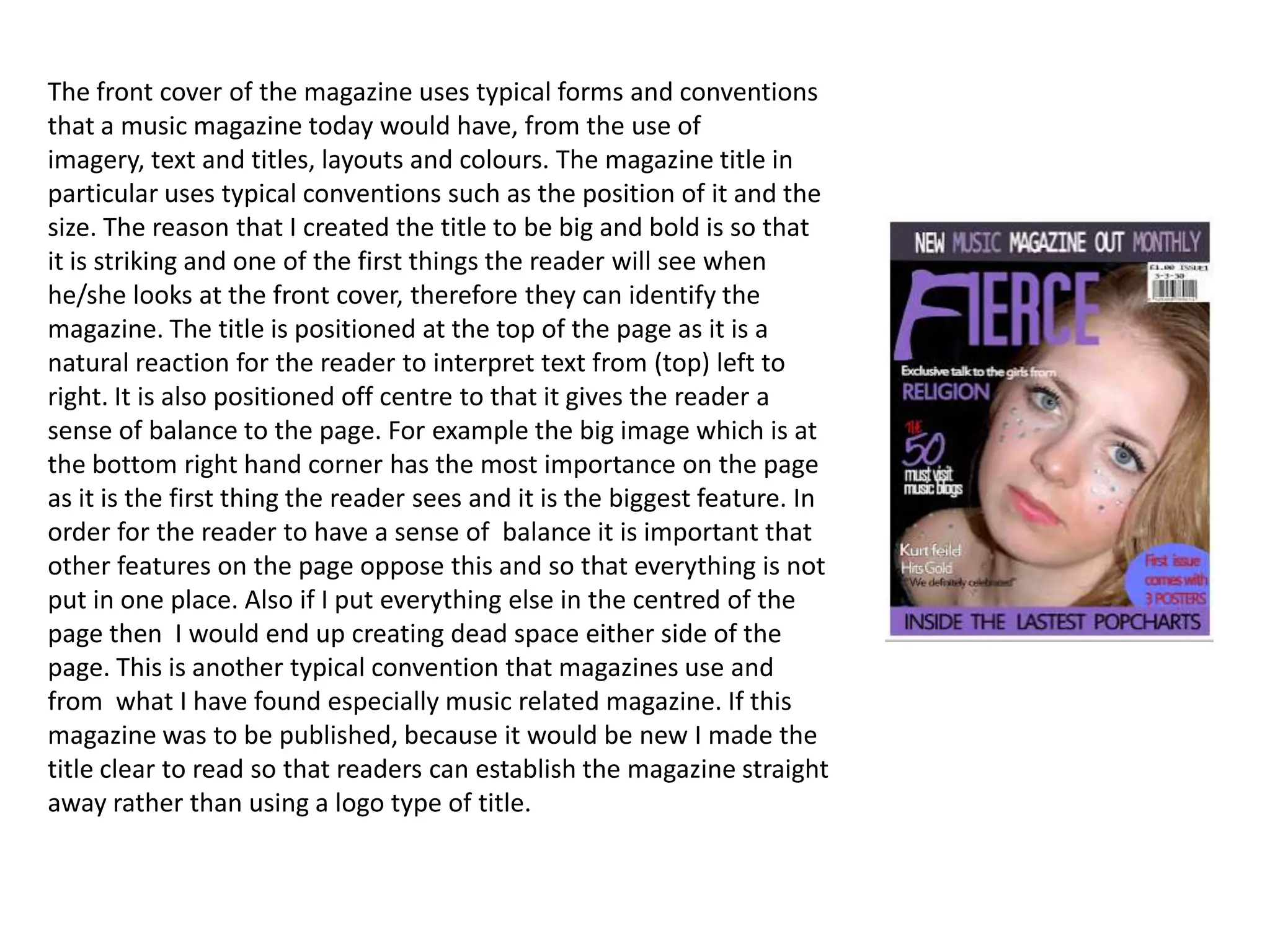
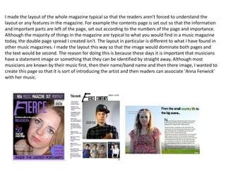
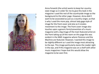
The document discusses the design choices made for the front cover of a mock music magazine. Key design elements include a large, bold title at the top to clearly identify the magazine. The title is positioned off-center for balance, with the largest image at the bottom right to draw the reader's eye. Inside pages follow typical magazine layout conventions to orient readers without confusion. A double-page spread features a large dominant image of the featured artist to introduce them visually.
Digital Summit 2014: 5-Steps for Creating Winning B2B VideoMarsden Associates
Marsden & Associates CEO, Anne Marsden, discusses video marketing strategy at Atlanta's Digital Marketing Summit 2014. Use these tips to enhance your video B2B marketing.
Helppoa ja hauskaa antaa lahjaksi monipuolinen lahjakortti, jolla lahjansaaja saa 12 kk aikana tilata mieleisensä lahjan! Ota yhteyttä asiakaspalvelu@eepe.fi
Marsden & Associates Principal, Anne Marsden, covers specific steps Marketing and Sales can take together to attract and engage prospects, and better position your sales force to make quota.
Listen to the full presentation here: http://hub.am/1ni3vvi
Memória Manipulada: A fotografia e a manipulação digitalJoss Silveira
Este trabalho de graduação apresenta o estudo sobre a manipulação manual e digital de imagens digitais que remetem a memórias, a partir de dados coletados na pesquisa de produção artística (experiência autoral).
1. The front cover of the magazine uses typical forms and conventions
that a music magazine today would have, from the use of
imagery, text and titles, layouts and colours. The magazine title in
particular uses typical conventions such as the position of it and the
size. The reason that I created the title to be big and bold is so that
it is striking and one of the first things the reader will see when
he/she looks at the front cover, therefore they can identify the
magazine. The title is positioned at the top of the page as it is a
natural reaction for the reader to interpret text from (top) left to
right. It is also positioned off centre to that it gives the reader a
sense of balance to the page. For example the big image which is at
the bottom right hand corner has the most importance on the page
as it is the first thing the reader sees and it is the biggest feature. In
order for the reader to have a sense of balance it is important that
other features on the page oppose this and so that everything is not
put in one place. Also if I put everything else in the centred of the
page then I would end up creating dead space either side of the
page. This is another typical convention that magazines use and
from what I have found especially music related magazine. If this
magazine was to be published, because it would be new I made the
title clear to read so that readers can establish the magazine straight
away rather than using a logo type of title.
2. I made the layout of the whole magazine typical so that the readers aren't forced to understand the
layout or any features in the magazine. For example the contents page is set out so that the information
and important parts are left of the page, set out according to the numbers of the page and importance.
Although the majority of things in the magazine are typical to what you would find in a music magazine
today, the double page spread I created isn't. The layout in particular is different to what I have found in
other music magazines. I made the layout this way so that the image would dominate both pages and
the text would be second. The reason for doing this is because these days it is important that musicians
have a statement image or something that they can be identified by straight away. Although most
musicians are known by their music first, then their name/band name and then there image, I wanted to
create this page so that it is sort of introducing the artist and then readers can associate 'Anna Fenwick'
with her music.
3. Anna Fenwick (the artist) wants to keep her country
style image so in order for me to give this look in the
magazine I used the rest of the countryside image as the
background to the other page. However, Anna didn't
want to be associated as just as a country singer, so that
is why I used the more pop, almost lady gaga style of
image for the front cover and also as it creates
movement to the image. The front cover image also
touches upon a generic form/convention of a music
magazine with a big image of the main featured artist on
the front taking up all the room on this page this was
evident in the NME magazine where Florence and the
Machine are featured. However, I wanted this image to
be slightly different so I used the image most attracting
to the eye. This image particularly stares the reader right
in the eye, and if this magazine was on a shelf with other
music magazines I hope that this would allow the
magazine to be seen first.