Mise En Scene The mise en scene of the poster is an important image to get across. By delivering a portent to what happens in the film, it strengthens the correlation between poster and finished film. Image The image itself was at first constructed to again foreshadow the ending, with a spoon and the plain background prevalent. However, a conscious decision was made to posterize the image, giving it the look of a pop art or comic, which further emphasised the comedic aspect of the film. Information The information at the bottom of the poster shows that we have followed convention as well as real life industry practise. It contains made up studio names as well as the information usually found on a poster. Tagline The tagline again is a portent of the events of the film, and it summarises the catalyst for the film’s events in a humorous manner. Font The font looks sketched and drawn instead of a typical computer font; this was a decision we made so it reflected the indie nature of the process of creating our film as well as its individuality. Logo The logo is representative of the film as well as the events of the film; the spoon foreshadows the predicament our main character finds himself in as well as providing humour. Colour The colour of the poster is keeping with the theme of the film; empty and stark. The black against the white is a sharp contrast in colours and summarises the film through visuals.
 
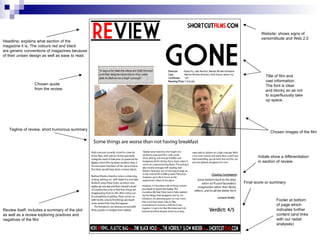
Footer at bottom of page which indicates further content (and links with our radial analyses) Final score or summary Review itself; includes a summary of the plot as well as a review exploring positives and negatives of the film Tagline of review, short humorous summary Headline; explains what section of the magazine it is. The colours red and black are generic conventions of magazines because of their unisex design as well as ease to read. Website; shows signs of verisimilitude and Web 2.0 Title of film and cast information.  The font is clear and blocky so as not to superfluously take  up space. Chosen quote from the review. Chosen images of the film Initials show a differentiation in section of review.

Poster & Review Analysis

  • 1.
  • 2.
    Mise En SceneThe mise en scene of the poster is an important image to get across. By delivering a portent to what happens in the film, it strengthens the correlation between poster and finished film. Image The image itself was at first constructed to again foreshadow the ending, with a spoon and the plain background prevalent. However, a conscious decision was made to posterize the image, giving it the look of a pop art or comic, which further emphasised the comedic aspect of the film. Information The information at the bottom of the poster shows that we have followed convention as well as real life industry practise. It contains made up studio names as well as the information usually found on a poster. Tagline The tagline again is a portent of the events of the film, and it summarises the catalyst for the film’s events in a humorous manner. Font The font looks sketched and drawn instead of a typical computer font; this was a decision we made so it reflected the indie nature of the process of creating our film as well as its individuality. Logo The logo is representative of the film as well as the events of the film; the spoon foreshadows the predicament our main character finds himself in as well as providing humour. Colour The colour of the poster is keeping with the theme of the film; empty and stark. The black against the white is a sharp contrast in colours and summarises the film through visuals.
  • 3.
  • 4.
    Footer at bottomof page which indicates further content (and links with our radial analyses) Final score or summary Review itself; includes a summary of the plot as well as a review exploring positives and negatives of the film Tagline of review, short humorous summary Headline; explains what section of the magazine it is. The colours red and black are generic conventions of magazines because of their unisex design as well as ease to read. Website; shows signs of verisimilitude and Web 2.0 Title of film and cast information. The font is clear and blocky so as not to superfluously take up space. Chosen quote from the review. Chosen images of the film Initials show a differentiation in section of review.