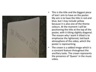
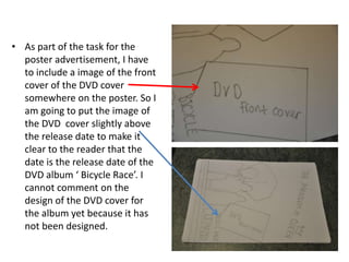
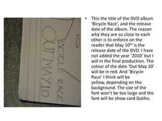
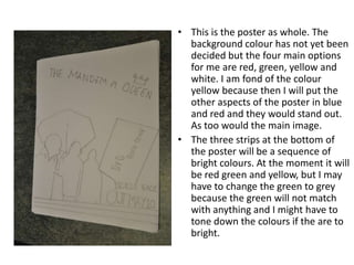
Poster flat plan
This is the title and the biggest piece of text I aim to have on the poster. My aim is to have the title in red and blue, but I may include yellow because it is also one of the theme colours. At the moment I will be positioning the title at the top of the poster, with it tilting slightly diagonal. The reason why I want it tilted is to emphasise the lightened, laid back atmosphere of the video, which the poster is representing.The crown is a added image which is a constant feature throughout the ancillary tasks. The crown represents the presence of ‘Queen’ in the music video.
As part of the task for the poster advertisement, I have to include a image of the front cover of the DVD cover somewhere on the poster. So I am going to put the image of the DVD  cover slightly above the release date to make it clear to the reader that the date is the release date of the DVD album ‘ Bicycle Race’. I cannot comment on the design of the DVD cover for the album yet because it has not been designed.
This the title of the DVD album ‘Bicycle Race’, and the release date of the album. The reason why they are so close to each other is to enforce on the reader that May 10th is the release date of the DVD. I have not added the year ‘2010’ but I will in the final production. The colour of the date ‘Out May 10’ will be in red. And ‘Bicycle Race’ I think will be yellow, depending on the background. The size of the font won’t be too large and the font will be show card Gothic.
This is the main image on the poster. Four of the other characters will be  in the image hopefully depending on the decision of one of the group, so for the time being I have drawn three. All the characters will be wearing bright colours, possibly, yellow, red and blue. The main actor in the video will be the one standing in the middle. The mise-en-scene of the characters will be coloured jackets too create a casual look. This image will take up a lot of space on the poster and will undoubtedly catch the eye of the viewer.
This is the poster as whole. The background colour has not yet been decided but the four main options for me are red, green, yellow and white. I am fond of the colour yellow because then I will put the other aspects of the poster in blue and red and they would stand out. As too would the main image. The three strips at the bottom of the poster will be a sequence of bright colours. At the moment it will be red green and yellow, but I may have to change the green to grey because the green will not match with anything and I might have to tone down the colours if the are to bright.

Poster flat plan

  • 1.
  • 2.
    This is thetitle and the biggest piece of text I aim to have on the poster. My aim is to have the title in red and blue, but I may include yellow because it is also one of the theme colours. At the moment I will be positioning the title at the top of the poster, with it tilting slightly diagonal. The reason why I want it tilted is to emphasise the lightened, laid back atmosphere of the video, which the poster is representing.The crown is a added image which is a constant feature throughout the ancillary tasks. The crown represents the presence of ‘Queen’ in the music video.
  • 3.
    As part ofthe task for the poster advertisement, I have to include a image of the front cover of the DVD cover somewhere on the poster. So I am going to put the image of the DVD cover slightly above the release date to make it clear to the reader that the date is the release date of the DVD album ‘ Bicycle Race’. I cannot comment on the design of the DVD cover for the album yet because it has not been designed.
  • 4.
    This the titleof the DVD album ‘Bicycle Race’, and the release date of the album. The reason why they are so close to each other is to enforce on the reader that May 10th is the release date of the DVD. I have not added the year ‘2010’ but I will in the final production. The colour of the date ‘Out May 10’ will be in red. And ‘Bicycle Race’ I think will be yellow, depending on the background. The size of the font won’t be too large and the font will be show card Gothic.
  • 5.
    This is themain image on the poster. Four of the other characters will be in the image hopefully depending on the decision of one of the group, so for the time being I have drawn three. All the characters will be wearing bright colours, possibly, yellow, red and blue. The main actor in the video will be the one standing in the middle. The mise-en-scene of the characters will be coloured jackets too create a casual look. This image will take up a lot of space on the poster and will undoubtedly catch the eye of the viewer.
  • 6.
    This is theposter as whole. The background colour has not yet been decided but the four main options for me are red, green, yellow and white. I am fond of the colour yellow because then I will put the other aspects of the poster in blue and red and they would stand out. As too would the main image. The three strips at the bottom of the poster will be a sequence of bright colours. At the moment it will be red green and yellow, but I may have to change the green to grey because the green will not match with anything and I might have to tone down the colours if the are to bright.