Poster analysi1
•Download as DOC, PDF•
0 likes•4,397 views
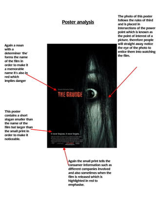
This poster follows rules of composition to draw the viewer's eye to the point of interest, a photo placed at the intersection of lines. It uses the eye-catching technique of placing the memorable film name in red to imply danger. It also features a noticeable slogan in smaller text than the film name but larger than other text. The small print informs viewers of production details like studios and release dates, with important details highlighted in red for emphasis.
Report
Share
Report
Share
Recommended
Film Poster Anotation
This document analyzes several film posters and how they convey information about the genre and content of the films. It discusses how the posters use techniques like the Rule of Thirds, focal points, taglines, colors, and lighting to attract audiences and establish the genres as romance, horror, or action/adventure. Specific elements of the posters like characters, backgrounds, and titles are examined for their symbolic meanings and how they provide clues about the films' narratives.
Magazinbe analasis
The document discusses the design of a magazine cover promoting a film. It uses a simple color scheme of black, white and red to fit a particular genre. The masthead clearly displays the magazine's identity and title in the same colors. Additional text on the cover in bold and capital letters emphasizes important information about the film while maintaining the color scheme's consistency.
Film poster deconstruction
This document analyzes and summarizes elements of film posters used to attract audiences. Key elements highlighted include:
- Using striking images that provide insights into the storyline and characters to grab attention.
- Incorporating frightening imagery or "ghouls" to tease the scary nature of the film.
- Employing dark color palettes and blurry or unfocused images to set an eerie, uneasy tone.
- Boldly displaying the film title and release date to ensure they stand out and are remembered.
Film poster research
The document discusses conventions for film posters and provides examples that could inspire the design of a new poster. It notes key elements of effective posters like an eye-catching title, persuasive language to attract viewers, inclusion of relevant details like actors and directors, and accurately representing the film's genre. The document examines posters that use techniques like bold colors, simple layouts, and ominous tones that match the expected moods of their films. These examples will inform the creation of a poster with a similar style to tie into film conventions.
Colours
Este documento proporciona enlaces a recursos educativos en inglés y español, incluyendo presentaciones de PowerPoint sobre temas como días especiales, familia, humor, islas canarias y navidad. También incluye enlaces para suscribirse a actualizaciones gratuitas y compartir los recursos con otros.
Endokrin patoloji pratik e4 b2TipciyizBiz(byramazankaya)4
Yeşim hocanın notlarında isimsiz koyduğu slaytların isimlendirilmiş hali
Mongol empire WS p1
Genghis Khan ruled the vast Mongol Empire from 1206-1227, expanding its territory across much of Asia and eastern Europe. After his death, the empire fractured under his sons' rule. Kublai Khan later reconquered much of China and established his capital in modern-day Beijing, making him the first non-Chinese ruler of China. European explorer Marco Polo traveled to the Mongol Empire in the late 1200s and brought back knowledge of Asia that was previously unknown in Europe.
Target audience
The document provides a breakdown of genres of movies and shows that are popular among different age groups and genders. Males as adults and teenagers enjoy action, sci-fi, and horror genres the most. Females/couples as teenagers and adults are more interested in romance/family genres and comedy. Boys and girls have different tastes as children.
Magazine development
The document outlines the basic layout of a magazine, including a slogan at the top, masthead, main image surrounded by other images of pugs and puffs. The author has further developed the idea by adding desired colors and following conventions of film magazines to aid in a trailer and explore genre.
Analysis of data from what staff and students
The document asks students and staff how often they use the music practice rooms, what shapes they would like for the rooms, and what colors they would like to see in the music rooms. It is gathering input on improving the design and use of the school's music practice facilities.
ערר היזמים של כפר נופש נחשולים
מנהל מקרקעי ישראל, משרד התיירות, ומשרד האדריכל טומי לייטרסדורף מגישים ערר על ההחלטה לבטל את תוכנית כפר הנופש נחשולים
חכ/336
Spring term 1 media homework project
The document discusses Terrelle's homework project for creating a news website targeted at 12-16 year olds. It provides links to 5 news stories that would be relevant for the target audience and discusses why each story is relevant. The stories include topics like the Olympics, a local disciplinary camp, a 15-year old winning a track competition, local gang culture, unemployment rates for youth, and a national football team. The document also mentions the website will have a mix of hard news and softer news stories and will aim to raise awareness of local issues for young people.
Horror film poster analysis.
The document provides an analysis of a film poster. It summarizes key elements of the poster's design and how they convey information to viewers. These include the use of dark colors and lighting to set a horror tone, the positioning of the title and actors' names for visibility, and symbolic images that reveal clues about the plot and genre. Overall, the analysis examines how visual codes and conventions in the poster are used to attract audience attention and inform them about the film.
Film poster anotation
This document analyzes several film posters and how they convey information about the genre and content of the films. It discusses how the posters use techniques like the Rule of Thirds, focal points, taglines, colors, and lighting to attract audiences and establish the genres as romance, horror, or action/adventure. Specific elements of the posters like characters, backgrounds, and titles are examined for their symbolic meanings and how they provide clues about the films' narratives.
Review Article Analysis
The document analyzes conventions used in film review magazines, such as layout, language, and images. It notes that short film reviews are lacking. To address this, it examines examples of film reviews and identifies common elements like: start ratings, descriptive images from the film, sections with different subtitles, and consistent color schemes. It also includes elements like names of people involved, film summaries, and critical verdicts. By understanding these conventions, the document aims to apply similar elements in reviews of short films.
How effective is the combination of your main product and ancillary texts ?
The document discusses how combining a film trailer with ancillary texts like a poster and magazine cover can increase effectiveness. It analyzes the poster and magazine cover created for a student film project. For the poster, key elements like the central image, actors' names, and tagline were used to attract attention and link to the trailer. The magazine cover also featured the central image and tagline to create synergy across products and intrigue audiences about the film's thriller genre. Analyzing real examples helped understand how to craft attractive and related ancillary texts to better promote the film.
2.How effective is the combination of your main product and your ancillary te...
The document discusses how effective the combination of a film trailer, poster, and magazine cover can be at promoting a film. It analyzes each product individually, noting how elements like images, fonts, and color schemes are repeated across the different media texts to create synergy and draw connections for the audience. The author believes their own film trailer, poster, and magazine cover work well together because they feature the same possessed main character, dark tones, and font to emphasize the thriller genre and draw the audience between the products. This repetition and consistency helps increase the effectiveness of the overall promotional package.
Momento film posters
The Memento film posters provide clues about the confusing and thought-provoking nature of the film through their unique design elements. Each poster features pictures within pictures to suggest the characters are getting inside each other's heads. The posters also highlight the main characters and actors to encourage the fan base to see the film. Symbols and clues on the posters, like tattoos and weapons, hint at the dramatic and psychological thriller themes that will be explored in the film's storyline. Common across the posters are the use of black and gold colors, snapshots from an old camera, and institutional information to identify the film and draw in audiences.
Review Article Analysis
The document analyzes conventions used in film review magazine articles, such as including a large image from the film, the film title and information, and a rating and verdict. It notes consistency in color schemes and layouts that make the reviews easy to read. The document concludes that after analyzing existing products, it will follow conventions like using a large film image, title, director/cast information, and a rating in its own short film reviews.
Film review research
The document provides guidance on how to layout a film review to effectively engage audiences. It recommends placing the film image on the left to draw the eye, including the film title and rating prominently below the image. Key details like the release date and cinemas for previews are highlighted in a separate color. The review is placed on the left side in bold text and black background to stand out. A character image and brief film facts are included on the right.
Poster analysis
The poster provides credits at the bottom listing the companies involved in producing, distributing, and exhibiting the film, which is a form of horizontal integration that advertises major names and encourages viewers to watch based on enjoyment of other films from those companies. There is a single central image that draws viewers in without revealing too much of the plot. The large title of the film "Saw" also grabs attention as one of the largest pieces of text on the poster. Manipulating the text makes it more aesthetically pleasing and interesting to look at, making viewers more likely to want to watch the film.
Poster analysi1
The photo on the movie poster follows rules of composition to draw the eye to the point of interest, placing it at an intersection to entice viewers. Additional text provides production company details and release date in red for emphasis. The film title uses a determiner like "the" to make it memorable, also in red implying danger. A shorter slogan is included to be noticeable, between the title and fine print.
More Related Content
Viewers also liked
Endokrin patoloji pratik e4 b2TipciyizBiz(byramazankaya)4
Yeşim hocanın notlarında isimsiz koyduğu slaytların isimlendirilmiş hali
Mongol empire WS p1
Genghis Khan ruled the vast Mongol Empire from 1206-1227, expanding its territory across much of Asia and eastern Europe. After his death, the empire fractured under his sons' rule. Kublai Khan later reconquered much of China and established his capital in modern-day Beijing, making him the first non-Chinese ruler of China. European explorer Marco Polo traveled to the Mongol Empire in the late 1200s and brought back knowledge of Asia that was previously unknown in Europe.
Target audience
The document provides a breakdown of genres of movies and shows that are popular among different age groups and genders. Males as adults and teenagers enjoy action, sci-fi, and horror genres the most. Females/couples as teenagers and adults are more interested in romance/family genres and comedy. Boys and girls have different tastes as children.
Magazine development
The document outlines the basic layout of a magazine, including a slogan at the top, masthead, main image surrounded by other images of pugs and puffs. The author has further developed the idea by adding desired colors and following conventions of film magazines to aid in a trailer and explore genre.
Analysis of data from what staff and students
The document asks students and staff how often they use the music practice rooms, what shapes they would like for the rooms, and what colors they would like to see in the music rooms. It is gathering input on improving the design and use of the school's music practice facilities.
ערר היזמים של כפר נופש נחשולים
מנהל מקרקעי ישראל, משרד התיירות, ומשרד האדריכל טומי לייטרסדורף מגישים ערר על ההחלטה לבטל את תוכנית כפר הנופש נחשולים
חכ/336
Spring term 1 media homework project
The document discusses Terrelle's homework project for creating a news website targeted at 12-16 year olds. It provides links to 5 news stories that would be relevant for the target audience and discusses why each story is relevant. The stories include topics like the Olympics, a local disciplinary camp, a 15-year old winning a track competition, local gang culture, unemployment rates for youth, and a national football team. The document also mentions the website will have a mix of hard news and softer news stories and will aim to raise awareness of local issues for young people.
Viewers also liked (12)
Endokrin patoloji pratik e4 b2TipciyizBiz(byramazankaya)4
Endokrin patoloji pratik e4 b2TipciyizBiz(byramazankaya)4
Similar to Poster analysi1
Horror film poster analysis.
The document provides an analysis of a film poster. It summarizes key elements of the poster's design and how they convey information to viewers. These include the use of dark colors and lighting to set a horror tone, the positioning of the title and actors' names for visibility, and symbolic images that reveal clues about the plot and genre. Overall, the analysis examines how visual codes and conventions in the poster are used to attract audience attention and inform them about the film.
Film poster anotation
This document analyzes several film posters and how they convey information about the genre and content of the films. It discusses how the posters use techniques like the Rule of Thirds, focal points, taglines, colors, and lighting to attract audiences and establish the genres as romance, horror, or action/adventure. Specific elements of the posters like characters, backgrounds, and titles are examined for their symbolic meanings and how they provide clues about the films' narratives.
Review Article Analysis
The document analyzes conventions used in film review magazines, such as layout, language, and images. It notes that short film reviews are lacking. To address this, it examines examples of film reviews and identifies common elements like: start ratings, descriptive images from the film, sections with different subtitles, and consistent color schemes. It also includes elements like names of people involved, film summaries, and critical verdicts. By understanding these conventions, the document aims to apply similar elements in reviews of short films.
How effective is the combination of your main product and ancillary texts ?
The document discusses how combining a film trailer with ancillary texts like a poster and magazine cover can increase effectiveness. It analyzes the poster and magazine cover created for a student film project. For the poster, key elements like the central image, actors' names, and tagline were used to attract attention and link to the trailer. The magazine cover also featured the central image and tagline to create synergy across products and intrigue audiences about the film's thriller genre. Analyzing real examples helped understand how to craft attractive and related ancillary texts to better promote the film.
2.How effective is the combination of your main product and your ancillary te...
The document discusses how effective the combination of a film trailer, poster, and magazine cover can be at promoting a film. It analyzes each product individually, noting how elements like images, fonts, and color schemes are repeated across the different media texts to create synergy and draw connections for the audience. The author believes their own film trailer, poster, and magazine cover work well together because they feature the same possessed main character, dark tones, and font to emphasize the thriller genre and draw the audience between the products. This repetition and consistency helps increase the effectiveness of the overall promotional package.
Momento film posters
The Memento film posters provide clues about the confusing and thought-provoking nature of the film through their unique design elements. Each poster features pictures within pictures to suggest the characters are getting inside each other's heads. The posters also highlight the main characters and actors to encourage the fan base to see the film. Symbols and clues on the posters, like tattoos and weapons, hint at the dramatic and psychological thriller themes that will be explored in the film's storyline. Common across the posters are the use of black and gold colors, snapshots from an old camera, and institutional information to identify the film and draw in audiences.
Review Article Analysis
The document analyzes conventions used in film review magazine articles, such as including a large image from the film, the film title and information, and a rating and verdict. It notes consistency in color schemes and layouts that make the reviews easy to read. The document concludes that after analyzing existing products, it will follow conventions like using a large film image, title, director/cast information, and a rating in its own short film reviews.
Film review research
The document provides guidance on how to layout a film review to effectively engage audiences. It recommends placing the film image on the left to draw the eye, including the film title and rating prominently below the image. Key details like the release date and cinemas for previews are highlighted in a separate color. The review is placed on the left side in bold text and black background to stand out. A character image and brief film facts are included on the right.
Similar to Poster analysi1 (8)
How effective is the combination of your main product and ancillary texts ?
How effective is the combination of your main product and ancillary texts ?
2.How effective is the combination of your main product and your ancillary te...
2.How effective is the combination of your main product and your ancillary te...
More from rachelkitchin93
Poster analysis
The poster provides credits at the bottom listing the companies involved in producing, distributing, and exhibiting the film, which is a form of horizontal integration that advertises major names and encourages viewers to watch based on enjoyment of other films from those companies. There is a single central image that draws viewers in without revealing too much of the plot. The large title of the film "Saw" also grabs attention as one of the largest pieces of text on the poster. Manipulating the text makes it more aesthetically pleasing and interesting to look at, making viewers more likely to want to watch the film.
Poster analysi1
The photo on the movie poster follows rules of composition to draw the eye to the point of interest, placing it at an intersection to entice viewers. Additional text provides production company details and release date in red for emphasis. The film title uses a determiner like "the" to make it memorable, also in red implying danger. A shorter slogan is included to be noticeable, between the title and fine print.
Poster analysis
The poster features a central image that provides insight into the film without revealing too much. This large image is most likely to grab attention. The title "Saw" is also large to draw the eye. Credits at the bottom list the cast and filmmakers, acting as a form of celebrity endorsement to entice viewers by familiar names. The companies involved in producing, distributing, and exhibiting the film are also listed at the bottom, showing horizontal integration and signifying quality through associated big names.
Character profiles
Brian Heyes is a 70-year-old white British male with experience in minor roles in short films and trailers. He is a method actor who takes all roles seriously. Timeline Productions chose Brian for the role of the Doctor as he met their criteria with his professionalism, experience, and suitable appearance, and listened well to direction. Brian expressed excitement and gratitude for being selected.
Character profile
Rachel Kitchin is a 17-year-old white British female who has had leading roles in school musicals and children's theater productions. She has experience presenting a documentary and auditioning for popular television shows. Producers chose Rachel for her versatile skills and experience taking on different roles. They feel she is well-suited to play the central vulnerable blonde protagonist.
Character profiles
Brian Heyes is a 70-year-old white British male with experience in minor roles in short films and trailers. He is a method actor who takes all roles seriously. Timeline Productions chose Brian for the role of the Doctor as he met their criteria with his professionalism, experience, and suitable appearance, and listened well to direction. Brian expressed excitement and gratitude for being selected.
Pre production templates
Khristie Lawton and Rachel Kitchin are collaborating on a short film project titled "The Damned" which must be completed by January. According to the project plan, they will divide responsibilities for writing the script, directing scenes, operating cameras, editing footage, and marketing the final product. A production schedule outlines the filming of three scenes in December at various outdoor locations, listing crew members and any required props or safety precautions. A production log will track the completion of tasks and any difficulties encountered.
Poster development
The document provides guidance on developing a simple and effective poster with minimal text or images. It recommends including a single prominent central image in black and white with writing in white or gray on a black background. The poster's final draft used a landscape orientation to maintain simplicity while coordinating with other materials promoting the film's genre and theme.
Empire mag
The document discusses conventions used in magazines that the author wishes to emulate for their own magazine. These include using a large, attention-grabbing masthead; having a common theme represented through colors; including different fonts to make the cover more interesting; and centering the main image to draw the audience's eyes. The author analyzes how these conventions were effectively used in the example magazine and plans to apply similar techniques for their own horror-themed magazine.
Empire mag
The document discusses a magazine cover and how the student plans to use similar codes and conventions for their own horror magazine cover. Key elements they note include using a large, recognizable masthead in red to show popularity; incorporating dark colors that contrast each other to represent the horror genre; including varied, playful fonts that relate to the theme; centering the main image so the eyes are drawn to it; and adding a tagline or subheading at the top in a contrasting color to provide insight into the magazine's contents. The student aims to tie all visual elements together cohesively to attract audiences and relate to the horror theme.
Poster analysis
This poster analysis discusses a movie poster featuring a red cross at the center of a dark background, which conveys connotations related to the film's title of "devil" and a feeling of seclusion. Key details like the actors and distributors are listed in small print while the dark background and isolated red cross create an ominous, horror-themed atmosphere.
Photos
The photographer took various photos for side tasks but did not use them, wanting more active images instead. A range of photos were taken so they could compare which would look better. They tried to capture disoriented, scary-looking girls to provide context for the storyline.
Locations
The document discusses important locations for horror films, including woods and isolated houses. It analyzes how these locations make characters vulnerable and increase tension by preventing access to help. It also presents photos of a nearby wood called Shawwood as a potential filming location, and notes attempts to get permission to film in an abandoned house and pharmacy to establish common horror film settings.
Target audience1
The document contains responses from several individuals regarding their opinions on horror films. Their ages range from 13 to over 25. Both males and females provide responses. Most say that trailers influence their decisions to watch a film and enjoy suspenseful films the most. Memorable films stay with the viewer through a combination of story, characters, scares and thrills. Commonly cited favorite films include The Shining, Saw, and When a Stranger Calls.
The doctor script
The script is for a horror film titled "The Doctor" and consists of 9 scenes. Scene 1 introduces the village, house, and woods with ominous music. Scene 2 shows the protagonist Cassie entering the Doctor's house/office where he questions her. Scene 3 establishes the Doctor's office. Scene 4 shows Cassie walking down a dark corridor. Scene 5 shows Cassie having flashes of scary girls and waking up. Scene 6 reveals the Doctor has photos of the girls on his wall, and Cassie flees in distress. Scene 7 shows Cassie entering a room with the girls in bed. Scene 8 cuts to the Doctor waking and closing the door. Scene 9 shows the girls entering the woods as the Doctor chases
Horror research
Horror films aim to elicit emotions of fear, disgust, and horror in viewers through techniques like jump scenes involving macabre or supernatural elements. They often overlap with fantasy, science fiction, and thriller genres. Horror fiction in literature also aims to frighten readers through supernatural or non-supernatural means. Thrillers use suspense and tension to excite viewers, with common subgenres being mystery, crime, and psychological thrillers. Horror relies more on graphic violence while thrillers emphasize unexpected scary moments to engage audiences. Common horror conventions include vulnerable young female protagonists, isolated settings at night, and graphic blood and weapons.
Synopsis
Three college students, Katie, Cassie, and Emily, seek help from a small-town physician but end up in danger. Emily and Katie were previously patients of the disturbed doctor and were tortured by him. Cassie starts having nightmares of two girls resembling Emily and Katie. When she meets the doctor, Cassie sees photos of the girls on his wall. During a sleepwalking episode, Cassie discovers Emily and Katie tied up at the doctor's clinic. The three girls try to escape the doctor into a nearby forest but find themselves alone and in danger.
Genres1
The document categorizes different genres of films including sci fi, thriller, horror, romantic comedy, romantic, drama, comedy, and action. It provides brief descriptions of each genre focusing on common themes, conventions, and challenges of production.
Genres
The document discusses different genres of films including sci-fi, thriller, horror, romantic comedy, period drama, drama, romantic, action, and comedy. It provides brief descriptions of each genre, noting that sci-fi, period drama, and action films can be difficult to produce due to their need for elaborate sets, costumes, makeup, or special effects.
More from rachelkitchin93 (20)
Recently uploaded
Executive Directors Chat Leveraging AI for Diversity, Equity, and Inclusion
Let’s explore the intersection of technology and equity in the final session of our DEI series. Discover how AI tools, like ChatGPT, can be used to support and enhance your nonprofit's DEI initiatives. Participants will gain insights into practical AI applications and get tips for leveraging technology to advance their DEI goals.
ANATOMY AND BIOMECHANICS OF HIP JOINT.pdf
it describes the bony anatomy including the femoral head , acetabulum, labrum . also discusses the capsule , ligaments . muscle that act on the hip joint and the range of motion are outlined. factors affecting hip joint stability and weight transmission through the joint are summarized.
Assessment and Planning in Educational technology.pptx
In an education system, it is understood that assessment is only for the students, but on the other hand, the Assessment of teachers is also an important aspect of the education system that ensures teachers are providing high-quality instruction to students. The assessment process can be used to provide feedback and support for professional development, to inform decisions about teacher retention or promotion, or to evaluate teacher effectiveness for accountability purposes.
Your Skill Boost Masterclass: Strategies for Effective Upskilling
Your Skill Boost Masterclass: Strategies for Effective UpskillingExcellence Foundation for South Sudan
Strategies for Effective Upskilling is a presentation by Chinwendu Peace in a Your Skill Boost Masterclass organisation by the Excellence Foundation for South Sudan on 08th and 09th June 2024 from 1 PM to 3 PM on each day.How to Add Chatter in the odoo 17 ERP Module
In Odoo, the chatter is like a chat tool that helps you work together on records. You can leave notes and track things, making it easier to talk with your team and partners. Inside chatter, all communication history, activity, and changes will be displayed.
Introduction to AI for Nonprofits with Tapp Network
Dive into the world of AI! Experts Jon Hill and Tareq Monaur will guide you through AI's role in enhancing nonprofit websites and basic marketing strategies, making it easy to understand and apply.
Pollock and Snow "DEIA in the Scholarly Landscape, Session One: Setting Expec...
Pollock and Snow "DEIA in the Scholarly Landscape, Session One: Setting Expec...National Information Standards Organization (NISO)
This presentation was provided by Steph Pollock of The American Psychological Association’s Journals Program, and Damita Snow, of The American Society of Civil Engineers (ASCE), for the initial session of NISO's 2024 Training Series "DEIA in the Scholarly Landscape." Session One: 'Setting Expectations: a DEIA Primer,' was held June 6, 2024.PCOS corelations and management through Ayurveda.
This presentation includes basic of PCOS their pathology and treatment and also Ayurveda correlation of PCOS and Ayurvedic line of treatment mentioned in classics.
South African Journal of Science: Writing with integrity workshop (2024)
South African Journal of Science: Writing with integrity workshop (2024)Academy of Science of South Africa
A workshop hosted by the South African Journal of Science aimed at postgraduate students and early career researchers with little or no experience in writing and publishing journal articles.Main Java[All of the Base Concepts}.docx
This is part 1 of my Java Learning Journey. This Contains Custom methods, classes, constructors, packages, multithreading , try- catch block, finally block and more.
RPMS TEMPLATE FOR SCHOOL YEAR 2023-2024 FOR TEACHER 1 TO TEACHER 3
RPMS Template 2023-2024 by: Irene S. Rueco
বাংলাদেশ অর্থনৈতিক সমীক্ষা (Economic Review) ২০২৪ UJS App.pdf
বাংলাদেশের অর্থনৈতিক সমীক্ষা ২০২৪ [Bangladesh Economic Review 2024 Bangla.pdf] কম্পিউটার , ট্যাব ও স্মার্ট ফোন ভার্সন সহ সম্পূর্ণ বাংলা ই-বুক বা pdf বই " সুচিপত্র ...বুকমার্ক মেনু 🔖 ও হাইপার লিংক মেনু 📝👆 যুক্ত ..
আমাদের সবার জন্য খুব খুব গুরুত্বপূর্ণ একটি বই ..বিসিএস, ব্যাংক, ইউনিভার্সিটি ভর্তি ও যে কোন প্রতিযোগিতা মূলক পরীক্ষার জন্য এর খুব ইম্পরট্যান্ট একটি বিষয় ...তাছাড়া বাংলাদেশের সাম্প্রতিক যে কোন ডাটা বা তথ্য এই বইতে পাবেন ...
তাই একজন নাগরিক হিসাবে এই তথ্য গুলো আপনার জানা প্রয়োজন ...।
বিসিএস ও ব্যাংক এর লিখিত পরীক্ষা ...+এছাড়া মাধ্যমিক ও উচ্চমাধ্যমিকের স্টুডেন্টদের জন্য অনেক কাজে আসবে ...
The History of Stoke Newington Street Names
Presented at the Stoke Newington Literary Festival on 9th June 2024
www.StokeNewingtonHistory.com
How to Manage Your Lost Opportunities in Odoo 17 CRM
Odoo 17 CRM allows us to track why we lose sales opportunities with "Lost Reasons." This helps analyze our sales process and identify areas for improvement. Here's how to configure lost reasons in Odoo 17 CRM
BÀI TẬP BỔ TRỢ TIẾNG ANH 8 CẢ NĂM - GLOBAL SUCCESS - NĂM HỌC 2023-2024 (CÓ FI...
BÀI TẬP BỔ TRỢ TIẾNG ANH 8 CẢ NĂM - GLOBAL SUCCESS - NĂM HỌC 2023-2024 (CÓ FI...Nguyen Thanh Tu Collection
https://app.box.com/s/y977uz6bpd3af4qsebv7r9b7s21935vdRecently uploaded (20)
Executive Directors Chat Leveraging AI for Diversity, Equity, and Inclusion
Executive Directors Chat Leveraging AI for Diversity, Equity, and Inclusion
Liberal Approach to the Study of Indian Politics.pdf
Liberal Approach to the Study of Indian Politics.pdf
Assessment and Planning in Educational technology.pptx
Assessment and Planning in Educational technology.pptx
Pride Month Slides 2024 David Douglas School District
Pride Month Slides 2024 David Douglas School District
Your Skill Boost Masterclass: Strategies for Effective Upskilling
Your Skill Boost Masterclass: Strategies for Effective Upskilling
Introduction to AI for Nonprofits with Tapp Network
Introduction to AI for Nonprofits with Tapp Network
Pollock and Snow "DEIA in the Scholarly Landscape, Session One: Setting Expec...
Pollock and Snow "DEIA in the Scholarly Landscape, Session One: Setting Expec...
South African Journal of Science: Writing with integrity workshop (2024)
South African Journal of Science: Writing with integrity workshop (2024)
RPMS TEMPLATE FOR SCHOOL YEAR 2023-2024 FOR TEACHER 1 TO TEACHER 3
RPMS TEMPLATE FOR SCHOOL YEAR 2023-2024 FOR TEACHER 1 TO TEACHER 3
বাংলাদেশ অর্থনৈতিক সমীক্ষা (Economic Review) ২০২৪ UJS App.pdf
বাংলাদেশ অর্থনৈতিক সমীক্ষা (Economic Review) ২০২৪ UJS App.pdf
How to Manage Your Lost Opportunities in Odoo 17 CRM
How to Manage Your Lost Opportunities in Odoo 17 CRM
BÀI TẬP BỔ TRỢ TIẾNG ANH 8 CẢ NĂM - GLOBAL SUCCESS - NĂM HỌC 2023-2024 (CÓ FI...
BÀI TẬP BỔ TRỢ TIẾNG ANH 8 CẢ NĂM - GLOBAL SUCCESS - NĂM HỌC 2023-2024 (CÓ FI...
Poster analysi1
- 1. The photo of this poster follows the rules of third Poster analysis and is placed in intersections of the power point which is known as the point of interest of a picture, therefore people Again a noun will straight away notice with a the eye of the photo to determiner ‘the’ entice them into watching forms the name the film. of the film in order to make it a memorable name it’s also in red which implies danger This poster contains a short slogan smaller than the name of the film but larger than the small print in order to make it noticeable. Again the small print tells the consumer information such as different companies involved and also sometimes when the film is released which is highlighted in red to emphasise.