Download to read offline


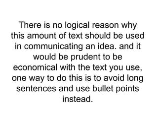
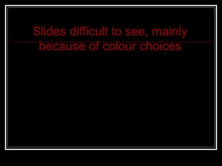


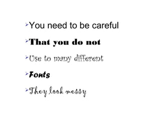


Poor Powerpoint slide design features include using too much text without bullet points, difficult to read colors, and too many different fonts. The document outlines 10 poor design elements and recommends using less text with bullet points, more readable colors, and limiting fonts for clearer slides. It introduces the topic of analyzing ineffective PowerPoint designs and improving slides for better communication.


