Download as PDF, PPTX


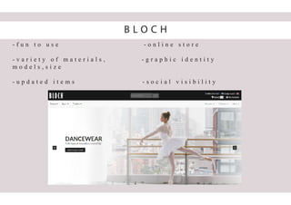


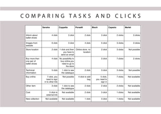
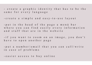
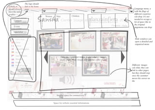
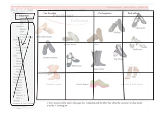
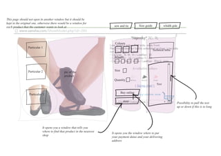


The document analyzes the website of Sansha, a European company selling dancewear, particularly ballet shoes, and identifies areas for improvement in its online presence compared to competitors. It describes various user personas and their specific needs when searching for ballet shoes, highlighting the lack of cohesive visual identity and user-friendly navigation on Sansha's site. The analysis suggests creating a consistent graphic identity, simplifying the layout, and enhancing accessibility for purchases to better communicate the quality of Sansha's products.


