Download to read offline


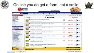


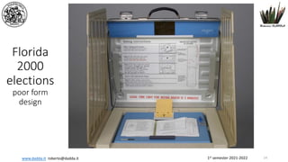

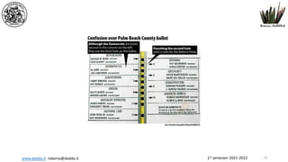
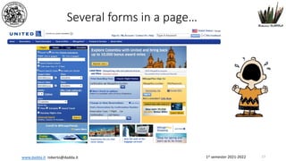
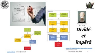


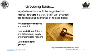


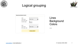
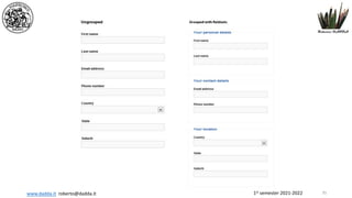
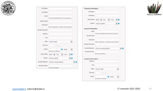
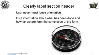

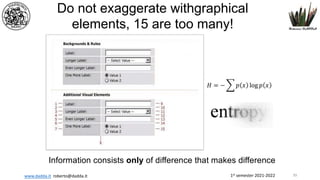


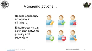
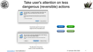


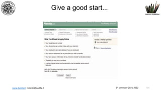
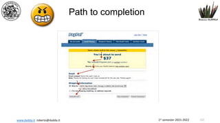
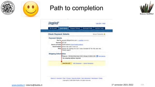


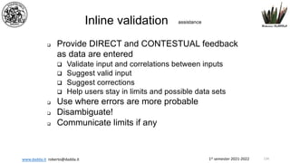
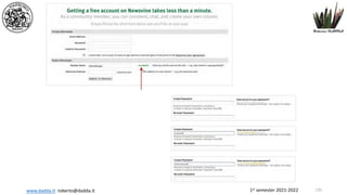
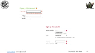
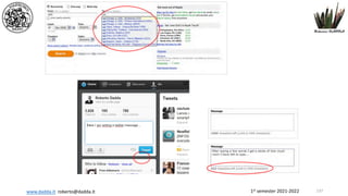

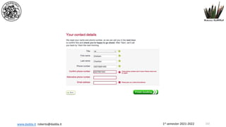
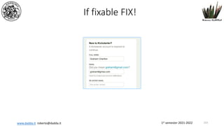


The document discusses the principles and best practices for designing usable web forms to enhance user experience and increase completion rates. It emphasizes the importance of form organization, label clarity, visual design, and user trust to minimize cognitive load and improve interaction. Key guidelines include logical grouping of input fields, the use of familiar language, and clear distinctions between primary and secondary actions.