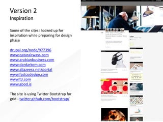
Download to read offline

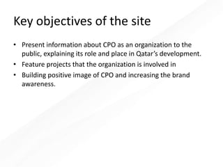
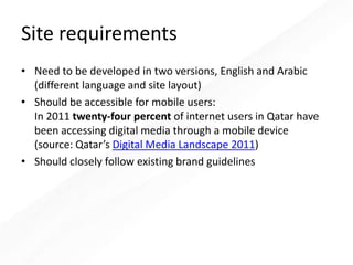
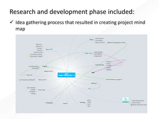
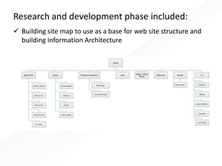

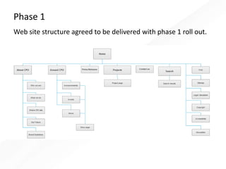

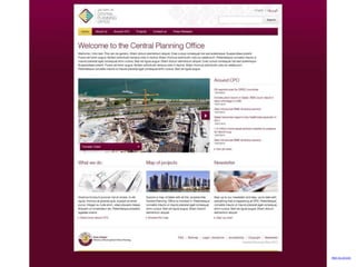


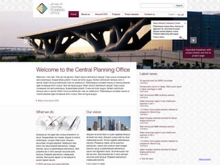
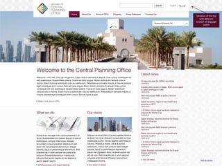

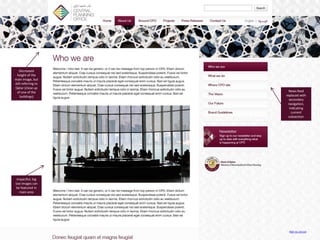

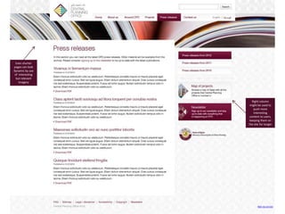

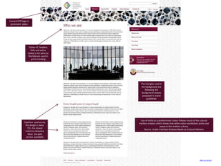
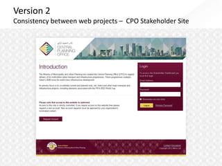
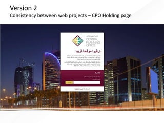


The document outlines a design proposal for a new public-facing website for the Central Planning Office in Qatar. The key objectives of the site are to present information about the CPO, feature projects it is involved in, and build its brand. The proposal includes research on best practices for designing sites for the Middle East. It presents initial wireframes and two versions of the site structure and pages, demonstrating consistency with CPO's existing branding guidelines. The proposal shows the site will be accessible on mobile and developed in both English and Arabic.


