
Recommended
Recommended
More Related Content
What's hot
What's hot (20)
More from veloforum
More from veloforum (20)
Recently uploaded
Recently uploaded (20)
Pawel Cal Interactive visualization
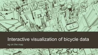
- 1. Interactive visualization of bicycle data eg on the map
- 2. Map service for cyclists
- 3. How is it mostly? Data presentation with geolocation Data visualization Combination of map and visualization Interactivity
- 4. How is it mostly? Data presentation with geolocation Data visualization Combination of map and visualization Interactivity
- 5. As it is in the majority?
- 6. As it is in the majority? Data presentation with geolocation Data visualization Combination of map and visualization Interactivity
- 8. Map - the presentation of location data The possibility of applying multiple layers of data The possibility of selection of primers to the data.
- 9. Map - the presentation of location data Heat map Map network, for example. Hexagonal
- 10. How is it mostly? Data presentation with geolocation Data visualization Combination of map and visualization Interactivity
- 11. Visualizations - the presentation of various data
- 12. Visualizations - the presentation of various data
- 13. How is it mostly? Data presentation with geolocation Data visualization Combination of map and visualization Interactivity
- 14. Combination of map and visualization
- 15. How is it mostly? Data presentation with geolocation Data visualization Combination of map and visualization Interactivity
- 16. Interactivity
- 17. Paul Cal Bicycle agreement Lublin E-mail: pawel.cal@ekolublin.pl Tel: 517-482-406 Web: mirl.info.pl