Download to read offline


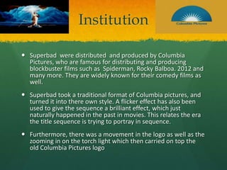
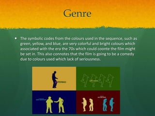
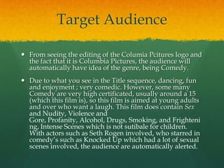

The document discusses the opening title sequence of the film Superbad. It summarizes that the sequence is abstract and doesn't give much away about the plot. It analyzes how the sequence subverts conventions by using a flicker effect and movement in the logo to portray the era the film is set in. The sequence aims to portray fun and enjoyment through dancing silhouettes to signal it is a comedy, while the production company Columbia Pictures further marks it as a comedy genre.


