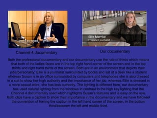
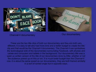
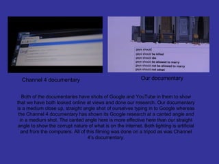
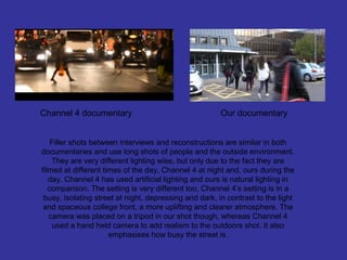
2. Our Task
• As a group of three and no more, we had to create a
documentary and two ancillary tasks of a radio trailer
and a double page spread to advertise our documentary.
• We had to do a lot of research in to documentaries
especially when we had to make only 5 minutes of a
documentary, which had to persuade an audience to
carry on to watch the rest of the hour. After much
research we decided to do a mixed documentary, with
interviews, archive material and narration.
• We also had to set a tone for our documentary and for
the two ancillary tasks. The first five minutes of the
documentary sets the tone for the whole documentary.
We wanted it to be serious yet not so depressing that the
audience would not want to continue watching.
3. Our audience
• We decided upon our audience being male and female 16 – 24 year olds in
social classes C2, D. This was determined through the magazine we were
going to put the double page spread in and by the radio station we were
going to put our trailer on.
• Our documentary had it’s own view of homosexuality and as we, the
producers, editors and ‘journalist’ of the documentary we chose to look upon
homosexuality in a positive way. The preferred reading of our text was that
homosexuality was neither a neither good nor bad thing and that everyone
had the right to be homosexual and they shouldn’t get tormented for this.
We wanted our audience to decode this from our text.
• Hegemony: Our documentary shows that people should just accept
homosexuality is going to be within our community and that more and more
people are accepting this, (which can be seen through our vox pops).
People, regardless of their opinion of homosexuality are keeping their
thoughts to themselves. Homosexuality is an issue debated over in the
Media which form part of the everyday ideological discourse in our society. It
is deemed unnatural in our society to have children or marry with
homosexuals it is against the dominant ideology of man and wife settling
down, marrying and having children.
4. Our audience
• The psychographic profile of our audience
would be:
• Male and Female
• Age 16 -24
• Social class C2 and D
• Fit in to the ‘explorer’ lifestyle
5. In what way does your media
product use, develop or challenge
forms and conventions of real
media products?
6. Documentary Modes – Bill Nichols
To begin with we looked at certain theorists and what categories documentaries can fall in to. The
first theorist we looked in to was Bill Nichols. In his first book ‘Documentary Modes’ by Bill Nichols,
he wrote about;
The Poetic Mode 'reassembling fragments of the world', a transformation of historical material into a
more abstract, lyrical form, usually associated with 1920s and modernist ideas.
The Expository Mode 'direct address', social issues assembled into an argumentative frame,
mediated by a voice-of-God narration, associated with 1920s-1930s, and some of the rhetoric and
polemic surrounding World War Two.
The Observational Mode as technology advanced by the 1960s and cameras became smaller and
lighter, able to document life in a less intrusive manner, there is less control required over lighting
etc, leaving the social actors free to act and the documentarists free to record without interacting
with each other.
The Participatory Mode the encounter between film-maker and subject is recorded, as the film-
maker actively engages with the situation they are documenting, asking questions of their subjects,
sharing experiences with them. Heavily reliant on the honesty of witnesses.
The Reflexive Mode demonstrates consciousness of the process of reading documentary, and
engages actively with the issues of realism and representation, acknowledging the presence of the
viewer and the modality judgements they arrive at. Corresponds to critical theory of the 1980s.
The Performative Mode acknowledges the emotional and subjective aspects of documentary, and
presents ideas as part of a context, having different meanings for different people, often
autobiographical in nature.
7. From looking at Bill Nichol’s documentary theory it is easy to tell that our documentary
falls in to the reflexive mode and the expository mode.
Our piece to camera freelance journalist; Ellie Morrice, talks directly to the camera
throughout the documentary about the subject matter and today’s issues about
Homosexuality (i.e. the reflexive mode). She draws attention to the subject matter by
being on screen and adds a touch of realism and creates a relationship between herself
and the viewer, making the issue personal.
Our documentary mainly focuses on our definite view of homosexuality being acceptable
and that homophobic reactions need to come to a halt. All apart from one of our vox
pops talk about homosexuality in a positive light whereas just the one speaks about
homosexuality negatively. This may be their personal opinions or they could have been
reacting differently or changing their opinions due to a camera being pointed at their
face. Our choice of vox pops does show our view on homosexuality. The journalist is
also pro-homosexuality throughout the documentary and whilst reading out homophobic
comments from blogs and YouTube videos, she shows her clear distress at what is
being said. Ellie also provides a ‘voice of God’ narration over two parts of the
documentary with information and statistics that help the viewer to perceive
homosexuality in a positive way (i.e. the expository mode). She also provides good
arguments along with the vox pops as to why certain laws should be passed for
homosexuals and why prejudice shouldn’t take place.
8. Stuart Hall & Cultural Studies
Stuart Hall looked at the ideological content of media products and researched how
audiences received these products and the processes by which meaning was
created. Hall realised that the meaning was not a fixed category, rather it was the
interaction by specific audiences with the text at a certain time and a certain place
that all contributed to creating a meaning.
Stuart Hall found the encoding and decoding theory: The text is encoded by the
producer and decoded by the audience.
We tried to go for a preferred reading so that we could show the audience how badly
homophobic reactions are to homosexuals and that we should support them in
coming out, having children and even getting married. Preferred reading of the text
may have disputed with the general dominant ideological ideas on the topic at the
time of release in 2013.
9. The Documentary
To compare codes and conventions of a professional documentary and
my own, I am using Channel 4’s documentary ‘Don’t blame face book’.
This is a relevant documentary to compare it to as our documentary is to
be aired on Channel 4 also and both are targeted at the same target
audience of 16 – 24 year old male and females.
10. Channel 4 documentary Our documentary
Straight from the start it is easy to see that we have
chosen a good setting for the vox pop which highlights
their role as a student the framing is also in rule of thirds
such as the Channel 4 documentary is. The shot is also
in a medium close up just as the channel four
documentary is in. In both, the lighting is artificial to
make the shots clear and light.
11. Channel 4 documentary Our documentary
Both the professional documentary and our documentary use the rule of thirds which means
that both of the ladies faces are in the top right hand corner of the screen and in the top
thirds and right hand thirds of the screen. Both are in an environment that depicts their
jobs/personality; Ellie is a journalist surrounded by books and sat at a desk like a student
whereas Susan is in an office surrounded by computers and telephones she is also dressed
in a suit to show her high authority and the importance of her job, whereas Ellie is dressed in
a more casual attire, she has less authority. The lighting is different here, our documentary
has used natural lighting from the windows in contrast to the high key lighting that the
Channel 4 documentary used which highlights Susan’s features and is easy on the eye.
Both clips have a caption to show their importance in the documentary and we have followed
the convention of having the caption in the left hand corner of the screen, in the bottom
third/between the left and middle third.
12. Channel 4 documentary Our documentary
These are the two title clips of both our documentary and they are both very
different. It is easy to tell who had more time and a better budget to create the title
clip and that would be the Channel 4 documentary. The Channel 4 one symbolises
the technological side of the documentary surrounding Facebook, with phones and
cables and computers and tablets in the background. Our documentary title was a
sped up written version of the title of our documentary done by Ellie, whether or not
the audience picked up on this or not. It is much lower budget than the Channel 4
one. It is about the same speed as our documentary, they are both framed similarly
in a sort of canted angle but in opposite ways.
13. Channel 4 documentary Our documentary
Both of the documentaries have shots of Google and YouTube in them to show
that we have both looked online at views and done our research. Our documentary
is a medium close up, straight angle shot of ourselves typing in to Google whereas
the Channel 4 documentary has shown its Google research at a canted angle and
in a medium shot. The canted angle here is more effective here than our straight
angle to show the corrupt nature of what is on the internet. Both lighting is artificial
and from the computers. All of this filming was done on a tripod as was Channel
4’s documentary.
14. Channel 4 documentary Our documentary
Filler shots between interviews and reconstructions are similar in both
documentaries and use long shots of people and the outside environment.
They are very different lighting wise, but only due to the fact they are
filmed at different times of the day, Channel 4 at night and, ours during the
day. Channel 4 has used artificial lighting and ours is natural lighting in
comparison. The setting is very different too, Channel 4’s setting is in a
busy, isolating street at night, depressing and dark, in contrast to the light
and spaceous college front, a more uplifting and clearer atmosphere. The
camera was placed on a tripod in our shot though, whereas Channel 4
used a hand held camera to add realism to the outdoors shot. It also
emphasises how busy the street is.
15. The double page spread
To compare our double page spread against a professional one, we have used
one of TV CHOICE’s own double page spread to see whether or not ours would
look good in their magazine.
Our magazine
16. The TV CHOICE logo is on the top left
hand corner on both double page spreads.
We have followed this convention from TV
CHOICE on to our magazine. The TV
CHOICE logo on ours is not copied and is
made by me on Photoshop. We are
missing the ‘THIS WEEK’ across the top of
the double page spread next to the logo. If
we were to remake the double page
spread we would add this boarder to the
top of our page.
The text on the masthead is very
different on both articles but they are on
the same side of the double page. We
have used different colours for our font
and we have chosen serifs font instead
on sans serifs. The sans serifs on TV
CHOICE is very rare in magazines and in
all the other television magazines we
have seen did use serifs font so we
followed that convention instead.
17. Our magazine article starts with a drop
cap at the beginning just like TV
CHOICE magazine. We have followed
this convention carefully.
The standfirst is directly under the
masthead in both magazine articles. Again
we have used a different font to the sans
serifs font that TV CHOICE magazine have
used. The masthead and standfirst are in
different places on both articles ours is
under the principal image and theirs is on
top. In the standfirst we have told the reader
who the article is about and what for such
as TV CHOICE does.
18. Both principal images are on the left hand
page and are very different in comparison to
eachother. The images on our magazine are
a collage of twelve pictures, each with
artificial light, straight on angle and are at a
medium close up/ close up whereas the TV
CHOICE principal image is below the
masthead in a long shot, straight on angle
and with natural light. Both images almost
cover up the left hand side of the page. We
have challenged the convention of having
just one image as the principal image.
The secondary image on our double page
spread is Ellie at the iMac, taken from our
documentary. The image on the TV
CHOICE magazine is also taken from the
television show it is about. At the bottom
of the photo is a caption and this is true
on both magazines. We have not
challenged this convention and instead
put it on to our magazine to let our
readers know what is happening in the
image.
19. Our magazine article has text going all the
way down the right hand page and wraps
around the images and pull quote. The text is
in serifs font which is a convention taken from
most other magazines we looked at, however
TV CHOICE magazine has chosen to have
sans serifs text which isn’t as formal as we
have previously seen. The text on our
magazine is in three columns whereas the TV
CHOICE article is in two columns, both
following the same convention with just a
different amount of columns. TV CHOICE’s
images also have text wrapped around them.
Both magazine articles have the time, day and
channel the programme will be aired on inside the
double page spread. In our double page spread
we ended our article with the time, day, channel,
facebook and twitter page. In contrast, TV
CHOICE has the day, channel and time in a small
graphical box on the right hand page. During our
research we saw that all the articles did end with
the information so I think that this TV CHOICE
article is an exception to the normal. We did follow
the convention of making sure we had this
information at the end of our article.
20. There are some major differences in the layout
between the two magazine articles. They have
a different number of columns, different fonts,
different set of images and shots, and borders
around the edges. The main similarities are
the fact that the text is in columns, the
principal image is on the left side and text on
the right, same logo in the top left hand corner,
standfirst under the masthead, a dropcap at
the start, image captions and a same shot
used for the secondary image – a medium
close up.
If we could make our double page spread
again I think we would make our text
stand out more by giving the masthead
drop shadows like TV CHOICE has, we
would also make the text bolder and add
a border around the outside of the article
like TV CHOICE did to add to their brand
identity. We have followed almost all of
the conventions we have previously
discovered during research.
21. The radio trailer
This was the last task, to create the radio trailer to advertise our
documentary. We did a lot of research in to trailers and we figured out what
conventions they use and which ones we needed to incorporate in to it
some way. I am now comparing it to another radio trailer advertising a
documentary on wildlife called ‘Last Chance to see’ to see how well we
succeeded.
The radio advertisement I am comparing it with is for a documentary on
BBC 2, which is in much contrast to our documentary as ours is for a
younger audience rather than a 40+ audience that watches BBC 2. Both
documentaries are also very different as the BBC 2 one is about wildlife
compared to ours about homosexuality.
They will have to follow the same conventions in order to advertise on the
radio to succeed.
22. The music: Our documentary music starts half way though the first set of vox pops and this music
then continues throughout. The music we chose was an upbeat disco tune that heightens and
quietens throughout as certain people talk and as it gets more exciting. In comparison, the BBC trailer
uses a set of string instruments to create a neutral happy nor sad tune that plays throughout just like
ours. Our choice of music was decided by the fact that we were airing our trailer on a radio channel
that plays upbeat pop music and we wanted to fit in with the radio station’s vibe. There is only one
track of music in both radio trailers. We have followed this convention of music playing throughout to
create a certain emotion linked to the documentary.
23. Narrative: The radio station we chose to air our trailer was aimed at 12 – 20 year old males and
females and we needed someone of their age to narrate the trailer so the obvious choice was Ellie –
our journalist for the documentary. She was able to get on to the youths level and they are probably
more likely to want to watch a programme that is presented by a young person. She has an excited
tone of voice that reflects in the trailer and she is eager to make people watch the documentary, she
makes it sound interesting. In comparison, the BBC trailer is narrated by a woman of around the age
of 40+ and speaks formally and yet still sounds interesting to an audience. The demographic of people
listening to radio four which this is playing on is males and females aged 35 – 65+ in the social class
A, B, C1 so this is no surprise. Ellie and the Radio four narrator also use hyperbolic language to entice
their listeners in to watching. Both trailers have a narrator which follows the convention of a normal
radio trailer.
24. Vox pops and extracts: In order to promote a show on the radio, it is important to add extracts
from the shows to try and give the listener a taste of what they will be learning about or seeing on it. In
the BBC 4 radio trailer, extracts of Stephen Fry’s voice was used throughout from the documentary
such as vox pops from our documentary were used in our radio trailer. There were a wide array of
voices from our documentary to show the vast amount of opinions we have taken in to account in our
documentary and the wide variety of people we will talk to, this is in contrast to the ‘Last chance to
see’ as they only show Stephen Fry’s voice from the documentary which emphasises the very
personal documentary it will be; a one on one with the audience. Both of these trailers follow the
convention of using the exciting and important parts of the documentaries to advertise it.
25. Sound: The sound levels through both radio trailers stayed consistent throughout and used more
than one track each. Our trailer used four tracks; two lots of vox pops, music in the background and a
narrator whereas the BBC 4 trailer used three; backing music, an extract from the documentary and a
narrative. There were no sound effects used on either as they were both realistic and fictional
documentaries and they weren’t suitable for this kind of trailer. There was some ambient sound behind
our documentary from the classrooms and lunch hall that came from our vox pops and it added to the
realism of the documentary. We followed all the main conventions of a documentary trailer here.
26. The radio trailer
Both radio trailers ended with the time, channel and day that the
documentary will be airing which is a common convention of radio trailers
and is obviously important and vital as it is needed to make sure our
listeners know where to find our documentary. They were made for different
audiences but contain the same techniques to create successful
documentary trailers.