
Recommended
More Related Content
What's hot
What's hot (16)
Viewers also liked
Viewers also liked (11)
Similar to Music magazine evaluation
Similar to Music magazine evaluation (20)
Music magazine evaluation
- 1. Music magazine evaluation Sophie-Jane Bowerman
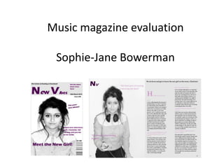
- 2. In what ways does your media product use, develop or challenge forms and conventions of real media products? • On my magazine cover I use a bold masthead, which is a typical convention of a magazine, as well as sell lines which I also use on my front cover. On the front cover of other music magazines they use more than one font colour, only used two. • On my double page spread I enlarged the first letter of the text which is a typical convention in magazines.
- 3. How does your media product represent particular social groups? • My music magazine would represent young teenagers. Many magazines out in the media today show women in a more sexual way. In my magazine the model is coverd up. I want my magazine to represent people are purely interested in music, not just the people featured on the front cover. • My magazine also represents women. Which is why only women are featured. But I didn’t want to feature her in a stereotypical way which is why she is fully clothed and in a medium close rather than a fully body shot.
- 4. What kind of media institution might distribute your media product and why? • I think my magazine would be more suited to a more independent distributor. This way it could feature smaller, and independent artists rather than mainstream. It would also allow me to keep the ideologies of the magazine. Global companies wouldn’t interested in my type of magazine.
- 5. Who would be the audience for your media product? • The audience for my music magazine would be teenagers, aged between 13-19. • It would also be more appealing to females rather than males.
- 6. How did you attract/address your audience? • To attract my audience I tried to use a minimal design, which is similar to fashion magazines such as vogue • I also tried to use colours such as black and white, and purple to attract a young female audience.
- 7. Feedback • When I asked people what they thought of my media product this is what they said • They said that they like the layout and the style but perhaps could use some different colours. • They also said that it wouldn't appeal to them as it looks very girly and more aimed at females. • Another said that the picture looks professional and makes the page stand out. And the colour scheme is very good because it makes the purple stand out. This person also liked the way I incorporated the title into the double spread. • Others liked the use of quotes on the double page spread.
- 8. What have you learnt about technologies from the process of constructing this product? • The main thing I have learnt from this project is a lot more time and effort goes into creating media products than I thought originally. • There has to be a lot a research and preparation before the actually constructing can begin. • I have also learnt about magazine conventions, as well as the use of Photoshop.
- 9. Looking back at your preliminary task, what do you feel you have learnt in the progression from it to the full product? • I have learnt how much work is involved in the process of creating media products. • I have also learnt how to make my product more suitable to my target audience. • I have learnt how to use photo shop to make my images fit better with the overall design of my product.