2. In what ways does your media product use, develop and/or
challenge forms and conventions of real media products?
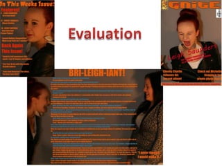
• The majority of media conventions appear on
my front cover, such as the identifier and
masthead.
• The masthead is bold, and dominant because
of the standout colour. It clearly shows what
the magazine is called.
• The identifier is unique, so when stacked on
shelves, people will clearly be able to
know, and see, where the magazine is.
• The main image. Shows the emotion of the
interview, and also, the pose matches the
masthead.
• The barcode and price are clearly shown. The
price is in a different place, on/in the
masthead. The ‘G’ is part of the identifier, and
the price is shown, for people to clearly and
quickly see the price.
• The cover stories are bold, and standout, for
people to also see what else is included.
Also, at the bottom is a banner, so people
know what else is included.
3. In what ways does your media product use, develop and/or
challenge forms and conventions of real media products?
• This is partially where I got inspiration for my
front cover. I wanted a standout image in the
centre to draw attention, and a clear, bold
masthead.
• Because of the centring of my model
however, I decided that I’d have the cover
lines either side.
• The model really stands out on this cover, and
that’s what I wanted. Also, the masthead
stands out too. It’s bold, and it’s close to what
I was aiming for. However, I wanted mine
more simple.
• The model, like I was aiming for with mine, is
portraying emotion. It shows that she is
clearly think. With mine I went for expression
of letting it all out.
• I think people prefer it when it looks more
open on a cover and to see a person that
looks like they have a story than, a boy
band, all fooling around.
4. In what ways does your media product use, develop and/or
challenge forms and conventions of real media products?
• At the beginning of the production, I wasn’t aiming to have such a centred
image. However, this is how it turned out and I’m glad of that, because if I
had of gone with my original idea, it would have seemed quite clustered.
• I think that with the space around the model on my front cover gives it the
look as if she has the space to let her thoughts and feelings out. I think the
red of her hair and lipstick also go with her pose, because she’s releasing
her anger over her ‘wild press reports’ as well as her happiness with her
‘recent success’
• The theme stays throughout my magazine, with the house style and
boldness. The bright orange stands out across the front cover, contents
page and DPS.
5. In what ways does your media product use, develop and/or
challenge forms and conventions of real media products?
• On my contents page, I decided to keep
things in a simple and organised
manner, much like ‘SPIN’ magazine. I used
that magazine’s contents page as partial
inspiration because I wanted the model to
be quite an important part of it so the
reader could notice, and understand that
this was who this edition of the magazine
was focussed on.
• I decided to keep the colour scheme of the
orange and red there, because those are
two quite outstanding colours from the
model. The red of her hair and lipstick and
the orange of where the light reflects off her
foundation.
• However, different to ‘SPIN’ I boldly
separated the features and regulars so
people knew what was in there and where
quickly.
6. • With my DPS, I tried to keep it simple, and easy
to define which was the interviewer
speaking, and which was the interviewee
responding.
• Once again, I kept the house style throughout
the DPS, apart from the blue, which I used to
display the emotion, which appears on the
DPS’s background image, of happiness. I used
that photo because it seems to give some sort
of behind the scenes look at the interview, so
people can realise not everything goes well
first time. Also, it sort of aligns with the
emotion that comes from the first half of the
interview questions which talks about her
success.
• The pull quote I used kept the house style too.
It also stands out, and gives the reader a little
bit of insight into the interview.
• Also, the interview flows pretty much smoothly
from one question and answer to the
next, which makes it easy and a decent read.
In what ways does your media product use, develop and/or
challenge forms and conventions of real media products?
7. • My magazine doesn’t represent any particular social group but it does spread through.
• I aimed it at teenagers, and young adults. Also, people who just enjoy pop music.
• This is represented through the bold, and attracting colour of the masthead and the magazine.
• Also, with the free giveaways, such as a luxurious trip to Paris, it attracts the readers attention, and
will extend across social groups and age ranges.
• My magazine is focused on all the latest pop news and exclusive photo shoots and interviews.
Within the interviews that would take place, there are certain parts where they include the
toughness of life, and how things don’t always go plain sailing for even the most famous of
professionals.
• My magazine goes against the principles of most pop magazines where there’re so many photos of
the model, looking perfect. I have fewer images so that girls (and guys for when it’s the guy in the
spotlight) so as to try and end the media beautification of people.
• I believe my magazine does represent the teens and young adults, because it focusses on keeping
the up to date, and to stop them feeling bad about the way they look.
How does your media product represent particular social
groups? And what was your intended audience?
8. What kind of media institution might distribute your media product and why?
• I had a look on the IPCMedia website, and had a browse through dufferent section, and chose this
one to be the distributor because quite a few of the magazines have a similar cover set-out to mine.
Also, I chose them because they are a large distrubutor and distribute many different magazine
genres.
9. Looking back at your preliminary task, what do you feel that you have learnt
in the progression of it to the full product?
• Looking back, I believe that I have learnt a number of
things. Starting off with the fact that when I started I
didn’t really know how to use Photoshop. It was a
knew experience and I’ve come through at the other
end better off.
• However, throughout the task, I picked up more
understanding, and bits and pieces to improve my final
piece.
• My masthead is much clearer and better positioned on
my final piece, along with the placement of the
models and the cover stories.
• Also, on my final piece, there is a clear house style
running through, where as the college magazine didn’t
have this.