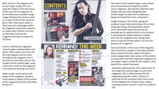
1. Editors notes- write up from the
editor of the magazine, usually a
small review or taster of the content
of this magazine and what the editor
thinks of it.
Colours used by the magazines
content page is yellows blacks and
white. These colours are iconic for
Kerrang magazine and are seen
throughout the magazine, this is
the same for the fonts used on the
headers of the content page, using
a font the is iconic to the magazine
and represents Kerrang as a brand
Featured articles in this issue of the magazine.
Each article has a header in Kerrangs branded
text to stand out to the reader and make it
easily navigate able. Each section of the articles
are separated into their respective categories to
once again make it simple for the reader to find
exactly the content they want
Subscribe advertisement, this is often seen on
any magazines content page not just music
magazines. This is advertisement for the
magazine giving the reader a chance to
subscribe to the company to get more issues
of the magazine at a cheaper price, always
including a phone number as well as a website
URL
Images linking to the articles, giving the
audience visual information about the articles
doing two things, firstly giving the reader
more information about the articles for
example who its about (artist) or the location.
It also grabs the readers attention pulling
then into the magazine and making them
want to read the articles which is of core the
purpose of a magazine
The layout of the content page is very unique
and unconventional compered to other
music magazines, Kerrang has used their own
design and style when designing their
content pages to stand out to audiences,
being more bold then their competitors
Main article in the magazine has
its own larger reader, this is to
draw the reader to the main focus
of this issue of the magazine. To
do this they have included a large
image linking to the article as well
as a name or title of the article to
give a little information about it.
They have also used pages within
the magazine to give the audience
an small taster of what's to come
so that they must buy the
magazine and read on to get the
full story
2. Kerrangs overall style and design is very uneiqe compered to other music magazines
using the basic conventions of a music magazine content page but putting their own
twists on things to stand out to different audiences pulling readers to their
magazine instead of other music magazines. Saying ‘Hey look at us we’re different
and better’ includeing information on we they can offer to readers.