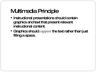
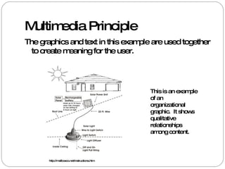
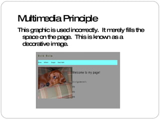
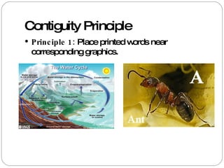
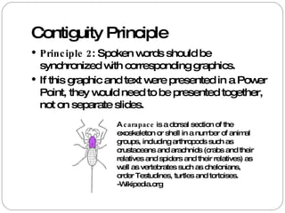
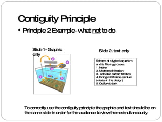
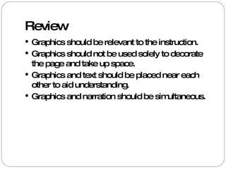
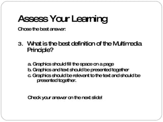
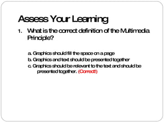
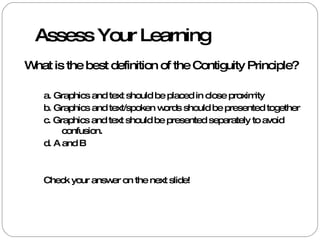
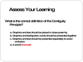
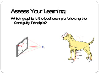
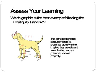
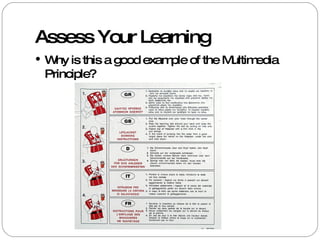
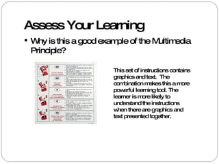
Beth Heim EdTech 513 February 2009 Multimedia and Contiguity Principles
Learning Objective Students will be able to correctly identify the elements of multimedia and contiguity principles in given examples.
Multimedia Principle Instructional presentations should contain graphics and text that present relevant instructional content. Graphics should  support  the text rather than just filling a space.
Multimedia Principle The graphics and text in this example are used together to create meaning for the user.  This is an example of an organizational graphic.  It shows qualitative relationships among content.  http://mailboxco.net/instructions.htm
Multimedia Principle This graphic is used incorrectly.  It merely fills the space on the page.  This is known as a decorative image.
Contiguity Principle Principle 1:  Place printed words near corresponding graphics.
Contiguity Principle Principle 2 : Spoken words should be synchronized with corresponding graphics. If this graphic and text were presented in a Power Point, they would need to be presented together, not on separate slides.  A  carapace  is a dorsal section of the exoskeleton or shell in a number of animal groups, including arthropods such as crustaceans and arachnids (crabs and their relatives and spiders and their relatives) as well as vertebrates such as chelonians, order Testudines, turtles and tortoises. -Wikipedia.org
Contiguity Principle Principle 2 Example- what  not  to do Slide 1- Graphic only Schema of a typical aquarium and its filtering process. 1. Intake  2. Mechanical filtration  3.  Activated carbon filtration  4. Biological filtration medium (rotates in this design)  5. Outflow to tank  Slide 2- text only To correctly use the contiguity principle the graphic and text should be on the same slide in order for the audience to view them simultaneously.
Review Graphics should be relevant to the instruction. Graphics should not be used solely to decorate the page and take up space. Graphics and text should be placed near each other to aid understanding. Graphics and narration should be simultaneous.
Assess Your Learning Chose the best answer: What is the best definition of the Multimedia Principle? a. Graphics should fill the space on a page b. Graphics and text should be presented together  c. Graphics should be relevant to the text and should be presented together.  Check your answer on the next slide!
Assess Your Learning What is the correct definition of the Multimedia Principle? a. Graphics should fill the space on a page b. Graphics and text should be presented together  c. Graphics should be relevant to the text and should be presented together.  (Correct!)
Assess Your Learning What is the best definition of the Contiguity Principle? a. Graphics and text should be placed in close proximity b. Graphics and text/spoken words should be presented together  c. Graphics and text should be presented separately to avoid confusion.  d. A and B Check your answer on the next slide!
Assess Your Learning What is the correct definition of the Contiguity Principle? a. Graphics and text should be placed in close proximity b. Graphics and text/spoken words should be presented together  c. Graphics and text should be presented separately to avoid confusion.  d. A and B  (Correct!)
Assess Your Learning Which graphic is the best example following the Contiguity Principle?
Assess Your Learning Which graphic is the best example following the Contiguity Principle? This is the best graphic because the text is presented along with the graphic, they are relevant to each other, and are presented in close proximity.
Assess Your Learning Why is this a good example of the Multimedia Principle?
Assess Your Learning Why is this a good example of the Multimedia Principle? This set of instructions contains graphics and text.  The combination makes this a more powerful learning tool. The learner is more likely to understand the instructions when there are graphics and text presented together.
Resources Information: Clark, R. & Mayer, R. (2008) e-Learning and the Science of Instruction, Fan Francisco: Pfeiffer. Images: Wikimedia Commons  http://commons.wikimedia.org/wiki/Main_Page http://mailboxco.net/instructions.htm

Multimedia And Contiguity Principles

  • 1.
    Beth Heim EdTech513 February 2009 Multimedia and Contiguity Principles
  • 2.
    Learning Objective Studentswill be able to correctly identify the elements of multimedia and contiguity principles in given examples.
  • 3.
    Multimedia Principle Instructionalpresentations should contain graphics and text that present relevant instructional content. Graphics should support the text rather than just filling a space.
  • 4.
    Multimedia Principle Thegraphics and text in this example are used together to create meaning for the user. This is an example of an organizational graphic. It shows qualitative relationships among content. http://mailboxco.net/instructions.htm
  • 5.
    Multimedia Principle Thisgraphic is used incorrectly. It merely fills the space on the page. This is known as a decorative image.
  • 6.
    Contiguity Principle Principle1: Place printed words near corresponding graphics.
  • 7.
    Contiguity Principle Principle2 : Spoken words should be synchronized with corresponding graphics. If this graphic and text were presented in a Power Point, they would need to be presented together, not on separate slides. A carapace is a dorsal section of the exoskeleton or shell in a number of animal groups, including arthropods such as crustaceans and arachnids (crabs and their relatives and spiders and their relatives) as well as vertebrates such as chelonians, order Testudines, turtles and tortoises. -Wikipedia.org
  • 8.
    Contiguity Principle Principle2 Example- what not to do Slide 1- Graphic only Schema of a typical aquarium and its filtering process. 1. Intake 2. Mechanical filtration 3. Activated carbon filtration 4. Biological filtration medium (rotates in this design) 5. Outflow to tank Slide 2- text only To correctly use the contiguity principle the graphic and text should be on the same slide in order for the audience to view them simultaneously.
  • 9.
    Review Graphics shouldbe relevant to the instruction. Graphics should not be used solely to decorate the page and take up space. Graphics and text should be placed near each other to aid understanding. Graphics and narration should be simultaneous.
  • 10.
    Assess Your LearningChose the best answer: What is the best definition of the Multimedia Principle? a. Graphics should fill the space on a page b. Graphics and text should be presented together c. Graphics should be relevant to the text and should be presented together. Check your answer on the next slide!
  • 11.
    Assess Your LearningWhat is the correct definition of the Multimedia Principle? a. Graphics should fill the space on a page b. Graphics and text should be presented together c. Graphics should be relevant to the text and should be presented together. (Correct!)
  • 12.
    Assess Your LearningWhat is the best definition of the Contiguity Principle? a. Graphics and text should be placed in close proximity b. Graphics and text/spoken words should be presented together c. Graphics and text should be presented separately to avoid confusion. d. A and B Check your answer on the next slide!
  • 13.
    Assess Your LearningWhat is the correct definition of the Contiguity Principle? a. Graphics and text should be placed in close proximity b. Graphics and text/spoken words should be presented together c. Graphics and text should be presented separately to avoid confusion. d. A and B (Correct!)
  • 14.
    Assess Your LearningWhich graphic is the best example following the Contiguity Principle?
  • 15.
    Assess Your LearningWhich graphic is the best example following the Contiguity Principle? This is the best graphic because the text is presented along with the graphic, they are relevant to each other, and are presented in close proximity.
  • 16.
    Assess Your LearningWhy is this a good example of the Multimedia Principle?
  • 17.
    Assess Your LearningWhy is this a good example of the Multimedia Principle? This set of instructions contains graphics and text. The combination makes this a more powerful learning tool. The learner is more likely to understand the instructions when there are graphics and text presented together.
  • 18.
    Resources Information: Clark,R. & Mayer, R. (2008) e-Learning and the Science of Instruction, Fan Francisco: Pfeiffer. Images: Wikimedia Commons http://commons.wikimedia.org/wiki/Main_Page http://mailboxco.net/instructions.htm