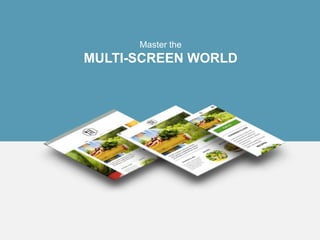
Multi screen world
•Download as PPTX, PDF•
0 likes•243 views
A multi-screen site refers to one website that is optimized for desktop, tablet and mobile. A common, but more technical, term for these kind of websites is “responsive.”
Report
Share
Report
Share

Recommended
Responsive website deck_googledude
This document discusses the importance of creating multi-screen websites that are optimized for desktop, tablet, and mobile devices. It notes that most people now use multiple screens throughout the day and that Google prefers responsive, multi-screen sites for search engine optimization. The document recommends businesses leverage features like click-to-call buttons, maps, reviews, and coupons to provide customized experiences across different devices. It also suggests using dynamic content to personalize the experience based on location, time of day, and previous visits. Additionally, the option of adding e-commerce capabilities to allow online shopping from any device is presented.
Mobile seminar-worksheet
This document provides information from a seminar on mobile marketing. It discusses:
- Why mobile marketing is important as mobile device usage increases and more searches are done on mobile. Consumers are more likely to take immediate action on mobile-friendly sites.
- The differences between mobile apps and mobile websites. Apps provide additional features but both an app and mobile-optimized website are generally needed.
- Types of mobile websites, including responsive designs that adapt content for all devices and standalone mobile sites optimized specifically for mobile.
- Best practices for mobile sites like keeping content quick to load, simplifying navigation, and designing for usability on mobile devices.
- The seminar concluded with a demonstration
Google vs Disneyland
The document compares and contrasts the Disneyland and Google Earth mobile apps. Both apps redirect users to the application when connected to a mobile device and allow free downloads. However, the Disneyland app is very commercial with many advertisements and limited interactivity, while the Google Earth app is highly interactive but offers little innovation beyond its 3D maps. Suggestions are made to make the Disneyland app more engaging with games and promotions and to add more contextual information to Google Earth beyond just Wikipedia links.
Prisync Blog - How to Develop an UX-Driven E-Commerce Mobile App?
Plenty of businesses have gone through a huge transformation since the inception of smartphones. One cannot negate the vital role of mobile app development companies in offering a mobile-first solution for the businesses to grow.
Travel app development
View and download the ppt addressing the statistics of the usage of travel apps in the world and the 7 Must-Include Feature In Mobile Apps Taking The Travel Industry By Storm developed by codiant software technologies.
UX Analysis for Fashion E-Commercial sites
The document discusses redesign proposals for Moda Operandi's product detail pages. It identifies issues with the current design such as heavy text, duplicated information, and unclear navigation. It then provides two redesign proposals labeled A and B. Proposal A focuses on highlighting relevant product details, presenting photography enticingly, and allowing user exploration. Proposal B incorporates competitive analysis and features interactive imagery, product contextualization, recommendations, and dynamic elements that move based on user interaction. The proposals aim to address the identified issues and present information in a clear, engaging manner for users.
Monetizing & Preparing for Mobile Traffic With WordPress
Marketing to Mobile Devices With WordPress: An introduction to turning mobile website users into your most profitable visitors.
How much traffic does your website get from mobile devices now, 40% or maybe even as high as 70%? Did you know that in 2013 there was more mobile web traffic than desktop traffic? That social media platforms like Twitter and Facebook receive more visitors to their mobile platforms than their desktop counterparts?
Think about how often you check your cell phone, while in bed, while in church, heck even while driving? Now ask yourself, “Is my website’s target audience doing the same thing?” I’d venture to say so.
On November 6, 2014 Codex Media Company’s Mal Campbell is going to be delving into this beautiful world of mobile marketing with the explicit focus on making everything go “Boom!” using WordPress. This isn’t the kind of talk you want to miss if your idea of mobile stops at “Buy a responsive template on Themeforest”.
This is strictly focused on turning bytes into dollars by monetizing mobile traffic.
Mobile Solutions: Empowering Businesses I Delighting Customers
Adworkz handcrafts innovative mobile solutions to empower businesses and delight customers.
Our mobile solutions are developed to respond directly to core priorities: operational efficiency, customer engagement/satisfaction, and business results.
This presentation swiftly explores current mobile trends and the features/benefits of Adworkz Mobile Coupon, Mobile Membership Card, Mobile Gift Card and Mobile ID Card.
Adworkz can also further customize mobile solutions to meet specific needs and requirements.
Stop Blocking Your Customers with a Mobile Friendly Website
Contact us to discuss the opportunities that the mobile web presents: info@digitalmarketingproz.com
Many professionals forecast by 2016, Internet users will rely more on mobile access to perform searches, access the web, and check email as opposed to the traditional methods of going online via a computer.
Obviously, with small screens and basic functionality,online users need an easy way to consume content from portable devices, which is why mobile websites came into existence.
A mobile website is a website that’s accessed through smartphones and portable tablets. Mobile websites are a streamlined versions of traditional websites, that makes it simple for mobile users to access and navigate websites quickly.
For small business owners, it is important to have a mobile website as many are now using the web through their mobile devices.
Customers who are using smartphones or portable tablets can perform an internet search for your type of product or service and reach your website. Therefore,This is why it’s so important that your company has a mobile friendly version of your site.
Finally, Lastly, mobile sites open up an entire new opportunity for marketing. Several alternative marketing channels are available on mobile sites, such as mobile coupons, location check-ins, and more.
Smartphones and tablets are being used by more and more people, and these figures are expected to grow. Having a mobile site is crucial for small business owners as more and more people are now use their smartphones as their only internet device.
Proposal for Footwear Brands - Ephlux CX Cloud
It is time that the "Footwear Retailers" evolved from the conventional method of advertising and selling - into engaging their customers with their brand. Here's a solution for the Canadian market.
Best practices for UI/UX in eCommerce
UI/UX play a giant role in the success of any eCoomerce website. Here is the case study of top most successful eCoomerce website UI/UX best practices.
Why Mobile App Should Upgrade to UX/UI Design?
Have you ever come across a mobile app that is intense and eye-catchy? It is all because of mesmerizing UX/UI design that stops you to browse that mobile app. UI and UX design plays a crucial role in mobile app development. A mobile app is nothing without these two aspects basically. AppClues Infotech is one of the best company to develop a creative & dynamic mobile app designs.
Mobile web
Mobile usage has overtaken desktop, with 48% of mobile experiences starting on search engines. Responsive web design allows a single website to automatically fit any screen size, while adaptive design optimizes specifically for mobile limitations and opportunities. Responsive design is generally easier to develop and maintain than adaptive, but adaptive may be better for complex websites to avoid poor mobile user experience. Most clients are best served with a responsive solution.
How to optimize your blog for mobile traffic
This document discusses how to optimize a blog for mobile traffic. It begins by noting that mobile web usage is growing and will soon surpass desktop usage. It then examines options in WordPress for mobile optimization, including building a separate mobile site, using a mobile-optimized theme, or developing a responsive design. Each approach has pros and cons. A responsive design allows content to automatically adjust for different devices but is more expensive, while a mobile theme is easier to implement but provides less branding control. Testing tools are outlined to evaluate a site's mobile performance. Overall load times and reducing dependencies are emphasized as important factors for optimizing a blog for mobile users.
Why Building a Mobile App is a Necessity?
Having a mobile app for your business can help increase visitors, popularize brand name, amplify growth, and do so much more.
Mobile websites are more important than you think
Mobile websites are increasingly important as more searches occur on mobile devices. Users expect mobile websites to load quickly, be easy to use, and allow them to continue tasks seamlessly across devices. Google has emphasized the importance of mobile-friendly and fast websites, and will rank these sites higher in mobile search results. New technologies like Accelerated Mobile Pages (AMP) and Progressive Web Apps (PWA) allow sites to load nearly instantly and have app-like capabilities while still being based on web technologies.
Your Mobile App Solution
This document discusses the benefits of mobile apps for businesses. It notes that the world has gone mobile, with 78% of Americans owning smartphones they keep within 9 feet at all times. Mobile apps allow businesses to provide customers with an engaging experience, gain exposure through sharing, and reduce marketing costs. An app can be created for $995, plus $59 per month, and provide features like push notifications, maps, shopping carts, and analytics. The document advocates that businesses get their app now to gain a first-to-market advantage and stay ahead of the competition.
Planes, Trains & Mobility
Planes, Trains & Mobility#PAY Symposium & Exposition | August 20 - 21, 2019 | Caesars Palace, Las Vegas
This is a feature that ran in Transaction World Magazine following the November Social Mobile Payments event. Look for our video interview with publisher Harold Montgomery coming soon in our YouTube Channel.What makes a complete mobile site
You already know how to create a visually attractive mobile site. What should you do to make sure the content part is also impressive?
You're Doing it Wrong – How App Developers Can Leverage the Web (June 2015 fo...
This is an updated and expanded version of a talk I gave at last year's Forum Oxford. It's aimed at App developers and emphasizes the ways in which they can and should take advantage of the open web for discovery, “sharability” and linkability, as well as encouraging the development of functional web applications where possible.
NMGpresentation
This document discusses the importance of businesses going mobile. It notes that over 80% of customers will abandon a mobile site that is not optimized for mobile use. Google also now factors mobile user experience into its search rankings. The document provides statistics on mobile user behavior, such as 95% searching locally and 90% acting within 24 hours. It recommends best practices for mobile sites like making navigation thumb-friendly, loading quickly, and including click-to-call functionality. Developing a mobile site can drive more sales and customers through features that make it easy for people to connect with a business from their phone.
Wetu Indaba Presentation
The document discusses empowering the travel industry in the digital age through improved content management and distribution. It outlines some of the challenges with outdated content distribution models and how content is often lost or changed as it moves through different industry channels. Wetu's solution creates an open database and technology that simplifies content distribution, allowing suppliers to easily distribute content to tour operators, travel agents, and other industry players through tools on their platform. This helps provide travelers with rich, interactive content online and gives industry members better marketing and sales tools to engage customers.
Use Mobile Marketing to get more customers
The document discusses how mobile marketing can be used to get more customers by having a mobile-optimized website, mobile apps, and using features like click-to-call, maps, forms, and payments to engage customers on their mobile devices. It provides tips for mobile marketing including using QR codes, offers, and loyalty programs, and explains the benefits of both mobile websites and apps for businesses.
10 ways to make your mobile marketing more awesome - Mobile Marketing Command...
Make sure you are making the most of your mobile marketing by following the Mobile Marketing Commandments. To get the free print, head to http://mobilemarketingcommandments.com/
Going Mobile
Michael McCleary gave a presentation about going mobile and developing apps and mobile websites. He discussed the history and growth of mobile technology. Smartphone adoption has increased dramatically in recent years. Mobile commerce is also growing rapidly, with many consumers now shopping and making purchases on their phones. For businesses, developing a mobile presence through a website or app can increase sales and profits by reaching customers on the go. While apps may be better for certain uses, mobile websites typically have lower costs and work across different devices. The future will continue to be driven by mobile as more activities shift to smartphones and tablets.
Mobile Marketing Made Easy - Informe
The document provides an overview of mobile marketing services offered by Informe, a mobile marketing agency. It discusses their mobile strategy consulting services, premium responsive mobile websites, sample mobile applications, use of QR codes, and text message marketing. It highlights key mobile marketing statistics and the benefits of their platform for quick and scalable mobile websites that are compatible with over 98% of mobile devices. It provides examples of using mobile technologies like QR codes, mobile websites, and text messages for customer acquisition, offers and loyalty programs, and direct response marketing.
liceo de pakil Alumni reg. form 2011
This document contains an alumni registration form for Liceo de Pakil. The form requests contact information such as name, gender, year of graduation, address, occupation details, and highest educational attainment. It also specifies a registration fee of PHP300 and provides details about upcoming alumni motorcades on January 29, February, and March 2011. Alumni are invited to join and submit the registration form by January 26 to receive an alumni t-shirt and packed lunch. Further inquiries can be directed to the provided phone number or Facebook account.
Keynote technicals currency intraday levels for 051012
The document provides daily technical analysis levels for currency futures contracts traded on the National Stock Exchange of India. It lists the previous day's close price, intraday trend, pivot point, and resistance and support levels for each contract. The pivot point is a trigger for intraday buy/sell decisions, with resistance and support levels providing targets. Traders are advised to take buy positions above the pivot point and sell positions below, using the pivot as a stop loss and moving stops to subsequent resistance or support levels if breached. The analysis is intended as an intraday trading tool to be used with stop losses.
FOX TV: Bad News For Workers!
The International Alliance of Theatrical and Stage Employees (IATSE), the International Brotherhood of Electrical Workers (IBEW), and the National Association of Broadcast Employees and Technicians-Communications Workers of America (NABET-CWA) are standing together at FOX TV stations in Chicago, Detroit, New York, Philadelphia, Washington and Los Angeles to inform viewers that “FOX-TV is bad news for workers!”
More Related Content
What's hot
Stop Blocking Your Customers with a Mobile Friendly Website
Contact us to discuss the opportunities that the mobile web presents: info@digitalmarketingproz.com
Many professionals forecast by 2016, Internet users will rely more on mobile access to perform searches, access the web, and check email as opposed to the traditional methods of going online via a computer.
Obviously, with small screens and basic functionality,online users need an easy way to consume content from portable devices, which is why mobile websites came into existence.
A mobile website is a website that’s accessed through smartphones and portable tablets. Mobile websites are a streamlined versions of traditional websites, that makes it simple for mobile users to access and navigate websites quickly.
For small business owners, it is important to have a mobile website as many are now using the web through their mobile devices.
Customers who are using smartphones or portable tablets can perform an internet search for your type of product or service and reach your website. Therefore,This is why it’s so important that your company has a mobile friendly version of your site.
Finally, Lastly, mobile sites open up an entire new opportunity for marketing. Several alternative marketing channels are available on mobile sites, such as mobile coupons, location check-ins, and more.
Smartphones and tablets are being used by more and more people, and these figures are expected to grow. Having a mobile site is crucial for small business owners as more and more people are now use their smartphones as their only internet device.
Proposal for Footwear Brands - Ephlux CX Cloud
It is time that the "Footwear Retailers" evolved from the conventional method of advertising and selling - into engaging their customers with their brand. Here's a solution for the Canadian market.
Best practices for UI/UX in eCommerce
UI/UX play a giant role in the success of any eCoomerce website. Here is the case study of top most successful eCoomerce website UI/UX best practices.
Why Mobile App Should Upgrade to UX/UI Design?
Have you ever come across a mobile app that is intense and eye-catchy? It is all because of mesmerizing UX/UI design that stops you to browse that mobile app. UI and UX design plays a crucial role in mobile app development. A mobile app is nothing without these two aspects basically. AppClues Infotech is one of the best company to develop a creative & dynamic mobile app designs.
Mobile web
Mobile usage has overtaken desktop, with 48% of mobile experiences starting on search engines. Responsive web design allows a single website to automatically fit any screen size, while adaptive design optimizes specifically for mobile limitations and opportunities. Responsive design is generally easier to develop and maintain than adaptive, but adaptive may be better for complex websites to avoid poor mobile user experience. Most clients are best served with a responsive solution.
How to optimize your blog for mobile traffic
This document discusses how to optimize a blog for mobile traffic. It begins by noting that mobile web usage is growing and will soon surpass desktop usage. It then examines options in WordPress for mobile optimization, including building a separate mobile site, using a mobile-optimized theme, or developing a responsive design. Each approach has pros and cons. A responsive design allows content to automatically adjust for different devices but is more expensive, while a mobile theme is easier to implement but provides less branding control. Testing tools are outlined to evaluate a site's mobile performance. Overall load times and reducing dependencies are emphasized as important factors for optimizing a blog for mobile users.
Why Building a Mobile App is a Necessity?
Having a mobile app for your business can help increase visitors, popularize brand name, amplify growth, and do so much more.
Mobile websites are more important than you think
Mobile websites are increasingly important as more searches occur on mobile devices. Users expect mobile websites to load quickly, be easy to use, and allow them to continue tasks seamlessly across devices. Google has emphasized the importance of mobile-friendly and fast websites, and will rank these sites higher in mobile search results. New technologies like Accelerated Mobile Pages (AMP) and Progressive Web Apps (PWA) allow sites to load nearly instantly and have app-like capabilities while still being based on web technologies.
Your Mobile App Solution
This document discusses the benefits of mobile apps for businesses. It notes that the world has gone mobile, with 78% of Americans owning smartphones they keep within 9 feet at all times. Mobile apps allow businesses to provide customers with an engaging experience, gain exposure through sharing, and reduce marketing costs. An app can be created for $995, plus $59 per month, and provide features like push notifications, maps, shopping carts, and analytics. The document advocates that businesses get their app now to gain a first-to-market advantage and stay ahead of the competition.
Planes, Trains & Mobility
Planes, Trains & Mobility#PAY Symposium & Exposition | August 20 - 21, 2019 | Caesars Palace, Las Vegas
This is a feature that ran in Transaction World Magazine following the November Social Mobile Payments event. Look for our video interview with publisher Harold Montgomery coming soon in our YouTube Channel.What makes a complete mobile site
You already know how to create a visually attractive mobile site. What should you do to make sure the content part is also impressive?
You're Doing it Wrong – How App Developers Can Leverage the Web (June 2015 fo...
This is an updated and expanded version of a talk I gave at last year's Forum Oxford. It's aimed at App developers and emphasizes the ways in which they can and should take advantage of the open web for discovery, “sharability” and linkability, as well as encouraging the development of functional web applications where possible.
NMGpresentation
This document discusses the importance of businesses going mobile. It notes that over 80% of customers will abandon a mobile site that is not optimized for mobile use. Google also now factors mobile user experience into its search rankings. The document provides statistics on mobile user behavior, such as 95% searching locally and 90% acting within 24 hours. It recommends best practices for mobile sites like making navigation thumb-friendly, loading quickly, and including click-to-call functionality. Developing a mobile site can drive more sales and customers through features that make it easy for people to connect with a business from their phone.
Wetu Indaba Presentation
The document discusses empowering the travel industry in the digital age through improved content management and distribution. It outlines some of the challenges with outdated content distribution models and how content is often lost or changed as it moves through different industry channels. Wetu's solution creates an open database and technology that simplifies content distribution, allowing suppliers to easily distribute content to tour operators, travel agents, and other industry players through tools on their platform. This helps provide travelers with rich, interactive content online and gives industry members better marketing and sales tools to engage customers.
Use Mobile Marketing to get more customers
The document discusses how mobile marketing can be used to get more customers by having a mobile-optimized website, mobile apps, and using features like click-to-call, maps, forms, and payments to engage customers on their mobile devices. It provides tips for mobile marketing including using QR codes, offers, and loyalty programs, and explains the benefits of both mobile websites and apps for businesses.
10 ways to make your mobile marketing more awesome - Mobile Marketing Command...
Make sure you are making the most of your mobile marketing by following the Mobile Marketing Commandments. To get the free print, head to http://mobilemarketingcommandments.com/
Going Mobile
Michael McCleary gave a presentation about going mobile and developing apps and mobile websites. He discussed the history and growth of mobile technology. Smartphone adoption has increased dramatically in recent years. Mobile commerce is also growing rapidly, with many consumers now shopping and making purchases on their phones. For businesses, developing a mobile presence through a website or app can increase sales and profits by reaching customers on the go. While apps may be better for certain uses, mobile websites typically have lower costs and work across different devices. The future will continue to be driven by mobile as more activities shift to smartphones and tablets.
Mobile Marketing Made Easy - Informe
The document provides an overview of mobile marketing services offered by Informe, a mobile marketing agency. It discusses their mobile strategy consulting services, premium responsive mobile websites, sample mobile applications, use of QR codes, and text message marketing. It highlights key mobile marketing statistics and the benefits of their platform for quick and scalable mobile websites that are compatible with over 98% of mobile devices. It provides examples of using mobile technologies like QR codes, mobile websites, and text messages for customer acquisition, offers and loyalty programs, and direct response marketing.
What's hot (18)
Stop Blocking Your Customers with a Mobile Friendly Website
Stop Blocking Your Customers with a Mobile Friendly Website
You're Doing it Wrong – How App Developers Can Leverage the Web (June 2015 fo...
You're Doing it Wrong – How App Developers Can Leverage the Web (June 2015 fo...
10 ways to make your mobile marketing more awesome - Mobile Marketing Command...
10 ways to make your mobile marketing more awesome - Mobile Marketing Command...
Viewers also liked
liceo de pakil Alumni reg. form 2011
This document contains an alumni registration form for Liceo de Pakil. The form requests contact information such as name, gender, year of graduation, address, occupation details, and highest educational attainment. It also specifies a registration fee of PHP300 and provides details about upcoming alumni motorcades on January 29, February, and March 2011. Alumni are invited to join and submit the registration form by January 26 to receive an alumni t-shirt and packed lunch. Further inquiries can be directed to the provided phone number or Facebook account.
Keynote technicals currency intraday levels for 051012
The document provides daily technical analysis levels for currency futures contracts traded on the National Stock Exchange of India. It lists the previous day's close price, intraday trend, pivot point, and resistance and support levels for each contract. The pivot point is a trigger for intraday buy/sell decisions, with resistance and support levels providing targets. Traders are advised to take buy positions above the pivot point and sell positions below, using the pivot as a stop loss and moving stops to subsequent resistance or support levels if breached. The analysis is intended as an intraday trading tool to be used with stop losses.
FOX TV: Bad News For Workers!
The International Alliance of Theatrical and Stage Employees (IATSE), the International Brotherhood of Electrical Workers (IBEW), and the National Association of Broadcast Employees and Technicians-Communications Workers of America (NABET-CWA) are standing together at FOX TV stations in Chicago, Detroit, New York, Philadelphia, Washington and Los Angeles to inform viewers that “FOX-TV is bad news for workers!”
El Caminodigital Underground
El documento resume la evolución de la comunicación digital desde los años 70 hasta la actualidad, destacando hitos como el surgimiento de Internet, los primeros sitios web y el aumento del uso de dispositivos móviles. También describe cómo las nuevas generaciones interactúan de forma nativa con la tecnología y los medios digitales, y cómo esto ha transformado la industria publicitaria y el modelo de negocios de varias industrias.
Chief investment officer navigating the ldi landscape
The document discusses the state of the liability-driven investment (LDI) landscape in the UK and US markets. In the UK, there are currently 14 providers but the market may be oversaturated, while in the US the demand for LDI strategies still outstrips the supply. Some feel there needs to be more customized solutions available in the US rather than just extending duration. Established UK providers believe the market has enough capacity already and that new entrants could be detrimental, but others see benefits to increased competition.
BlackBerry WebWorks
WebWorks allows web developers to build BlackBerry applications using HTML5, CSS, and JavaScript. Some key capabilities include building apps with native functionality, integrating with BlackBerry services like BBM and Push, and distributing apps through the BlackBerry World app store. The process involves setting up a development environment with the WebWorks SDK, emulating apps using Ripple, and packaging and signing apps for testing on devices.
Sales Enablement Marketing
Whether your B2B sales organization has too many leads or not enough, qualifying your needs requires tight integration of every piece of communications lined up to each stage of the traditional sales funnel. An integrated marketing expert, Marc Lefton has worked with Bloomberg, DirecTV for Business, L'Oreal Professional, InfiniGraph, Me-Ality and many other B2B organizations to perfect their sales communications.
Introducing Endace Packets - EndaceVision™ with Protocol Decodes
This document discusses the challenges network analysts face in investigating issues at 10GbE network speeds. It outlines how traditional tools like Wireshark struggle with the volume of data at high speeds. The document then introduces EndaceVision and Endace Packets as a solution, which leverages purpose-built hardware for 100% accurate network recording at 10GbE speeds and faster protocol decoding. It argues these tools allow analysts to more effectively search, filter, and drill down into precise packets of interest when troubleshooting complex network issues.
Shitstorm-Analyse zu Werder Bremen und Wiesenhof
AUSSCHNITT Medienbeobachtung hat die Aufregung um den neuen Werder Bremen Sponsor Wiesenhof im August 2012 in Social Media und klassischen Medien analysiert. Werder Bremen stellte erfolgreich seine eigenen Social Media-Kanäle als Plattform für kritische Diskussionen bereit und hatte damit die Möglichkeit, mit seinen Fans jederzeit in den Dialog zu treten. Die wichtigsten Ergebnisse finden sich in der Präsentation. Mehr Informationen: www.ausschnitt.de
THTT so 449 tháng 11 năm 2014
This document discusses properties of fractional parts that are useful for solving olympiad math problems. It introduces 12 properties of fractional parts, such as the fractional part of a sum is less than or equal to the sum of the fractional parts. It then provides examples and explanations for each property. The document aims to help students better understand fractional parts and improve their math problem solving skills.
Geometry Batching Using Texture-Arrays
High-quality rendering of 3D virtual environments typically depends on high-quality 3D models with significant geometric complexity and texture data. One major bottleneck for real-time image-synthesis represents the number of state changes, which a specific rendering API has to perform. To improve performance, batching can be used to group and sort geometric primitives into batches to reduce the number of required state changes, whereas the size of the batches determines the number of required draw-calls, and therefore, is critical for rendering performance. For example, in the case of texture atlases, which provide an approach for efficient texture management, the batch size is limited by the efficiency of the texture-packing algorithm and the texture resolution itself. This paper presents a pre-processing approach and rendering technique that overcomes these limitations by further grouping textures or texture atlases and thus enables the creation of larger geometry batches. It is based on texture arrays in combination with an additional indexing schema that is evaluated at run-time using shader programs. This type of texture management is especially suitable for real-time rendering of large-scale texture-rich 3D virtual environments, such as virtual city and landscape models.
Landing page - вводная
Посмотрев эту презентацию, вы поймете, что такое лендинг страница, как она может помочь вам продавать ваши товары/услуги. При желании, можете обращаться к нам, чтобы создать качественную страницу за деньги (контакты на последнем слайде).
Cómo hacer crecer su negocio con Inbound Marketing y Email Marketing
El marketing ha cambiado por que las personas han cambiado la forma de consumir hoy.
En esta presentación de Marketing Digital usted podrá aprender cómo se puede realmente hacer crecer su negocio con las herramientas online que hoy existen al alcance de las empresas de la forma más efectiva, simple y útil.
Congo Presentation(2)
The document provides an overview of the conflict in the Democratic Republic of Congo, including its colonial history, post-independence instability, and the involvement of foreign militias and armies. It discusses the failed efforts of peace agreements and UN peacekeeping missions to stabilize the country and end widespread violence, human rights abuses, and the exploitation of natural resources that have led to millions of deaths. Key challenges included the lack of internal buy-in for ceasefires, inadequate security forces, and the UN's reluctance to take robust action against rebel groups.
Sydney Australia
K9 DOG OBEDIENCE TRAINING offers dog obedience training services in Sydney, Australia, including a 14-day in-house training and boarding program for $650, as well as private lessons for $110 per session on Saturdays and Sundays and specialized walking and jumping courses for $330. They provide dog training methods with a guarantee and will start puppy classes later in 2015, while also serving the Central Coast area of Australia.
Viewers also liked (17)
Keynote technicals currency intraday levels for 051012
Keynote technicals currency intraday levels for 051012
Chief investment officer navigating the ldi landscape
Chief investment officer navigating the ldi landscape
Introducing Endace Packets - EndaceVision™ with Protocol Decodes
Introducing Endace Packets - EndaceVision™ with Protocol Decodes
Cómo hacer crecer su negocio con Inbound Marketing y Email Marketing
Cómo hacer crecer su negocio con Inbound Marketing y Email Marketing
Similar to Multi screen world
responsive_website.pptx
The importance of a responsive website in your business. Get more visitors and paying customers changing this one thing on your website.
Responsive website, mobtle app, mobile web
This document discusses the importance of creating multi-screen websites that are optimized for desktop, tablet, and mobile devices. It notes that most people now use multiple screens throughout the day and that Google prefers responsive, multi-screen sites for search engine optimization. The document recommends businesses leverage features like click-to-call buttons, maps, reviews, and coupons to provide customized experiences across different devices. It also suggests using dynamic content to personalize the experience based on location, time of day, and previous visits. Additionally, the option of adding e-commerce capabilities to allow online shopping from any device is presented.
Responsive web design blog sample
Responsive web design is becoming increasingly popular as more people use tablets and smartphones. A responsive website automatically adjusts the layout, image sizes, and text based on the device it is being viewed on, whether it is a desktop, laptop, tablet, or mobile phone. This allows a single website to be easily viewed and functional on any device. Some benefits of responsive design include reaching a wider audience, providing a consistent user experience across devices, improving search engine optimization as only one website needs to be optimized, and reducing costs as only one website needs to be managed and maintained.
Responsive design
Responsive web design allows websites to automatically adjust to different screen sizes and devices, providing a consistent experience. It controls the viewing experience from a single website solution without maintaining multiple sites. With responsive design, all content is resized for any device, and customers can easily continue their experience across devices. It also simplifies website management and updates while reducing costs. Early adoption of responsive design can provide businesses a competitive advantage with a more engaging customer experience.
Responsive website
Responsive websites automatically adapt their layout and content based on the screen size of the device being used to view the website. This allows websites to be easily viewed on all devices, from phones to desktop computers, without resizing or scrolling. The key benefits of responsive websites are that they provide an optimal experience for users on any device, require less development than separate mobile sites, improve visibility and usability on mobile, and help ensure a website remains effective as more people access the internet on mobile devices.
What Is Responsive website
1) A responsive website automatically changes its layout and appearance based on the size of the screen it is displayed on, allowing for an optimal viewing experience across different devices.
2) Responsive sites can make text larger and buttons easier to press on smaller screens. They can also hide or present different information depending on the device.
3) The key benefits of responsive websites include providing a consistent user experience and branding across devices, reducing development costs by only needing one website, improving visibility and usability on mobile, and ensuring the site remains optimized as mobile usage increases.
Mobile marketing copy
Mobile optimization is a top priority for companies in 2013 according to surveys. The document discusses various methods for mobile optimization including responsive design, dedicated mobile websites, mobile apps, and mobile landing pages. Responsive design allows one website to adapt to different devices but can be complex and slow. Dedicated mobile websites are optimized specifically for mobile but require more maintenance. Mobile apps are useful if they make tasks easier for users. Landing pages are effective for mobile advertising campaigns to capture leads. Case studies show that simplifying the mobile user experience can significantly increase conversions.
Henry mader project4_week4
The document discusses the history of tablets and how their usage has grown. It notes that tablets were first patented in 1915 and various companies like Apple, Microsoft, and Palm introduced early tablet concepts between 1987 and 2000. The document emphasizes that websites need to be accessible on all mobile devices like phones and tablets. It advises making sites simple and quick-loading for mobile or having a separate mobile version to ensure usability and encourage people to stay on the site.
Designing for the Multi-Device, Hyper-Connected Consumer
This document discusses designing digital experiences for consumers in an era of multi-device ownership, short attention spans, and constant connectivity. It highlights trends like seamless experiences across devices, the blending of physical and digital worlds, and designing for instant and delayed consumption. Examples are provided of mobile applications that leverage location data, social sharing, and real-time updates. The challenges of meeting consumers' expectations for personalized, relevant experiences on their terms are also discussed.
Business Advantage of Responsive Design
Responsive design is a web design and development technique that creates a site or system that reacts to the size of a user’s screen. It will optimise a user’s browsing experience by creating a flexible and responsive web page, optimized for the device that is accessing it.
You'll find in the slides tips and tricks on why responsive design is important to a business.
The templates shown in this presentation are all in the Squeezemobillionaire platform. The mobile app and site builder in this platform has the feature to add news feeds to the sites/apps. Get to know more about what is included in the platform here: https://www.squeezemobillionaire.com/sign-up/pricing/
Responsive Websites: Are They A Trend Or Are They Here To Stay
The document discusses the importance of having a mobile-friendly website for an optometry practice. It states that over half of internet usage now occurs on mobile devices, so practices need a responsive website that automatically adapts to the device being used. A responsive site is easier to maintain and improves the user experience by providing the same look and feel across different screens. It recommends hiring a web designer familiar with responsive design to evaluate converting an existing site or building a new one with responsiveness.
Best Practices for Creating a Mobile-Friendly Website : The Ant Firm
Discover the secrets to creating a mobile-friendly website with our comprehensive PowerPoint presentation. Learn the best practices and expert tips to ensure your website is optimized for mobile devices, delivering a seamless user experience. From responsive design to mobile SEO, this presentation covers it all. Enhance your online presence and drive more traffic to your website by implementing these proven strategies.
Visit www.theantfirm.com to learn more about our web design and development services.
XV Targi eHandlu SCENA C nr 1 -Vue Storefront/Divante- Artur Wala "Progressiv...
XV Targi eHandlu SCENA C nr 1 -Vue Storefront/Divante- Artur Wala "Progressiv...ecommerce poland expo
Fast. Reliable. Engaging. Tak w 3 słowach Google potrafi określić sposób na zatarcie różnic pomiędzy doświadczeniem użytkownika na desktopie i w mobile.
Podczas prezentacji dowiemy się jakie problemy rozwiązuje, gdzie znajduje zastosowania i czym w ogóle jest Progressive Web App oraz jak sprawnie dostosować się do jednego z największych trendów eCommerce'owych w swojej organizacji.XV Targi eHandlu SCENA C nr 1 -Vue Storefront / Divante- Artur Wala "Progress...
XV Targi eHandlu SCENA C nr 1 -Vue Storefront / Divante- Artur Wala "Progress...ecommerce poland expo
"Fast. Reliable. Engaging. Tak w 3 słowach Google potrafi określić sposób na zatarcie różnic pomiędzy doświadczeniem użytkownika na desktopie i w mobile.
Podczas prezentacji dowiemy się jakie problemy rozwiązuje, gdzie znajduje zastosowania i czym w ogóle jest Progressive Web App oraz jak sprawnie dostosować się do jednego z największych trendów eCommerce'owych w swojej organizacji"
Responsive Design
Responsive design aims to provide optimal viewing experiences for websites across different devices by adapting the layout. It uses fluid layouts with relative sizing, media queries to apply different CSS styles based on screen size, and viewport meta tags to control layout on mobile. Ethan Marcotte first described the challenges of responsive design. Now all websites should be developed with responsive characteristics to accommodate varying screen sizes and input types.
Responsive Design
This document discusses responsive design and approaches to developing websites and mobile apps. It defines responsive design as developing sites to provide an optimal viewing experience across devices. Key aspects of responsive design include fluid layouts, media queries, and overriding default settings. The document also discusses the pros and cons of different approaches like responsive design, separate mobile sites, and native mobile apps.
Responsive & Adaptive Design: Delivering Websites That Delight Your Users
Considering that mobile and tablet users constitute an ever-growing share Internet traffic, designing websites with a mobile-first strategy is crucial to a sites success. This paper considers the two UX design techniques that can bring beautiful web design to the smaller screen.
Smile mobile 2015
Smile Open Source Solutions – the leading open source integrator in Europe.
We would like to propose you our expertise in mobile area to put your store in «customer’s hands».
012. What are the must-have features of eCommerce websites for 2023.pdf
The document discusses must-have features for ecommerce websites in 2023. It recommends having a responsive design for mobile users, easy navigation with an emphasis on the left side of pages, and strong security features like SSL certificates and multi-factor authentication. Other key features include optimized shopping carts and checkout, multiple payment options, FAQs, shipping/return policies, and high-quality product photos/videos. An effective contact page and omnichannel experience are also advised.
Trimax solutions article why your website must now be responsive for smartp...
The document discusses why mobile responsive websites are important for businesses. As mobile internet usage increases, many businesses still do not have mobile responsive websites. This can lead to poor user experiences and lost opportunities. Mobile responsive websites adapt to different screen sizes and provide faster loading times and easier navigation on mobile devices. Statistics show mobile usage is growing and will soon surpass desktop usage. Having a mobile responsive website improves the user experience, loads faster, performs better for social media and blogging traffic, ensures compatibility with future devices, and benefits SEO. The company being discussed, Trimax Solutions, offers mobile responsive website design services.
Similar to Multi screen world (20)
Designing for the Multi-Device, Hyper-Connected Consumer
Designing for the Multi-Device, Hyper-Connected Consumer
Responsive Websites: Are They A Trend Or Are They Here To Stay
Responsive Websites: Are They A Trend Or Are They Here To Stay
Best Practices for Creating a Mobile-Friendly Website : The Ant Firm
Best Practices for Creating a Mobile-Friendly Website : The Ant Firm
XV Targi eHandlu SCENA C nr 1 -Vue Storefront/Divante- Artur Wala "Progressiv...
XV Targi eHandlu SCENA C nr 1 -Vue Storefront/Divante- Artur Wala "Progressiv...
XV Targi eHandlu SCENA C nr 1 -Vue Storefront / Divante- Artur Wala "Progress...
XV Targi eHandlu SCENA C nr 1 -Vue Storefront / Divante- Artur Wala "Progress...
Responsive & Adaptive Design: Delivering Websites That Delight Your Users
Responsive & Adaptive Design: Delivering Websites That Delight Your Users
012. What are the must-have features of eCommerce websites for 2023.pdf
012. What are the must-have features of eCommerce websites for 2023.pdf
Trimax solutions article why your website must now be responsive for smartp...
Trimax solutions article why your website must now be responsive for smartp...
Recently uploaded
办理新西兰奥克兰大学毕业证学位证书范本原版一模一样
原版一模一样【微信:741003700 】【新西兰奥克兰大学毕业证学位证书】【微信:741003700 】学位证,留信认证(真实可查,永久存档)offer、雅思、外壳等材料/诚信可靠,可直接看成品样本,帮您解决无法毕业带来的各种难题!外壳,原版制作,诚信可靠,可直接看成品样本。行业标杆!精益求精,诚心合作,真诚制作!多年品质 ,按需精细制作,24小时接单,全套进口原装设备。十五年致力于帮助留学生解决难题,包您满意。
本公司拥有海外各大学样板无数,能完美还原海外各大学 Bachelor Diploma degree, Master Degree Diploma
1:1完美还原海外各大学毕业材料上的工艺:水印,阴影底纹,钢印LOGO烫金烫银,LOGO烫金烫银复合重叠。文字图案浮雕、激光镭射、紫外荧光、温感、复印防伪等防伪工艺。材料咨询办理、认证咨询办理请加学历顾问Q/微741003700
留信网认证的作用:
1:该专业认证可证明留学生真实身份
2:同时对留学生所学专业登记给予评定
3:国家专业人才认证中心颁发入库证书
4:这个认证书并且可以归档倒地方
5:凡事获得留信网入网的信息将会逐步更新到个人身份内,将在公安局网内查询个人身份证信息后,同步读取人才网入库信息
6:个人职称评审加20分
7:个人信誉贷款加10分
8:在国家人才网主办的国家网络招聘大会中纳入资料,供国家高端企业选择人才
存档可查的(USC毕业证)南加利福尼亚大学毕业证成绩单制做办理
精仿办理南加利福尼亚大学毕业证成绩单(【微信176555708】)毕业证学历认证OFFER专卖国外文凭学历学位证书办理澳洲文凭|澳洲毕业证,澳洲学历认证,澳洲成绩单【微信176555708】 澳洲offer,教育部学历认证及使馆认证永久可查 ,国外毕业证|国外学历认证,国外学历文凭证书 USC毕业证,USC毕业证,USC毕业证,USC毕业证,USC毕业证,USC毕业证【微信176555708】,USC毕业证,专业为留学生办理毕业证、成绩单、使馆留学回国人员证明、教育部学历学位认证、录取通知书、Offer、(留信学历认证永久存档查询)采用学校原版纸张、特殊工艺完全按照原版一比一制作(包括:隐形水印,阴影底纹,钢印LOGO烫金烫银,LOGO烫金烫银复合重叠,文字图案浮雕,激光镭射,紫外荧光,温感,复印防伪)行业标杆!精益求精,诚心合作,真诚制作!多年品质 ,按需精细制作,24小时接单,全套进口原装设备,十五年致力于帮助留学生解决难题,业务范围有加拿大、英国、澳洲、韩国、美国、新加坡,新西兰等学历材料,包您满意。
◆◆◆◆◆ — — — — — — — — 【留学教育】留学归国服务中心 — — — — — -◆◆◆◆◆
【主营项目】
一.毕业证【微信:176555708】成绩单、使馆认证、教育部认证、雅思托福成绩单、学生卡等!
二.真实使馆公证(即留学回国人员证明,不成功不收费)
三.真实教育部学历学位认证(教育部存档!教育部留服网站永久可查)
四.办理各国各大学文凭(一对一专业服务,可全程监控跟踪进度)
如果您处于以下几种情况:
◇在校期间,因各种原因未能顺利毕业……拿不到官方毕业证【微信:176555708】
◇面对父母的压力,希望尽快拿到;
◇不清楚认证流程以及材料该如何准备;
◇回国时间很长,忘记办理;
◇回国马上就要找工作,办给用人单位看;
◇企事业单位必须要求办理的
◇需要报考公务员、购买免税车、落转户口
◇申请留学生创业基金
留信网认证的作用:
1:该专业认证可证明留学生真实身份
2:同时对留学生所学专业登记给予评定
3:国家专业人才认证中心颁发入库证书
4:这个认证书并且可以归档倒地方
5:凡事获得留信网入网的信息将会逐步更新到个人身份内,将在公安局网内查询个人身份证信息后,同步读取人才网入库信息
6:个人职称评审加20分
7:个人信誉贷款加10分→ 【关于价格问题(保证一手价格)
8:在国家人才网主办的国家网络招聘大会中纳入资料,供国家高端企业选择人才
选择实体注册公司办理,更放心,更安全!我们的承诺:可来公司面谈,可签订合同,会陪同客户一起到教育部认证窗口递交认证材料,客户在教育部官方认证查询网站查询到认证通过结果后付款,不成功不收费!
我们所定的价格是非常合理的,而且我们现在做得单子大多数都是代理和回头客户介绍的所以一般现在有新的单子 我给客户的都是第一手的代理价格,因为我想坦诚对待大家 不想跟大家在价格方面浪费时间
对于老客户或者被老客户介绍过来的朋友,我们都会适当给一些优惠。
学历顾问:微信:176555708
快速办理(Vic毕业证书)惠灵顿维多利亚大学毕业证完成信一模一样
学校原件一模一样【微信:741003700 】《(Vic毕业证书)惠灵顿维多利亚大学毕业证》【微信:741003700 】学位证,留信认证(真实可查,永久存档)原件一模一样纸张工艺/offer、雅思、外壳等材料/诚信可靠,可直接看成品样本,帮您解决无法毕业带来的各种难题!外壳,原版制作,诚信可靠,可直接看成品样本。行业标杆!精益求精,诚心合作,真诚制作!多年品质 ,按需精细制作,24小时接单,全套进口原装设备。十五年致力于帮助留学生解决难题,包您满意。
本公司拥有海外各大学样板无数,能完美还原。
1:1完美还原海外各大学毕业材料上的工艺:水印,阴影底纹,钢印LOGO烫金烫银,LOGO烫金烫银复合重叠。文字图案浮雕、激光镭射、紫外荧光、温感、复印防伪等防伪工艺。材料咨询办理、认证咨询办理请加学历顾问Q/微741003700
【主营项目】
一.毕业证【q微741003700】成绩单、使馆认证、教育部认证、雅思托福成绩单、学生卡等!
二.真实使馆公证(即留学回国人员证明,不成功不收费)
三.真实教育部学历学位认证(教育部存档!教育部留服网站永久可查)
四.办理各国各大学文凭(一对一专业服务,可全程监控跟踪进度)
如果您处于以下几种情况:
◇在校期间,因各种原因未能顺利毕业……拿不到官方毕业证【q/微741003700】
◇面对父母的压力,希望尽快拿到;
◇不清楚认证流程以及材料该如何准备;
◇回国时间很长,忘记办理;
◇回国马上就要找工作,办给用人单位看;
◇企事业单位必须要求办理的
◇需要报考公务员、购买免税车、落转户口
◇申请留学生创业基金
留信网认证的作用:
1:该专业认证可证明留学生真实身份
2:同时对留学生所学专业登记给予评定
3:国家专业人才认证中心颁发入库证书
4:这个认证书并且可以归档倒地方
5:凡事获得留信网入网的信息将会逐步更新到个人身份内,将在公安局网内查询个人身份证信息后,同步读取人才网入库信息
6:个人职称评审加20分
7:个人信誉贷款加10分
8:在国家人才网主办的国家网络招聘大会中纳入资料,供国家高端企业选择人才
一比一原版(USYD毕业证)悉尼大学毕业证如何办理
USYD硕士毕业证成绩单【微信95270640】《如何办理悉尼大学毕业证认证》【办证Q微信95270640】《悉尼大学文凭毕业证制作》《USYD学历学位证书哪里买》办理悉尼大学学位证书扫描件、办理悉尼大学雅思证书!
国际留学归国服务中心《如何办悉尼大学毕业证认证》《USYD学位证书扫描件哪里买》实体公司,注册经营,行业标杆,精益求精!
如果您是以下情况,我们都能竭诚为您解决实际问题:【公司采用定金+余款的付款流程,以最大化保障您的利益,让您放心无忧】
1、在校期间,因各种原因未能顺利毕业,拿不到官方毕业证+微信95270640
2、面对父母的压力,希望尽快拿到悉尼大学悉尼大学毕业证offer;
3、不清楚流程以及材料该如何准备悉尼大学悉尼大学毕业证offer;
4、回国时间很长,忘记办理;
5、回国马上就要找工作,办给用人单位看;
6、企事业单位必须要求办理的;
面向美国乔治城大学毕业留学生提供以下服务:
【★悉尼大学悉尼大学毕业证offer毕业证、成绩单等全套材料,从防伪到印刷,从水印到钢印烫金,与学校100%相同】
【★真实使馆认证(留学人员回国证明),使馆存档可通过大使馆查询确认】
【★真实教育部认证,教育部存档,教育部留服网站可查】
【★真实留信认证,留信网入库存档,可查悉尼大学悉尼大学毕业证offer】
我们从事工作十余年的有着丰富经验的业务顾问,熟悉海外各国大学的学制及教育体系,并且以挂科生解决毕业材料不全问题为基础,为客户量身定制1对1方案,未能毕业的回国留学生成功搭建回国顺利发展所需的桥梁。我们一直努力以高品质的教育为起点,以诚信、专业、高效、创新作为一切的行动宗旨,始终把“诚信为主、质量为本、客户第一”作为我们全部工作的出发点和归宿点。同时为海内外留学生提供大学毕业证购买、补办成绩单及各类分数修改等服务;归国认证方面,提供《留信网入库》申请、《国外学历学位认证》申请以及真实学籍办理等服务,帮助众多莘莘学子实现了一个又一个梦想。
专业服务,请勿犹豫联系我
如果您真实毕业回国,对于学历认证无从下手,请联系我,我们免费帮您递交
诚招代理:本公司诚聘当地代理人员,如果你有业余时间,或者你有同学朋友需要,有兴趣就请联系我
你赢我赢,共创双赢
你做代理,可以帮助悉尼大学同学朋友
你做代理,可以拯救悉尼大学失足青年
你做代理,可以挽救悉尼大学一个个人才
你做代理,你将是别人人生悉尼大学的转折点
你做代理,可以改变自己,改变他人,给他人和自己一个机会过暑假的小学生快乐的日子总是过得飞快山娃尚未完全认清那几位小朋友时他们却一个接一个地回家了山娃这时才恍然发现二个月的暑假已转到了尽头他的城市生活也将划上一个不很圆满的句号了值得庆幸的是山娃早记下了他们的学校和联系方式说也奇怪在山娃离城的头一天父亲居然请假陪山娃耍了一天那一天父亲陪着山娃辗转长隆水上乐园疯了一整天水上漂流高空冲浪看大马戏大凡里面有的父亲都带着他去疯一把山娃算了算这一次足足花了老爸元很
Ready to Unlock the Power of Blockchain!
Imagine a world where data flows freely, yet remains secure. A world where trust is built into the fabric of every transaction. This is the promise of blockchain, a revolutionary technology poised to reshape our digital landscape.
Toptal Tech is at the forefront of this innovation, connecting you with the brightest minds in blockchain development. Together, we can unlock the potential of this transformative technology, building a future of transparency, security, and endless possibilities.
快速办理(新加坡SMU毕业证书)新加坡管理大学毕业证文凭证书一模一样
学校原件一模一样【微信:741003700 】《(新加坡SMU毕业证书)新加坡管理大学毕业证文凭证书》【微信:741003700 】学位证,留信认证(真实可查,永久存档)原件一模一样纸张工艺/offer、雅思、外壳等材料/诚信可靠,可直接看成品样本,帮您解决无法毕业带来的各种难题!外壳,原版制作,诚信可靠,可直接看成品样本。行业标杆!精益求精,诚心合作,真诚制作!多年品质 ,按需精细制作,24小时接单,全套进口原装设备。十五年致力于帮助留学生解决难题,包您满意。
本公司拥有海外各大学样板无数,能完美还原。
1:1完美还原海外各大学毕业材料上的工艺:水印,阴影底纹,钢印LOGO烫金烫银,LOGO烫金烫银复合重叠。文字图案浮雕、激光镭射、紫外荧光、温感、复印防伪等防伪工艺。材料咨询办理、认证咨询办理请加学历顾问Q/微741003700
【主营项目】
一.毕业证【q微741003700】成绩单、使馆认证、教育部认证、雅思托福成绩单、学生卡等!
二.真实使馆公证(即留学回国人员证明,不成功不收费)
三.真实教育部学历学位认证(教育部存档!教育部留服网站永久可查)
四.办理各国各大学文凭(一对一专业服务,可全程监控跟踪进度)
如果您处于以下几种情况:
◇在校期间,因各种原因未能顺利毕业……拿不到官方毕业证【q/微741003700】
◇面对父母的压力,希望尽快拿到;
◇不清楚认证流程以及材料该如何准备;
◇回国时间很长,忘记办理;
◇回国马上就要找工作,办给用人单位看;
◇企事业单位必须要求办理的
◇需要报考公务员、购买免税车、落转户口
◇申请留学生创业基金
留信网认证的作用:
1:该专业认证可证明留学生真实身份
2:同时对留学生所学专业登记给予评定
3:国家专业人才认证中心颁发入库证书
4:这个认证书并且可以归档倒地方
5:凡事获得留信网入网的信息将会逐步更新到个人身份内,将在公安局网内查询个人身份证信息后,同步读取人才网入库信息
6:个人职称评审加20分
7:个人信誉贷款加10分
8:在国家人才网主办的国家网络招聘大会中纳入资料,供国家高端企业选择人才
成绩单ps(UST毕业证)圣托马斯大学毕业证成绩单快速办理
一比一原版制作UST毕业证【微信176555708】圣托马斯大学毕业证书原版↑制作圣托马斯大学学历认证文凭办理圣托马斯大学留信网认证,留学回国办理毕业证成绩单文凭学历认证【微信176555708】专业为海外学子办理毕业证成绩单、文凭制作,学历仿制,回国人员证明、做文凭,研究生、本科、硕士学历认证、留信认证、结业证、学位证书样本、美国教育部认证百分百真实存档可查】(留信学历认证永久存档查询)采用学校原版纸张、特殊工艺完全按照原版一比一制作(包括:隐形水印,阴影底纹,钢印LOGO烫金烫银,LOGO烫金烫银复合重叠,文字图案浮雕,激光镭射,紫外荧光,温感,复印防伪)行业标杆!精益求精,诚心合作,真诚制作!多年品质 ,按需精细制作,24小时接单,全套进口原装设备,十五年致力于帮助留学生解决难题,业务范围有加拿大、英国、澳洲、韩国、美国、新加坡,新西兰等学历材料,包您满意。
◆◆◆◆◆ — — — — — — — — 【留学教育】留学归国服务中心 — — — — — -◆◆◆◆◆
【主营项目】
一.毕业证【微信:176555708】成绩单、使馆认证、教育部认证、雅思托福成绩单、学生卡等!
二.真实使馆公证(即留学回国人员证明,不成功不收费)
三.真实教育部学历学位认证(教育部存档!教育部留服网站永久可查)
四.办理各国各大学文凭(一对一专业服务,可全程监控跟踪进度)
如果您处于以下几种情况:
◇在校期间,因各种原因未能顺利毕业……拿不到官方毕业证【微信:176555708】
◇面对父母的压力,希望尽快拿到;
◇不清楚认证流程以及材料该如何准备;
◇回国时间很长,忘记办理;
◇回国马上就要找工作,办给用人单位看;
◇企事业单位必须要求办理的
◇需要报考公务员、购买免税车、落转户口
◇申请留学生创业基金
留信网认证的作用:
1:该专业认证可证明留学生真实身份
2:同时对留学生所学专业登记给予评定
3:国家专业人才认证中心颁发入库证书
4:这个认证书并且可以归档倒地方
5:凡事获得留信网入网的信息将会逐步更新到个人身份内,将在公安局网内查询个人身份证信息后,同步读取人才网入库信息
6:个人职称评审加20分
7:个人信誉贷款加10分→ 【关于价格问题(保证一手价格)
8:在国家人才网主办的国家网络招聘大会中纳入资料,供国家高端企业选择人才
选择实体注册公司办理,更放心,更安全!我们的承诺:可来公司面谈,可签订合同,会陪同客户一起到教育部认证窗口递交认证材料,客户在教育部官方认证查询网站查询到认证通过结果后付款,不成功不收费!
我们所定的价格是非常合理的,而且我们现在做得单子大多数都是代理和回头客户介绍的所以一般现在有新的单子 我给客户的都是第一手的代理价格,因为我想坦诚对待大家 不想跟大家在价格方面浪费时间
对于老客户或者被老客户介绍过来的朋友,我们都会适当给一些优惠。
学历顾问:微信:176555708
Gen Z and the marketplaces - let's translate their needs
The product workshop focused on exploring the requirements of Generation Z in relation to marketplace dynamics. We delved into their specific needs, examined the specifics in their shopping preferences, and analyzed their preferred methods for accessing information and making purchases within a marketplace. Through the study of real-life cases , we tried to gain valuable insights into enhancing the marketplace experience for Generation Z.
The workshop was held on the DMA Conference in Vienna June 2024.
不能毕业如何获得(USYD毕业证)悉尼大学毕业证成绩单一比一原版制作
挂科购买☀【悉尼大学毕业证购买】【微信176555708】【USYD毕业证模板办理】加拿大文凭、本科、硕士、研究生学历都可以做,二、业务范围:
★、全套服务:毕业证、成绩单、化学专业毕业证书伪造【悉尼大学大学毕业证】微信176555708【USYD学位证书购买】◆◆◆◆◆ — — — 归国服务中心 — — -◆◆◆◆◆
【主营项目】
一.毕业证、成绩单、使馆认证、教育部认证、雅思托福成绩单、学生卡等!
二.真实使馆公证(即留学回国人员证明,不成功不收费)
三.真实教育部学历学位认证(教育部存档!教育部留服网站永久可查)
四.办理各国各大学文凭(一对一专业服务,可全程监控跟踪进度)
国外毕业证、学位证、成绩单办理流程:
1、客户提供办理信息:姓名、生日、专业、学位、毕业时间等(如信息不确定可以咨询顾问:【微信176555708】我们有专业老师帮你查询);
2、开始安排制作毕业证、成绩单电子图;
3、毕业证、成绩单电子版做好以后发送给您确认;
4、毕业证、成绩单电子版您确认信息无误之后安排制作成品;
5、成品做好拍照或者视频给您确认;
6、快递给客户(国内顺丰,国外DHL、UPS等快读邮寄)。
专业服务,请勿犹豫联系我!本公司是留学创业和海归创业者们的桥梁。一次办理,终生受用,一步到位,高效服务。详情请在线咨询办理,欢迎有诚意办理的客户咨询!洽谈。
◆招聘代理:本公司诚聘英国、加拿大、澳洲、新西兰、加拿大、法国、德国、新加坡各地代理人员,如果你有业余时间,有兴趣就请联系我们咨询【微信176555708】
没文凭怎么找工作。让您回国发展信心十足!
★、真实教育部学历学位认证;(一对一专业服务,可全程监控跟踪进度)
★、真实使馆认证,可以通过大使馆查询确认;(即教育部留服认证,不成功不收费)
★、毕业证、成绩单等材料,从防伪到印刷、水印到钢印烫金,高精仿度都是跟学校原版100%相同的;(敬请放心使用)
★、可以提供钢印、水印、烫金、激光防伪、凹凸版、最新版的毕业证、百分之百让您绝对满意、
★、印刷,DHL快递毕业证、成绩单7个工作日,真实大使馆教育部认证1个月。为了达到高水准高效率。
HijackLoader Evolution: Interactive Process Hollowing
CrowdStrike researchers have identified a HijackLoader (aka IDAT Loader) sample that employs sophisticated evasion techniques to enhance the complexity of the threat. HijackLoader, an increasingly popular tool among adversaries for deploying additional payloads and tooling, continues to evolve as its developers experiment and enhance its capabilities.
In their analysis of a recent HijackLoader sample, CrowdStrike researchers discovered new techniques designed to increase the defense evasion capabilities of the loader. The malware developer used a standard process hollowing technique coupled with an additional trigger that was activated by the parent process writing to a pipe. This new approach, called "Interactive Process Hollowing", has the potential to make defense evasion stealthier.
留学挂科(UofM毕业证)明尼苏达大学毕业证成绩单复刻办理
精仿办理明尼苏达大学学历证书<176555708微信>【毕业证明信-推荐信做学费单>【微信176555708】【制作UofM毕业证文凭认证明尼苏达大学毕业证成绩单购买】【UofM毕业证书】{明尼苏达大学文凭购买}】成绩单,录取通知书,Offer,在读证明,雅思托福成绩单,真实大使馆教育部认证,回国人员证明,>【制作UofM毕业证文凭认证明尼苏达大学毕业证成绩单购买】【UofM毕业证书】{明尼苏达大学文凭购买}留信网认证。
明尼苏达大学学历证书<微信176555708(一对一服务包括毕业院长签字,专业课程,学位类型,专业或教育领域,以及毕业日期.不要忽视这些细节.这两份文件同样重要!毕业证成绩单文凭留信网学历认证!)(留信学历认证永久存档查询)采用学校原版纸张、特殊工艺完全按照原版一比一制作(包括:隐形水印,阴影底纹,钢印LOGO烫金烫银,LOGO烫金烫银复合重叠,文字图案浮雕,激光镭射,紫外荧光,温感,复印防伪)行业标杆!精益求精,诚心合作,真诚制作!多年品质 ,按需精细制作,24小时接单,全套进口原装设备,十五年致力于帮助留学生解决难题,业务范围有加拿大、英国、澳洲、韩国、美国、新加坡,新西兰等学历材料,包您满意。
◆◆◆◆◆ — — — — — — — — 【留学教育】留学归国服务中心 — — — — — -◆◆◆◆◆
【主营项目】
一.毕业证【微信:176555708】成绩单、使馆认证、教育部认证、雅思托福成绩单、学生卡等!
二.真实使馆公证(即留学回国人员证明,不成功不收费)
三.真实教育部学历学位认证(教育部存档!教育部留服网站永久可查)
四.办理各国各大学文凭(一对一专业服务,可全程监控跟踪进度)
如果您处于以下几种情况:
◇在校期间,因各种原因未能顺利毕业……拿不到官方毕业证【微信:176555708】
◇面对父母的压力,希望尽快拿到;
◇不清楚认证流程以及材料该如何准备;
◇回国时间很长,忘记办理;
◇回国马上就要找工作,办给用人单位看;
◇企事业单位必须要求办理的
◇需要报考公务员、购买免税车、落转户口
◇申请留学生创业基金
留信网认证的作用:
1:该专业认证可证明留学生真实身份
2:同时对留学生所学专业登记给予评定
3:国家专业人才认证中心颁发入库证书
4:这个认证书并且可以归档倒地方
5:凡事获得留信网入网的信息将会逐步更新到个人身份内,将在公安局网内查询个人身份证信息后,同步读取人才网入库信息
6:个人职称评审加20分
7:个人信誉贷款加10分→ 【关于价格问题(保证一手价格)
8:在国家人才网主办的国家网络招聘大会中纳入资料,供国家高端企业选择人才
选择实体注册公司办理,更放心,更安全!我们的承诺:可来公司面谈,可签订合同,会陪同客户一起到教育部认证窗口递交认证材料,客户在教育部官方认证查询网站查询到认证通过结果后付款,不成功不收费!
我们所定的价格是非常合理的,而且我们现在做得单子大多数都是代理和回头客户介绍的所以一般现在有新的单子 我给客户的都是第一手的代理价格,因为我想坦诚对待大家 不想跟大家在价格方面浪费时间
对于老客户或者被老客户介绍过来的朋友,我们都会适当给一些优惠。
学历顾问:微信:176555708
怎么办理(umiami毕业证书)美国迈阿密大学毕业证文凭证书实拍图原版一模一样
原版定制【微信:bwp0011】《(umiami毕业证书)美国迈阿密大学毕业证文凭证书》【微信:bwp0011】成绩单 、雅思、外壳、留信学历认证永久存档查询,采用学校原版纸张、特殊工艺完全按照原版一比一制作(包括:隐形水印,阴影底纹,钢印LOGO烫金烫银,LOGO烫金烫银复合重叠,文字图案浮雕,激光镭射,紫外荧光,温感,复印防伪)行业标杆!精益求精,诚心合作,真诚制作!多年品质 ,按需精细制作,24小时接单,全套进口原装设备,十五年致力于帮助留学生解决难题,业务范围有加拿大、英国、澳洲、韩国、美国、新加坡,新西兰等学历材料,包您满意。
【业务选择办理准则】
一、工作未确定,回国需先给父母、亲戚朋友看下文凭的情况,办理一份就读学校的毕业证【微信bwp0011】文凭即可
二、回国进私企、外企、自己做生意的情况,这些单位是不查询毕业证真伪的,而且国内没有渠道去查询国外文凭的真假,也不需要提供真实教育部认证。鉴于此,办理一份毕业证【微信bwp0011】即可
三、进国企,银行,事业单位,考公务员等等,这些单位是必需要提供真实教育部认证的,办理教育部认证所需资料众多且烦琐,所有材料您都必须提供原件,我们凭借丰富的经验,快捷的绿色通道帮您快速整合材料,让您少走弯路。
留信网认证的作用:
1:该专业认证可证明留学生真实身份
2:同时对留学生所学专业登记给予评定
3:国家专业人才认证中心颁发入库证书
4:这个认证书并且可以归档倒地方
5:凡事获得留信网入网的信息将会逐步更新到个人身份内,将在公安局网内查询个人身份证信息后,同步读取人才网入库信息
6:个人职称评审加20分
7:个人信誉贷款加10分
8:在国家人才网主办的国家网络招聘大会中纳入资料,供国家高端企业选择人才
【关于价格问题(保证一手价格)】
我们所定的价格是非常合理的,而且我们现在做得单子大多数都是代理和回头客户介绍的所以一般现在有新的单子 我给客户的都是第一手的代理价格,因为我想坦诚对待大家 不想跟大家在价格方面浪费时间
对于老客户或者被老客户介绍过来的朋友,我们都会适当给一些优惠。
Discover the benefits of outsourcing SEO to India
"Discover the benefits of outsourcing SEO to India! From cost-effective services and expert professionals to round-the-clock work advantages, learn how your business can achieve digital success with Indian SEO solutions.
办理毕业证(NYU毕业证)纽约大学毕业证成绩单官方原版办理
退学买【纽约大学毕业证认证】【办证微信176555708】【纽约大学文凭毕业证制作】【NYU学历学位证书哪里买】办理纽约大学学位证书扫描件、办理纽约大学雅思证书!
国际留学归国服务中心【如何办纽约大学毕业证认证】【NYU学位证书扫描件哪里买】实体公司,注册经营,行业标杆,精益求精!(留信学历认证永久存档查询)采用学校原版纸张、特殊工艺完全按照原版一比一制作(包括:隐形水印,阴影底纹,钢印LOGO烫金烫银,LOGO烫金烫银复合重叠,文字图案浮雕,激光镭射,紫外荧光,温感,复印防伪)行业标杆!精益求精,诚心合作,真诚制作!多年品质 ,按需精细制作,24小时接单,全套进口原装设备,十五年致力于帮助留学生解决难题,业务范围有加拿大、英国、澳洲、韩国、美国、新加坡,新西兰等学历材料,包您满意。
◆◆◆◆◆ — — — — — — — — 【留学教育】留学归国服务中心 — — — — — -◆◆◆◆◆
【主营项目】
一.毕业证【微信:176555708】成绩单、使馆认证、教育部认证、雅思托福成绩单、学生卡等!
二.真实使馆公证(即留学回国人员证明,不成功不收费)
三.真实教育部学历学位认证(教育部存档!教育部留服网站永久可查)
四.办理各国各大学文凭(一对一专业服务,可全程监控跟踪进度)
如果您处于以下几种情况:
◇在校期间,因各种原因未能顺利毕业……拿不到官方毕业证【微信:176555708】
◇面对父母的压力,希望尽快拿到;
◇不清楚认证流程以及材料该如何准备;
◇回国时间很长,忘记办理;
◇回国马上就要找工作,办给用人单位看;
◇企事业单位必须要求办理的
◇需要报考公务员、购买免税车、落转户口
◇申请留学生创业基金
留信网认证的作用:
1:该专业认证可证明留学生真实身份
2:同时对留学生所学专业登记给予评定
3:国家专业人才认证中心颁发入库证书
4:这个认证书并且可以归档倒地方
5:凡事获得留信网入网的信息将会逐步更新到个人身份内,将在公安局网内查询个人身份证信息后,同步读取人才网入库信息
6:个人职称评审加20分
7:个人信誉贷款加10分→ 【关于价格问题(保证一手价格)
8:在国家人才网主办的国家网络招聘大会中纳入资料,供国家高端企业选择人才
选择实体注册公司办理,更放心,更安全!我们的承诺:可来公司面谈,可签订合同,会陪同客户一起到教育部认证窗口递交认证材料,客户在教育部官方认证查询网站查询到认证通过结果后付款,不成功不收费!
我们所定的价格是非常合理的,而且我们现在做得单子大多数都是代理和回头客户介绍的所以一般现在有新的单子 我给客户的都是第一手的代理价格,因为我想坦诚对待大家 不想跟大家在价格方面浪费时间
对于老客户或者被老客户介绍过来的朋友,我们都会适当给一些优惠。
学历顾问:微信:176555708
办理毕业证(UPenn毕业证)宾夕法尼亚大学毕业证成绩单快速办理
官方原版办理宾夕法尼亚大学毕业证【微信176555708】学历认证怎么做:原版仿制宾夕法尼亚大学电子版成绩单毕业证认证【宾夕法尼亚大学毕业证成绩单】、宾夕法尼亚大学文凭证书成绩单复刻offer录取通知书、购买UPenn圣力嘉学院本科毕业证、【宾夕法尼亚大学毕业证办理UPenn毕业证书哪里买】、宾夕法尼亚大学 Offer在线办理UPenn Offer宾夕法尼亚大学Bachloer Degree。(留信学历认证永久存档查询)采用学校原版纸张、特殊工艺完全按照原版一比一制作(包括:隐形水印,阴影底纹,钢印LOGO烫金烫银,LOGO烫金烫银复合重叠,文字图案浮雕,激光镭射,紫外荧光,温感,复印防伪)行业标杆!精益求精,诚心合作,真诚制作!多年品质 ,按需精细制作,24小时接单,全套进口原装设备,十五年致力于帮助留学生解决难题,业务范围有加拿大、英国、澳洲、韩国、美国、新加坡,新西兰等学历材料,包您满意。
◆◆◆◆◆ — — — — — — — — 【留学教育】留学归国服务中心 — — — — — -◆◆◆◆◆
【主营项目】
一.毕业证【微信:176555708】成绩单、使馆认证、教育部认证、雅思托福成绩单、学生卡等!
二.真实使馆公证(即留学回国人员证明,不成功不收费)
三.真实教育部学历学位认证(教育部存档!教育部留服网站永久可查)
四.办理各国各大学文凭(一对一专业服务,可全程监控跟踪进度)
如果您处于以下几种情况:
◇在校期间,因各种原因未能顺利毕业……拿不到官方毕业证【微信:176555708】
◇面对父母的压力,希望尽快拿到;
◇不清楚认证流程以及材料该如何准备;
◇回国时间很长,忘记办理;
◇回国马上就要找工作,办给用人单位看;
◇企事业单位必须要求办理的
◇需要报考公务员、购买免税车、落转户口
◇申请留学生创业基金
留信网认证的作用:
1:该专业认证可证明留学生真实身份
2:同时对留学生所学专业登记给予评定
3:国家专业人才认证中心颁发入库证书
4:这个认证书并且可以归档倒地方
5:凡事获得留信网入网的信息将会逐步更新到个人身份内,将在公安局网内查询个人身份证信息后,同步读取人才网入库信息
6:个人职称评审加20分
7:个人信誉贷款加10分→ 【关于价格问题(保证一手价格)
8:在国家人才网主办的国家网络招聘大会中纳入资料,供国家高端企业选择人才
选择实体注册公司办理,更放心,更安全!我们的承诺:可来公司面谈,可签订合同,会陪同客户一起到教育部认证窗口递交认证材料,客户在教育部官方认证查询网站查询到认证通过结果后付款,不成功不收费!
我们所定的价格是非常合理的,而且我们现在做得单子大多数都是代理和回头客户介绍的所以一般现在有新的单子 我给客户的都是第一手的代理价格,因为我想坦诚对待大家 不想跟大家在价格方面浪费时间
对于老客户或者被老客户介绍过来的朋友,我们都会适当给一些优惠。
学历顾问:微信:176555708
Should Repositories Participate in the Fediverse?
Presentation for OR2024 making the case that repositories could play a part in the "fediverse" of distributed social applications
Recently uploaded (19)
Gen Z and the marketplaces - let's translate their needs
Gen Z and the marketplaces - let's translate their needs
HijackLoader Evolution: Interactive Process Hollowing
HijackLoader Evolution: Interactive Process Hollowing
Multi screen world
- 2. AGENDA What is a multi-screen website The growing importance of multi-screen sites What Google recommends Turning visitors into customers Providing a custom experience Dynamic content eCommerce Weighing your options Getting started
- 3. What is a MULTI-SCREEN SITE? A multi-screen site refers to one website that is optimized for desktop, tablet and mobile. A common, but more technical, term for these kind of websites is “responsive.”
- 4. A desktop-only website used to cut it, but not anymore… DESKTOP TABLET SMARTPHONE Device share of website traffic: Devices are diversifying & WEBSITES MUST ADAPT
- 5. DIFFERENT DEVICES DOESN’T MEAN DIFFERENT CUSTOMERS 90% use multiple screens sequentially to accomplish a task over time The average person uses a combination of 3 different screens every day Smartphones are the most common starting place for online activities PCs/laptops are most often a starting point for more complex activities Tablets are most often a starting point for shopping and trip planning
- 6. A MULTI-SCREEN SITE IS SEO GOLD In June 2012, Google declared that they prefer responsive web design over separate mobile and desktop websites THE REASON One single URL makes it easier for Google to search a site for relevant content. THEREFORE Responsive websites generally rank much higher in search results.
- 7. WE GO BEYOND RESPONSIVE With Business-Driving Features Our multi-screen websites are unique. We build in high-powered features to meet the specific needs of your business and customers. Here are just a few examples. CLICK-TO-CALL Enables your customers to contact you with just the push of a button MAPS Ensures your customers will always be able to find their way to your door YELP REVIEWS Inspires confidence in your business and assures customers you’re the right choice CUSTOM COUPONS Places your most enticing deal front and center on your website
- 8. v To Provide a Custom Experience DEVICE BY DEVICE Different devices means different customer needs. When visitors land on your site via mobile or a tablet, they don’t necessarily need all of the same information that’s on your desktop site. Image Slider for tablet users A Click-to-Call button for mobile users Full navigation only for desktop users
- 9. And Leverage DYNAMIC CONTENT Everyone wants a personalized experience and we can deliver just that. Using technology that has traditionally been reserved for enterprise-level companies like Amazon, we’ll set up a custom experience for your customers based on their physical location, time of day, number of previous visits to the site and more. FIRST-TIME VISITORS Will view a welcome video AFTER HOURS Ask your users to leave a message
- 10. THE ECOMMERCE OPTION In addition to creating a website that encourages customers to visit your brick-and-mortar store, we can give them the convenience to shop anywhere from any device. Depending on your needs, your store can include: COUPON CODES Generate coupon codes for a particular product, or overall order, for customers to use at checkout. 30+ PAYMENT OPTIONS Customers can pay using secure, trusted payment providers like PayPal, Stripe, Authorize.net and more. E-GOODS Offer digital content for purchase and download (e.g. video and audio files, images, documents, etc.). AND SO MUCH MORE.
- 11. WHICH WAY DO YOU WANT TO GO? Stick with what you’re doing Create a responsive website?
- 12. GO MULTI-SCREEN: 73% of visitors prefer a site that’s optimized for mobile Faster load times Takes full advantage of the 4.4 hours of leisure time customers spend in front of different screens each day THE RESULTS You only get one chance to make a first impression. A responsive website ensures you’ll be putting your best foot forward, no matter what device your customers are using to view your site. STAY THE COURSE 61% of visitors will abandon a site that isn’t mobile-friendly 40% of consumers will abandon a web page that takes more than 3 seconds to load KISS metrics Google 2013
- 13. ONE LAST REASON TO BE RESPONSIVE It’s future-proof! Our multi-screen websites are built using a framework that adapts to all device types. This means that no matter what someone is using to view your site, it will display perfectly. So in the future, as new devices, like TVs, watches and Google Glass, grow in web capabilities, your responsive site will still provide visitors with a fantastic user experience.
- 14. READY TO GET STARTED? www.JooJoo.com.au Joo Joo Fiona Pirlo 0435 494 656 Fiona@JooJoo.com.au