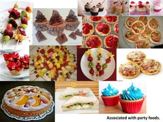
Mood board party food
•Download as PPTX, PDF•
1 like•1,461 views
The document discusses party foods and mentions themes, color schemes, flatbread, and fonts such as Broadway, Flatbread, and Bauhaus 93.
Report
Share
Report
Share

Recommended
Research techniques
1. Research is important to avoid errors when creating products, as research allows you to tailor the product to the audience and market.
2. There are three main types of research: audience research to understand the target customer, market research to analyze the relevant market, and production research to determine necessary materials and equipment.
3. Qualitative and quantitative research methods can be used, with qualitative involving open-ended questions to understand opinions and quantitative using closed questions and statistics.
Pre production techiques
Hannah will self-finance her production of recipe cards for children. Self-financing means she will pay for all costs herself, which has advantages of full creative control but risks her being out of pocket or in debt. Her production will require financing for personnel like a photographer, equipment, ingredients, and printing. She plans to have a team of two including herself and a friend, with roles like photographer, chef, and graphic designer. Locations will likely be homes to avoid costs, and she will use a recce to identify suitable locations. Legal and regulatory considerations include copyright, health and safety, and food advertising guidelines from the ASA.
Fact profile – vegetarian’s work added
The document outlines three main reasons people choose a vegetarian lifestyle: health, animal welfare, and environmental impact. A vegetarian diet provides more fiber and nutrients than a meat-eating diet. Many are also concerned with animal cruelty and the environmental resources required for meat production. While a vegetarian lifestyle can benefit personal health and global sustainability, people interpret and practice it in different ways.
Risk assessment
The document is a risk assessment for a creative media production project involving making recipe cards. It identifies several hazards associated with the project including confined spaces in the kitchen, audiences being distracting, risks from electricity/gas, fatigue from long hours, injuries from machinery, noise being distracting, crowds being distracting, and risks from working with food like allergens or food poisoning. It outlines controls that will be taken for each hazard like clearing space, limiting audience size, safely using appliances, taking breaks, checking machinery is safe, managing noise, limiting crowd size, and checking food is safe.
Evaluation
The document discusses the design choices made for recipe cards targeting children and parents. The designer chose a simple layout with touches like borders to make it more professional without being boring. Images were taken by the designer and edited to look more professional. A large image on the front grabs attention while a smaller image on the back provides contrast. Text and images are balanced. Peer feedback helped improve readability by changing some background colors. Overall, the designer learned skills like using clipping masks and custom fonts that could be applied to future projects. Communication and working alone versus in a group are discussed.
Critique
The document summarizes the design choices made for children's recipe cards, including using fun fonts, colorful banners and shapes, and bullet points and numbers to make the instructions easy to understand for the target audience. Feedback indicates the cards fit the audience and purpose well but the back side could have been more exciting. The design referenced the brief and achieved the goal.
Evaluation
- The document is an evaluation of recipe cards created for a visual language project.
- The student chose to layout the recipe cards in a creative but formal way, adding curves to banners while keeping text flat and easy to read.
- Images were taken by the student for 3 cards but one used a stock image as the finished product did not look presentable.
- The target audience was children at parties to get parents to listen to what children want, using bright colors and stars.
- Design influences included looking at existing media products but not directly copying them. The finished products reflected the initial plans with some changes.
Final cards
This menu lists 4 snack items for an event: corn on the cob, curly wurly cupcakes, pizza fingers, and strawberry shots.
Peer feedback 2
The recipe cards appeal to families with young children and aim to involve them in cooking. The fonts are easy to read against the backgrounds. The images could be improved by adding more contrast to make the food look more appealing. Overall, the cards work well as a set due to consistent fonts, layouts, and color schemes.
Peer feedback 1
The fonts and images used on the recipe cards appeal well to children through their bright colors, illustrative style, and fun elements. One font is a bit harder to read than the others due to compact spacing. The starry salad image is the clearest with strong contrast against its background color. The layout works cohesively as a set and ties the color scheme together nicely for each card. Minor adjustments could improve readability and image clarity further.
Screenshot diary
Hannah Harkus kept a screenshot diary documenting her week working on recipe cards and receiving feedback from her tutor. On Tuesday, she took photos of foods and created recipe cards using images from her phone. Her tutor provided feedback on making one image smaller using a clipping mask and adjusting the color of tomatoes in one photo. For another card, the tutor advised using a hard-edged circular clipping mask rather than a faded effect. Over the week, Hannah worked on improving four recipe cards based on her tutor's guidance.
Planning documentation
This planning document outlines the roles and responsibilities of team members Hannah Harkus and Maddie Sanderson for a project. Both will take on roles as chefs, photographers, copy writers, graphic designers, and photo editors. They will each make 4 recipes and source fonts from dafont.com. The document states they must keep records of any resource bookings as evidence for their grade and lists the ingredients, equipment, and software needed including a camera, tripod, computer, Photoshop, memory stick, Microsoft Word, and dafont.com.
Evidence
This document summarizes the creation of a recipe card. The creator divided the page into two sections for the front and back of the card. On the front, an image, title, vegetarian society logo, and banner were added. The back included the ingredients and method, noting the dish was suitable for vegetarians and vegans. Various fonts and colors were used to make the card exciting for its target audience. Images of the finished dish were also included to show what it would look like complete. Overall, the card matched the specifications of the target audience but a more interesting recipe may have been better.
Flat plans
This document contains recipes for party foods including lists of ingredients and step-by-step instructions. There are multiple recipes presented with titles and photographs of the finished dishes. For each recipe, ingredients are listed first followed by the directions which include 10 steps to prepare the food from start to finish.
Treatment
The document discusses two potential treatments for recipe cards - "Food from around the World" and "Pie and Peas".
The "Food from around the World" treatment would feature recipes from different cultures like Chinese, Indian, Italian and Mexican. The intended audience is mainly young females interested in trying new foods. The treatment recommends A5 sized laminated cards for the sophisticated recipes.
The "Pie and Peas" treatment focuses on a meat pie with peas. The intended audience is older males who enjoy this food at social events. If produced, this treatment recommends cards in the shape of a pie with dull colors and laminated finish.
Idea development
This document discusses party food ideas for an Italian themed event including pie and peas, with a focus on theme and design elements to match the Italian food.
Initial ideas
Hannah presented 5 ideas for recipe cards and received feedback on each from an evaluator. The ideas included desserts, Chinese cuisine, healthy snacks, vegetarian pies, and pizza. The evaluator generally liked that the ideas were colorful, unique, and focused on vegetarian options. They suggested Hannah explain more about the target audience and card design. Hannah agreed she should have better defined these aspects. While she liked the pizza idea, she noted it may be difficult to find suitable toppings that appetize people. Her favorite overall was the dessert idea as everyone enjoys desserts.
Recipe cards
This document contains recipe cards created by Maddie Sanderson. Maddie Sanderson likely collects or develops her own recipes and records them on individual recipe cards. The recipe cards allow Maddie to organize her recipes in a format that makes the ingredients and instructions easy to access.
Peer feedback 2
The recipe cards appeal to families with young children and aim to involve them in cooking. The fonts are easy to read against the backgrounds. The images could be improved by adding more contrast to make the food look more appealing. Overall, the cards work well as a set due to consistent fonts, layouts, and color schemes.
Peer feedback 1
The fonts and images used on the recipe cards appeal well to children through their bright colors, illustrative style, and fun elements. One font is a bit harder to read than the others due to compact spacing. The starry salad image is the clearest with strongest background color. Layout works well overall though some images could have more contrasting backgrounds for improved clarity.
Treatment 1
The document discusses recipe cards for children's party food. It includes recipes for finger pizzas, cheese rolls, cheese straws, egg mayo sandwiches, fruit kebabs, strawberry tarts, cupcakes, and potato stars. Most of the recipes are easy to make and include a mixture of sweet and savory foods. The target audience for the recipe cards is adults age 40 and over since the food is for children's parties. The cards will be die cut in the shape of a cupcake and use pastel colors based on survey results, with a simple layout mixing pictures and text.
Send to mads
From a survey of 37 respondents:
- More respondents were meat eaters (24) than vegetarians (11).
- Respondents were majority female (28) and in the 17-20 age range.
- Most respondents described themselves as happy or funny.
- Favorite foods included strawberries, apples, melons, pizza, and party rings.
- Most wanted to see pictures on recipe cards and recipes for foods from around the world or party foods.
- Pastel colors were the most popular choice for recipe card color schemes.
Research
The document summarizes the results of an online survey about recipe preferences. Key findings include:
- More females than males completed the survey.
- Vegetarians showed interest in pizza and preferred a combination of pictures and text on cards.
- Equal interest was shown in healthy foods and foods from around the world.
- Pastel colors were the most popular choice for the card design.
Existing recipe card evaluation
This recipe card aims to promote vegetarian food to young people. The use of the word "veggie" and a printed heart are intended to make vegetarian food seem appealing. The simple writing style with short sentences and alliteration in the heading help explain what the card is about in a straightforward, eye-catching way for its target audience. However, the overall design is seen as too "babyish" without enough information for adults and could be improved with more vibrant colors related to its message.
Analysis
The document summarizes a poster that promotes a "Fish Free Friday" campaign. It uses simple, short sentences and bold fonts to catch attention. The overall design is seen as dull with limited colors. The layout effectively draws attention to the heading and central image while placing less important details like the logo in less prominent positions.
Initial ideas and feedback
The document contains feedback from Maddie Sanderson on initial ideas for recipe card designs. Five ideas are presented with details on theme, target audience, colors, and layout. The feedback provider comments on what they like about each idea, areas for improvement, and what they find interesting. They agree most ideas are creative but some could be more detailed. Their favorite is Maddie's first idea for party food with cupcake-shaped recipe cards as it is very creative and appealing to children.
Working to a brief
This document discusses different types of briefs including contractual, formal, informal, co-operative, negotiated, commission, tender, and competition briefs. It then provides details about a vegetarian recipe cards brief, including that it will use a co-operative structure and discusses reading, negotiating, and exploring opportunities related to the brief.
More Related Content
More from hannahandmads
Peer feedback 2
The recipe cards appeal to families with young children and aim to involve them in cooking. The fonts are easy to read against the backgrounds. The images could be improved by adding more contrast to make the food look more appealing. Overall, the cards work well as a set due to consistent fonts, layouts, and color schemes.
Peer feedback 1
The fonts and images used on the recipe cards appeal well to children through their bright colors, illustrative style, and fun elements. One font is a bit harder to read than the others due to compact spacing. The starry salad image is the clearest with strong contrast against its background color. The layout works cohesively as a set and ties the color scheme together nicely for each card. Minor adjustments could improve readability and image clarity further.
Screenshot diary
Hannah Harkus kept a screenshot diary documenting her week working on recipe cards and receiving feedback from her tutor. On Tuesday, she took photos of foods and created recipe cards using images from her phone. Her tutor provided feedback on making one image smaller using a clipping mask and adjusting the color of tomatoes in one photo. For another card, the tutor advised using a hard-edged circular clipping mask rather than a faded effect. Over the week, Hannah worked on improving four recipe cards based on her tutor's guidance.
Planning documentation
This planning document outlines the roles and responsibilities of team members Hannah Harkus and Maddie Sanderson for a project. Both will take on roles as chefs, photographers, copy writers, graphic designers, and photo editors. They will each make 4 recipes and source fonts from dafont.com. The document states they must keep records of any resource bookings as evidence for their grade and lists the ingredients, equipment, and software needed including a camera, tripod, computer, Photoshop, memory stick, Microsoft Word, and dafont.com.
Evidence
This document summarizes the creation of a recipe card. The creator divided the page into two sections for the front and back of the card. On the front, an image, title, vegetarian society logo, and banner were added. The back included the ingredients and method, noting the dish was suitable for vegetarians and vegans. Various fonts and colors were used to make the card exciting for its target audience. Images of the finished dish were also included to show what it would look like complete. Overall, the card matched the specifications of the target audience but a more interesting recipe may have been better.
Flat plans
This document contains recipes for party foods including lists of ingredients and step-by-step instructions. There are multiple recipes presented with titles and photographs of the finished dishes. For each recipe, ingredients are listed first followed by the directions which include 10 steps to prepare the food from start to finish.
Treatment
The document discusses two potential treatments for recipe cards - "Food from around the World" and "Pie and Peas".
The "Food from around the World" treatment would feature recipes from different cultures like Chinese, Indian, Italian and Mexican. The intended audience is mainly young females interested in trying new foods. The treatment recommends A5 sized laminated cards for the sophisticated recipes.
The "Pie and Peas" treatment focuses on a meat pie with peas. The intended audience is older males who enjoy this food at social events. If produced, this treatment recommends cards in the shape of a pie with dull colors and laminated finish.
Idea development
This document discusses party food ideas for an Italian themed event including pie and peas, with a focus on theme and design elements to match the Italian food.
Initial ideas
Hannah presented 5 ideas for recipe cards and received feedback on each from an evaluator. The ideas included desserts, Chinese cuisine, healthy snacks, vegetarian pies, and pizza. The evaluator generally liked that the ideas were colorful, unique, and focused on vegetarian options. They suggested Hannah explain more about the target audience and card design. Hannah agreed she should have better defined these aspects. While she liked the pizza idea, she noted it may be difficult to find suitable toppings that appetize people. Her favorite overall was the dessert idea as everyone enjoys desserts.
Recipe cards
This document contains recipe cards created by Maddie Sanderson. Maddie Sanderson likely collects or develops her own recipes and records them on individual recipe cards. The recipe cards allow Maddie to organize her recipes in a format that makes the ingredients and instructions easy to access.
Peer feedback 2
The recipe cards appeal to families with young children and aim to involve them in cooking. The fonts are easy to read against the backgrounds. The images could be improved by adding more contrast to make the food look more appealing. Overall, the cards work well as a set due to consistent fonts, layouts, and color schemes.
Peer feedback 1
The fonts and images used on the recipe cards appeal well to children through their bright colors, illustrative style, and fun elements. One font is a bit harder to read than the others due to compact spacing. The starry salad image is the clearest with strongest background color. Layout works well overall though some images could have more contrasting backgrounds for improved clarity.
Treatment 1
The document discusses recipe cards for children's party food. It includes recipes for finger pizzas, cheese rolls, cheese straws, egg mayo sandwiches, fruit kebabs, strawberry tarts, cupcakes, and potato stars. Most of the recipes are easy to make and include a mixture of sweet and savory foods. The target audience for the recipe cards is adults age 40 and over since the food is for children's parties. The cards will be die cut in the shape of a cupcake and use pastel colors based on survey results, with a simple layout mixing pictures and text.
Send to mads
From a survey of 37 respondents:
- More respondents were meat eaters (24) than vegetarians (11).
- Respondents were majority female (28) and in the 17-20 age range.
- Most respondents described themselves as happy or funny.
- Favorite foods included strawberries, apples, melons, pizza, and party rings.
- Most wanted to see pictures on recipe cards and recipes for foods from around the world or party foods.
- Pastel colors were the most popular choice for recipe card color schemes.
Research
The document summarizes the results of an online survey about recipe preferences. Key findings include:
- More females than males completed the survey.
- Vegetarians showed interest in pizza and preferred a combination of pictures and text on cards.
- Equal interest was shown in healthy foods and foods from around the world.
- Pastel colors were the most popular choice for the card design.
Existing recipe card evaluation
This recipe card aims to promote vegetarian food to young people. The use of the word "veggie" and a printed heart are intended to make vegetarian food seem appealing. The simple writing style with short sentences and alliteration in the heading help explain what the card is about in a straightforward, eye-catching way for its target audience. However, the overall design is seen as too "babyish" without enough information for adults and could be improved with more vibrant colors related to its message.
Analysis
The document summarizes a poster that promotes a "Fish Free Friday" campaign. It uses simple, short sentences and bold fonts to catch attention. The overall design is seen as dull with limited colors. The layout effectively draws attention to the heading and central image while placing less important details like the logo in less prominent positions.
Initial ideas and feedback
The document contains feedback from Maddie Sanderson on initial ideas for recipe card designs. Five ideas are presented with details on theme, target audience, colors, and layout. The feedback provider comments on what they like about each idea, areas for improvement, and what they find interesting. They agree most ideas are creative but some could be more detailed. Their favorite is Maddie's first idea for party food with cupcake-shaped recipe cards as it is very creative and appealing to children.
Working to a brief
This document discusses different types of briefs including contractual, formal, informal, co-operative, negotiated, commission, tender, and competition briefs. It then provides details about a vegetarian recipe cards brief, including that it will use a co-operative structure and discusses reading, negotiating, and exploring opportunities related to the brief.
More from hannahandmads (20)
Mood board party food
- 1. Associated with party foods.
- 2. Theme.
- 3. Colour scheme. Flatbread Round slab FlatBread outline Broadway Flatbread inline Book Man Old Style Bauhaus 93