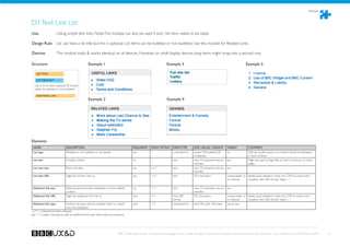
Download as PDF, PPTX


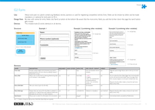
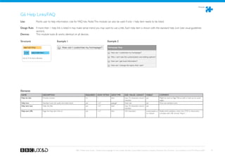
![Actionable pages
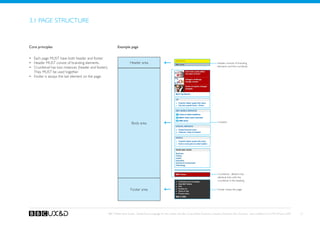
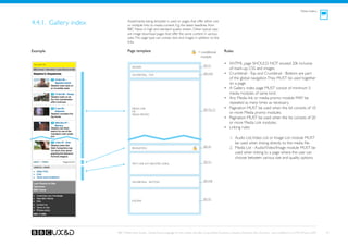
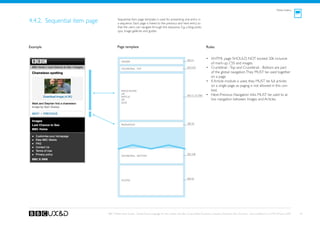
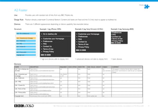
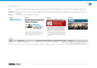
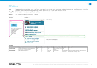
4.5.1. Media object page Media object page shows a single image (in some cases also audio
or video) file that can be viewed on the page. There is no other
content on the page.
NOTE: The device plays audio and video files with their native
media player applications, thus this page is a backup option for
audio and video content.
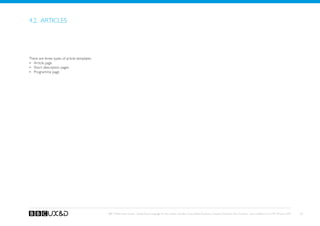
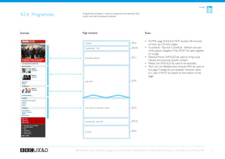
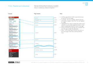
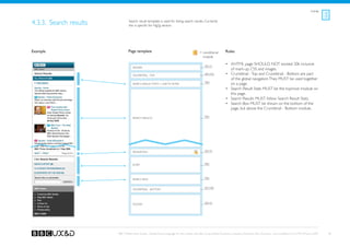
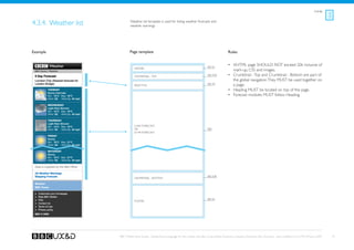
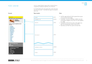
Example Page template Rules
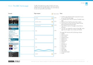
• XHTML page SHOULD NOT exceed 20k inclusive of
mark-up, CSS and images.
• The users end up on this page when selecting an im-
age size from a list of options.
• The users can save the image to their devices using
the options in the device’s native UI.
• This page is a dead-end: The users navigate away from
this page by using their device’s native UI logic, e.g.
Image file
back -option.
• The native UI of the device handles the video and au-
[Video file or Audio file]
dio files. E.g. the browser hands over to a media player
when the user selects to view a video. When the
video has finished, the media player (generally) offers
an option to return to the web page.
BBC Mobile Style Guide - Global Visual Language for the mobile web. Ben Guyer, Riikka Puustinen, Claudia Urschbach, Dan Dumitriu. Last modified at 5:16 PM, 09 June 2009 46](https://image.slidesharecdn.com/mobileguidev1-1compressed-130409094811-phpapp01/85/BBC-Mobile-Style-Guide-1-1-Global-Visual-Language-for-the-mobile-web-46-320.jpg)
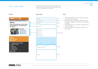
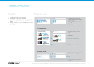
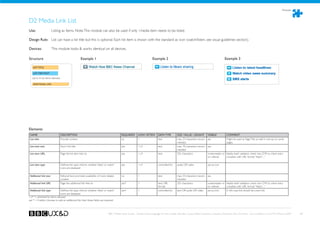
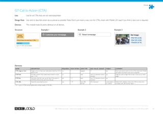
![Administrative pages
!
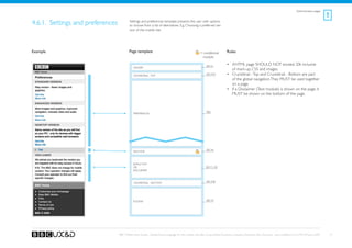
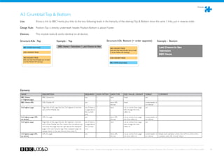
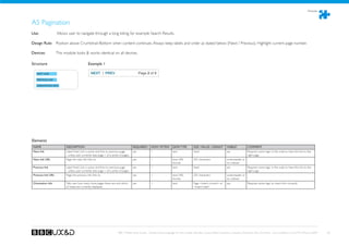
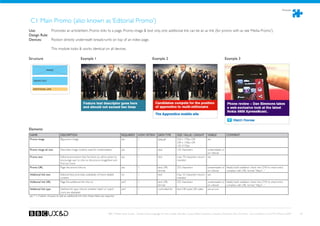
4.6.2. Alerts and errors This page template informs the user about error situations and
other types of alerts.
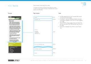
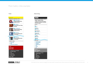
Example Page template Rules
See A1
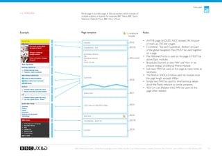
• XHTML page MUST be as light as possible.
Header
• Crumbtrail - Top and Crumbtrail - Bottom are part of
Crumbtrail - Top
See A3a the global navigation. They MUST be used together on
a page.
• Alert MUST be shown on the top of the page.
See G3
Alert
[any module depending on the page context]
Crumbtrail - Bottom See A3b
See A2
Footer
BBC Mobile Style Guide - Global Visual Language for the mobile web. Ben Guyer, Riikka Puustinen, Claudia Urschbach, Dan Dumitriu. Last modified at 5:16 PM, 09 June 2009 52](https://image.slidesharecdn.com/mobileguidev1-1compressed-130409094811-phpapp01/85/BBC-Mobile-Style-Guide-1-1-Global-Visual-Language-for-the-mobile-web-52-320.jpg)

The BBC Mobile Style Guide outlines principles and standards for creating mobile web pages, aimed at ensuring consistency and quality across BBC mobile platforms. It covers areas like design principles, usability considerations, and technical requirements, and serves as a resource for designers, developers, and producers. The guide incorporates visual guidelines and specifies the structure, navigation, and editorial principles that should be adhered to for optimal user experience.


![Web Standards: Fueling Innovation [Web Design World Boston '08]](https://cdn.slidesharecdn.com/ss_thumbnails/web-standards-fueling-innovation-1228796603037960-8-thumbnail.jpg?width=640&height=640&fit=bounds)