Download to read offline

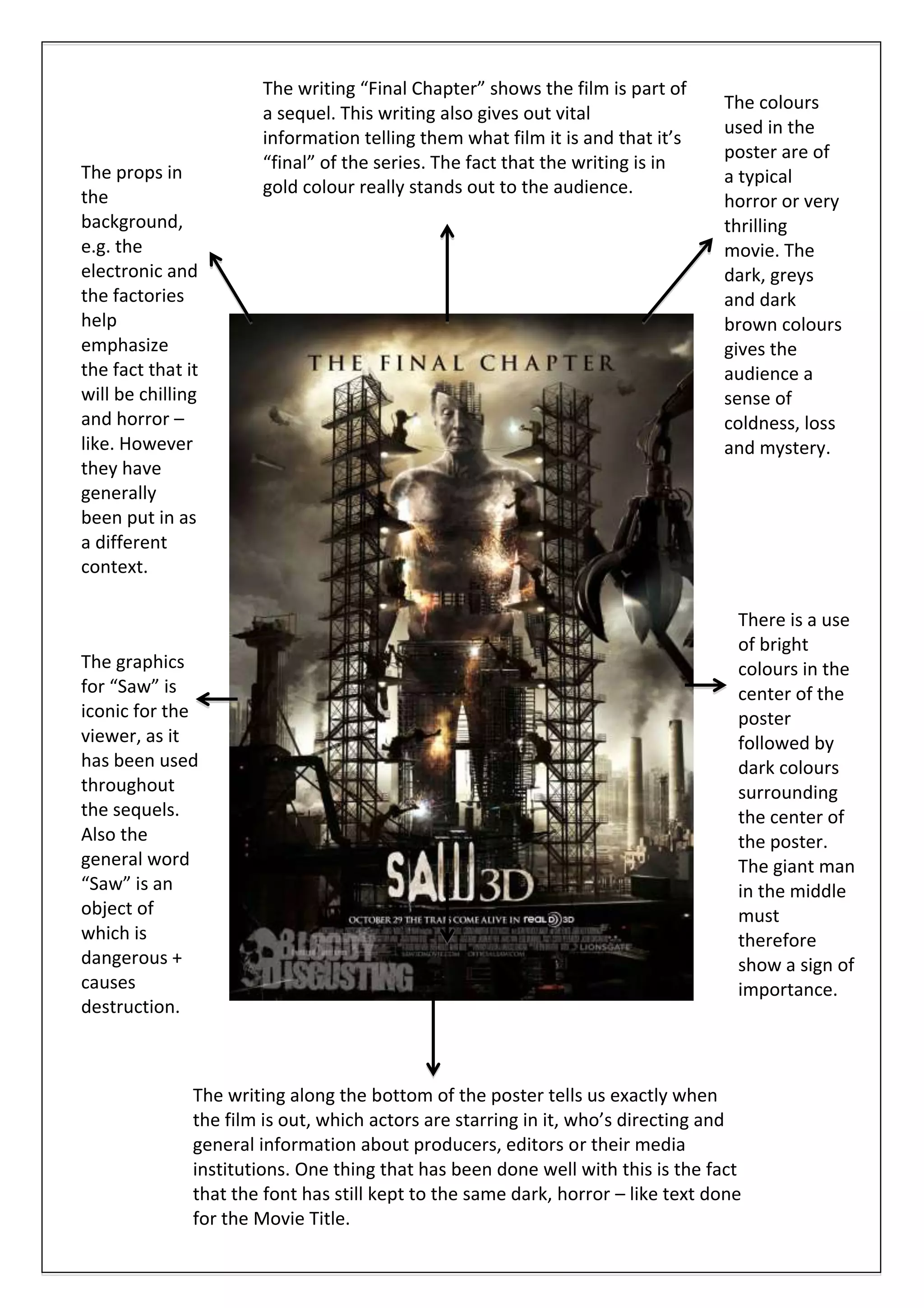

The document summarizes a movie poster for the final installment in the Saw film series. Key details that stand out include the title "Final Chapter" in gold writing to indicate it is the last film, dark color tones used throughout to set a chilling atmosphere, and text at the bottom providing release date and production credits in a font matching the horror theme of the movie title. Iconic graphics and the word "Saw" signal to viewers that it is part of the popular horror franchise.


![[DevCamp 2014] Melhorando a usabilidade com animações](https://cdn.slidesharecdn.com/ss_thumbnails/ienpoao3qwswsrvv88ym-signature-483704c5d1ba8b9498d30ab31892cb3d410d948410c4c1ecd5c207db5dc0e829-poli-140831034734-phpapp01-thumbnail.jpg?width=640&height=640&fit=bounds)


