SlideShare a Scribd company logo
Evaluation

1.In what way does your media product use, develop or challenge forms and conventions of real
media products?

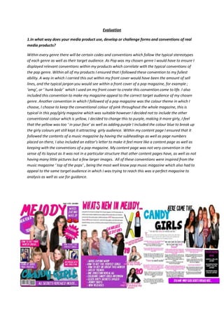
Within every genre there will be certain codes and conventions which follow the typical stereotypes
of each genre as well as their target audience. As Pop was my chosen genre I would have to ensure I
displayed relevant conventions within my products which correlate with the typical conventions of
the pop genre. Within all of my products I ensured that I followed these convention to my fullest
ability. A way in which I carried this out within my front cover would have been the amount of sell
lines, and the typical jargon you would see within a front cover of a pop magazine, for example ;
‘omg’, or ‘ hunk bodz’ which I used on my front cover to create this convention come to life. I also
included this convention to make my magazine appeal to the correct target audience of my chosen
genre. Another convention in which I followed of a pop magazine was the colour theme in which I
choose, I choose to keep the conventional colour of pink throughout the whole magazine, this is
typical in this pop/girly magazine which was suitable however I decided not to include the other
conventional colour which is yellow, I decided to change this to purple, making it more girly, I feel
that the yellow was too ‘ in your face’ as well as adding purple I included the colour blue to break up
the girly colours yet still kept it attracting girly audience. Within my content page I ensured that it
followed the contents of a music magazine by having the subheadings as well as page numbers
placed on there, I also included an editor’s letter to make it feel more like a content page as well as
keeping with the conventions of a pop magazine. My content page was not very convention in the
sense of its layout as it was not in a particular structure that other content pages have, as well as not
having many little pictures but a few larger images. All of these conventions were inspired from the
music magazine ‘ top of the pops’ , being the most well know pop music magazine which also had to
appeal to the same target audience in which I was trying to reach this was a perfect magazine to
analysis as well as use for guidance.
2.What kind of media institution might distribute your media product and why?

The media institution which owns and distributes my magazine is BBC Magazines was the magazine
publishing division of BBC Worldwide; it is now part of a new venture called Immediate Media
Company which combined with Origin Publishing and Magicalia. To view Immediate media’s website
for further information please click here. BBC Magazines also distribute worldwide know magazines
like;

    -   Top Gear: Turbo Challenge
    -   BBC Focus
    -   BBC Wildlife
    -   BBC Sky at Night
    -   Easy Cook
    -   Countryfile
    -   Gardeners' World
    -   Homes & Antiques
    -   Bob the Builder
    -   CBeebies Weekly
    -   Charlie and Lola
    -   Fifi and the Flowertots

I personally felt that this media institution was suitable to use to accompany my magazine, as my
magazine Is a pop magazine alongside this BBC magazine also were the creators of the ‘Top Of The
Pops’ Magazine, in which BBC founded from the original TV program which started in 1964, which
was then axed in 2006, however the magazine is still being manufactured, it has been running since
1995. The circulation of ‘Top of the Pops’ consists of 78,352 with a readership of 331,000. This
breaks down into 87% of the readership being females with the other 15% being males, the age
range of the target audience in which buy the magazine varies from the age of 11 up to the age of
15, knowing these about the magazine and the fact ha they are run by BBC magazine, persuade me
to choose this company to look after and publish my magazine. Due to BBC magazines being a well
know worldwide company in which many people recognise the name and the well trusted company.

3. How does your media product represent particular social groups?

There are particular social groups in which my magazine appeals to, my music magazine ‘ melody’
will appeal to girls more than males, many males would not read my magazine, as pop magazines
appeal to young teenage girls , we see this through conventions like the colours pink and yellow, as
many males would not be attracted to something pink or yellow, alongside this another convention
in which is represents the magazine appealing towards females rather than males would be the free
posters in which the magazine offers, these poster usually consist of a topless male or a boy
band/artist. The type of class that would be attracted towards this magazine would be a middle class
young teenager; this is due to them usually being involved with the heart throb crushes and following
of male artist or bands, as well as pop usually being assioated within them. Most of the readership
towards this magazine will be from teenagers rough fully round the ages of 12-14, maybe to the
maximum age of 16.
My three pieces of media give the representation of the stereotypically teenage girl, in love with
fashion, make up, boys and the colour pink. My magazine portrays the typical teenage girl being over
fascinated with her appearance into cute boys, in conjunction with this I try to give my pop magazine
in which would typically follow through with all these conventions and different and more mature
look, to appeal to an older reader, I tried to portray the readers as a more quirky and original person,
less girl however still chic, alongside this I also ensured the magazine did not give the woman a look
of being a sex object in which is usually portrayed in magazines like Vibe. My magazine portrays the
females as independent and all for girl power however is still correlated with the original conventions
of pop magazines. I used my magazine to represent the older target audience of pop rather than the
stereotypical girly girls.

Dominant representation to people who listen to pop music;

        Pink
        Pretty
        Girly
        Obsessed with make-up and hair
         Always up to date with fashion
        Childish
        Infatuated with boys
        Always following the crowd

Alternate representation to people who listen to pop music;

         Other colours rather than pink e.g. blues
        Quirky
        Different
        Rebels from the crowd
         Not appreance obsessed
        Still loves music
        Boys are not number one priority

The reason we correlate these with a typical pop fan is due to stereotypes and generalisation. Due to
one person who is like these following representations and like pop, many people feel that each
person in which listen to pop follows these. Alongside this media can also influence people’s opinions
or beliefs on a person in which listens to pop, this can be through
posters, music video etc.

Little mix is a perfect example of the typical girl band for a pop
stereotype, however they also rebel the stereotype in certain ways.
They fit the stereotype due to the very girly image in the sense that
their hair is always perfect alongside their makeup and physical
appreance.
However a perfect example of a pop artist in which goes against the
typical convention of a pop artist would be EmeliSande, this is due to
her short hair which appeals to be very defeminising, as well as her
lack of colourful appreance, and she is very natural looking with just
black, white and grey clothing. This rebels against the pop stereotype,
and highlights that there are differences and not everyone fits to the
stereotype, this is what I tried to appeal to the readers of my
magazine.

Alongside posters or images we also see it through there music video, as in little mix video, we will
see a very upbeat, girly theme to the music and actual video, a wonderful example of this would be
their wings video.

http://www.youtube.com/watch?v=Wj1xlgORopg&safe=active

This is very girly due to the range of colours, settings and backgrounds displayed within the video,
alongside this we also see a range of colourful clothing from the band members and back up
dancers., it is very typical for a group of pop artist, like shorts, crop tops bright colours and highly
fashionable. Alongside the clothing there hair and makeup is very girls, curly or straight hair with
very innocent pink coloured makeup. This represents the particular social group of pop fans as it goes
with the stereotypes of being pink, pretty, girly, obsessed with make-up and hair, always up to date
with fashion .


4. Who would be the audience for your media product?

 The target audience in which ‘Melody’ magazine appeals to while consist of being mainly girls, due
to the population of people in which listen to pop music is dominated by females; the age ranges of
16-22, however even though this age range has been set it, it does not nessciarly mean that females
or males of other ages cannot read, the only thing that should really matter is the content and the
music that is being spoken about within the magazine. My target audience is a female of a very
quirky edge but still fits some of the stereotypical conventions of a pop fan, for example loves the
heartthrob boys and loves having a good appreance, however stands out with the fashion and is a
leader rather than a follower. My magazine will not only be about the music but to help the fans and
followers of the magazine to reach their full potential which correlates with the media theorist;
Maslow and his hierarchy of needs.


‘Melody’ magazine will try to help their followers
to reach their full potential by reaching the top of
the hierarchy which is self-actualization., this is
when a person reaches the best they can be
within their live, by being accepted by everyone and themselves personally, feeling comfortable and
confident within themselves. However a person is unable to move up on the hierarchy unless all other
levels are completed to the best standard possible. Due to being a magazine based for girls, we will
help to boost their confidences and give them tips to feel comfortable within themselves in which will
help them reach the top of the pyramid. The section in which my magazine will help the audience in
the most will be the Esteem level. We will boost this through various articles, types and facts in which
will appeal to my target audience.

My magazine is suitable for my target audience because it fulfils all their needs. It features the entire
latest artist and fills the gap in the market for a edgy, quirk, pop magazine, which helps boost both
the target audiences self-esteem as well as keeping them up to date with their favourite artist and
how they are reaching their full potential as well. As I am a female myself my target audience can see
this on the content page from the image of myself and this shows I have made the magazine with
them in mind.


5. How did you attract/address your audience?

The way in which my media products would have attracted
my audience would have been in various methods such as
colours, fonts, images, mode of address and other methods.
Throughout my media products I kept a consistent colour
scheme this was to ensure the readers would correlate these
colours with my magazine, keep them attracted and
appealing towards the eye. The colours in which I repeatedly
used where, pink and purple, these are classified as girly
colours, alongside this they also easily attract the eye of the
reader. I also choose to use the colour blue even though this
is not seen as a girly colour; this rebelled against the pinks
and purple making each media product stand out more to
the readerships eyes.

 My front cover appealed towards my readership in many
ways, as seen within the image of my front cover. The use of
white writing, highlighted and luminated the use of bright
pink and purple attracting the reader’s eyes automatically.
However the colours were not the only way in which I
attracted the readers, within my sell lines what I offered to
supply towards the target audience as well as the mode of address. The sell lines which are seen on
my front cover such as ‘ how to get your winter crush’ would appeal to the reader of ‘Melody’
magazine as it is appealing towards the girl due to her being able to get her crush she wants. As well
as the offers in which the magazine are supplying to the readers the mode of address attracts the
readers as it feel like they are talking to a friend, such as the word ‘hunk’ is see as a very informal
word and would usually be used among younger girls. Using this mode of address would instantly
attract my target audience due to it being on there level of communication like the magazine are
directing them personally. Alongside all thes factors, the magazine front cover uses the use of smaller
images in which give a sneak peak into what will be seen in the magazine which raise the attention
towards the magazine and makes them want to see more of what the magazine is offering.


                                                The magazine keeps the correlation of colours within the
                                               contents page as you can see within the image of the
                                               contents page, however there is no use of blue, this
                                               creates a more girly atmosphere, correlation with the
                                               stereotype of pop fans. The use of white writing is still
                                               being used to attract the readers eyes, as due to the
                                               white writing this will be the first part of the contents
                                               page they will look at, to ensure they see the articles they
                                               are being offered and what story is attracting them first.
                                               We also see the use of smaller images once again, this
                                               also is used for the same reason in that they will be
                                               attracted to see what is being offered to them, such as
                                               the makeup products in which is being displayed, will
                                               attract the target audience as they are females in which
                                               take care of their appreance and choose to look good
                                               through knowing about the latest beauty products in
                                               which ‘Melody’ offers information on. There are also
                                               uses of clips out of the articles in which I have wrote
                                               about, we see these under pictures of the band members
of Candy Girls this will attract and intrigue the readers to what to know who said what. Within the
editors letter I have also highlighted key word in both a different font and colour in which instantly
attracts the eye of the reader to wonder why these are like this and to furthermore read the editors
letter.


 At a first look of the double page spread all we
see is the flood of colour we have solids black
and blue used in the title, which intrigues the
eyes of the reader as it is a pop magazine and
the colour pink is not being used. Moving down
the page we then see the writing in both black
and pink in which correlate well together due
to the black being a dominate colour with the
pink then being bright and eye catching. I sued
the questions in pink and the rest of the writing
to ensure that the reader did not get confused
when they were reading the article it separates
the question to the answers. In correlation with
this, there is only one image seen of the double page spread in which goes against the stereotype of
a pop magazine, however it give it the more older/ mature image in which I was trying to produce
and appeal to the readership. The use of colourful boxes like the pink banner we see at the bottom of
the page attracts the reader as soon as they have finished the reading the article, in which tempts
the reader to move on throughout the magazine rather than to close it. Alongside this there is also a
black box with white writing in which once again drags the target audience’s eye towards this box to
intrigue them to find out what is writing inside the box, which follows on from them carrying to read
on throughout the magazine.

6. What have you learnt about technologies from the process of constructing this product?

Within working for this product I have produced and learn variable skills, each skill I have picked up
have been useful. Before starting this product I had not worked with or used the following
programmes;

        Blogspot.com
        Adobe Photoshop
        Camera
        Slideshare.com
        dafont.com
 Each of these programs, were new to me when starting to use them I was easily confused and
frustrated when working with the programs. My skills in which I used to start with were very basic
and lacked a lot of experience, as seen in my preliminary task. The best example would be with
Adobe Photoshop, I had no experience at all, I was unsure of how to work the program and the
components within it. Alongside this I was completely unaware of blogspot.com, I had no clue in how
to work or post within the blog, this was a whole new experience and I was thrown in the deep end.
Once exploring each of the programs, I final found my feet and learnt how to use each of them to my
own advantage, such as I have learnt how to use embedded codes and how to embed YouTube
videos and slide share documents into my blog without just putting the link in, alongside learning
how to post pictures and other files on to the blog. Alongside these I learnt how to use dafont.com in
which allowed me to explore and use other fonts to produce my work, this allowed more variety to
my work


here are some examples in which I have explained above, and how I learnt how to use them to my
advantages;
7. Looking back at your preliminary task, what do you feel you have learnt in the progression from
it to the full product?

 Personally looking back due to only starting to be a media students in September, it was a big jump,
I felt like I would struggle due to never doing media, let alone knowing what media was about. I felt
that my prelinary was a more of a plant compared to a tree, it was on such a smaller scale and of an
appalling lower standard. Looking back now, I feel I could easily improve it and make a better
preliminary task to an outstanding standard. Alongside this I would also carry out a lot more further
research to the task, as in the preliminary I was unaware of how to go about the task what to add in
to the articles, or what to write as sell lines etc. if I was to look back and compare the standards of
each of my front covers I would be able to see the improvement made and how my skills have
developed within practice and research.


At a first glance you can clearly see the improvements made between the two products not only does
‘ melody’ magazine look more appealing but the standard of the writing and the sell lines have
improved alongside the creativity of the product has also exceeded massively. ‘ The Daily Martyrs’
looks very messy disorganised and lacks the appeal of automatically grabbing the reader, it is clear to
see the use of skills in which have been used to make it have being very basic, where as for ‘ Melody’
it is clear to see they understand how to use the resource in which have been used to make the
product.
Within this task in which h have completed I have uncovered many things I may have not necessarily
know about, for example I have learnt how the use Photoshop, alongside enjoying using it when
carrying out the production of my products. As well as find out about the pop industry and the code
and convention in which are portrayed. Personally I am pleased with the final media products in
which I produced, I am happy with the feedback in which I received and the criticisms in which I took
on board and then changed the products to use these cristicism.

More Related Content

What's hot

Question 1
Question 1Question 1
Question 1
tomngai_17
 
Media evaluation
Media evaluationMedia evaluation
Media evaluation
ajennings_
 
Media complete when get home
Media complete when get homeMedia complete when get home
Media complete when get home
georgehunt
 
Media Coursework
Media CourseworkMedia Coursework
Media Courseworkgeorgehunt
 
Media Evaluation Final Draft
Media Evaluation Final DraftMedia Evaluation Final Draft
Media Evaluation Final Draftabbiejennings
 
Question 1
Question 1Question 1
Question 1
tomngai_17
 
I have finished media buzzing
I have finished media buzzingI have finished media buzzing
I have finished media buzzinggeorgeahunt
 
My Images
My ImagesMy Images
My Images
nathanholmes0207
 
Exam evaluation 2
Exam evaluation 2Exam evaluation 2
Exam evaluation 2Shahnaaz96
 
Evaluation question 2
Evaluation question 2Evaluation question 2
Evaluation question 2
jamiedawsonvyners
 
Analysing 3 Pop Music Magazines
Analysing 3 Pop Music MagazinesAnalysing 3 Pop Music Magazines
Analysing 3 Pop Music Magazines
nathanholmes0207
 
As media studies evaluation 1
As media studies evaluation 1As media studies evaluation 1
As media studies evaluation 1aduhenejas
 
Question 2
Question 2Question 2
Question 2
tomngai_17
 
Media studies as
Media studies asMedia studies as
Media studies asabbietaylor
 
As media studies evaluation 1
As media studies evaluation 1As media studies evaluation 1
As media studies evaluation 1aduhenejas
 
As media studies evaluation 1
As media studies evaluation 1As media studies evaluation 1
As media studies evaluation 1aduhenejas
 

What's hot (18)

Question 1
Question 1Question 1
Question 1
 
Media evaluation
Media evaluationMedia evaluation
Media evaluation
 
Media complete when get home
Media complete when get homeMedia complete when get home
Media complete when get home
 
Media Coursework
Media CourseworkMedia Coursework
Media Coursework
 
Media Evaluation Final Draft
Media Evaluation Final DraftMedia Evaluation Final Draft
Media Evaluation Final Draft
 
Question 1
Question 1Question 1
Question 1
 
I have finished media buzzing
I have finished media buzzingI have finished media buzzing
I have finished media buzzing
 
My Images
My ImagesMy Images
My Images
 
Magazine Evaluation
Magazine EvaluationMagazine Evaluation
Magazine Evaluation
 
Exam evaluation 2
Exam evaluation 2Exam evaluation 2
Exam evaluation 2
 
Evaluation question 2
Evaluation question 2Evaluation question 2
Evaluation question 2
 
Analysing 3 Pop Music Magazines
Analysing 3 Pop Music MagazinesAnalysing 3 Pop Music Magazines
Analysing 3 Pop Music Magazines
 
As media studies evaluation 1
As media studies evaluation 1As media studies evaluation 1
As media studies evaluation 1
 
Question 2
Question 2Question 2
Question 2
 
Media studies as
Media studies asMedia studies as
Media studies as
 
As media studies evaluation 1
As media studies evaluation 1As media studies evaluation 1
As media studies evaluation 1
 
As media studies evaluation 1
As media studies evaluation 1As media studies evaluation 1
As media studies evaluation 1
 
Question Two
Question TwoQuestion Two
Question Two
 

Viewers also liked

Collaboration series beers db
Collaboration series beers dbCollaboration series beers db
Collaboration series beers db
David Jones
 
Vim Basics
Vim BasicsVim Basics
Vim Basics
parkerwightman
 
Ethical advertising, subvertising and the blogosphere
Ethical advertising, subvertising and the blogosphereEthical advertising, subvertising and the blogosphere
Ethical advertising, subvertising and the blogosphere
David Fox
 
Persuasion and Ethics in Advertising
Persuasion and Ethics in AdvertisingPersuasion and Ethics in Advertising
Persuasion and Ethics in Advertising
starryeyed.ani
 
Advertising and gender
Advertising and genderAdvertising and gender
Advertising and gendersmtrubat
 
The Rug Republic Story
The Rug Republic StoryThe Rug Republic Story
The Rug Republic Story
Admin Trr
 

Viewers also liked (6)

Collaboration series beers db
Collaboration series beers dbCollaboration series beers db
Collaboration series beers db
 
Vim Basics
Vim BasicsVim Basics
Vim Basics
 
Ethical advertising, subvertising and the blogosphere
Ethical advertising, subvertising and the blogosphereEthical advertising, subvertising and the blogosphere
Ethical advertising, subvertising and the blogosphere
 
Persuasion and Ethics in Advertising
Persuasion and Ethics in AdvertisingPersuasion and Ethics in Advertising
Persuasion and Ethics in Advertising
 
Advertising and gender
Advertising and genderAdvertising and gender
Advertising and gender
 
The Rug Republic Story
The Rug Republic StoryThe Rug Republic Story
The Rug Republic Story
 

Similar to Evaluation

Media evaluation part 4
Media evaluation part 4Media evaluation part 4
Media evaluation part 4bethbowyer
 
Evaluation Questions.
Evaluation Questions.Evaluation Questions.
Evaluation Questions.guest75f99d
 
Exam evaluation 2
Exam evaluation 2Exam evaluation 2
Exam evaluation 2Shahnaaz96
 
Media
Media Media
Media
Mary Morgan
 
Media evaluation
Media evaluationMedia evaluation
Media evaluation
Mary Morgan
 
Evaluation new
Evaluation newEvaluation new
Evaluation newbhatty97
 
ANEESAH'S EVALUATION
ANEESAH'S EVALUATIONANEESAH'S EVALUATION
ANEESAH'S EVALUATIONAneesah09
 
Evaluation new
Evaluation newEvaluation new
Evaluation newbhatty97
 
Task 5 done and on blog
Task 5   done and on blogTask 5   done and on blog
Task 5 done and on blog
EmilySampson14
 
Question 2 : How does your media product represent particular social groups?
Question 2 : How does your media product represent particular social groups? Question 2 : How does your media product represent particular social groups?
Question 2 : How does your media product represent particular social groups? EstherY7865
 
Who would be the audience for your media product?
Who would be the audience for your media product? Who would be the audience for your media product?
Who would be the audience for your media product?
ellentozer1
 
Evaluation question 4)
Evaluation question 4)Evaluation question 4)
Evaluation question 4)Morgan Boon
 
Q1
Q1Q1
Q1
livd2
 
Front Cover Overview
Front Cover OverviewFront Cover Overview
Front Cover Overview
scarletthayward
 
Evaluation
EvaluationEvaluation
EvaluationEirinnGM
 

Similar to Evaluation (20)

Media evaluation part 4
Media evaluation part 4Media evaluation part 4
Media evaluation part 4
 
Evaluation Questions.
Evaluation Questions.Evaluation Questions.
Evaluation Questions.
 
Exam evaluation 2
Exam evaluation 2Exam evaluation 2
Exam evaluation 2
 
Media
Media Media
Media
 
Media evaluation
Media evaluationMedia evaluation
Media evaluation
 
Evaluation new
Evaluation newEvaluation new
Evaluation new
 
ANEESAH'S EVALUATION
ANEESAH'S EVALUATIONANEESAH'S EVALUATION
ANEESAH'S EVALUATION
 
Evaluation new
Evaluation newEvaluation new
Evaluation new
 
Task 5 done and on blog
Task 5   done and on blogTask 5   done and on blog
Task 5 done and on blog
 
Evaluation
EvaluationEvaluation
Evaluation
 
Evaluation
EvaluationEvaluation
Evaluation
 
Question 2 : How does your media product represent particular social groups?
Question 2 : How does your media product represent particular social groups? Question 2 : How does your media product represent particular social groups?
Question 2 : How does your media product represent particular social groups?
 
Who would be the audience for your media product?
Who would be the audience for your media product? Who would be the audience for your media product?
Who would be the audience for your media product?
 
Evaluation question 4)
Evaluation question 4)Evaluation question 4)
Evaluation question 4)
 
Magazine Evaluation
Magazine EvaluationMagazine Evaluation
Magazine Evaluation
 
Q1
Q1Q1
Q1
 
Front Cover Overview
Front Cover OverviewFront Cover Overview
Front Cover Overview
 
Evaluation question 2
Evaluation question 2Evaluation question 2
Evaluation question 2
 
Evaluation question 2~
Evaluation question 2~Evaluation question 2~
Evaluation question 2~
 
Evaluation
EvaluationEvaluation
Evaluation
 

Evaluation

  • 1. Evaluation 1.In what way does your media product use, develop or challenge forms and conventions of real media products? Within every genre there will be certain codes and conventions which follow the typical stereotypes of each genre as well as their target audience. As Pop was my chosen genre I would have to ensure I displayed relevant conventions within my products which correlate with the typical conventions of the pop genre. Within all of my products I ensured that I followed these convention to my fullest ability. A way in which I carried this out within my front cover would have been the amount of sell lines, and the typical jargon you would see within a front cover of a pop magazine, for example ; ‘omg’, or ‘ hunk bodz’ which I used on my front cover to create this convention come to life. I also included this convention to make my magazine appeal to the correct target audience of my chosen genre. Another convention in which I followed of a pop magazine was the colour theme in which I choose, I choose to keep the conventional colour of pink throughout the whole magazine, this is typical in this pop/girly magazine which was suitable however I decided not to include the other conventional colour which is yellow, I decided to change this to purple, making it more girly, I feel that the yellow was too ‘ in your face’ as well as adding purple I included the colour blue to break up the girly colours yet still kept it attracting girly audience. Within my content page I ensured that it followed the contents of a music magazine by having the subheadings as well as page numbers placed on there, I also included an editor’s letter to make it feel more like a content page as well as keeping with the conventions of a pop magazine. My content page was not very convention in the sense of its layout as it was not in a particular structure that other content pages have, as well as not having many little pictures but a few larger images. All of these conventions were inspired from the music magazine ‘ top of the pops’ , being the most well know pop music magazine which also had to appeal to the same target audience in which I was trying to reach this was a perfect magazine to analysis as well as use for guidance.
  • 2. 2.What kind of media institution might distribute your media product and why? The media institution which owns and distributes my magazine is BBC Magazines was the magazine publishing division of BBC Worldwide; it is now part of a new venture called Immediate Media Company which combined with Origin Publishing and Magicalia. To view Immediate media’s website for further information please click here. BBC Magazines also distribute worldwide know magazines like; - Top Gear: Turbo Challenge - BBC Focus - BBC Wildlife - BBC Sky at Night - Easy Cook - Countryfile - Gardeners' World - Homes & Antiques - Bob the Builder - CBeebies Weekly - Charlie and Lola - Fifi and the Flowertots I personally felt that this media institution was suitable to use to accompany my magazine, as my magazine Is a pop magazine alongside this BBC magazine also were the creators of the ‘Top Of The Pops’ Magazine, in which BBC founded from the original TV program which started in 1964, which was then axed in 2006, however the magazine is still being manufactured, it has been running since 1995. The circulation of ‘Top of the Pops’ consists of 78,352 with a readership of 331,000. This breaks down into 87% of the readership being females with the other 15% being males, the age range of the target audience in which buy the magazine varies from the age of 11 up to the age of 15, knowing these about the magazine and the fact ha they are run by BBC magazine, persuade me to choose this company to look after and publish my magazine. Due to BBC magazines being a well know worldwide company in which many people recognise the name and the well trusted company. 3. How does your media product represent particular social groups? There are particular social groups in which my magazine appeals to, my music magazine ‘ melody’ will appeal to girls more than males, many males would not read my magazine, as pop magazines appeal to young teenage girls , we see this through conventions like the colours pink and yellow, as many males would not be attracted to something pink or yellow, alongside this another convention in which is represents the magazine appealing towards females rather than males would be the free posters in which the magazine offers, these poster usually consist of a topless male or a boy band/artist. The type of class that would be attracted towards this magazine would be a middle class young teenager; this is due to them usually being involved with the heart throb crushes and following of male artist or bands, as well as pop usually being assioated within them. Most of the readership towards this magazine will be from teenagers rough fully round the ages of 12-14, maybe to the maximum age of 16.
  • 3. My three pieces of media give the representation of the stereotypically teenage girl, in love with fashion, make up, boys and the colour pink. My magazine portrays the typical teenage girl being over fascinated with her appearance into cute boys, in conjunction with this I try to give my pop magazine in which would typically follow through with all these conventions and different and more mature look, to appeal to an older reader, I tried to portray the readers as a more quirky and original person, less girl however still chic, alongside this I also ensured the magazine did not give the woman a look of being a sex object in which is usually portrayed in magazines like Vibe. My magazine portrays the females as independent and all for girl power however is still correlated with the original conventions of pop magazines. I used my magazine to represent the older target audience of pop rather than the stereotypical girly girls. Dominant representation to people who listen to pop music; Pink Pretty Girly Obsessed with make-up and hair Always up to date with fashion Childish Infatuated with boys Always following the crowd Alternate representation to people who listen to pop music; Other colours rather than pink e.g. blues Quirky Different Rebels from the crowd Not appreance obsessed Still loves music Boys are not number one priority The reason we correlate these with a typical pop fan is due to stereotypes and generalisation. Due to one person who is like these following representations and like pop, many people feel that each person in which listen to pop follows these. Alongside this media can also influence people’s opinions or beliefs on a person in which listens to pop, this can be through posters, music video etc. Little mix is a perfect example of the typical girl band for a pop stereotype, however they also rebel the stereotype in certain ways. They fit the stereotype due to the very girly image in the sense that their hair is always perfect alongside their makeup and physical appreance.
  • 4. However a perfect example of a pop artist in which goes against the typical convention of a pop artist would be EmeliSande, this is due to her short hair which appeals to be very defeminising, as well as her lack of colourful appreance, and she is very natural looking with just black, white and grey clothing. This rebels against the pop stereotype, and highlights that there are differences and not everyone fits to the stereotype, this is what I tried to appeal to the readers of my magazine. Alongside posters or images we also see it through there music video, as in little mix video, we will see a very upbeat, girly theme to the music and actual video, a wonderful example of this would be their wings video. http://www.youtube.com/watch?v=Wj1xlgORopg&safe=active This is very girly due to the range of colours, settings and backgrounds displayed within the video, alongside this we also see a range of colourful clothing from the band members and back up dancers., it is very typical for a group of pop artist, like shorts, crop tops bright colours and highly fashionable. Alongside the clothing there hair and makeup is very girls, curly or straight hair with very innocent pink coloured makeup. This represents the particular social group of pop fans as it goes with the stereotypes of being pink, pretty, girly, obsessed with make-up and hair, always up to date with fashion . 4. Who would be the audience for your media product? The target audience in which ‘Melody’ magazine appeals to while consist of being mainly girls, due to the population of people in which listen to pop music is dominated by females; the age ranges of 16-22, however even though this age range has been set it, it does not nessciarly mean that females or males of other ages cannot read, the only thing that should really matter is the content and the music that is being spoken about within the magazine. My target audience is a female of a very quirky edge but still fits some of the stereotypical conventions of a pop fan, for example loves the heartthrob boys and loves having a good appreance, however stands out with the fashion and is a leader rather than a follower. My magazine will not only be about the music but to help the fans and followers of the magazine to reach their full potential which correlates with the media theorist; Maslow and his hierarchy of needs. ‘Melody’ magazine will try to help their followers to reach their full potential by reaching the top of the hierarchy which is self-actualization., this is when a person reaches the best they can be
  • 5. within their live, by being accepted by everyone and themselves personally, feeling comfortable and confident within themselves. However a person is unable to move up on the hierarchy unless all other levels are completed to the best standard possible. Due to being a magazine based for girls, we will help to boost their confidences and give them tips to feel comfortable within themselves in which will help them reach the top of the pyramid. The section in which my magazine will help the audience in the most will be the Esteem level. We will boost this through various articles, types and facts in which will appeal to my target audience. My magazine is suitable for my target audience because it fulfils all their needs. It features the entire latest artist and fills the gap in the market for a edgy, quirk, pop magazine, which helps boost both the target audiences self-esteem as well as keeping them up to date with their favourite artist and how they are reaching their full potential as well. As I am a female myself my target audience can see this on the content page from the image of myself and this shows I have made the magazine with them in mind. 5. How did you attract/address your audience? The way in which my media products would have attracted my audience would have been in various methods such as colours, fonts, images, mode of address and other methods. Throughout my media products I kept a consistent colour scheme this was to ensure the readers would correlate these colours with my magazine, keep them attracted and appealing towards the eye. The colours in which I repeatedly used where, pink and purple, these are classified as girly colours, alongside this they also easily attract the eye of the reader. I also choose to use the colour blue even though this is not seen as a girly colour; this rebelled against the pinks and purple making each media product stand out more to the readerships eyes. My front cover appealed towards my readership in many ways, as seen within the image of my front cover. The use of white writing, highlighted and luminated the use of bright pink and purple attracting the reader’s eyes automatically. However the colours were not the only way in which I attracted the readers, within my sell lines what I offered to supply towards the target audience as well as the mode of address. The sell lines which are seen on my front cover such as ‘ how to get your winter crush’ would appeal to the reader of ‘Melody’ magazine as it is appealing towards the girl due to her being able to get her crush she wants. As well as the offers in which the magazine are supplying to the readers the mode of address attracts the readers as it feel like they are talking to a friend, such as the word ‘hunk’ is see as a very informal word and would usually be used among younger girls. Using this mode of address would instantly attract my target audience due to it being on there level of communication like the magazine are directing them personally. Alongside all thes factors, the magazine front cover uses the use of smaller
  • 6. images in which give a sneak peak into what will be seen in the magazine which raise the attention towards the magazine and makes them want to see more of what the magazine is offering. The magazine keeps the correlation of colours within the contents page as you can see within the image of the contents page, however there is no use of blue, this creates a more girly atmosphere, correlation with the stereotype of pop fans. The use of white writing is still being used to attract the readers eyes, as due to the white writing this will be the first part of the contents page they will look at, to ensure they see the articles they are being offered and what story is attracting them first. We also see the use of smaller images once again, this also is used for the same reason in that they will be attracted to see what is being offered to them, such as the makeup products in which is being displayed, will attract the target audience as they are females in which take care of their appreance and choose to look good through knowing about the latest beauty products in which ‘Melody’ offers information on. There are also uses of clips out of the articles in which I have wrote about, we see these under pictures of the band members of Candy Girls this will attract and intrigue the readers to what to know who said what. Within the editors letter I have also highlighted key word in both a different font and colour in which instantly attracts the eye of the reader to wonder why these are like this and to furthermore read the editors letter. At a first look of the double page spread all we see is the flood of colour we have solids black and blue used in the title, which intrigues the eyes of the reader as it is a pop magazine and the colour pink is not being used. Moving down the page we then see the writing in both black and pink in which correlate well together due to the black being a dominate colour with the pink then being bright and eye catching. I sued the questions in pink and the rest of the writing to ensure that the reader did not get confused when they were reading the article it separates the question to the answers. In correlation with this, there is only one image seen of the double page spread in which goes against the stereotype of a pop magazine, however it give it the more older/ mature image in which I was trying to produce
  • 7. and appeal to the readership. The use of colourful boxes like the pink banner we see at the bottom of the page attracts the reader as soon as they have finished the reading the article, in which tempts the reader to move on throughout the magazine rather than to close it. Alongside this there is also a black box with white writing in which once again drags the target audience’s eye towards this box to intrigue them to find out what is writing inside the box, which follows on from them carrying to read on throughout the magazine. 6. What have you learnt about technologies from the process of constructing this product? Within working for this product I have produced and learn variable skills, each skill I have picked up have been useful. Before starting this product I had not worked with or used the following programmes; Blogspot.com Adobe Photoshop Camera Slideshare.com dafont.com Each of these programs, were new to me when starting to use them I was easily confused and frustrated when working with the programs. My skills in which I used to start with were very basic and lacked a lot of experience, as seen in my preliminary task. The best example would be with Adobe Photoshop, I had no experience at all, I was unsure of how to work the program and the components within it. Alongside this I was completely unaware of blogspot.com, I had no clue in how to work or post within the blog, this was a whole new experience and I was thrown in the deep end. Once exploring each of the programs, I final found my feet and learnt how to use each of them to my own advantage, such as I have learnt how to use embedded codes and how to embed YouTube videos and slide share documents into my blog without just putting the link in, alongside learning how to post pictures and other files on to the blog. Alongside these I learnt how to use dafont.com in which allowed me to explore and use other fonts to produce my work, this allowed more variety to my work here are some examples in which I have explained above, and how I learnt how to use them to my advantages;
  • 8. 7. Looking back at your preliminary task, what do you feel you have learnt in the progression from it to the full product? Personally looking back due to only starting to be a media students in September, it was a big jump, I felt like I would struggle due to never doing media, let alone knowing what media was about. I felt that my prelinary was a more of a plant compared to a tree, it was on such a smaller scale and of an appalling lower standard. Looking back now, I feel I could easily improve it and make a better preliminary task to an outstanding standard. Alongside this I would also carry out a lot more further research to the task, as in the preliminary I was unaware of how to go about the task what to add in to the articles, or what to write as sell lines etc. if I was to look back and compare the standards of each of my front covers I would be able to see the improvement made and how my skills have developed within practice and research. At a first glance you can clearly see the improvements made between the two products not only does ‘ melody’ magazine look more appealing but the standard of the writing and the sell lines have improved alongside the creativity of the product has also exceeded massively. ‘ The Daily Martyrs’ looks very messy disorganised and lacks the appeal of automatically grabbing the reader, it is clear to see the use of skills in which have been used to make it have being very basic, where as for ‘ Melody’ it is clear to see they understand how to use the resource in which have been used to make the product.
  • 9. Within this task in which h have completed I have uncovered many things I may have not necessarily know about, for example I have learnt how the use Photoshop, alongside enjoying using it when carrying out the production of my products. As well as find out about the pop industry and the code and convention in which are portrayed. Personally I am pleased with the final media products in which I produced, I am happy with the feedback in which I received and the criticisms in which I took on board and then changed the products to use these cristicism.