The document provides an analysis of the coursework for a film project. It discusses various aspects of filmmaking including genre, narrative, camera work, editing, sound, mise-en-scene, target audience, and what was learned. For the genre of horror/thriller, transitions between shots were smooth to build tension without giving away it was a thriller. Camera angles stuck to the 180 degree rule for continuity. Diegetic and non-diegetic sounds were added. Research was done on the target audience and the film was revised based on their feedback. Valuable lessons were learned about camera techniques, editing software, and improving from preliminary tasks to the final product.
The document analyzes and summarizes CD covers of famous rap artists like Eminem, Jay Z, Nicki Minaj, and 50 Cent. It discusses conventions used in rap music CD covers like props, facial expressions, camera angles, and colors. It analyzes how these aspects represent the artists' backgrounds and struggles while attracting their target audiences. Mood boards are also created to inspire the author's own CD cover design.
This document discusses the concept of intertextuality, which is using aspects of other texts to shape your own work. It provides examples of how different genres may reference different types of works, such as punk music referencing political events. The document then discusses various artistic works that have inspired the creation of a music video, including songs, paintings, and quotes. These references and inspirations will be used to convey messages of overcoming negativity with positivity through creative works.
This document summarizes how a media project represents teenagers and young adults as a social group through its main character, Amber. It describes Amber as rebellious and wild, unlike typical shy horror characters. Amber's costume, makeup, facial expressions, and body language are described as portraying her daring and fearless personality. The locations and camera shots are chosen to enhance Amber's rebellious nature and show her curiosity leading to danger. The music also starts calm but builds tension to represent Amber's interests diverging from her friend's and her vulnerability increasing as she explores alone.
The document discusses the conventions of horror films that the media product did and did not follow in its opening sequence. It met some conventions such as using low key lighting, camera following the subject, and including production logos and character credits. However, it challenged other conventions by not using narration, flashbacks, establishing shots, or action scenes. The document also analyzes where the media product's techniques could have been more effective at conveying horror, such as through different lighting or camerawork. Overall, the document provides a critical review of the techniques used in the opening sequence and how well they did or did not line up with horror film conventions.
The document provides ideas for creating a music video for the song "Use Somebody" by Kings of Leon. It discusses generating ideas based on the lyrical meaning, choosing a concept/narrative/performance style for the video, incorporating appropriate iconography and genre conventions of rock music. It also offers suggestions for camera work, characters, settings, lighting, editing, and digital effects to include. The overall goal is to convey feelings of loneliness, love, and other emotions from the lyrics through visuals in the video.
Bo Burnham and Dan Harmon are masters of meta-comedy and storytelling who both explore existential themes. Burnham's specials each encapsulate a phase: cynicism in Words Words Words, a search for meaning in what., and creating your own meaning in Make Happy. Harmon pays homage to tropes while adding meaning through episodes like Abed's Uncontrollable Christmas and Remedial Chaos Theory. Both argue we must create our own purpose, as Camus said about Sisyphus, rather than despairing over the lack of inherent meaning.
The music video for Nina Sky's song "DayDreaming" tells a nonlinear narrative about a man having affairs with different women. It uses flashbacks and jumps between the relationships to contrast them and leave the audience wondering what truly happened. One woman portrayed breaks stereotypes by having a masculine appearance. The video also represents women as emotionally volatile and men as vulnerable. It utilizes common techniques like location shots and repetition to fit the R&B and hip-hop genres.
The document analyzes and compares three music videos based on their representation of the artist, relationship between images and lyrics, and relationship between music and images. Common features identified across the videos include the use of muted colors to convey emotion, minimalist visuals that focus attention on the music, and lyrics that are emphasized by corresponding images, particularly in the choruses.
The document analyzes the front cover and contents page of the rock magazine Kerrang. Some key points:
- The color scheme of black, red, and white is meant to appeal to Kerrang's target rock audience.
- Photos show rock artists in poses that signify rebellion associated with the genre.
- Fonts and writing styles are aggressive to suit the target adult/teenage audience.
- Layouts are coordinated but messy to appeal to fans of alternative rock music.
Research analysis into mediums of ancillary textstrupti_123
1. The magazine advert for Jessie J's album features her image looking directly at the camera, the album name in quotation marks, and logos of record labels to encourage sales.
2. Ed Sheeran's magazine advert uses a faded close-up image to imply his rise to success, with words like "Out now" and a recognizable iTunes logo to persuade buyers.
3. Rihanna's ad features only the first letter of her name in an incomplete font, with a close-up image of her looking serious to hint at a secret or new beginning, promoting her song "TE AMO".
The document analyzes three music posters:
1) A Lady Gaga poster that attracts through her direct gaze and seductive pose in black and white, though lacks the album release date.
2) A Beyoncé poster using a sharp pose to portray her as a strong woman in black and white on a sepia background, focusing on her over the single name.
3) A Hoosiers tour poster stands out through an unusual font and promises of special guests, using natural colors and highlighting tour locations in red, though another image could further engage audiences.
The document summarizes the process of creating a 2 minute opening scene for a psychological thriller film. The group decided on this genre as it suited their strengths. They established characters through stereotypes and relationships. Iconography and editing were used to transition between a happy opening scene and a dark ending. A variety of filming techniques like POV shots, close-ups, and match cuts were employed. Sound design with diegetic and non-diegetic sounds also helped set the atmosphere. Through this process, the group learned about new film technologies, camerawork, lighting, editing skills, and improved their use of camera shots.
A short film pitch proposes a horror/mystery film about a girl who receives creepy messages on her phone from an unknown stalker as she makes her way home. Upon arriving home, she discovers a body and realizes the stalker has been following her movements. However, a twist ending reveals that the girl is actually the stalker who enjoys recreating her victims' experiences and manipulating their fears. The film is aimed at a 16-24 year old audience and uses realistic yet unsettling cinematography and music to surprise viewers with the reveal that the seemingly innocent girl is the true villain.
The document analyzes the cover and contents page of the rock magazine Kerrang. Some key points:
- The color scheme of black, red, and white is meant to appeal to Kerrang's target rock audience.
- Photos feature rock artists in poses associated with rebellion to signify the rock genre.
- Fonts are distressed and aggressive to match the rock aesthetic.
- Layouts are coordinated but messy, appealing to fans of alternative rock music.
- Imagery, language, and topics are aimed at older teenage and adult readers rather than children.
The document discusses how the film "Red Bullet" portrayed its main characters, Jamie and Hunter, through their social class and gender representations to create drama and intrigue. Jamie is portrayed as working class through her plain pink dressing gown and bedroom, though she defies expectations by being ambitious and career-focused rather than passive. Hunter is portrayed as upper class and masculine through his workout routine and blue bedroom. Their morning routines are similar through mise-en-scene to show minimal differences between social classes and genders. The film aims to challenge stereotypes while still reflecting popular 1970s representations for drama.
This document outlines ideas for two short films. For the first film idea, titled "S.A.D in the winter", the main character India suffers from seasonal affective disorder (SAD) which worsens in the winter. The film would have three acts showing India's depression worsening and then starting to cope better. The second film idea is titled "Letter x" and follows a character named Anabella who begins receiving anonymous letters from one of her exes but does not know which one. It also has three acts, with her trying to figure out who is sending the letters and eventually discovering it is her last ex Alex who wants to reconcile. Both films are targeted at teenagers and young adults and would have a realistic
This document discusses ideas for designing a digipak for an existing artist. It considers using split or torn designs on the cover to represent different sides of the artist's personality or merged albums. Font styles are explored that match the artist's edgy personality. Photo ideas show the artist making eye contact with the camera to draw in customers and convey dominance. Color schemes involving red are proposed to suggest danger and tie to album titles. Consumer feedback is gathered through social media to help decide the digipak title.
This document discusses ideas for designing a digipak for an existing artist. It considers using split or torn designs on the cover to represent different sides of the artist's personality or merged albums. Font styles are explored that match the artist's edgy personality. Photo ideas show the artist making eye contact to draw in customers and establish dominance. Color schemes involving red are proposed to suggest danger and tie to album titles. Feedback from fans on names like "Fierce" or "Reckless" is gathered via social media to ensure the design matches the target audience's tastes.
The group is planning their opening sequence for a film. They will explore conventions of realistic struggles like alcoholism, depression, and neglect. Characters will be in conflict with themselves or others. They discuss the target audience of 15+ males and females from working class backgrounds interested in realistic films. Risk assessments and planning meetings are scheduled to storyboard scenes and film flashbacks and the present day.
The document provides an evaluation of a student media project. It discusses how the project used conventions of real media, such as ominous music, camera angles, shots, characters and plotlines. It represents teenagers and adults in both stereotypical and unconventional ways. The intended audience is ages 15-25 who would be attracted to the psychological thriller genre. In creating the full project, the student learned to improve camerawork, focus props and mis-en-scene to create a more polished final product free of distractions.
The music video for Brockhampton's "Star" features unconventional and abstract visuals throughout. It begins with the band members shaking on the floor in bright colors, setting the tone for saturated and unusual imagery. Key elements that reoccur include members being painted blue and dancing with oversized props. These repeating motifs emphasize the theme of "saturation" and help advertise their album of the same name. The video also shows the group's versatility and openness through scenes like a member dancing in a dress, appealing to their diverse audience.
The music video for DyE's song "Fantasy" uses horror elements and unconventional techniques to push boundaries and create tension. It features a female protagonist who encounters grotesque creatures in a dark, dystopian setting lit from below. Through angled shots, quick cuts, and a point-of-view attack sequence, the video builds an unsettling atmosphere and leaves the protagonist's fate ambiguous at the end. DyE aims to produce alternative, boundary-pushing music and videos that match his sci-fi concept and target a mature audience.
1) The document reflects on a preliminary task of filming a scene between two characters, Milly and her art teacher, discussing her work.
2) It notes that the actors, both being young, were not ideally suited for the roles given the characters' ages. The location was also noisy and busy, detracting from the intended setting of an evening art class.
3) In moving to the full project, skills like planning, directing, tracking, continuity, and sound checking were improved upon. Areas that could be changed if refilming the preliminary scene included casting older actors for the roles, changing the art teacher character to male, reducing unnecessary shots, filming at night, and choosing a quieter location
This document provides an analysis of the media thriller production evaluating how it uses and develops conventions of the genre. It summarizes the ways locations, characters, props, lighting, sound, and color were used to both conform to and challenge stereotypes of the time period around the 1950s regarding women and their roles. The main female character, Eva Crawford, is depicted taking control of her life by gaining power over the man who previously oppressed her, represented through interactions with the setting and props. Character names, costumes, and other elements were chosen deliberately to fit with genre conventions while also subverting expectations in service of the plot.
The document evaluates a media product created by the student. It uses several conventions common to psychological thriller genre films including:
1. Adding ominous music and camera angles like high shots to create tension and vulnerability.
2. Using close-up shots of characters' facial expressions to create intimacy and engage audiences with their emotions.
3. Featuring a protagonist deeply affected by loss who sees a dead friend and feels haunted, mirroring plots from films like "The Invisible."
4. Representing teenagers realistically but also using stereotypes of them being emotional, and subverting expectations with a self-centered alcoholic mother character.
5. Attracting the target teenage audience through relatable
The document discusses the production's portrayal of various stereotypes regarding class, race, age, gender, and sexuality in films. Regarding class, the house used in filming contradicted the working class setting intended. For race, white actors were used as the primary audience. The actor chosen for age did not fully portray the intended immaturity of a young person widowed. Gender stereotypes were somewhat challenged by portraying the male as vulnerable and the female as stronger. The production used heterosexual characters for their mainstream appeal but attempted to challenge norms of relationships and success.
This document discusses a media product targeting teenagers aged 15-25. The opening establishes suspense through mysterious events involving teenagers. Feedback from the target audience was positive about the suspense created and unexpected ending, with some suggesting more dialogue. The media product aims to attract teenagers through its suspenseful storyline and by addressing themes, characters, and music they would enjoy. It draws similarities to other thrillers through mysterious elements while also featuring unique aspects like a brave female teenager.
My film is a thriller defined by its dark poster and magazine cover featuring mysterious imagery. The trailer establishes the thriller genre through fast pacing, tension-building music and camerawork. It follows the protagonist Nina versus pursuing government forces. Nina disrupts the story's equilibrium and must establish a new one. Key themes include loss of childhood and portrayals of females. The target audience is young females who may connect with the young female protagonist, with young males also a potential audience.
The document provides an analysis of a short horror/thriller film coursework project. It summarizes the key elements of the film including the narrative structure, editing techniques, camera work, sound design, and mise-en-scene. It also analyzes the social groups represented in the film, potential media institutions for distribution, the target audience, and the research conducted on the audience.
This document analyzes and summarizes shots from the student's music video that demonstrate how it uses, develops, or challenges conventions of real music videos. The student provides two examples each of shots that show: a link between lyrics and visuals, how a record company may want an artist represented, use of music genre, an intertextual reference, camera use, lighting, mise-en-scene, and having watched other music videos. The examples cite specific shots and music videos for comparison.
Performative Ecologies by Ruairi GlynnLipika Kumar
This digital art installation from 2007-2009 involved performers interacting with each other and an audience on a stage, with choices made around the structural form of the performance. Dancers interacted and performed for viewers in an environment that explored performance structure and format.
Sgt. generic is fueled by the death of his father and hatred of communists as he finds himself in a vaguely foreign land with his trusty sidekick Rex, Boy, or Dog. Despite enemies who cannot aim, things take a turn when his friend betrays him. Through an inexplicable flashback and power of will, he survives to have a 1 on 1 fight with the antagonist, just as his comrades arrive to help kill anyone remaining. The gameplay involves healing when blood leaves the screen, endless ammunition, detecting grenades behind you, and being killed by a knife anywhere.
ONLYswim creating things simpler for You, easy Access of grand swimwear products with special offers at an affordable prices.Our trained support team are at your hassle free service 24 hours a day.
Topics to cover
-Do gamers today understand and care about cloud gaming?
-What are missing links in today’s cloud gaming push?
-What enablers are required to deliver the promise?
-How Ubitus is paving the way for our customers to succeed?
Antisense RNA is a single-stranded RNA that is complementary to messenger RNA (mRNA) and inhibits its translation. Historically, antisense RNA effects were confused with RNA interference, which involves small interfering RNAs targeting mRNA for degradation. Antisense RNA works by forming duplexes with mRNA, blocking the ribosome from accessing nucleotides or leading to degradation. Examples include transgenic Flavr Savr tomatoes with reduced ethylene production using antisense RNA against an ethylene-producing enzyme, and natural antisense RNA in mice and humans that blocks insulin-like growth factor 2 receptor mRNA. While promising, antisense RNA drugs still face challenges in design, activity, and delivery that have limited
VEGF signaling plays an important role in angiogenesis and vasculogenesis. VEGF binds to VEGFR receptors and activates several key pathways involved in endothelial cell proliferation, survival, migration and permeability. This includes the Ras/MAPK, PI3K/Akt, eNOS and PKC pathways. VEGF signaling is tightly regulated during development and in response to hypoxia. Dysregulation of VEGF signaling can lead to various angiogenic diseases if there is either excess or deficiency of VEGF.
PRODUCTION OF PHARMACEUTICALS BY GENETICALLY ENGINEERED CELLS (HORMONES AND I...Prabhu Thirusangu
The document discusses the production of pharmaceuticals like human insulin, growth hormone, and interferons through genetic engineering of cells. It describes how recombinant DNA technology has allowed genes coding for therapeutic proteins to be inserted into bacteria or yeast cells, which then produce large quantities of the proteins. Specifically, it provides details on how human insulin was the first genetically engineered product approved for medical use in 1982. It also outlines the process for producing other proteins like growth hormone and interferons in genetically engineered cells and purifying them for pharmaceutical use.
This document discusses hypoxia-inducible factor 1 (HIF-1) and its role in cancer therapy. HIF-1 is a heterodimeric protein composed of HIF-1α and HIF-1β subunits. Under normal oxygen conditions, HIF-1α is hydroxylated and degraded by the von Hippel-Lindau tumor suppressor protein (VHL). Under hypoxic conditions, HIF-1α evades degradation, dimerizes with HIF-1β, and activates genes involved in oxygen homeostasis, angiogenesis, glucose metabolism, and cell proliferation. Targeting HIF-1α stabilization and activity is a potential strategy for cancer therapy. The document reviews the
The document discusses the hallmarks of cancer. It describes six fundamental changes or hallmarks in cancer cells that allow them to grow uncontrollably and potentially spread throughout the body. These hallmarks are: self-sufficiency in growth signals, insensitivity to anti-growth signals, evading programmed cell death (apoptosis), limitless replicative potential, sustained angiogenesis, and tissue invasion and metastasis. The document provides details on each of these hallmarks and how they enable cancerous behavior in cells.
The document summarizes the contemporary method of chemically synthesizing DNA, known as the phosphoramidite method. It describes how this method works by adding nucleotides one by one in an automated DNA synthesizer using a 3' to 5' direction, opposite of natural DNA synthesis. The phosphoramidite method is widely used due to its high yield, purity, and adaptability to automated machines. Single-stranded DNA fragments are synthesized separately and then joined and ligated together to form the full length synthetic gene of interest.
1) Agrobacterium tumefaciens is a soil bacterium that was discovered to transfer genes between itself and plants, enabling the development of genetic engineering methods for plants.
2) The most common transgenic traits in crops include herbicide and insect resistance, with field corn often containing Bt genes for insect resistance.
3) Agrobacterium-mediated transformation is the most widely used method for producing transgenic plants. It involves using disarmed Agrobacterium strains to transfer desired gene sequences into plant cells.
The document summarizes various methods used to measure apoptosis and cell viability, including membrane integrity assays, functional assays, DNA labeling assays, and morphological assays. Membrane integrity assays like trypan blue exclusion, annexin V binding, and LDH leakage determine cell viability based on plasma membrane integrity. Functional assays like MTT, XTT, and Alamar Blue measure cell metabolism. DNA labeling assays use fluorescent conjugates to label cells, while morphological assays examine changes in cell morphology during apoptosis. The document provides details on the principles, materials, and procedures for several common assays used to measure apoptosis and cell viability.
1. Secondary metabolites are molecules produced by organisms that are not essential for growth but provide other important functions.
2. Alkaloids are an important class of secondary metabolites derived from amino acids. They have diverse pharmacological effects used in medicine.
3. Terpenoids are another major class of secondary metabolites derived from chains of isoprene units. They contribute flavors, scents, pigments and hormones in plants.
This document summarizes the title sequence for a psychological thriller film called "Rose" created by the author. Some key points:
1) The title sequence uses some conventions of thrillers like showing the production company name but also challenges conventions to fit the narrative.
2) It represents the main characters as young, white, middle-class individuals to make them relatable to audiences. Gender roles and stereotypes are also portrayed.
3) A major film studio like DreamWorks or Lionsgate would be suitable to distribute the film since they have experience with similar psychological thriller genres.
4) The target audience is 15-19 year olds since the actors appear to be in their 20s and the story
The document discusses how the media product challenges several conventions of psychological horror films. It sticks closely to conventions such as using an orchestral score and realistic appearances. However, it also challenges conventions by leaving the identity of the killer ambiguous and not revealing who or what is stalking the main character. This ambiguity leaves room for audience interpretation and discussion. Location filming and low-budget production techniques maintain the realism and verisimilitude expected of the genre.
The document discusses how the student's media product, a horror thriller film titled "Till Death Do Us Part", uses and challenges conventions of the genre. It features a female villain who targets men resembling her ex-lover. This challenges the typical portrayal of women as victims and men as villains. The film aims to create tension through its dark, isolated setting and quick shots. It would likely be distributed as a TV movie or online release rather than by major Hollywood studios, due to its unconventional storyline. Merchandising opportunities are limited but could include t-shirts featuring the knife used by the villain.
The document provides an evaluation of the title sequence for a media product called "Revelations". It summarizes how the title sequence uses and develops conventions of real thriller films. It notes that the titles shake and move across the screen, using a grainy font as seen in films like Se7en. It also discusses how the sequence presents different social groups through the characters of a priest and a male protagonist, and how it targets its audience of 18-30 year olds through relatable characters.
The document discusses ways the filmmakers tried to attract their target audience of 15-18 year olds interested in spy thrillers. They used a mysterious poster that revealed little about the plot to create intrigue. The opening scene gradually builds suspense like Skyfall rather than starting with action. Camera shots like point of view were used to make the audience feel more involved by experiencing events through the main character's perspective. The audience is meant to witness the protagonist Alessia's ordinary life before a shooter creates suspense about what will happen next, following conventions of the spy thriller genre.
The document provides an evaluation of a title sequence called "Revelations". It discusses how the title sequence uses and develops conventions of real thriller films. It was created to be realistic and similar to other religious thrillers. Key conventions included a "shaky" title moving around the screen and a grainy, blurred font for the title. The sequence contrasts a family living room scene with a dark torture room. It was important to include conventions like the victim waking up scene. While it didn't include some thriller conventions like action scenes, the document argues this was appropriate given the storyline. The sequence could potentially be distributed by a major Hollywood studio like Warner Bros or Universal Pictures given its engagement and similarities to other mainstream thrillers.
In what ways does your media product use, develop or challenge forms and conv...hannahgrinham
This document discusses how the media product uses and challenges conventions of real psychological horror films. It adheres to conventions such as an orchestral score and realistic appearances. However, it challenges conventions like the hysterical female victim trope and not revealing the killer. It has a low budget, uses amateur actors and locations, and does not include CGI, staying true to independent film conventions. Technically, it follows conventions like the 180 degree rule but challenges continuity expectations. The goal is to create uncertainty around the narrative for audiences.
The document discusses how the filmmakers addressed their target audience of young teens and young adults when creating their thriller film. They conducted audience research through questionnaires and video interviews to understand what type of thriller the audience wanted. Based on the responses, they created a psychological thriller with a stalker villain set in a forest and city. They selected music, titles, camera shots, and editing techniques to attract the audience and build suspense. Costumes and props of characters as modern teenagers also aimed to engage their target demographic.
The document provides details about the production of an opening sequence for a film. It discusses the ideas behind using shots of the protagonist's eye, exterior locations of past murders, and revealing the protagonist through mise-en-scene. It describes using a drum sound to introduce the protagonist and faster camera movements when an alarm goes off. Visual and audio changes are made to shots and music to create tension and unsettle the audience. Sound editing in Logic Pro is used to loop music under shots to extend its length.
The document discusses how a media project represented people with mental illness. It focused on a protagonist named Chris who has dual-personality disorder. His other personality torments him and controls his actions, representing the struggles of living with mental illness. Scenes were filmed at night to convey the protagonist's dark thoughts and loneliness. Various film techniques like lighting, camera work, and editing were used intentionally to portray people with mental illness in a realistic, non-stigmatizing way. The goal was to increase understanding of mental health issues.
This document outlines the plans for a thriller film opening titled "Hidden Oak". It will target teenagers aged 15-18 and have an R16 rating. The opening aims to create mystery and confusion by showing fragmented scenes that are slowly pieced together. Iconography like shadows and low key lighting will be used. The plot involves a psychotic kidnapper holding a girl named Sarah captive in his isolated home. Practical filming can be done safely at a group member's property that resembles an isolated forest setting.
The document provides an evaluation of the ways in which the student's media product uses, develops, or challenges conventions of real media. It examines the conventions used in the opening, titles, character exposition, and subgenre. It discusses how conventions were technically constructed, including camera work, sound, lighting, mise-en-scene, and editing. Challenges encountered during the shoot such as lighting and use of equipment like a skateboard as a tracking device are also summarized.
This document summarizes the opening of a student film project that aims to challenge conventions of the thriller genre. The opening establishes a sense of normalcy by showing a house and a photo of a happy couple. It then shows the female protagonist transforming from a "nerdy" identity to a glamorous and dangerous femme fatale through shots of her changing clothes and appearance. Upon completing her transformation, she discovers her boyfriend dead and calmly adjusts his tie, leaving the audience wondering if she killed him. The opening uses conventions like suspenseful music, identity transformation themes, and props associated with thrillers to set up intrigue and suggest the genre without revealing plot details. It introduces the main character through a photo that contrasts with her
The document provides an evaluation of a media thriller project titled "Till Death Do Us Part" in response to four questions. To develop the forms and conventions of real media, the project analyzed thriller and horror films to incorporate appropriate camera work, editing, sound, and mise-en-scene. It challenged conventions by having a female rather than male killer. The project aims to represent various social groups through the use of a red photography room and music to relate to photographers and music lovers. The intended 15+ teenage audience is discussed. Finally, the document compares the project to films like "Psycho" and "Don't Be Afraid of the Dark" to determine that a major studio like Universal Pictures would be suited to
The document provides an evaluation of the student's media production project. It discusses various technical and creative aspects of constructing the opening to a short film, including use of titles, flashforwards, mise-en-scene, sound, characterizations, target audience, and skills learned during the editing process. The student demonstrates knowledge of film techniques and genres, citing influences from films like American Beauty, Trainspotting, and London to Brighton. Reflection on the process shows an understanding of planning, organization, and the roles of different crew members in film production.
The document provides an evaluation of the student's media production project. It discusses various technical and creative aspects of constructing the opening to a short film, including use of titles, mise-en-scene, camerawork, editing, sound, and character development. The student learned key skills like blogging, camera operation, and video editing software. Organization and planning improved from the preliminary task. Overall the project helped develop the student's understanding of film production.
The document provides an evaluation of a media product titled "Stolen" created by Danielle Gallagher. It summarizes how the product used and developed conventions of the psychological crime thriller genre. It analyzed elements like camera work, titles, lighting, costumes, and characters to represent stereotypes and attract its target middle-class audience of 15+ year old males and females. The evaluator believes the product could be distributed by film companies like New Line Cinema or Film4 and garner interest from those who enjoy thrillers with similar conventions like Misery. Feedback on an early cut praised the music, titles, and ability to engage and intrigue the audience about what would happen next.
The document provides an analysis of the creative choices made in developing the opening of a psychological horror film trailer. It examines elements like the title design, character introductions, settings, costumes, camera work, editing, story setup, genre cues, and special effects. The character introductions establish the villain as emotionless, the first victim as a typical teen, and the second victim as vulnerable. Flashbacks, mystery, and a sense of danger suggest the psychological genre.
The document discusses how the media products "Torment" and "Rumour" use and challenge conventions of the thriller genre.
"Torment" is a 1920s psychological thriller that challenges stereotypes by having the female protagonist kill the male antagonist. "Rumour" is an action thriller set in the woods that features two young female protagonists being stalked by an unknown creature.
Both productions aim to follow thriller conventions like suspense, mystery, and vulnerable characters while also challenging expectations through choices like their settings, characters, and endings. Research of films like "Blair Witch Project" informed the productions' style and plot developments.
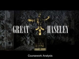
2. Q1. What are the forms and conventions of the medium genre you are working in?
Medium: Film Genre: Horror / Thriller
Narrative Editing
The whole of the film acts as a starting point for the film itself, we do not Transition between shots are quite smooth to not give away the hint that our
actually ever give a complete obvious answer to what is happening, for text is a thriller, but instead lull the audience into thinking that everything is
example one person who I interviewed after I had shown them our final cut happy. Until the climax of the opening to act as a shock.
of the opening scene actually said that they believed that the person who Titles and credits fade in and out slowly to also add to this.
was putting up the notice of the death in Great Haseley was predicting the The radio host in the beginning was in a older accent with some white noise
death because he was about to do it, and we did not actually have a set over the voice to establish early that it is not modern day, I also purchased a
ending so it can be interpreted by the audience in which way they like. melon and smashed it in order to create the sound effect of smashing a mans
head.
Camera work and various angles SFX
In our preliminary task we made the mistake of not actually sticking to the Our title comes over the cross on the alter that the victim was murdered in,
180 degree rule and instead kept altering our filming angles which made the along with the smashing of his head in the background. We used a grand
film very distracting and generally hard to watch! So in our final film we stuck font to show the church’s gothic style.
to the rule as much as we could but we didn’t actually have to do it in Our titles have shadows that are black or white so you can see what the title
between characters, as there was no dialogue. is saying if it is against a darker or lighter background.
We used match on match action a few times whilst editing, I can think of one We used a fade in and out to build up the calm before the climax where your
moment when we used it so that the audiences attention was not changing ideas of the production are changed
and helped us shorten a shot without bad continuity of starting a shot with
the subject in the middle of the area.
Sound Mise-en-scene
We added certain sounds in our film and included diegetic and non-diegetic During the scenes in the church we intentionally left the lights off to show
sound, for example we had “We’ll meet again” by Vera Lynn and this was the darkness of what is about to happen, and the darkness of the action that
Non-diegetic sound as the audience can hear it but the characters can not, is about to happen.
but it is still important to the setting as it shows what the time is, so it is not We intentionally had the protagonist show the least amount of character so
modern. We added Diegetic sound in the part when the man is hammering that the audience would not ever change their views on him.
the nail because it was a great sound and good overall effect on the mood as
it also added something else to the same-old tune of the music.
We also added a crackling effect of a white noise over the radio hosts voice
to show it is not in modern times but in an older time but still something the
audience can understand and relate to.
3. Q2. How does your social media product represent particular social groups?
Character Social group How represented? Conforms to Effect on audience
stereotype?
Cyclist Lower-middle class. We represent the cyclist in the We can see that he conforms Our desired effect on the
way he is in a rush for to the stereotype of being a audience was possibly
Male something, something we do working lower class boy making them feel for him in
Age 19 not know until the end, and because he is putting lots of the way that they could feel
Courier this shows someone relies on effort into reaching his bad for him, but up until the
him or has some power over destination. point when we see the
him. We thought of him as a He is also seen as venerable person he his delivering the
sort of victim but not in the because we can see he is letter to and why the
sense he was being murdered
anxious, and that it could audience should have no
but blackmailed, but we leave
conform to his age. opinion on him..
it to the audience to decide
Church worker Lower class He is represented as a He is shown as being a When he kills the man we
normal man at first, it may worker as he is doing manual want the audience to dislike
Male seem slightly odd that he is labour which conforms to his him, because they have no
Age 24 showing no emotion or pity class and then it gets opinion on him they can
Church worker or any feelings whilst putting confirmed when he kills the easily be convinced on the
this notice up on the church man, it is brutish since he type of person he is.
entrance. does it with a hammer, we Because he is not showing
When he kills the man he is did not know why the reason any emotions throughout we
represented as being a brute is but the manner he killed do not want the audience to
because he did it in a him conforms to his status. have an opinion on him until
malicious way (hammer) he is killing him
Murder victim Higher class He is represented as being He conforms to the The same as the murderer,
quite wealthy due to his stereotype of being wealthy the audience should have no
Male clothing, he seems to have as he owns a smart jacked opinion of him, he does not
Age 26 free time because he his and is not at work during the have much screen time and
City worker heading to the church out of time he is in the church , we does not effect the
service hours and probably his know it is a working day audience’s opinion on him,
own time. because all other characters he I not cared for until
As we do not show him much are working as this is murdered.
prior to his death the
happening
audience should not mind him
dying
4. Q3. What kind of media institutions might distribute your media product and why?
Media institutions Why
Hammer films, although a large film company might distribute our media
Hammer Films product for many reasons.
Hammer films specialises in horror films and our film categorises into that
genre, although it is not a science fiction horror like their general films used
to be (Mummies, vampires, Frankenstein etc.) it is still odd in the way we
challenge the conventions of the general run of the mill horror and instead
use a stranger setting than usual.
They may also distribute our product due to (as I touched on before) its
individuality, not many films focus on an idea so odd, we tried to add as
much mystery into our film as possible (The letter, why the church, the
reason for the murder) and we believe that it makes our film more desirable
As I said before, our film is very individual, we challenge the conventions of
Warp films regular cinema, but although this is true I believe that warp would actually
choose us for individuality not because they have not seen that much but
actually because it is a rather large independent film company and their
films are very strange and individual.
Warp films has no horror films but instead has very strange and charismatic
films like four lions, submarine and This is England ’86 and although none of
these films are horror films they are very individual and succeeded because
of that.
I believe that monkey inc. combines the best of both of hammer films and
Monkey inc. warp films due to the fact that hammer films focusses on horror films and
small independent indie films and monkeys inc. focusses on horror small
independent quite original films which is what I like to think our film will be
due to the fact that our film is not a very normal stereotypical film because
they all tend to be in the same date and time with similar plots.
Monkey inc. makes films that are quite interesting in a philisophical way
because they ask the question in the film monkey what people would be like
in an enclosed environment.
5. Q4. Who would be the audience for your media product?
Describe your target audience?
Our target audience can vary from the ages of 18 to the ages of 80 as the setting makes it both
interesting for both spectrums of the age group
Link to your medium and genre
Our opening scene had the target of being a horror (possibly thriller) film. As you can see on my
blog you can see the different versions of horror, sci-fi and thriller films that I had researched
which could be linked towards our piece and I also watched horror films to use similar
techniques. For example in the woman in black there is no dialogue but it is still scary to watch
which was inspiration for us to create a more successful horror film. Like in Alfred Hitchcock films
we used two story lines which combined at the end to make a crescendo of drama and made a
lasting impact on our audience, this was good because the pressure builds up and up until it
comes to this single point when it releases all of the tension of the scene and the audience into
one quick moment of climax. To show the idea of speeding up to increase tension we made
shorter and shorter cut until the end.
Evidence for this?
I carried out a questionnaire/survey on some people wanted to see before getting an idea of the plot
and also showed clips from some horror films to ask them what they like the most to put into a film by
us. We also did research on famous and good directors to see what techniques they used for us to
incorporate in ours.
6. Q5. How did you attract/address your audience
What research did you do to find what your target audience wanted?
We did a survey/questionnaire asking certain questions: How old they where, what gender they
are, their favourite horror movies and whether they like horror movies at all, and also what time
of day it should be filmed? The survey was very strange with the last question, people named all
the types of day, some said morning, some said mid-day some said afternoon/dusk and some
said middle of the night.
What decisions and revision did you make about form and content based on these findings?
we watched films of the same genre, like Alfred Hitchcock's film Phycho we used the effect of a
lot of non-diegetic music to add to our piece this adds tension even if it is not necessarily scary
music we tried to use it in a way that would make our piece gripping none the less.
Through our survey we found that people wanted a horror film and we had very mixed opinions
on what the people wanted the time of day to be so we filmed the climactic point in doors to
add an eerie effect and a nice mise-en-scene.
Where you successful in attracting your audience?
After we had filmed and edited to a final product we showed it to the same people we
interviewed earlier to ask what they think of the film, and we received a lot of positive feedback
and a few helpful criticisms like we had accidently written a typo and we had to re-render the
film and upload it but these criticisms helped us a lot in what we should/could be doing next
year. People also said that even though the music was happy it built suspense up well and that
the final shots which took place in the church where especially good.
7. Q6. What have you learnt about technologies from the process of constructing this
product?
Using the camera Using the editing software
Learning the various camera shots (close up, I learnt how to desaturate film so that I could
wide shot, over the shoulder, pan, low angle put the film in a gloomy sort of light because
just to name a few) we used this to make the way we filmed made the film too happy
dynamic frames and keep the audience and lively due to the bright colours.
interested throughout.
Learning the camera techniques (shot reverse How to overlay the text over the film to make
shot, 180 degree rule, match on match action credits and putting shadows behind them so
etc.) this helped in the way that we didn’t they would stand out more, also fading in and
distract the audience from the action. out of the titles.
Learning how to use the tripod so we wouldn’t I learnt how to keep continuity throughout was
have jittery film, we did encounter the difficult due to the amount of shots we took.
problem that the tripod would move whilst Trying and keep the film as short as possible
attempting to pan so we had to use another. seeing as the film had to be 2 minutes our
rough cut was closer to four.
We shot more than once per scene so that Using various transition techniques to make it
there was no continuity errors and that we smooth, like when we had to make a very long
could make the film better if we made any shot much shorter we used the centre of
mistakes in costume or not sticking to the attention in the last shot and started it from
setting, or anything else. there, and also fading in and out.
8. Q7. Looking back at your preliminary task, what do you feel you have learnt in the
progression from it to the full product?
Preliminary task Main task
In the preliminary film we tried to use a variety I believe that in our main task we looked at all
of shots and keep the recommended time the mistakes we had made in the preliminary
which we did not do very well, we tried to get task so that we would not make them in the
it to be thirty seconds but it ended up being final product, we found that our film did not
closer to one minute. We attempted to keep have continuity errors in it like it did in the
continuity throughout, but we did not succeed preliminary task, we had a few troubles having
to do that because we made a mistake when I the continuity be the same when in one scene
entered the room and showed the door the cyclist had his sleeves down but then he
opening twice, from different angles, and we had them up above his elbows next shot but
accidently used the same clip twice in different we managed to fix it when we went back to
parts. We had no set plan which made the reshoot it again. We had a set plan, but we
whole process very disorganised and we did changed the end part to make it more thrilling
not use a tripod which made the video very for the audience. We used a tripod in all of our
shaky, we wrote all of this down for later shots so the camera was not moving to almost
reference so we would not forget it in our final act as a god eye view (third person). In the
main task. Our editing was very minimal in the editing we used Sony Vegas 12.0 and learnt
preliminary task with the title screen being how to desaturate film, make an interesting
white text on a black background with no titles title, include credits throughout and add sound
in it either. to make the film overall far more interesting
than it would have been unedited.