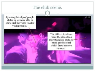
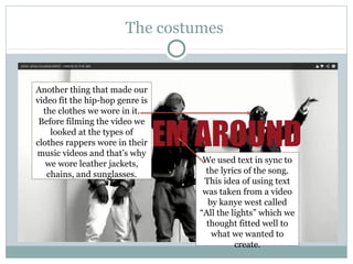
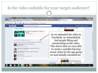
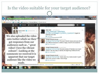
The document evaluates the effectiveness of combining a music product and ancillary tasks. It finds that:
1) The music video fulfilled its purpose of appealing to its target audience of 14-22 year olds through its bright colors, hip-hop genre, and inclusion of club scenes.
2) Feedback on social media showed the video was suitable for its intended young audience.
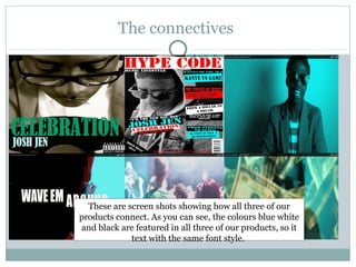
3) The prints and video connected through their use of the same black, white, and blue colors as well as the same font style for text.