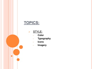
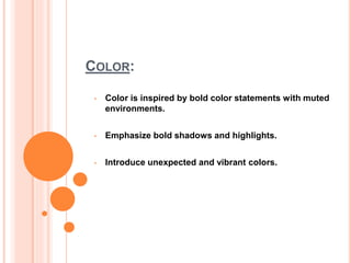
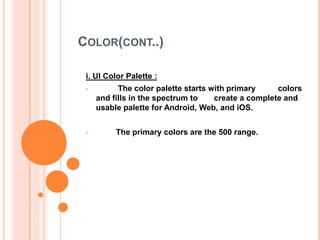
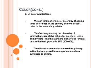
PRESENTING
• Momotaz Begum Panna
• 4th Year 1st Semester
PRESENTATION
ON
MATERIAL DESIGN
TOPICS:
 STYLE:
• Color
• Typography
• Icons
• Imagery
COLOR:
• Color is inspired by bold color statements with muted
environments.
• Emphasize bold shadows and highlights.
• Introduce unexpected and vibrant colors.
COLOR(CONT..)
Contents:
I. UI Color Palette
II. UI Color Application
III. Themes
COLOR(CONT..)
i. UI Color Palette :
• The color palette starts with primary colors
and fills in the spectrum to create a complete and
usable palette for Android, Web, and iOS.
• The primary colors are the 500 range.
COLOR(CONT..)
ii. UI Color Application :
• We can limit our choice of colors by choosing
three color hues in the primary and one accent
color in the secondary palette.
• To effectively convey the hierarchy of
information, use alpha values for grey text, icons,
and dividers , like the standard alpha value for text
on a white background is 87% (#000000).
• The vibrant accent color are used for primary
action buttons as well as components such as
switchers or sliders.
COLOR(CONT..)
iii. Themes
• Themes are a way to apply a consistent tone to
an app. The style specifies the darkness of the
surfaces, level of shadow, and appropriate opacity
of ink elements.
TYPOGRAPHY
• The Android design language relies on
traditional typographic tools such as scale,
space, rhythm, and alignment with an
underlying grid.
• Successful deployment of these tools is
essential to help users quickly understand
a screen of information.
Contents:
i . Roboto
ii. Standard Styles
TYPOGRAPHY(CONT..)
i. Roboto :
• To support such typography, Ice Cream Sandwich
introduced a new type family named Roboto ,
created specifically for the requirements of UI and
high-resolution screens.
• Roboto has been the standard typeface for
Android. In this version, Roboto has been refined
extensively to work across the wider set of
supported platforms.
ii. Standard Styles :
• Too many type sizes and styles at once can wreck
any layout. A typographic scale is a limited set of
type sizes that work well together, along with the
layout grid.
TYPOGRAPHY(CONT..)
ii. Standard Styles :(cont..)
• Text should maintain a minimum contrast ratio of at
least 4.5:1 for legibility.
• Type sizes are specified with SP ( scaleable pixels).
• Dynamic type sizes enable large type in cases
where the length of the text in a layout is unknown.
Dynamic sizes are selected from a typographic
scale based on available space and letter size
estimates.
• There should have around 60 characters per line if
we want a good reading experience
ICONS:
Contents:
i . System Icons
ICONS(CONT..)
i.System Icons:
• A system icon, or UI icon, symbolizes a command,
file, device, or directory.
• Shapes of icons are bold and geometric in
execution.
• Two sets of shapes with varying sizes are available
for icons in our app: The Status Bar and Contextual
Icon set and the Action Bar and Desktop icon set.
• A play on round corner and sharp corners can be
applied to square and rectangular shapes that have
a protrusion or indentation. All stroked icons have
sharp corners.
ICONS(CONT..)
• i.System Icons:(cont..)
• Consistency is important. Use the existing system
icons whenever possible and across different apps.
• Icons are nestled in the 24 dps bounding box
determined by the grid.
IMAGERY
• In material design, imagery—whether illustration or
photography—is constructed but never contrived,
magical but never overproduced.
• The principles of imagery support the goal of
purposeful, thoughtful, beautiful UIs.
Contents:
I. Principles
II. Best Practices
III. UI Integration
IMAGERY(CONT…)
i.Principles:
• When using illustration and photography to enhance
the user experience, choose images that express
personal relevance, information and delight.
• Incorporate logic to ensure images are dynamic,
context-intelligent, and context-relevant.
ii.Best Practices:
• Both illustration and photography can live within the
same product.
• Photography automatically implies a degree of
specificity and should be used to showcase specific
entities and stories.
• Illustration is effective for representing concepts and
metaphors where specific photography might be
alienating.
IMAGERY(CONT…)
ii.Best Practices:(cont..)
• Create an immersive story and a sense of context.
• Maintain the original integrity of the image. Don’t
apply heavy filters or gaussian blurs to imagery,
especially when trying to hide degradation.
IMAGERY(CONT…)
iii.UI Integration:
• Make sure our images are appropriately sized for
their containers and across platforms.
• To make typography legible on imagery, add text
protection scrims.
• Hero images are images that are usually anchored
in a prominent position, above the fold, such as a
banner at the top of the screen.
• Gallery images are bold visual hero images within
homogeneous layouts in either a grid or as a single
image.
THANK YOU ALL

Material Design on Goolge material desing

  • 1.
    PRESENTING • Momotaz BegumPanna • 4th Year 1st Semester
  • 2.
  • 3.
    TOPICS:  STYLE: • Color •Typography • Icons • Imagery
  • 4.
    COLOR: • Color isinspired by bold color statements with muted environments. • Emphasize bold shadows and highlights. • Introduce unexpected and vibrant colors.
  • 5.
    COLOR(CONT..) Contents: I. UI ColorPalette II. UI Color Application III. Themes
  • 6.
    COLOR(CONT..) i. UI ColorPalette : • The color palette starts with primary colors and fills in the spectrum to create a complete and usable palette for Android, Web, and iOS. • The primary colors are the 500 range.
  • 7.
    COLOR(CONT..) ii. UI ColorApplication : • We can limit our choice of colors by choosing three color hues in the primary and one accent color in the secondary palette. • To effectively convey the hierarchy of information, use alpha values for grey text, icons, and dividers , like the standard alpha value for text on a white background is 87% (#000000). • The vibrant accent color are used for primary action buttons as well as components such as switchers or sliders.
  • 8.
    COLOR(CONT..) iii. Themes • Themesare a way to apply a consistent tone to an app. The style specifies the darkness of the surfaces, level of shadow, and appropriate opacity of ink elements.
  • 9.
    TYPOGRAPHY • The Androiddesign language relies on traditional typographic tools such as scale, space, rhythm, and alignment with an underlying grid. • Successful deployment of these tools is essential to help users quickly understand a screen of information. Contents: i . Roboto ii. Standard Styles
  • 10.
    TYPOGRAPHY(CONT..) i. Roboto : •To support such typography, Ice Cream Sandwich introduced a new type family named Roboto , created specifically for the requirements of UI and high-resolution screens. • Roboto has been the standard typeface for Android. In this version, Roboto has been refined extensively to work across the wider set of supported platforms. ii. Standard Styles : • Too many type sizes and styles at once can wreck any layout. A typographic scale is a limited set of type sizes that work well together, along with the layout grid.
  • 11.
    TYPOGRAPHY(CONT..) ii. Standard Styles:(cont..) • Text should maintain a minimum contrast ratio of at least 4.5:1 for legibility. • Type sizes are specified with SP ( scaleable pixels). • Dynamic type sizes enable large type in cases where the length of the text in a layout is unknown. Dynamic sizes are selected from a typographic scale based on available space and letter size estimates. • There should have around 60 characters per line if we want a good reading experience
  • 12.
  • 13.
    ICONS(CONT..) i.System Icons: • Asystem icon, or UI icon, symbolizes a command, file, device, or directory. • Shapes of icons are bold and geometric in execution. • Two sets of shapes with varying sizes are available for icons in our app: The Status Bar and Contextual Icon set and the Action Bar and Desktop icon set. • A play on round corner and sharp corners can be applied to square and rectangular shapes that have a protrusion or indentation. All stroked icons have sharp corners.
  • 14.
    ICONS(CONT..) • i.System Icons:(cont..) •Consistency is important. Use the existing system icons whenever possible and across different apps. • Icons are nestled in the 24 dps bounding box determined by the grid.
  • 15.
    IMAGERY • In materialdesign, imagery—whether illustration or photography—is constructed but never contrived, magical but never overproduced. • The principles of imagery support the goal of purposeful, thoughtful, beautiful UIs. Contents: I. Principles II. Best Practices III. UI Integration
  • 16.
    IMAGERY(CONT…) i.Principles: • When usingillustration and photography to enhance the user experience, choose images that express personal relevance, information and delight. • Incorporate logic to ensure images are dynamic, context-intelligent, and context-relevant. ii.Best Practices: • Both illustration and photography can live within the same product. • Photography automatically implies a degree of specificity and should be used to showcase specific entities and stories. • Illustration is effective for representing concepts and metaphors where specific photography might be alienating.
  • 17.
    IMAGERY(CONT…) ii.Best Practices:(cont..) • Createan immersive story and a sense of context. • Maintain the original integrity of the image. Don’t apply heavy filters or gaussian blurs to imagery, especially when trying to hide degradation.
  • 18.
    IMAGERY(CONT…) iii.UI Integration: • Makesure our images are appropriately sized for their containers and across platforms. • To make typography legible on imagery, add text protection scrims. • Hero images are images that are usually anchored in a prominent position, above the fold, such as a banner at the top of the screen. • Gallery images are bold visual hero images within homogeneous layouts in either a grid or as a single image.
  • 19.