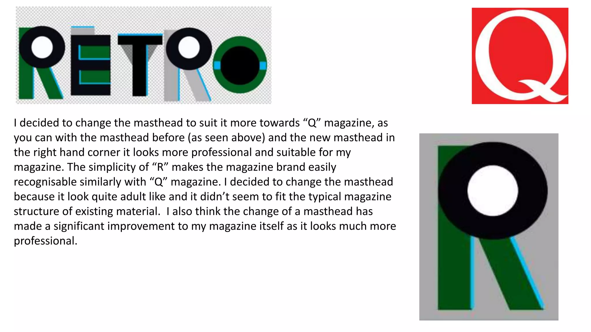
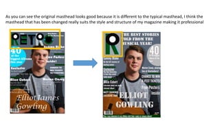
The author changed their magazine's masthead from an "R" to a "Q" to make it look more like the well-known Q magazine and seem more professional. They felt the original masthead looked too adult-like and didn't fit the typical magazine structure. The new masthead with the "Q" is simpler, more easily recognizable as the magazine's brand, and significantly improves the professional look of the magazine overall.