Masthead analysis
•Download as PPTX, PDF•
0 likes•23 views
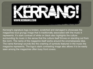
Kerrang! magazine's signature logo features a broken and scratched design to represent the loud and grungy image of the music it covers. Its stark white on black contrast highlights how the culture surrounding this music stands out from the norm. The onomatopoeic name Kerrang! and logo's high-contrast style make it easily visible among the magazine's busy covers by evoking the crashing of symbols in the featured music.
Report
Share
Report
Share
Recommended
Ancillary task taylor swift 
The front cover of Taylor Swift's 1989 album depicts faded polaroid-style images of the artist to create a retro, vintage aesthetic. Her face is partially cut off, contrasting her fame. The inside continues this theme with pastel colors and handwritten font, making it seem personal. It includes lyrics and more polaroid photos of Swift to give insight into the album's songs. The back cover and CD also use the polaroid and handwritten styles to maintain continuity and enhance the idea of "old fashioned" technology throughout the packaging.
Ancillary task calvin harris
The album cover for Calvin Harris' album "i created a disco" follows a disco theme with bright yellow and black colors. The yellow casing is eye-catching and links to the energetic, lively dance music featured on the album. The front cover prominently displays Calvin Harris' face wearing funky glasses to portray a disco image. The back cover continues the theme with angled track listing and includes typical legal information. The CD disk also uses the yellow and black color scheme to tie the design together cohesively.
Emma Hudson: Ancillary task Digi-paks
The document provides details about several album covers and digipaks. It analyzes the Rihanna album covers "Loud" and "Unapologetic", discussing visual elements like imagery, colors, typography and how they relate to the themes of the albums. It also summarizes the Alicia Keys album "The Diary of Alicia Keys", noting the prominence of the piano and how it connects to her music. Finally, it analyzes details of the Drake album "Nothing Was the Same" like the blue color scheme and imagery of a child meant to represent Drake's growth as an artist.
Ancillary task calvin harris
The album cover for Calvin Harris' album "i created a disco" follows a disco theme with bright yellow and black colors. The front cover features a close-up of Calvin Harris wearing funky glasses to fit the disco image. The track listing on the back cover is written diagonally to stand out. The CD disk continues the yellow and black color scheme with Calvin Harris' name in a large, bold font to catch the audience's attention.
Iconography – the killers
The document analyzes and compares several images representing the band The Killers to understand their evolving iconography and style. The album covers show contrasting images that suggest an abstract musical style and themes that blend cheerful and gloomy topics. Fan art of the band is colorful but lacks consistency. Concert posters establish the band's logo and black-and-white schemes as recognizable traits, while their unconventional depiction in a boxing context reinforces their unpredictability as a group that supports each other.
Indie iconography (a-level media)
- The document discusses various album covers and logos for indie bands such as Arctic Monkeys, The Kooks, and The Killers.
- It notes similarities between the covers such as striking colors like reds and blacks, and peculiar images.
- It also analyzes different font styles and which would be most suitable for The Kooks band logo, concluding that a "kooky" font best captures the band's quirky character.
Magazine Analysis
This document provides an analysis of magazine advertisements for various music albums and bands. It examines elements like font, album art, logos, and additional information included for several examples. Key aspects discussed include the use of thirds to divide content, prominence of the band or album name, minimalist versus colorful designs, quotes and images featured, and how conventions are both followed and subverted in different ads. Analysis also covers meanings potentially conveyed by design choices and how strategies like these viral ads build anticipation for Daft Punk's return and tour.
Anaysis of digipak
The digipak features a medium close-up of Lana's face displaying her vintage style which has become recognizable to her target audience. On the front cover, a soft filter is used to reflect the link between her artistic image and music. The back cover uses bold red and white colors that could represent the powerful emotions in her song lyrics, and lists the track titles in a simple font consistent with the overall minimal design. Roses placed on a white background on the CD may symbolize themes of pure, innocent love explored in her songs.
Recommended
Ancillary task taylor swift
The front cover of Taylor Swift's 1989 album depicts faded polaroid-style images of the artist to create a retro, vintage aesthetic. Her face is partially cut off, contrasting her fame. The inside continues this theme with pastel colors and handwritten font, making it seem personal. It includes lyrics and more polaroid photos of Swift to give insight into the album's songs. The back cover and CD also use the polaroid and handwritten styles to maintain continuity and enhance the idea of "old fashioned" technology throughout the packaging.
Ancillary task calvin harris
The album cover for Calvin Harris' album "i created a disco" follows a disco theme with bright yellow and black colors. The yellow casing is eye-catching and links to the energetic, lively dance music featured on the album. The front cover prominently displays Calvin Harris' face wearing funky glasses to portray a disco image. The back cover continues the theme with angled track listing and includes typical legal information. The CD disk also uses the yellow and black color scheme to tie the design together cohesively.
Emma Hudson: Ancillary task Digi-paks
The document provides details about several album covers and digipaks. It analyzes the Rihanna album covers "Loud" and "Unapologetic", discussing visual elements like imagery, colors, typography and how they relate to the themes of the albums. It also summarizes the Alicia Keys album "The Diary of Alicia Keys", noting the prominence of the piano and how it connects to her music. Finally, it analyzes details of the Drake album "Nothing Was the Same" like the blue color scheme and imagery of a child meant to represent Drake's growth as an artist.
Ancillary task calvin harris
The album cover for Calvin Harris' album "i created a disco" follows a disco theme with bright yellow and black colors. The front cover features a close-up of Calvin Harris wearing funky glasses to fit the disco image. The track listing on the back cover is written diagonally to stand out. The CD disk continues the yellow and black color scheme with Calvin Harris' name in a large, bold font to catch the audience's attention.
Iconography – the killers
The document analyzes and compares several images representing the band The Killers to understand their evolving iconography and style. The album covers show contrasting images that suggest an abstract musical style and themes that blend cheerful and gloomy topics. Fan art of the band is colorful but lacks consistency. Concert posters establish the band's logo and black-and-white schemes as recognizable traits, while their unconventional depiction in a boxing context reinforces their unpredictability as a group that supports each other.
Indie iconography (a-level media)
- The document discusses various album covers and logos for indie bands such as Arctic Monkeys, The Kooks, and The Killers.
- It notes similarities between the covers such as striking colors like reds and blacks, and peculiar images.
- It also analyzes different font styles and which would be most suitable for The Kooks band logo, concluding that a "kooky" font best captures the band's quirky character.
Magazine Analysis
This document provides an analysis of magazine advertisements for various music albums and bands. It examines elements like font, album art, logos, and additional information included for several examples. Key aspects discussed include the use of thirds to divide content, prominence of the band or album name, minimalist versus colorful designs, quotes and images featured, and how conventions are both followed and subverted in different ads. Analysis also covers meanings potentially conveyed by design choices and how strategies like these viral ads build anticipation for Daft Punk's return and tour.
Anaysis of digipak
The digipak features a medium close-up of Lana's face displaying her vintage style which has become recognizable to her target audience. On the front cover, a soft filter is used to reflect the link between her artistic image and music. The back cover uses bold red and white colors that could represent the powerful emotions in her song lyrics, and lists the track titles in a simple font consistent with the overall minimal design. Roses placed on a white background on the CD may symbolize themes of pure, innocent love explored in her songs.
Digipak Analysis
The document analyzes and summarizes the digipak designs of three albums: Bastille's "Bad Blood", Fall Out Boy's "Save Rock and Roll", and Foxes' "Glorious". For Bastille's album, the front cover features the lead singer running away from a car, implying a storyline. The design has a cinematic feel reflecting indie conventions. Fall Out Boy's cover shows a "punk and monk" holding hands, representing tradition and change clashing. The design appeals to alternative fans through its rough styling. Foxes' debut album focuses on her image on the front with a simple yet feminine design, implying vulnerability and relatability to target a female audience.
Digipak Analyses
Charli XCX's album cover features her name and the album title in bold font against a white background, introducing her in a confident statement. The image of Charli is fused with a galaxy pattern that relates to her electro-pop genre. PVRIS uses a black and white color scheme throughout their media that features a simple mirror image on their debut album cover. Lights' album cover depicts her in a cartoon-like image that relates to her dreamy pop style, with her name in a contrasting yellow font.
Textual analysis of magazine adverts
1) Magazine advertisements are a popular way for artists to promote their albums using conventional portrait images and information like the album title and release date placed at the bottom.
2) Ads typically use the album cover image to associate the advertisement with the album. Additional details like song titles can further entice audiences.
3) Visual elements in ads like colors, fonts, and imagery aim to represent the theme or style of the album to attract particular audiences. Consistency between the ad and album packaging helps recognition.
Textual Analysis of Magazine Adverts
1) Magazine advertisements are a popular way for artists to promote their albums using conventional portrait images and information like the album title and release date placed at the bottom.
2) Ads typically use the album cover image to associate the advertisement with the album. Additional details like song titles can further entice audiences.
3) Visual elements in ads like colors, fonts, and imagery aim to represent the theme or style of the album to attract particular audiences. Consistency between the ad and album packaging helps recognition.
Final Digipak Outcome
The document discusses two template designs for a band's album digipak. Template 1 uses pastel colors and geometric patterns to portray a mature, classic style. It features overlapping triangles on the inside representing the band's unity. Template 2 is monochromatic with hints of purple. It features a group shot showing the band's individuality and unity. Film strips alternate between band members to give them equal representation. The inside links the band members with complexly interlinking triangles. Both designs aim to portray the band's professionalism and maturity through classic, traditional visual styles.
Digipack and advertising
The document analyzes the packaging and advertising for a Nathaniel Rateliff album. The digipak cover focuses on Rateliff's image to identify him as the main singer and imply a rock genre. Dark colors suggest rock and soul elements, while brightness implies light-hearted music. Small font for the artist name emphasizes the songs over the band. The back continues dark colors and focuses on the songs, not promoting the band itself. The advertising poster shows the full band in rock and country-style clothing with bold text and Rateliff centered to identify him and catch the reader's eye.
Digipak Analysis
The digipak cover for a Libertines album features a medium shot of two band members, one making direct eye contact with the camera. This creates intimacy between the artist and viewer. The band's name appears in a consistent font used across their albums. The CD disc keeps things simple with the band name and copyright information in white text on black. It lacks additional design elements found on most discs. The back cover contrasts with brighter colors and a group photo of all four band members, reinforcing the band as a unit. It includes the track list again and a barcode in an uncommon top-right position. Overall, the covers emphasize the relationship between the artists and consumers through consistent imagery and fonts.
Band Logo
The band logo must be unique, meaningful to the band, and clearly represent their brand image and genre of music. The font is gothic with an unusual "S" making it distinctive and easily recognizable. The colors of white, light grey, and subtle blue tie into the band's video and reflect that their messages have ulterior motives beneath the surface. The cracked stone texture reinforces the heavy genre while also implying the band feels society is shattered or they have been cracked by society.
Music profile
The document discusses clothing, accessories, and the website of a band. It describes t-shirts advertising the band's recent album with a modified album cover design. The accessories section sells miscellaneous items to attract different audiences beyond the band's genre, such as key rings and badges. The website has a basic black and dark orange color scheme representing the band's dark mood, which is a slight difference from their folky genre. The colors and basic informative design show the essence of the band and their music.
CD Cover Textual Analysis
This document analyzes and compares the album covers of four popular artists - Adele, Rihanna, Metallica, and Eminem. It discusses how each artist's album covers reflect the style of music they create through use of color, imagery, typography, and motifs. Adele's covers portray her as melancholy and pensive, matching her slow songs. Rihanna's covers use vibrant colors that contrast with Adele's and represent her louder music. Metallica's covers feature ominous symbols like crosses and fire to depict their heavy metal genre. Eminem's covers show him alone on journeys, connecting to the personal nature of his lyrics. Common motifs across each artist's covers help fans recognize their
Lana del ray digipak
The document analyzes the digipack for Lana Del Rey's album "Born to Die". It discusses each element of the packaging including the front cover photo of Del Rey, the retro aesthetic and color scheme carried throughout. The back cover highlights the song titles and exclusives. Inside are bonus photos of Del Rey and lyrics pages conveying the melancholy themes through imagery like splattered blood. The CD itself features roses to symbolize the album's passionate yet dark sound.
Digipak
Paramore released their second album "Riot" in 2007 featuring hit songs like "Misery Business" and "CrushCrushCrush". The album cover depicts the band in a cartoon-like, black-and-white style from above, reflecting the album's punk theme. Text on the cover including the album title is in a bold, capitalized handwritten font to emphasize the idea of a riot. The CD and back cover continue this theme through repetition of the word "riot" and a similar black-and-white aesthetic.
Media Studies: Cavalier Youth Digipak Analysis
This document analyzes the design elements of the digipak for the album "Cavalier Youth" by the band You Me At Six. Key elements discussed include the placement of the barcode, the band's name and logo displayed prominently on the front and spine for branding purposes. Inside, photos from recording sessions in LA give fans insight into the album's production. Design choices like the lighter color scheme and simpler track listing reflect the band's maturation compared to past albums.
Mastheads
The document defines a masthead as the title of a newspaper or magazine at the head of the first or editorial page. It then provides examples and brief descriptions of the mastheads for several publications, including NME (New Musical Express), Q Magazine, Kerrang!, and Billboard. The descriptions note design elements like fonts, colors, shapes, and symbols used in each masthead and how those elements relate to the target audience and content of the respective publication.
Analysis of Logos
This logo for the band Queen features images that symbolize royalty like a crown, lions, and a phoenix to emphasize the powerful connotation of the band's name. The word "Queen" is capitalized and in red text, further linking it to notions of royalty, dominance, and power. However, there is also a juxtaposition since the lion is called the "king of the jungle," contrasting with the band's title of "Queen." The unconventional use of color also stands out compared to typical rock genre logos.
Digital digipack draft
The document discusses digital draft designs for various parts of an album package, including the back cover, CD design, inside cover, and poster. Key details include using consistent fonts and photos from a photoshoot to tie the designs together visually and reinforce the band's identity. Feedback is provided on elements that could be improved, such as adding more content to the poster draft and using lighter colors in the back cover design. The goal is to create a cohesive album package that effectively promotes the band and their new music.
Digipak 2
The document analyzes and summarizes the album artwork for Paramore's "Riot" album and The Script's "Science and Faith" album. For Paramore's album, the typography and imagery emphasize themes of danger, darkness, and rebellion. The artwork ties the album, CD, and back cover together through a consistent style. For The Script's album, the front cover features the band members and simple logo/typography, while the back cover has a differing religious theme. Imagery throughout ties to the album's title alluding to its themes.
Analysis of Digipak Advert 1: Rihanna - Rated R
The advertisement summarizes key information about Rihanna's album "Rated R" in 3 sentences:
The advertisement features Rihanna's name, logo, and image prominently displayed to act as branding and draw attention. It also lists two popular songs from the album to entice audiences and provide a preview of the album's style. The dark color scheme and title "Rated R" are meant to suggest a dangerous and mysterious tone for the album.
Analysis of digipaks
This document analyzes the digipak for Rihanna's album "Loud". It describes the digipak as having folding panels and plastic holders for the disc. The front features a close-up photo of Rihanna with bold red hair and lipstick, looking down to convey shyness. Inside artwork depicts Rihanna lying among red roses, giving a fairytale setting despite some risque song lyrics. Red roses symbolize love, relating to songs about relationships. The bold red color and spaced lettering of the title imply the "Loud" aspect. Overall the digipak uses symbols of love and innocence to tell a narrative and represent the album's themes through visual imagery and design elements.
美洲杯买球-美洲杯买球下注平台-美洲杯买球投注平台|【网址🎉ac55.net🎉】
【网址🎉ac55.net🎉】美洲杯买球是爱尔兰的博彩公司,成立于1988年,位于爱尔兰的都柏林。美洲杯买球通过在爱尔兰和英国的一系列持牌博彩商店以及经营爱尔兰最大的电话博彩服务来开展业务。在互联网上,美洲杯买球提供体育博彩,在线扑克,在线宾果游戏,在线赌场和在线游戏。
一比一原版英国伦敦南岸大学毕业证(LSBU学位证)如何办理
原件一模一样【微信:WP101A】【英国伦敦南岸大学毕业证(LSBU学位证)学位证)成绩单】【微信:WP101A】(留信学历认证永久存档查询)采用学校原版纸张、特殊工艺完全按照原版一比一制作(包括:隐形水印,阴影底纹,钢印LOGO烫金烫银,LOGO烫金烫银复合重叠,文字图案浮雕,激光镭射,紫外荧光,温感,复印防伪)行业标杆!精益求精,诚心合作,真诚制作!多年品质 ,按需精细制作,24小时接单,全套进口原装设备,十五年致力于帮助留学生解决难题,业务范围有加拿大、英国、澳洲、韩国、美国、新加坡,新西兰等学历材料,包您满意。
【业务选择办理准则】
一、工作未确定,回国需先给父母、亲戚朋友看下文凭的情况,办理一份就读学校的毕业证【微信:WP101A】文凭即可
二、回国进私企、外企、自己做生意的情况,这些单位是不查询毕业证真伪的,而且国内没有渠道去查询国外文凭的真假,也不需要提供真实教育部认证。鉴于此,办理一份毕业证【微信:WP101A】即可
三、进国企,银行,事业单位,考公务员等等,这些单位是必需要提供真实教育部认证的,办理教育部认证所需资料众多且烦琐,所有材料您都必须提供原件,我们凭借丰富的经验,快捷的绿色通道帮您快速整合材料,让您少走弯路。
留信网认证的作用:
1:该专业认证可证明留学生真实身份【微信:WP101A】
2:同时对留学生所学专业登记给予评定
3:国家专业人才认证中心颁发入库证书
4:这个认证书并且可以归档倒地方
5:凡事获得留信网入网的信息将会逐步更新到个人身份内,将在公安局网内查询个人身份证信息后,同步读取人才网入库信息
6:个人职称评审加20分
7:个人信誉贷款加10分
8:在国家人才网主办的国家网络招聘大会中纳入资料,供国家高端企业选择人才
→ 【关于价格问题(保证一手价格)
我们所定的价格是非常合理的,而且我们现在做得单子大多数都是代理和回头客户介绍的所以一般现在有新的单子 我给客户的都是第一手的代理价格,因为我想坦诚对待大家 不想跟大家在价格方面浪费时间
对于老客户或者被老客户介绍过来的朋友,我们都会适当给一些优惠。
选择实体注册公司办理,更放心,更安全!我们的承诺:可来公司面谈,可签订合同,会陪同客户一起到教育部认证窗口递交认证材料,客户在教育部官方认证查询网站查询到认证通过结果后付款,不成功不收费!
办理英国伦敦南岸大学毕业证(LSBU学位证)学位证)学位证【微信:WP101A 】外观非常精致,由特殊纸质材料制成,上面印有校徽、校名、毕业生姓名、专业等信息。
办理英国伦敦南岸大学毕业证(LSBU学位证)学位证)学位证【微信:WP101A 】格式相对统一,各专业都有相应的模板。通常包括以下部分:
校徽:象征着学校的荣誉和传承。
校名:学校英文全称
授予学位:本部分将注明获得的具体学位名称。
毕业生姓名:这是最重要的信息之一,标志着该证书是由特定人员获得的。
颁发日期:这是毕业正式生效的时间,也代表着毕业生学业的结束。
其他信息:根据不同的专业和学位,可能会有一些特定的信息或章节。
办理英国伦敦南岸大学毕业证(LSBU学位证)学位证)学位证【微信:WP101A 】价值很高,需要妥善保管。一般来说,应放置在安全、干燥、防潮的地方,避免长时间暴露在阳光下。如需使用,最好使用复印件而不是原件,以免丢失。
综上所述,办理英国伦敦南岸大学毕业证(LSBU学位证)学位证)学位证【微信:WP101A 】是证明身份和学历的高价值文件。外观简单庄重,格式统一,包括重要的个人信息和发布日期。对持有人来说,妥善保管是非常重要的。
More Related Content
What's hot
Digipak Analysis
The document analyzes and summarizes the digipak designs of three albums: Bastille's "Bad Blood", Fall Out Boy's "Save Rock and Roll", and Foxes' "Glorious". For Bastille's album, the front cover features the lead singer running away from a car, implying a storyline. The design has a cinematic feel reflecting indie conventions. Fall Out Boy's cover shows a "punk and monk" holding hands, representing tradition and change clashing. The design appeals to alternative fans through its rough styling. Foxes' debut album focuses on her image on the front with a simple yet feminine design, implying vulnerability and relatability to target a female audience.
Digipak Analyses
Charli XCX's album cover features her name and the album title in bold font against a white background, introducing her in a confident statement. The image of Charli is fused with a galaxy pattern that relates to her electro-pop genre. PVRIS uses a black and white color scheme throughout their media that features a simple mirror image on their debut album cover. Lights' album cover depicts her in a cartoon-like image that relates to her dreamy pop style, with her name in a contrasting yellow font.
Textual analysis of magazine adverts
1) Magazine advertisements are a popular way for artists to promote their albums using conventional portrait images and information like the album title and release date placed at the bottom.
2) Ads typically use the album cover image to associate the advertisement with the album. Additional details like song titles can further entice audiences.
3) Visual elements in ads like colors, fonts, and imagery aim to represent the theme or style of the album to attract particular audiences. Consistency between the ad and album packaging helps recognition.
Textual Analysis of Magazine Adverts
1) Magazine advertisements are a popular way for artists to promote their albums using conventional portrait images and information like the album title and release date placed at the bottom.
2) Ads typically use the album cover image to associate the advertisement with the album. Additional details like song titles can further entice audiences.
3) Visual elements in ads like colors, fonts, and imagery aim to represent the theme or style of the album to attract particular audiences. Consistency between the ad and album packaging helps recognition.
Final Digipak Outcome
The document discusses two template designs for a band's album digipak. Template 1 uses pastel colors and geometric patterns to portray a mature, classic style. It features overlapping triangles on the inside representing the band's unity. Template 2 is monochromatic with hints of purple. It features a group shot showing the band's individuality and unity. Film strips alternate between band members to give them equal representation. The inside links the band members with complexly interlinking triangles. Both designs aim to portray the band's professionalism and maturity through classic, traditional visual styles.
Digipack and advertising
The document analyzes the packaging and advertising for a Nathaniel Rateliff album. The digipak cover focuses on Rateliff's image to identify him as the main singer and imply a rock genre. Dark colors suggest rock and soul elements, while brightness implies light-hearted music. Small font for the artist name emphasizes the songs over the band. The back continues dark colors and focuses on the songs, not promoting the band itself. The advertising poster shows the full band in rock and country-style clothing with bold text and Rateliff centered to identify him and catch the reader's eye.
Digipak Analysis
The digipak cover for a Libertines album features a medium shot of two band members, one making direct eye contact with the camera. This creates intimacy between the artist and viewer. The band's name appears in a consistent font used across their albums. The CD disc keeps things simple with the band name and copyright information in white text on black. It lacks additional design elements found on most discs. The back cover contrasts with brighter colors and a group photo of all four band members, reinforcing the band as a unit. It includes the track list again and a barcode in an uncommon top-right position. Overall, the covers emphasize the relationship between the artists and consumers through consistent imagery and fonts.
Band Logo
The band logo must be unique, meaningful to the band, and clearly represent their brand image and genre of music. The font is gothic with an unusual "S" making it distinctive and easily recognizable. The colors of white, light grey, and subtle blue tie into the band's video and reflect that their messages have ulterior motives beneath the surface. The cracked stone texture reinforces the heavy genre while also implying the band feels society is shattered or they have been cracked by society.
Music profile
The document discusses clothing, accessories, and the website of a band. It describes t-shirts advertising the band's recent album with a modified album cover design. The accessories section sells miscellaneous items to attract different audiences beyond the band's genre, such as key rings and badges. The website has a basic black and dark orange color scheme representing the band's dark mood, which is a slight difference from their folky genre. The colors and basic informative design show the essence of the band and their music.
CD Cover Textual Analysis
This document analyzes and compares the album covers of four popular artists - Adele, Rihanna, Metallica, and Eminem. It discusses how each artist's album covers reflect the style of music they create through use of color, imagery, typography, and motifs. Adele's covers portray her as melancholy and pensive, matching her slow songs. Rihanna's covers use vibrant colors that contrast with Adele's and represent her louder music. Metallica's covers feature ominous symbols like crosses and fire to depict their heavy metal genre. Eminem's covers show him alone on journeys, connecting to the personal nature of his lyrics. Common motifs across each artist's covers help fans recognize their
Lana del ray digipak
The document analyzes the digipack for Lana Del Rey's album "Born to Die". It discusses each element of the packaging including the front cover photo of Del Rey, the retro aesthetic and color scheme carried throughout. The back cover highlights the song titles and exclusives. Inside are bonus photos of Del Rey and lyrics pages conveying the melancholy themes through imagery like splattered blood. The CD itself features roses to symbolize the album's passionate yet dark sound.
Digipak
Paramore released their second album "Riot" in 2007 featuring hit songs like "Misery Business" and "CrushCrushCrush". The album cover depicts the band in a cartoon-like, black-and-white style from above, reflecting the album's punk theme. Text on the cover including the album title is in a bold, capitalized handwritten font to emphasize the idea of a riot. The CD and back cover continue this theme through repetition of the word "riot" and a similar black-and-white aesthetic.
Media Studies: Cavalier Youth Digipak Analysis
This document analyzes the design elements of the digipak for the album "Cavalier Youth" by the band You Me At Six. Key elements discussed include the placement of the barcode, the band's name and logo displayed prominently on the front and spine for branding purposes. Inside, photos from recording sessions in LA give fans insight into the album's production. Design choices like the lighter color scheme and simpler track listing reflect the band's maturation compared to past albums.
Mastheads
The document defines a masthead as the title of a newspaper or magazine at the head of the first or editorial page. It then provides examples and brief descriptions of the mastheads for several publications, including NME (New Musical Express), Q Magazine, Kerrang!, and Billboard. The descriptions note design elements like fonts, colors, shapes, and symbols used in each masthead and how those elements relate to the target audience and content of the respective publication.
Analysis of Logos
This logo for the band Queen features images that symbolize royalty like a crown, lions, and a phoenix to emphasize the powerful connotation of the band's name. The word "Queen" is capitalized and in red text, further linking it to notions of royalty, dominance, and power. However, there is also a juxtaposition since the lion is called the "king of the jungle," contrasting with the band's title of "Queen." The unconventional use of color also stands out compared to typical rock genre logos.
Digital digipack draft
The document discusses digital draft designs for various parts of an album package, including the back cover, CD design, inside cover, and poster. Key details include using consistent fonts and photos from a photoshoot to tie the designs together visually and reinforce the band's identity. Feedback is provided on elements that could be improved, such as adding more content to the poster draft and using lighter colors in the back cover design. The goal is to create a cohesive album package that effectively promotes the band and their new music.
Digipak 2
The document analyzes and summarizes the album artwork for Paramore's "Riot" album and The Script's "Science and Faith" album. For Paramore's album, the typography and imagery emphasize themes of danger, darkness, and rebellion. The artwork ties the album, CD, and back cover together through a consistent style. For The Script's album, the front cover features the band members and simple logo/typography, while the back cover has a differing religious theme. Imagery throughout ties to the album's title alluding to its themes.
Analysis of Digipak Advert 1: Rihanna - Rated R
The advertisement summarizes key information about Rihanna's album "Rated R" in 3 sentences:
The advertisement features Rihanna's name, logo, and image prominently displayed to act as branding and draw attention. It also lists two popular songs from the album to entice audiences and provide a preview of the album's style. The dark color scheme and title "Rated R" are meant to suggest a dangerous and mysterious tone for the album.
Analysis of digipaks
This document analyzes the digipak for Rihanna's album "Loud". It describes the digipak as having folding panels and plastic holders for the disc. The front features a close-up photo of Rihanna with bold red hair and lipstick, looking down to convey shyness. Inside artwork depicts Rihanna lying among red roses, giving a fairytale setting despite some risque song lyrics. Red roses symbolize love, relating to songs about relationships. The bold red color and spaced lettering of the title imply the "Loud" aspect. Overall the digipak uses symbols of love and innocence to tell a narrative and represent the album's themes through visual imagery and design elements.
What's hot (19)
Recently uploaded
美洲杯买球-美洲杯买球下注平台-美洲杯买球投注平台|【网址🎉ac55.net🎉】
【网址🎉ac55.net🎉】美洲杯买球是爱尔兰的博彩公司,成立于1988年,位于爱尔兰的都柏林。美洲杯买球通过在爱尔兰和英国的一系列持牌博彩商店以及经营爱尔兰最大的电话博彩服务来开展业务。在互联网上,美洲杯买球提供体育博彩,在线扑克,在线宾果游戏,在线赌场和在线游戏。
一比一原版英国伦敦南岸大学毕业证(LSBU学位证)如何办理
原件一模一样【微信:WP101A】【英国伦敦南岸大学毕业证(LSBU学位证)学位证)成绩单】【微信:WP101A】(留信学历认证永久存档查询)采用学校原版纸张、特殊工艺完全按照原版一比一制作(包括:隐形水印,阴影底纹,钢印LOGO烫金烫银,LOGO烫金烫银复合重叠,文字图案浮雕,激光镭射,紫外荧光,温感,复印防伪)行业标杆!精益求精,诚心合作,真诚制作!多年品质 ,按需精细制作,24小时接单,全套进口原装设备,十五年致力于帮助留学生解决难题,业务范围有加拿大、英国、澳洲、韩国、美国、新加坡,新西兰等学历材料,包您满意。
【业务选择办理准则】
一、工作未确定,回国需先给父母、亲戚朋友看下文凭的情况,办理一份就读学校的毕业证【微信:WP101A】文凭即可
二、回国进私企、外企、自己做生意的情况,这些单位是不查询毕业证真伪的,而且国内没有渠道去查询国外文凭的真假,也不需要提供真实教育部认证。鉴于此,办理一份毕业证【微信:WP101A】即可
三、进国企,银行,事业单位,考公务员等等,这些单位是必需要提供真实教育部认证的,办理教育部认证所需资料众多且烦琐,所有材料您都必须提供原件,我们凭借丰富的经验,快捷的绿色通道帮您快速整合材料,让您少走弯路。
留信网认证的作用:
1:该专业认证可证明留学生真实身份【微信:WP101A】
2:同时对留学生所学专业登记给予评定
3:国家专业人才认证中心颁发入库证书
4:这个认证书并且可以归档倒地方
5:凡事获得留信网入网的信息将会逐步更新到个人身份内,将在公安局网内查询个人身份证信息后,同步读取人才网入库信息
6:个人职称评审加20分
7:个人信誉贷款加10分
8:在国家人才网主办的国家网络招聘大会中纳入资料,供国家高端企业选择人才
→ 【关于价格问题(保证一手价格)
我们所定的价格是非常合理的,而且我们现在做得单子大多数都是代理和回头客户介绍的所以一般现在有新的单子 我给客户的都是第一手的代理价格,因为我想坦诚对待大家 不想跟大家在价格方面浪费时间
对于老客户或者被老客户介绍过来的朋友,我们都会适当给一些优惠。
选择实体注册公司办理,更放心,更安全!我们的承诺:可来公司面谈,可签订合同,会陪同客户一起到教育部认证窗口递交认证材料,客户在教育部官方认证查询网站查询到认证通过结果后付款,不成功不收费!
办理英国伦敦南岸大学毕业证(LSBU学位证)学位证)学位证【微信:WP101A 】外观非常精致,由特殊纸质材料制成,上面印有校徽、校名、毕业生姓名、专业等信息。
办理英国伦敦南岸大学毕业证(LSBU学位证)学位证)学位证【微信:WP101A 】格式相对统一,各专业都有相应的模板。通常包括以下部分:
校徽:象征着学校的荣誉和传承。
校名:学校英文全称
授予学位:本部分将注明获得的具体学位名称。
毕业生姓名:这是最重要的信息之一,标志着该证书是由特定人员获得的。
颁发日期:这是毕业正式生效的时间,也代表着毕业生学业的结束。
其他信息:根据不同的专业和学位,可能会有一些特定的信息或章节。
办理英国伦敦南岸大学毕业证(LSBU学位证)学位证)学位证【微信:WP101A 】价值很高,需要妥善保管。一般来说,应放置在安全、干燥、防潮的地方,避免长时间暴露在阳光下。如需使用,最好使用复印件而不是原件,以免丢失。
综上所述,办理英国伦敦南岸大学毕业证(LSBU学位证)学位证)学位证【微信:WP101A 】是证明身份和学历的高价值文件。外观简单庄重,格式统一,包括重要的个人信息和发布日期。对持有人来说,妥善保管是非常重要的。
按照学校原版(UofT文凭证书)多伦多大学毕业证快速办理
快速办理【(UofT毕业证书)多伦多大学毕业证】【176555708微信号】硕士毕业证成绩单、外壳、offer、留信学历认证(永久存档真实可查)采用学校原版纸张、特殊工艺完全按照原版一比一制作(包括:隐形水印,阴影底纹,钢印LOGO烫金烫银,LOGO烫金烫银复合重叠,文字图案浮雕,激光镭射,紫外荧光,温感,复印防伪)行业标杆!精益求精,诚心合作,真诚制作!多年品质 ,按需精细制作,24小时接单,全套进口原装设备,十五年致力于帮助留学生解决难题,业务范围有加拿大、英国、澳洲、韩国、美国、新加坡,新西兰等学历材料,包您满意。
【我们承诺采用的是学校原版纸张(纸质、底色、纹路),我们拥有全套进口原装设备,特殊工艺都是采用不同机器制作,仿真度基本可以达到100%,所有工艺效果都可提前给客户展示,不满意可以根据客户要求进行调整,直到满意为止!】
【业务选择办理准则】
一、工作未确定,回国需先给父母、亲戚朋友看下文凭的情况,办理一份就读学校的毕业证【微信176555708】文凭即可
二、回国进私企、外企、自己做生意的情况,这些单位是不查询毕业证真伪的,而且国内没有渠道去查询国外文凭的真假,也不需要提供真实教育部认证。鉴于此,办理一份毕业证【微信176555708】即可
三、进国企,银行,事业单位,考公务员等等,这些单位是必需要提供真实教育部认证的,办理教育部认证所需资料众多且烦琐,所有材料您都必须提供原件,我们凭借丰富的经验,快捷的绿色通道帮您快速整合材料,让您少走弯路。
留信网认证的作用:
1:该专业认证可证明留学生真实身份
2:同时对留学生所学专业登记给予评定
3:国家专业人才认证中心颁发入库证书
4:这个认证书并且可以归档倒地方
5:凡事获得留信网入网的信息将会逐步更新到个人身份内,将在公安局网内查询个人身份证信息后,同步读取人才网入库信息
6:个人职称评审加20分
7:个人信誉贷款加10分
8:在国家人才网主办的国家网络招聘大会中纳入资料,供国家高端企业选择人才
留信网服务项目:
1、留学生专业人才库服务(留信分析)
2、国(境)学习人员提供就业推荐信服务
3、留学人员区块链存储服务
→ 【关于价格问题(保证一手价格)】
我们所定的价格是非常合理的,而且我们现在做得单子大多数都是代理和回头客户介绍的所以一般现在有新的单子 我给客户的都是第一手的代理价格,因为我想坦诚对待大家 不想跟大家在价格方面浪费时间
对于老客户或者被老客户介绍过来的朋友,我们都会适当给一些优惠。
选择实体注册公司办理,更放心,更安全!我们的承诺:客户在留信官方认证查询网站查询到认证通过结果后付款,不成功不收费!
Learnings from Successful Jobs Searchers
Are you interested to know what actions help in a job search? This webinar is the summary of several individuals who discussed their job search journey for others to follow. You will learn there are common actions that helped them succeed in their quest for gainful employment.
按照学校原版(ArtEZ文凭证书)ArtEZ艺术学院毕业证快速办理
官方原版办理【(ArtEZ毕业证书)ArtEZ艺术学院毕业证】【176555708微信号】海外认证成绩单、外壳、offer、留信学历认证(永久存档真实可查)采用学校原版纸张、特殊工艺完全按照原版一比一制作(包括:隐形水印,阴影底纹,钢印LOGO烫金烫银,LOGO烫金烫银复合重叠,文字图案浮雕,激光镭射,紫外荧光,温感,复印防伪)行业标杆!精益求精,诚心合作,真诚制作!多年品质 ,按需精细制作,24小时接单,全套进口原装设备,十五年致力于帮助留学生解决难题,业务范围有加拿大、英国、澳洲、韩国、美国、新加坡,新西兰等学历材料,包您满意。
【我们承诺采用的是学校原版纸张(纸质、底色、纹路),我们拥有全套进口原装设备,特殊工艺都是采用不同机器制作,仿真度基本可以达到100%,所有工艺效果都可提前给客户展示,不满意可以根据客户要求进行调整,直到满意为止!】
【业务选择办理准则】
一、工作未确定,回国需先给父母、亲戚朋友看下文凭的情况,办理一份就读学校的毕业证【微信176555708】文凭即可
二、回国进私企、外企、自己做生意的情况,这些单位是不查询毕业证真伪的,而且国内没有渠道去查询国外文凭的真假,也不需要提供真实教育部认证。鉴于此,办理一份毕业证【微信176555708】即可
三、进国企,银行,事业单位,考公务员等等,这些单位是必需要提供真实教育部认证的,办理教育部认证所需资料众多且烦琐,所有材料您都必须提供原件,我们凭借丰富的经验,快捷的绿色通道帮您快速整合材料,让您少走弯路。
留信网认证的作用:
1:该专业认证可证明留学生真实身份
2:同时对留学生所学专业登记给予评定
3:国家专业人才认证中心颁发入库证书
4:这个认证书并且可以归档倒地方
5:凡事获得留信网入网的信息将会逐步更新到个人身份内,将在公安局网内查询个人身份证信息后,同步读取人才网入库信息
6:个人职称评审加20分
7:个人信誉贷款加10分
8:在国家人才网主办的国家网络招聘大会中纳入资料,供国家高端企业选择人才
留信网服务项目:
1、留学生专业人才库服务(留信分析)
2、国(境)学习人员提供就业推荐信服务
3、留学人员区块链存储服务
→ 【关于价格问题(保证一手价格)】
我们所定的价格是非常合理的,而且我们现在做得单子大多数都是代理和回头客户介绍的所以一般现在有新的单子 我给客户的都是第一手的代理价格,因为我想坦诚对待大家 不想跟大家在价格方面浪费时间
对于老客户或者被老客户介绍过来的朋友,我们都会适当给一些优惠。
选择实体注册公司办理,更放心,更安全!我们的承诺:客户在留信官方认证查询网站查询到认证通过结果后付款,不成功不收费!
一比一原版美国西北大学毕业证(NWU毕业证书)学历如何办理
原版办理【微信号:BYZS866】【美国西北大学毕业证(NWU毕业证书)】【微信号:BYZS866】《成绩单、外壳、雅思、offer、真实留信官方学历认证(永久存档/真实可查)》采用学校原版纸张、特殊工艺完全按照原版一比一制作(包括:隐形水印,阴影底纹,钢印LOGO烫金烫银,LOGO烫金烫银复合重叠,文字图案浮雕,激光镭射,紫外荧光,温感,复印防伪)行业标杆!精益求精,诚心合作,真诚制作!多年品质 ,按需精细制作,24小时接单,全套进口原装设备,十五年致力于帮助留学生解决难题,业务范围有加拿大、英国、澳洲、韩国、美国、新加坡,新西兰等学历材料,包您满意。
【我们承诺采用的是学校原版纸张(纸质、底色、纹路)我们拥有全套进口原装设备,特殊工艺都是采用不同机器制作,仿真度基本可以达到100%,所有工艺效果都可提前给客户展示,不满意可以根据客户要求进行调整,直到满意为止!】
【业务选择办理准则】
一、工作未确定,回国需先给父母、亲戚朋友看下文凭的情况,办理一份就读学校的毕业证【微信号BYZS866】文凭即可
二、回国进私企、外企、自己做生意的情况,这些单位是不查询毕业证真伪的,而且国内没有渠道去查询国外文凭的真假,也不需要提供真实教育部认证。鉴于此,办理一份毕业证【微信号BYZS866】即可
三、进国企,银行,事业单位,考公务员等等,这些单位是必需要提供真实教育部认证的,办理教育部认证所需资料众多且烦琐,所有材料您都必须提供原件,我们凭借丰富的经验,快捷的绿色通道帮您快速整合材料,让您少走弯路。
留信网认证的作用:
1:该专业认证可证明留学生真实身份
2:同时对留学生所学专业登记给予评定
3:国家专业人才认证中心颁发入库证书
4:这个认证书并且可以归档倒地方
5:凡事获得留信网入网的信息将会逐步更新到个人身份内,将在公安局网内查询个人身份证信息后,同步读取人才网入库信息
6:个人职称评审加20分
7:个人信誉贷款加10分
8:在国家人才网主办的国家网络招聘大会中纳入资料,供国家高端企业选择人才
留信网服务项目:
1、留学生专业人才库服务(留信分析)
2、国(境)学习人员提供就业推荐信服务
3、留学人员区块链存储服务
【关于价格问题(保证一手价格)】
我们所定的价格是非常合理的,而且我们现在做得单子大多数都是代理和回头客户介绍的所以一般现在有新的单子 我给客户的都是第一手的代理价格,因为我想坦诚对待大家 不想跟大家在价格方面浪费时间
对于老客户或者被老客户介绍过来的朋友,我们都会适当给一些优惠。
选择实体注册公司办理,更放心,更安全!我们的承诺:客户在留信官方认证查询网站查询到认证通过结果后付款,不成功不收费!
欧洲杯投注-欧洲杯投注投注官方网站-欧洲杯投注买球投注官网|【网址🎉ac99.net🎉】
【网址🎉ac99.net🎉】在欧洲杯投注,你会发现数之不尽的在线博彩机会,包括世界各地的精彩体育赛事以及绝佳的赔率。此外,欧洲杯投注还会为你提供诸如赌场、宾果和扑克等在线游戏以及各种各样的奖金优惠,包括欧洲杯投注的免费投注。无论你是忠实的足球迷,或者是二十一点的专业玩家,在这里都可以找到你最感兴趣的投注市场或游戏。
5 key differences between Hard skill and Soft skills
𝐓𝐡𝐞 𝐏𝐞𝐫𝐟𝐞𝐜𝐭 𝐁𝐥𝐞𝐧𝐝:
𝐖𝐡𝐲 𝐘𝐨𝐮 𝐍𝐞𝐞𝐝 𝐁𝐨𝐭𝐡 𝐇𝐚𝐫𝐝 & 𝐒𝐨𝐟𝐭 𝐒𝐤𝐢𝐥𝐥𝐬 𝐭𝐨 𝐓𝐡𝐫𝐢𝐯𝐞 💯
In today's dynamic and competitive market, a well-rounded skillset is no longer a luxury - it's a necessity.
While technical expertise (hard skills) is crucial for getting your foot in the door, it's the combination of hard and soft skills that propels you towards long-term success and career advancement. ✨
Think of it like this: Imagine a highly skilled carpenter with a masterful understanding of woodworking (hard skills). But if they struggle to communicate effectively with clients, collaborate with builders, or adapt to project changes (soft skills), their true potential remains untapped. 😐
The synergy between hard and soft skills is what creates true value in the workplace. Strong communication allows you to clearly articulate your technical expertise, while problem-solving skills help you navigate complex challenges alongside your team. 💫
By actively developing both sets of skills, you position yourself as a well-rounded professional who can not only perform tasks efficiently but also contribute meaningfully to a collaborative and dynamic work environment.
Go through the carousel and let me know your views 🤩
欧洲杯足彩-欧洲杯足彩体育投注-欧洲杯足彩投注网站|【网址🎉ac99.net🎉】
【网址🎉ac99.net🎉】欧洲杯足彩是世界上历史最悠久的博彩公司之一。其历史可以追溯到十九世纪末,确切时间是1886年。这家英国公司拥有超过15000名员工,是博彩行业规模最大的公司。欧洲杯足彩是英国最受欢迎的实体博彩公司之一,其排名仅次于欧洲杯足彩,旗下2800家投注站遍布全英国。
LinkedIn for Your Job Search June 17, 2024
This webinar helps you understand and navigate your way through LinkedIn. Topics covered include learning the many elements of your profile, populating your work experience history, and understanding why a profile is more than just a resume. You will be able to identify the different features available on LinkedIn and where to focus your attention. We will teach how to create a job search agent on LinkedIn and explore job applications on LinkedIn.
办理阿卡迪亚大学毕业证(uvic毕业证)本科文凭证书原版一模一样
原版一模一样【微信:741003700 】【阿卡迪亚大学毕业证(uvic毕业证)本科文凭证书】【微信:741003700 】学位证,留信认证(真实可查,永久存档)offer、雅思、外壳等材料/诚信可靠,可直接看成品样本,帮您解决无法毕业带来的各种难题!外壳,原版制作,诚信可靠,可直接看成品样本。行业标杆!精益求精,诚心合作,真诚制作!多年品质 ,按需精细制作,24小时接单,全套进口原装设备。十五年致力于帮助留学生解决难题,包您满意。
本公司拥有海外各大学样板无数,能完美还原海外各大学 Bachelor Diploma degree, Master Degree Diploma
1:1完美还原海外各大学毕业材料上的工艺:水印,阴影底纹,钢印LOGO烫金烫银,LOGO烫金烫银复合重叠。文字图案浮雕、激光镭射、紫外荧光、温感、复印防伪等防伪工艺。材料咨询办理、认证咨询办理请加学历顾问Q/微741003700
留信网认证的作用:
1:该专业认证可证明留学生真实身份
2:同时对留学生所学专业登记给予评定
3:国家专业人才认证中心颁发入库证书
4:这个认证书并且可以归档倒地方
5:凡事获得留信网入网的信息将会逐步更新到个人身份内,将在公安局网内查询个人身份证信息后,同步读取人才网入库信息
6:个人职称评审加20分
7:个人信誉贷款加10分
8:在国家人才网主办的国家网络招聘大会中纳入资料,供国家高端企业选择人才
世预赛买球-世预赛买球下注平台-世预赛买球投注平台|【网址🎉ac10.net🎉】
【网址🎉ac10.net🎉】世预赛买球是体育博彩和在线赌场之一,得益于UKGC的三项许可。 成立之初是三名博彩公司将40家博彩商店的合并的结果,共同创建一家名为世预赛买球的公司。 世预赛买球在线赌场为游戏爱好者提供了300多种游戏,其中200多种老虎机,其他游戏包括二十一点,轮盘,真人荷官和真人赌场等。
一比一原版(EUR毕业证)鹿特丹伊拉斯姆斯大学毕业证如何办理
原件一模一样【微信:95270640】【鹿特丹伊拉斯姆斯大学毕业证EUR学位证成绩单】【微信:95270640】(留信学历认证永久存档查询)采用学校原版纸张、特殊工艺完全按照原版一比一制作(包括:隐形水印,阴影底纹,钢印LOGO烫金烫银,LOGO烫金烫银复合重叠,文字图案浮雕,激光镭射,紫外荧光,温感,复印防伪)行业标杆!精益求精,诚心合作,真诚制作!多年品质 ,按需精细制作,24小时接单,全套进口原装设备,十五年致力于帮助留学生解决难题,业务范围有加拿大、英国、澳洲、韩国、美国、新加坡,新西兰等学历材料,包您满意。
【业务选择办理准则】
一、工作未确定,回国需先给父母、亲戚朋友看下文凭的情况,办理一份就读学校的毕业证【微信:95270640】文凭即可
二、回国进私企、外企、自己做生意的情况,这些单位是不查询毕业证真伪的,而且国内没有渠道去查询国外文凭的真假,也不需要提供真实教育部认证。鉴于此,办理一份毕业证【微信:95270640】即可
三、进国企,银行,事业单位,考公务员等等,这些单位是必需要提供真实教育部认证的,办理教育部认证所需资料众多且烦琐,所有材料您都必须提供原件,我们凭借丰富的经验,快捷的绿色通道帮您快速整合材料,让您少走弯路。
留信网认证的作用:
1:该专业认证可证明留学生真实身份【微信:95270640】
2:同时对留学生所学专业登记给予评定
3:国家专业人才认证中心颁发入库证书
4:这个认证书并且可以归档倒地方
5:凡事获得留信网入网的信息将会逐步更新到个人身份内,将在公安局网内查询个人身份证信息后,同步读取人才网入库信息
6:个人职称评审加20分
7:个人信誉贷款加10分
8:在国家人才网主办的国家网络招聘大会中纳入资料,供国家高端企业选择人才
→ 【关于价格问题(保证一手价格)
我们所定的价格是非常合理的,而且我们现在做得单子大多数都是代理和回头客户介绍的所以一般现在有新的单子 我给客户的都是第一手的代理价格,因为我想坦诚对待大家 不想跟大家在价格方面浪费时间
对于老客户或者被老客户介绍过来的朋友,我们都会适当给一些优惠。
选择实体注册公司办理,更放心,更安全!我们的承诺:可来公司面谈,可签订合同,会陪同客户一起到教育部认证窗口递交认证材料,客户在教育部官方认证查询网站查询到认证通过结果后付款,不成功不收费!
办理鹿特丹伊拉斯姆斯大学毕业证毕业证offerEUR学位证【微信:95270640 】外观非常精致,由特殊纸质材料制成,上面印有校徽、校名、毕业生姓名、专业等信息。
办理鹿特丹伊拉斯姆斯大学毕业证EUR学位证毕业证offer【微信:95270640 】格式相对统一,各专业都有相应的模板。通常包括以下部分:
校徽:象征着学校的荣誉和传承。
校名:学校英文全称
授予学位:本部分将注明获得的具体学位名称。
毕业生姓名:这是最重要的信息之一,标志着该证书是由特定人员获得的。
颁发日期:这是毕业正式生效的时间,也代表着毕业生学业的结束。
其他信息:根据不同的专业和学位,可能会有一些特定的信息或章节。
办理鹿特丹伊拉斯姆斯大学毕业证毕业证offerEUR学位证【微信:95270640 】价值很高,需要妥善保管。一般来说,应放置在安全、干燥、防潮的地方,避免长时间暴露在阳光下。如需使用,最好使用复印件而不是原件,以免丢失。
综上所述,办理鹿特丹伊拉斯姆斯大学毕业证毕业证offerEUR学位证【微信:95270640 】是证明身份和学历的高价值文件。外观简单庄重,格式统一,包括重要的个人信息和发布日期。对持有人来说,妥善保管是非常重要的。
欧洲杯买球-欧洲杯买球买球推荐-欧洲杯买球买球推荐网站|【网址🎉ac10.net🎉】
【网址🎉ac10.net🎉】欧洲杯买球是一家极具特色的欧洲主流博彩公司,对于自己所擅长的赛事往往把赔率值压得很低,掩饰平局是他们一贯的手法。例如,当伟德旗帜鲜明地支持客胜,降低客胜值,提升主胜值,而平局赔率却与欧洲杯买球、欧洲杯买球的态度较吻合时,这场比赛往往以平局收场。
美洲杯投注-美洲杯投注比分-美洲杯投注比分投注|【网址🎉ac44.net🎉】
【网址🎉ac44.net🎉】美洲杯投注是世界上最大的网上博彩公司之一,于直布罗陀注册,在200个国家拥有超过3500万客户。在国际上都可以称得上是极其优秀的博彩公司。总部位于英国Stoke-on-Trent,美洲杯投注在世界各地的雇员超过600名。该公司登录亚洲市场多年,近年针对亚洲的市场拓展的很快。它的特点是投注赔率富于变化,同时对于冷门赛事,赔率变化幅度会大于其它博彩公司。美洲杯投注在终赔阶段往往向立博、韦德等靠拢,一旦差异很大,往往会出现问题。
一比一原版(uwm毕业证书)美国威斯康星大学密尔沃基分校毕业证如何办理
原版一模一样【微信:741003700 】【(uwm毕业证书)美国威斯康星大学密尔沃基分校毕业证成绩单】【微信:741003700 】学位证,留信认证(真实可查,永久存档)原件一模一样纸张工艺/offer、雅思、外壳等材料/诚信可靠,可直接看成品样本,帮您解决无法毕业带来的各种难题!外壳,原版制作,诚信可靠,可直接看成品样本。行业标杆!精益求精,诚心合作,真诚制作!多年品质 ,按需精细制作,24小时接单,全套进口原装设备。十五年致力于帮助留学生解决难题,包您满意。
本公司拥有海外各大学样板无数,能完美还原。
1:1完美还原海外各大学毕业材料上的工艺:水印,阴影底纹,钢印LOGO烫金烫银,LOGO烫金烫银复合重叠。文字图案浮雕、激光镭射、紫外荧光、温感、复印防伪等防伪工艺。材料咨询办理、认证咨询办理请加学历顾问Q/微741003700
【主营项目】
一.毕业证【q微741003700】成绩单、使馆认证、教育部认证、雅思托福成绩单、学生卡等!
二.真实使馆公证(即留学回国人员证明,不成功不收费)
三.真实教育部学历学位认证(教育部存档!教育部留服网站永久可查)
四.办理各国各大学文凭(一对一专业服务,可全程监控跟踪进度)
如果您处于以下几种情况:
◇在校期间,因各种原因未能顺利毕业……拿不到官方毕业证【q/微741003700】
◇面对父母的压力,希望尽快拿到;
◇不清楚认证流程以及材料该如何准备;
◇回国时间很长,忘记办理;
◇回国马上就要找工作,办给用人单位看;
◇企事业单位必须要求办理的
◇需要报考公务员、购买免税车、落转户口
◇申请留学生创业基金
留信网认证的作用:
1:该专业认证可证明留学生真实身份
2:同时对留学生所学专业登记给予评定
3:国家专业人才认证中心颁发入库证书
4:这个认证书并且可以归档倒地方
5:凡事获得留信网入网的信息将会逐步更新到个人身份内,将在公安局网内查询个人身份证信息后,同步读取人才网入库信息
6:个人职称评审加20分
7:个人信誉贷款加10分
8:在国家人才网主办的国家网络招聘大会中纳入资料,供国家高端企业选择人才
办理(uwm毕业证书)美国威斯康星大学密尔沃基分校毕业证【微信:741003700 】外观非常简单,由纸质材料制成,上面印有校徽、校名、毕业生姓名、专业等信息。
办理(uwm毕业证书)美国威斯康星大学密尔沃基分校毕业证【微信:741003700 】格式相对统一,各专业都有相应的模板。通常包括以下部分:
校徽:象征着学校的荣誉和传承。
校名:学校英文全称
授予学位:本部分将注明获得的具体学位名称。
毕业生姓名:这是最重要的信息之一,标志着该证书是由特定人员获得的。
颁发日期:这是毕业正式生效的时间,也代表着毕业生学业的结束。
其他信息:根据不同的专业和学位,可能会有一些特定的信息或章节。
办理(uwm毕业证书)美国威斯康星大学密尔沃基分校毕业证【微信:741003700 】价值很高,需要妥善保管。一般来说,应放置在安全、干燥、防潮的地方,避免长时间暴露在阳光下。如需使用,最好使用复印件而不是原件,以免丢失。
综上所述,办理(uwm毕业证书)美国威斯康星大学密尔沃基分校毕业证【微信:741003700 】是证明身份和学历的高价值文件。外观简单庄重,格式统一,包括重要的个人信息和发布日期。对持有人来说,妥善保管是非常重要的。
在线办理(UOIT毕业证书)安大略省理工大学毕业证在读证明一模一样
原件一模一样【微信:bwp0011】《(UOIT毕业证书)安大略省理工大学毕业证》【微信:bwp0011】学位证,留信认证(真实可查,永久存档)原件一模一样纸张工艺/offer、雅思、外壳等材料/诚信可靠,可直接看成品样本,帮您解决无法毕业带来的各种难题!外壳,原版制作,诚信可靠,可直接看成品样本。行业标杆!精益求精,诚心合作,真诚制作!多年品质 ,按需精细制作,24小时接单,全套进口原装设备。十五年致力于帮助留学生解决难题,包您满意。
本公司拥有海外各大学样板无数,能完美还原。
1:1完美还原海外各大学毕业材料上的工艺:水印,阴影底纹,钢印LOGO烫金烫银,LOGO烫金烫银复合重叠。文字图案浮雕、激光镭射、紫外荧光、温感、复印防伪等防伪工艺。材料咨询办理、认证咨询办理请加学历顾问微bwp0011
【主营项目】
一.毕业证【微bwp0011】成绩单、使馆认证、教育部认证、雅思托福成绩单、学生卡等!
二.真实使馆公证(即留学回国人员证明,不成功不收费)
三.真实教育部学历学位认证(教育部存档!教育部留服网站永久可查)
四.办理各国各大学文凭(一对一专业服务,可全程监控跟踪进度)
如果您处于以下几种情况:
◇在校期间,因各种原因未能顺利毕业……拿不到官方毕业证【微bwp0011】
◇面对父母的压力,希望尽快拿到;
◇不清楚认证流程以及材料该如何准备;
◇回国时间很长,忘记办理;
◇回国马上就要找工作,办给用人单位看;
◇企事业单位必须要求办理的
◇需要报考公务员、购买免税车、落转户口
◇申请留学生创业基金
留信网认证的作用:
1:该专业认证可证明留学生真实身份
2:同时对留学生所学专业登记给予评定
3:国家专业人才认证中心颁发入库证书
4:这个认证书并且可以归档倒地方
5:凡事获得留信网入网的信息将会逐步更新到个人身份内,将在公安局网内查询个人身份证信息后,同步读取人才网入库信息
6:个人职称评审加20分
7:个人信誉贷款加10分
8:在国家人才网主办的国家网络招聘大会中纳入资料,供国家高端企业选择人才
Recently uploaded (20)
5 key differences between Hard skill and Soft skills
5 key differences between Hard skill and Soft skills
Masthead analysis
- 1. Kerrang!’s signature logo is broken, scratched and damaged to showcase the magazines loud grungy image that is traditionally associated with the music it represents. It’s stark contrast of white on black also highlights the culture surrounding its music in the sense that the culture itself thrives on standing out from the norm. The name of the magazine itself works around the onomatopoeia idea. The name Kerrang! sounds like the crashing of symbols featured in the music the magazine represents. The logo’s stark contrasting image also allows it to be easily seen among the magazines often busy front covers.