Download to read offline

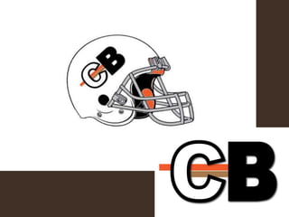
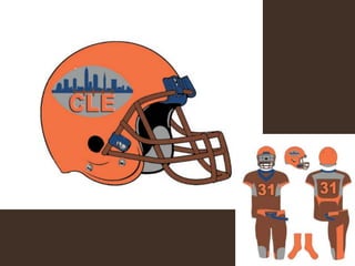
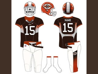
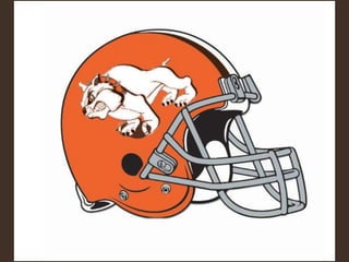
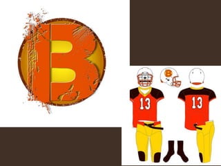
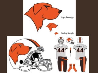
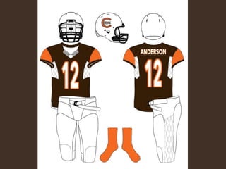
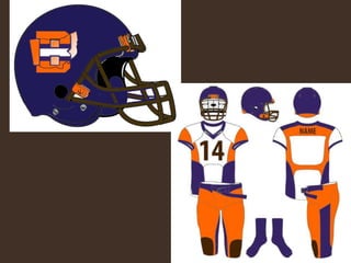
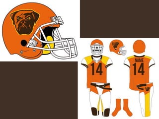
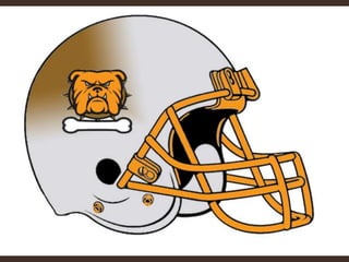
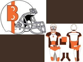
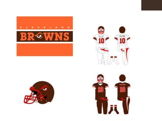
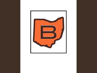
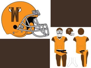
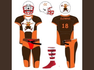
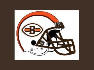
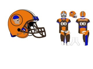
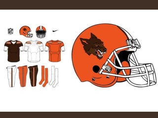
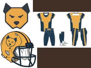
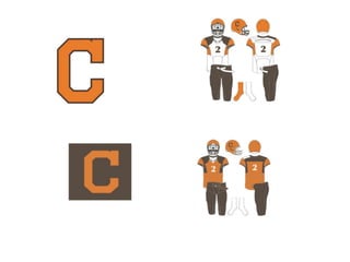
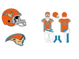
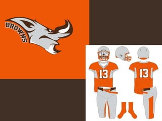
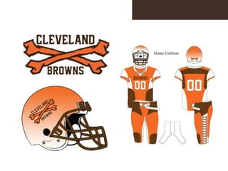
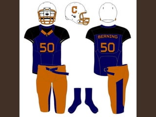
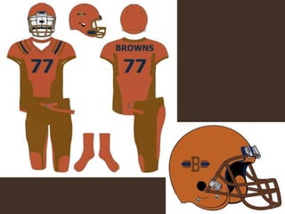
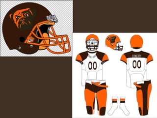
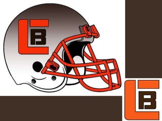
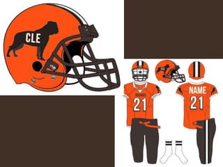
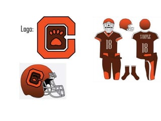
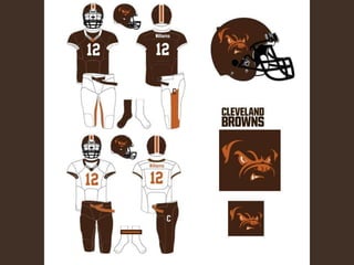
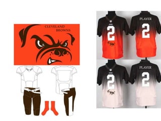
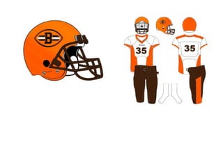
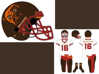
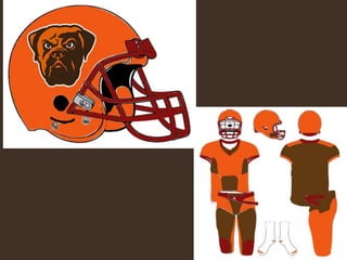
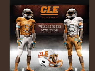
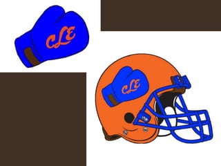
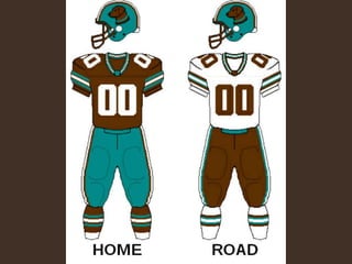
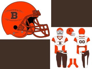
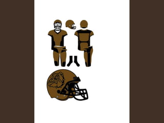
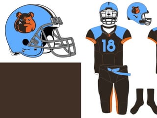


The document provides feedback on logo submissions for a football team. It shows the submitted logos anonymously and notes that participants can choose to claim their logo or remain anonymous. The feedback comments that most logos did well but some common mistakes were forgetting important colors, not following NFL style guidelines, and logos being too cute rather than fitting the league's image. Positives included vibrant use of colors, great contrast choices, and logos looking clean which meets NFL standards. Overall the feedback was that the submissions did well.