1
Lecture 4- DataWrangling
Dr. Sampath Jayarathna
Old Dominion University
CS 620 / DASC 600
Introduction to Data Science
& Analytics
2.
Exploring Your Data
•Working with data is both an art and a science. We’ve mostly
been talking about the science part, getting your feet wet
with Python tools for Data Science. Lets look at some of the
art now.
• After you’ve identified the questions you’re trying to answer
and have gotten your hands on some data, you might be
tempted to dive in and immediately start building models and
getting answers. But you should resist this urge. Your first
step should be to explore your data.
Data Wrangling
• Theprocess of transforming “raw” data into data that can be
analyzed to generate valid actionable insights
• Data Wrangling : aka
• Data preprocessing
• Data preparation
• Data Cleansing
• Data Scrubbing
• Data Munging
• Data Transformation
• Data Fold, Spindle, Mutilate……
5.
Data Wrangling Steps
•Iterative process of
• Obtain
• Understand
• Explore
• Transform
• Augment
• Visualize
Exploring Your Data
•The simplest case is when you have a one-dimensional data
set, which is just a collection of numbers. For example,
• daily average number of minutes each user spends on your site,
• the number of times each of a collection of data science tutorial videos was
watched,
• the number of pages of each of the data science books in your data science
library.
• An obvious first step is to compute a few summary statistics.
• You’d like to know how many data points you have, the smallest, the largest,
the mean, and the standard deviation.
• But even these don’t necessarily give you a great understanding.
9.
Summary statistics ofa single data set
• Information (numbers) that give a quick and simple
description of the data
• Maximum value
• Minimum value
• Range (dispersion): max – min
• Mean
• Median
• Mode
• Quantile
• Standard deviation
• Etc.
0 quartile = 0 quantile = 0 percentile
1 quartile = 0.25 quantile = 25 percentile
2 quartile = .5 quantile = 50 percentile (median)
3 quartile = .75 quantile = 75 percentile
4 quartile = 1 quantile = 100 percentile
10.
Mean vs averagevs median vs mode
• (Arithmetic) Mean: the “average” value of the data
• Average: can be ambiguous
• The average household income in this community is $60,000
• The average (mean) income for households in this community is $60,000
• The income for an average household in this community is $60,000
• What if most households are earning below $30,000 but one household is
earning $1M
• Median: the “middlest” value, or mean of the two middle values
• Can be obtained by sorting the data first
• Does not depend on all values in the data.
• More robust to outliers
• Mode: the most-common value in the data
def mean(a): return sum(a) / float(len(a))
def mean(a): return reduce(lambda x, y: x+y, a) / float(len(a))
Quantile: a generalization of
median.
E.g. 75 percentile is the value
which 75% of values are less
than or equal to
11.
Variance and standarddeviation
• Describes the spread of the data from the mean
• Is the mean squared of the deviation
• Standard deviation (square root of the variance):
• Easier to understand than variance
• Has the same unit as the measurement
• Say the data measures height of people in inch, the unit of is also inch. The
unit for 2
is square inch …
12.
CDC BRFSS Dataset
•The Behavioral Risk Factor Surveillance System (BRFSS) is
the nation's premier system of health-related telephone
surveys that collect state data about U.S. residents regarding
their health-related risk behaviors, chronic health conditions,
and use of preventive services.
• https://www.cs.odu.edu/~sampath/courses/f19/cs620/files/data/brfss.csv
13.
Activity 8
• Downloadthe brfss.csv file and load it to your python module.
• https://www.cs.odu.edu/~sampath/courses/f19/cs620/files/data/brfss.csv
• Display the content and observe the data
• Create a function cleanBRFSSFrame() to clean the dataset
• Drop the sex from the dataframe
• Drop the rows of NaN values (every single NaN)
• Use describe() method to display the count, mean, std, min, and
quantile data for column weight2.
• Find the median (median()) and mode (mode()) of the age
14.
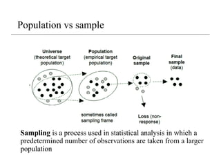
Population vs sample
Samplingis a process used in statistical analysis in which a
predetermined number of observations are taken from a larger
population
15.
Population vs sample
•Population: all members of a group in a study
• The average height of men
• The average height of living male ≥ 18yr in USA between 2001 and 2010
• The average height of all male students ≥ 18yr registered in Fall’17
• Sample: a subset of the members in the population
• Most studies choose to sample the population due to cost/time or other factors
• Each sample is only one of many possible subsets of the population
• May or may not be representative of the whole population
• Sample size and sampling procedure is important
df = pd.read_csv('brfss.csv')
print(df.sample(100)) # random sample of 100 values
16.
Why do wesample?
• Enables research/ surveys to be done more quickly/ timely
• Less expensive and often more accurate than large CENSUS
( survey of the entire population)
• Given limited research budgets and large population sizes, there
is no alternative to sampling.
• Sampling also allows for minimal damage or lost
• Sample data can also be used to validate census data
• A survey of the entire universe (gives real estimate not sample estimate)
17.
Simple Random Sampling
•In Simple Random Sampling, each element of the larger
population is assigned a unique ID number, and a table of
random numbers or a lottery technique is used to select
elements, one at a time, until the desired sample size is reached.
• Simple random sampling is usually reserved for use with
relatively small populations with an easy-to-use sampling frame
( very tedious when drawing large samples).
• Bias is avoided because the person drawing the sample does not
manipulate the lottery or random number table to select certain
individuals.
18.
Random Selection
• Selectsat random
• With replacement
• From any array
• A specified number of times
np.random.choice
np.random.choice(some_array, sample size)
Example:
import numpy as np
d = np.arange(6) + 1
s = np.random.choice(d, 1000)
print(s)
19.
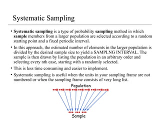
Systematic Sampling
• Systematicsampling is a type of probability sampling method in which
sample members from a larger population are selected according to a random
starting point and a fixed periodic interval.
• In this approach, the estimated number of elements in the larger population is
divided by the desired sample size to yield a SAMPLNG INTERVAL. The
sample is then drawn by listing the population in an arbitrary order and
selecting every nth case, starting with a randomly selected.
• This is less time consuming and easier to implement.
• Systematic sampling is useful when the units in your sampling frame are not
numbered or when the sampling frame consists of very long list.
20.
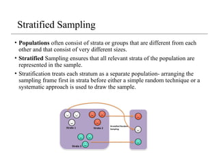
• Populations oftenconsist of strata or groups that are different from each
other and that consist of very different sizes.
• Stratified Sampling ensures that all relevant strata of the population are
represented in the sample.
• Stratification treats each stratum as a separate population- arranging the
sampling frame first in strata before either a simple random technique or a
systematic approach is used to draw the sample.
Stratified Sampling
21.
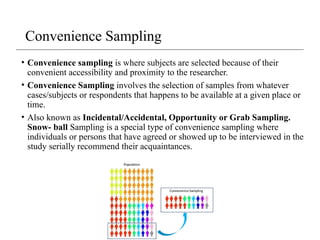
• Convenience samplingis where subjects are selected because of their
convenient accessibility and proximity to the researcher.
• Convenience Sampling involves the selection of samples from whatever
cases/subjects or respondents that happens to be available at a given place or
time.
• Also known as Incidental/Accidental, Opportunity or Grab Sampling.
Snow- ball Sampling is a special type of convenience sampling where
individuals or persons that have agreed or showed up to be interviewed in the
study serially recommend their acquaintances.
Convenience Sampling
22.
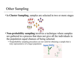
• In ClusterSampling, samples are selected in two or more stages
• Non-probability sampling involves a technique where samples
are gathered in a process that does not give all the individuals in
the population equal chances of being selected.
• Nonprobability sampling procedures are not valid for obtaining a sample that is
truly representative of a larger population
Other Sampling
23.
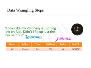
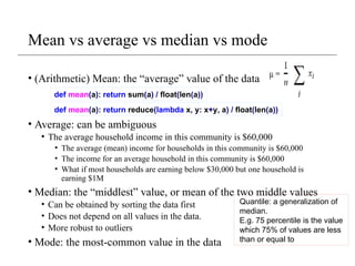
Exploring Your Data
•Good next step is to create a histogram, in which you group
your data into discrete buckets and count how many points
fall into each bucket:
df = pd.read_csv('brfss.csv', index_col=0)
df['weight2'].hist(bins=100)
A histogram is a plot that lets
you discover, and show, the
underlying frequency
distribution (shape) of a set
of continuous data. This
allows the inspection of the
data for its underlying
distribution (e.g., normal
distribution), outliers,
skewness, etc.
24.
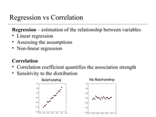
Regression – estimationof the relationship between variables
• Linear regression
• Assessing the assumptions
• Non-linear regression
Correlation
• Correlation coefficient quantifies the association strength
• Sensitivity to the distribution
Regression vs Correlation
Relationship No Relationship
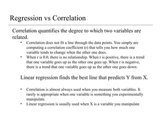
Correlation quantifies thedegree to which two variables are
related.
• Correlation does not fit a line through the data points. You simply are
computing a correlation coefficient (r) that tells you how much one
variable tends to change when the other one does.
• When r is 0.0, there is no relationship. When r is positive, there is a trend
that one variable goes up as the other one goes up. When r is negative,
there is a trend that one variable goes up as the other one goes down.
Linear regression finds the best line that predicts Y from X.
• Correlation is almost always used when you measure both variables. It
rarely is appropriate when one variable is something you experimentally
manipulate.
• Linear regression is usually used when X is a variable you manipulate
Regression vs Correlation
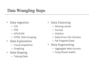
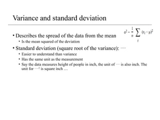
Feature Matrix
• Wecan review the relationships between attributes by
looking at the distribution of the interactions of each pair of
attributes.
from pandas.tools.plotting import
scatter_matrix
scatter_matrix(df[['weight2', 'wtyrago', 'htm3' ]])
This is a powerful plot from
which a lot of inspiration
about the data can be drawn.
For example, we can see a
possible correlation between
weight and weight year ago
29.
3 - 29
Thereare two basic types of data: numerical and
categorical data.
Numerical data: data to which a number is
assigned as a quantitative value.
age, weight, shoe size….
Categorical data: data defined by the classes or
categories into which an individual member falls.
eye color, gender, blood type, ethnicity
Types of data
30.
Continuous or Non-continuousdata
• A continuous variable is one in which it can
theoretically assume any value between the lowest and
highest point on the scale on which it is being
measured
• (e.g. weight, speed, price, time, height)
• Non-continuous variables, also known as discrete
variables, that can only take on a finite number of
values
• Discrete data can be numeric -- like numbers of
apples -- but it can also be categorical -- like red or
blue, or male or female, or good or bad.
31.
Qualitative vs. QuantitativeData
• A qualitative data is one in which the “true” or naturally
occurring levels or categories taken by that variable are not
described as numbers but rather by verbal groupings
• Open ended answers
• Quantitative data on the other hand are those in which the
natural levels take on certain quantities (e.g. price, travel time)
• That is, quantitative variables are measurable in some
numerical unit (e.g. pesos, minutes, inches, etc.)
• Likert scales, semantic scales, yes/no, check box
32.
Data transformation
• Transformdata to obtain a certain distribution
• transform data so different columns became comparable / compatible
• Typical transformation approach:
• Z-score transformation
• Scale to between 0 and 1
• mean normalization
33.
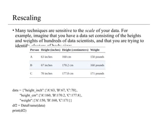
Rescaling
• Many techniquesare sensitive to the scale of your data. For
example, imagine that you have a data set consisting of the heights
and weights of hundreds of data scientists, and that you are trying to
identify clusters of body sizes.
data = {"height_inch":{'A':63, 'B':67, 'C':70},
"height_cm":{'A':160, 'B':170.2, 'C':177.8},
"weight":{'A':150, 'B':160, 'C':171}}
df2 = DataFrame(data)
print(df2)
34.
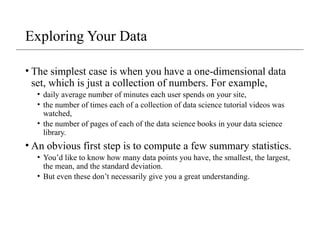
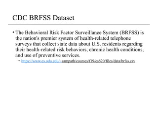
Why normalization (re-scaling)
height_inchheight_cm weight
A 63 160.0 150
B 67 170.2 160
C 70 177.8 171
from scipy.spatial import distance
a = df2.iloc[0, [0,2]]
b = df2.iloc[1, [0,2]]
c = df2.iloc[2, [0,2]]
print("%.2f" % distance.euclidean(a,b)) #10.77
print("%.2f" % distance.euclidean(a,c)) # 22.14
print("%.2f" % distance.euclidean(b,c)) #11.40
35.
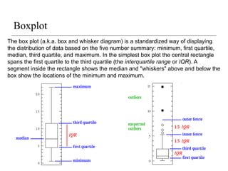
Boxplot
The box plot(a.k.a. box and whisker diagram) is a standardized way of displaying
the distribution of data based on the five number summary: minimum, first quartile,
median, third quartile, and maximum. In the simplest box plot the central rectangle
spans the first quartile to the third quartile (the interquartile range or IQR). A
segment inside the rectangle shows the median and "whiskers" above and below the
box show the locations of the minimum and maximum.
36.
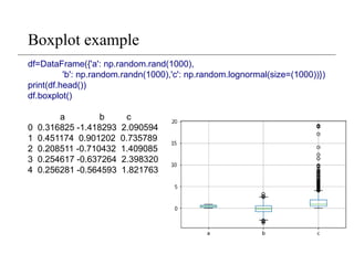
Boxplot example
df=DataFrame({'a': np.random.rand(1000),
'b':np.random.randn(1000),'c': np.random.lognormal(size=(1000))})
print(df.head())
df.boxplot()
a b c
0 0.316825 -1.418293 2.090594
1 0.451174 0.901202 0.735789
2 0.208511 -0.710432 1.409085
3 0.254617 -0.637264 2.398320
4 0.256281 -0.564593 1.821763
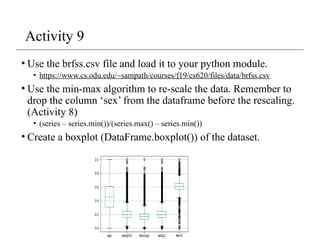
Activity 9
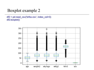
• Usethe brfss.csv file and load it to your python module.
• https://www.cs.odu.edu/~sampath/courses/f19/cs620/files/data/brfss.csv
• Use the min-max algorithm to re-scale the data. Remember to
drop the column ‘sex’ from the dataframe before the rescaling.
(Activity 8)
• (series – series.min())/(series.max() – series.min())
• Create a boxplot (DataFrame.boxplot()) of the dataset.
39.
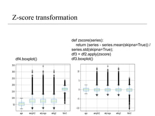
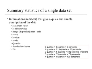
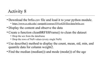
Z-score transformation
• Zscores, or standard scores, indicate how many standard
deviations an observation is above or below the mean. These
scores are a useful way of putting data from different sources
onto the same scale.
• The z-score linearly transforms the data in such a way, that
the mean value of the transformed data equals 0 while their
standard deviation equals 1. The transformed values
themselves do not lie in a particular interval like [0,1] or so.
Z score: Z = (x - sample mean)/sample standard deviation.
#23 The major difference is that a histogram is only used to plot the frequency of score occurrences in a continuous data set that has been divided into classes, called bins. Bar charts, on the other hand, can be used for a great deal of other types of variables including ordinal and nominal data sets.
#40 Suppose you weigh an apple and it weighs 110 grams. There’s no way to tell from the weight alone how this apple compares to other apples. However, as you’ll see, after you calculate its Z-score, you know where it falls relative to other apples. Standardization are a great way to understand where a specific observation falls relative to the entire distribution. They also allow you to take observations drawn from normally distributed populations that have different means and standard deviations and place them on a standard scale. This standard scale enables you to compare observations that would otherwise be difficult.


![Exploring Your Data
• Good next step is to create a histogram, in which you group
your data into discrete buckets and count how many points
fall into each bucket:
df = pd.read_csv('brfss.csv', index_col=0)
df['weight2'].hist(bins=100)
A histogram is a plot that lets
you discover, and show, the
underlying frequency
distribution (shape) of a set
of continuous data. This
allows the inspection of the
data for its underlying
distribution (e.g., normal
distribution), outliers,
skewness, etc.](https://image.slidesharecdn.com/lecture4-datawrangling-250907134359-1889520f/85/Lecture-4-Data-Wrangling-pptx-unit-one-23-320.jpg)
![Feature Matrix
• We can review the relationships between attributes by
looking at the distribution of the interactions of each pair of
attributes.
from pandas.tools.plotting import
scatter_matrix
scatter_matrix(df[['weight2', 'wtyrago', 'htm3' ]])
This is a powerful plot from
which a lot of inspiration
about the data can be drawn.
For example, we can see a
possible correlation between
weight and weight year ago](https://image.slidesharecdn.com/lecture4-datawrangling-250907134359-1889520f/85/Lecture-4-Data-Wrangling-pptx-unit-one-28-320.jpg)
![Why normalization (re-scaling)
height_inch height_cm weight
A 63 160.0 150
B 67 170.2 160
C 70 177.8 171
from scipy.spatial import distance
a = df2.iloc[0, [0,2]]
b = df2.iloc[1, [0,2]]
c = df2.iloc[2, [0,2]]
print("%.2f" % distance.euclidean(a,b)) #10.77
print("%.2f" % distance.euclidean(a,c)) # 22.14
print("%.2f" % distance.euclidean(b,c)) #11.40](https://image.slidesharecdn.com/lecture4-datawrangling-250907134359-1889520f/85/Lecture-4-Data-Wrangling-pptx-unit-one-34-320.jpg)
![Z-score transformation
• Z scores, or standard scores, indicate how many standard
deviations an observation is above or below the mean. These
scores are a useful way of putting data from different sources
onto the same scale.
• The z-score linearly transforms the data in such a way, that
the mean value of the transformed data equals 0 while their
standard deviation equals 1. The transformed values
themselves do not lie in a particular interval like [0,1] or so.
Z score: Z = (x - sample mean)/sample standard deviation.](https://image.slidesharecdn.com/lecture4-datawrangling-250907134359-1889520f/85/Lecture-4-Data-Wrangling-pptx-unit-one-39-320.jpg)