Downloaded 282 times


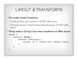
![STACK
• Easy back-to-front layering
• z-order matches order of content[] sequence
• Its preferred size is largest preferred width/height of children
• Resizes Resizables to “fill” stack (up to their max size limits)
Stack {
content: [
Rectangle { ... }
Circle { ... }
Label {
text: “3”
}
]
}](https://image.slidesharecdn.com/layoutsecrets011310-key-100219135854-phpapp02/85/JavaFX-Layout-Secrets-with-Amy-Fowler-18-320.jpg)
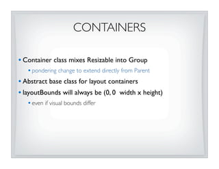
![HBOX & VBOX
• Simple horizontal row or vertical column of nodes
• Configurable spacing & alignment
• Resizes Resizables to their preferred sizes
HBox {
spacing: 4
content: for (in in [0..4])
Thing {
text: “{i}”
}
]
}](https://image.slidesharecdn.com/layoutsecrets011310-key-100219135854-phpapp02/85/JavaFX-Layout-Secrets-with-Amy-Fowler-19-320.jpg)
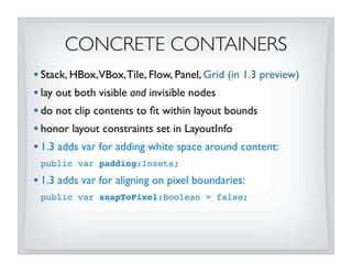
![TILE
• Lays out nodes in grid of uniform-sized “tiles”
• Horizontal or vertical orientation
• Wraps tiles when Tile’s size changes
• Size of each “tile” defaults to largest preferred content
• Resizes nodes to “fill” tile (up to their max size limits)
• Configurable spacing & alignment
Tile {
columns: 3
hgap: 3 vgap: 3
content: for (i in [0..5])
Thing { text: “{i}” }
}](https://image.slidesharecdn.com/layoutsecrets011310-key-100219135854-phpapp02/85/JavaFX-Layout-Secrets-with-Amy-Fowler-20-320.jpg)
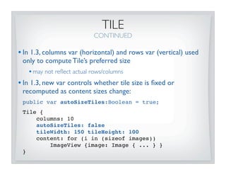
![FLOW
• Horizontal or vertical flow that wrap on width/height
boundaries
• Always resizes Resizables to their preferred sizes
• Configurable spacing & alignment
• 1.3 adds var to control the preferred wrap dimension:
public var wrapLength:Number = 400;
Flow {
wrapLength: 300
hgap: 5 vgap: 10
content: for (i in [0..7])
Thing { ... }
}](https://image.slidesharecdn.com/layoutsecrets011310-key-100219135854-phpapp02/85/JavaFX-Layout-Secrets-with-Amy-Fowler-22-320.jpg)
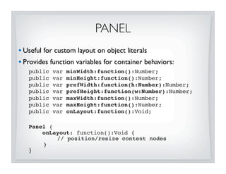
![IMPLEMENTING PANELS
• Use convenience functions from Container!
import javafx.scene.layout.Container.*;
getManaged(content:Node[]):Node[]
getNodePrefWidth(node)/getNodePrefHeight(node)
positionNode(node, x, y)
resizeNode(node, width, height)
layoutNode(node, areaX, areaY, areaWidth, areaHeight,
baseline, hfill, vfill, hpos, vpos)
• They are smart...
• handle subtracting minX, minY for positioning
• deal with Resizable vs. non-Resizable nodes
• honor LayoutInfo if set on node
• swallow bind exceptions when width/height are bound](https://image.slidesharecdn.com/layoutsecrets011310-key-100219135854-phpapp02/85/JavaFX-Layout-Secrets-with-Amy-Fowler-24-320.jpg)
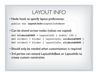
![GRID
• Based on Grid from JFXtra’s (thanks, Stephen!)
• Supports rich, row-oriented grid layout
• spanning, growing, alignment, etc
Grid {
hgap: 5 vgap: 8
rows: [
GridRow { cells: [
Label{},
ListView {
layoutInfo: GridLayoutInfo { hspan:3 }
}
]}
GridRow { cells: [ ...] }
]
}](https://image.slidesharecdn.com/layoutsecrets011310-key-100219135854-phpapp02/85/JavaFX-Layout-Secrets-with-Amy-Fowler-25-320.jpg)
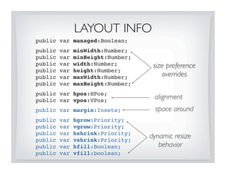
![OVERRIDING SIZE PREFS
• Resizables have intrinsic values for min, pref, max sizes
• Can use LayoutInfo to override values
• To set a specific size on a Resizable, override it’s preferred:
VBox {
content: [
Button {
// VBox will resize button to 100x100
layoutInfo: LayoutInfo {
width: 100 height: 100
}
}...
]
}
• DO NOT set width/height directly on Resizable - parent will
obliterate values! (unless Resizable is unmanaged)](https://image.slidesharecdn.com/layoutsecrets011310-key-100219135854-phpapp02/85/JavaFX-Layout-Secrets-with-Amy-Fowler-29-320.jpg)
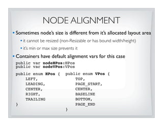
![NODE ALIGNMENT
CONTINUED
• LayoutInfo can be used to override alignment for specific nodes
VBox {
// nodeHPos defaults to HPos.LEFT
content: [
Thing { text: “0” }
Thing { text: “1” }
Thing { text: “2”
layoutInfo: LayoutInfo {
hpos: HPos.CENTER
}
}
]
}](https://image.slidesharecdn.com/layoutsecrets011310-key-100219135854-phpapp02/85/JavaFX-Layout-Secrets-with-Amy-Fowler-31-320.jpg)
![BASELINE ALIGNMENT
• 1.3 Containers supports roman baseline vertical alignment!
HBox {
nodeVPos: VPos.BASELINE
content: [ ... ]
}
• TextOffsets mixin must be implemented by classes that want
to be aligned on baseline:
public var baselineOffset:Number
• Text, Container, and Controls all implement TextOffsets
• Classes that don’t implement TextOffsets will be treated as if
baseline was on bottom edge](https://image.slidesharecdn.com/layoutsecrets011310-key-100219135854-phpapp02/85/JavaFX-Layout-Secrets-with-Amy-Fowler-32-320.jpg)
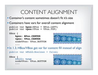
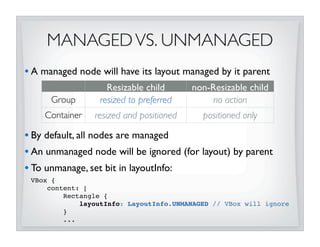
![FILLING
• “Filling” defines behavior when Resizable’s allocated layout area
is larger than its preferred size
fill = false fill = true
keep node to preferred size expand node to fill layout area
(up to max limit)
• Stack and Tile do filling by default
• HBox,VBox, Flow, and Grid do not fill by default
• In 1.3 LayoutInfo can be used to change node’s fill behavior:
Stack {
content: [
Button {
layoutInfo: LayoutInfo { vfill: false }
}...
]
}](https://image.slidesharecdn.com/layoutsecrets011310-key-100219135854-phpapp02/85/JavaFX-Layout-Secrets-with-Amy-Fowler-34-320.jpg)
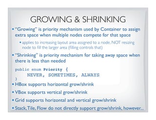
![GROWING & SHRINKING
• Grow/shrink priorities are propagated up scene-graph
• if Container has child with a grow of ALWAYS, then its grow value will
be ALWAYS
• enables powerful default behavior without heavy customization
HBox {
content: [
Button{},
Button{},
TextBox {
layoutInfo: LayoutInfo {
hfill: true
hgrow: Priority.ALWAYS
hshrink: Priority.ALWAYS
}
}
Label{}
]
}](https://image.slidesharecdn.com/layoutsecrets011310-key-100219135854-phpapp02/85/JavaFX-Layout-Secrets-with-Amy-Fowler-36-320.jpg)
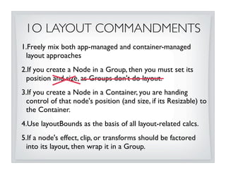
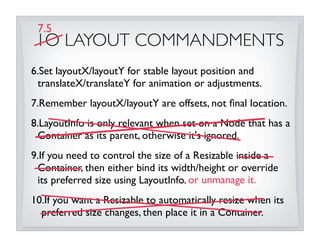


This document discusses JavaFX layout fundamentals, including changes coming in version 1.3. It covers the layout mechanism, resizable vs non-resizable nodes, layout bounds, app-managed vs container-managed layout, common layout containers like Stack and HBox, and concepts like growing, shrinking, and filling. The document also provides 10 commandments for working with JavaFX layout.