TEXT AND INFORMATION
MEDIA
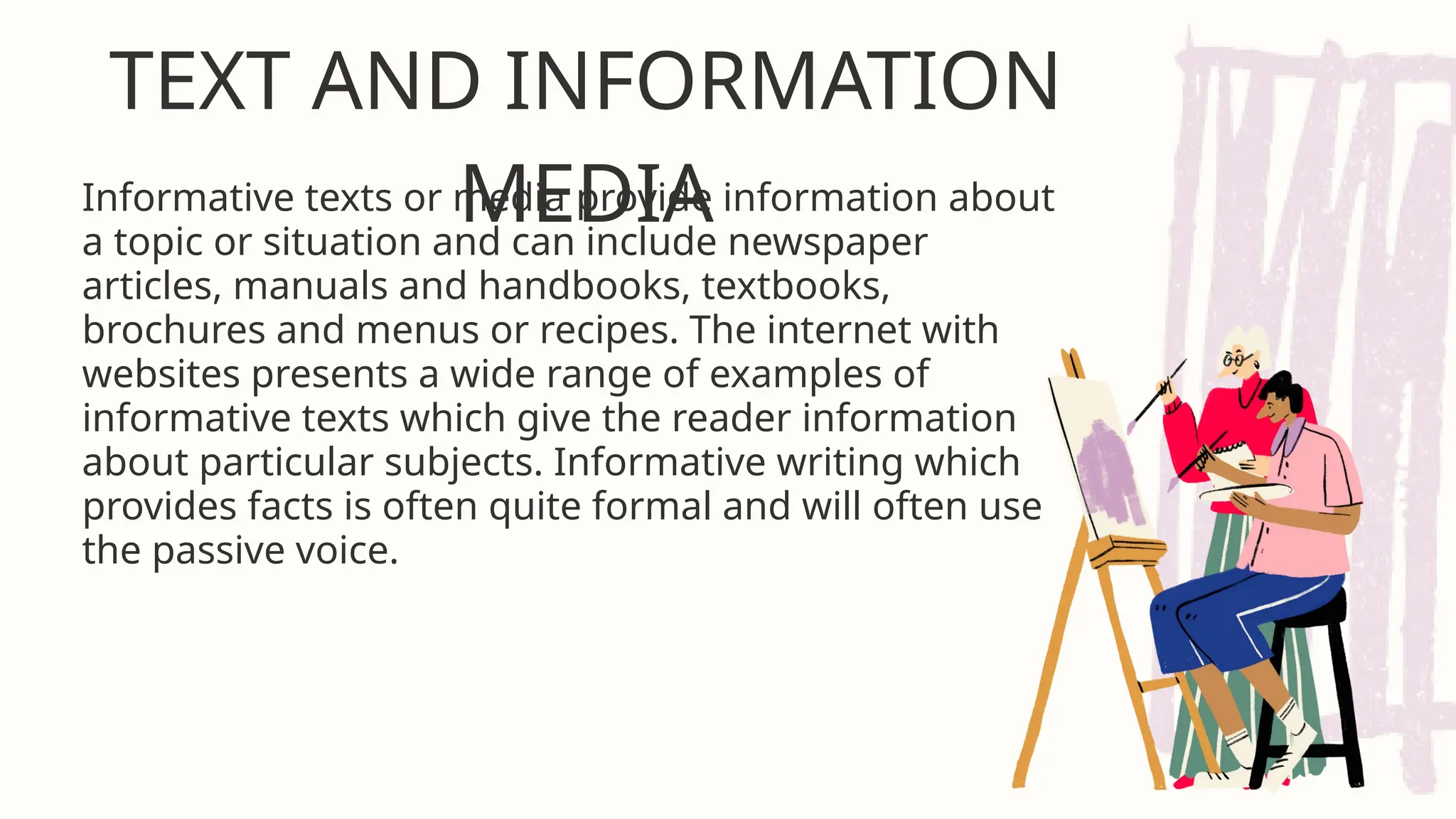
Informativetexts or media provide information about
a topic or situation and can include newspaper
articles, manuals and handbooks, textbooks,
brochures and menus or recipes. The internet with
websites presents a wide range of examples of
informative texts which give the reader information
about particular subjects. Informative writing which
provides facts is often quite formal and will often use
the passive voice.
3.
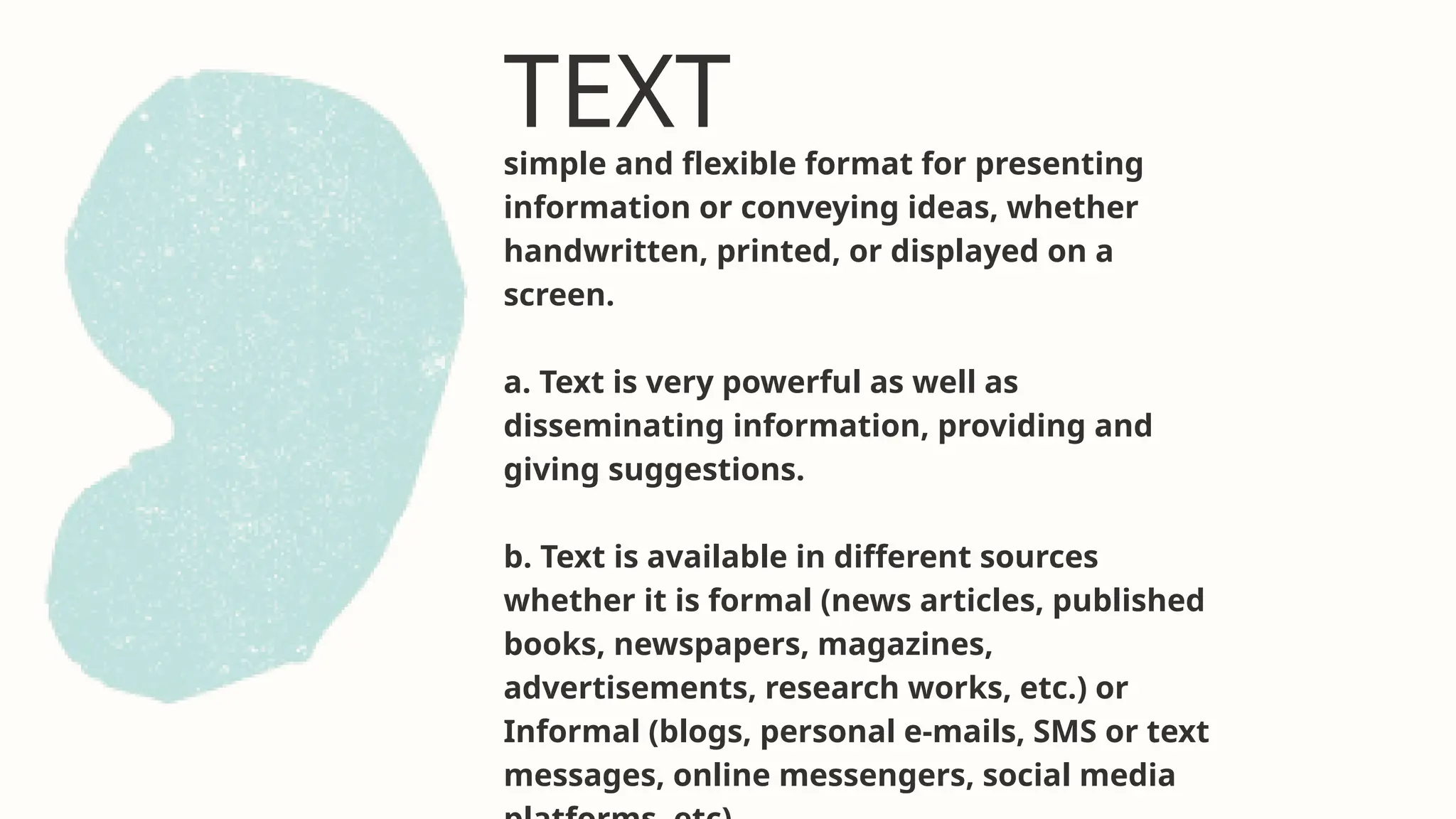
TEXT
simple and flexibleformat for presenting
information or conveying ideas, whether
handwritten, printed, or displayed on a
screen.
a. Text is very powerful as well as
disseminating information, providing and
giving suggestions.
b. Text is available in different sources
whether it is formal (news articles, published
books, newspapers, magazines,
advertisements, research works, etc.) or
Informal (blogs, personal e-mails, SMS or text
messages, online messengers, social media
4.
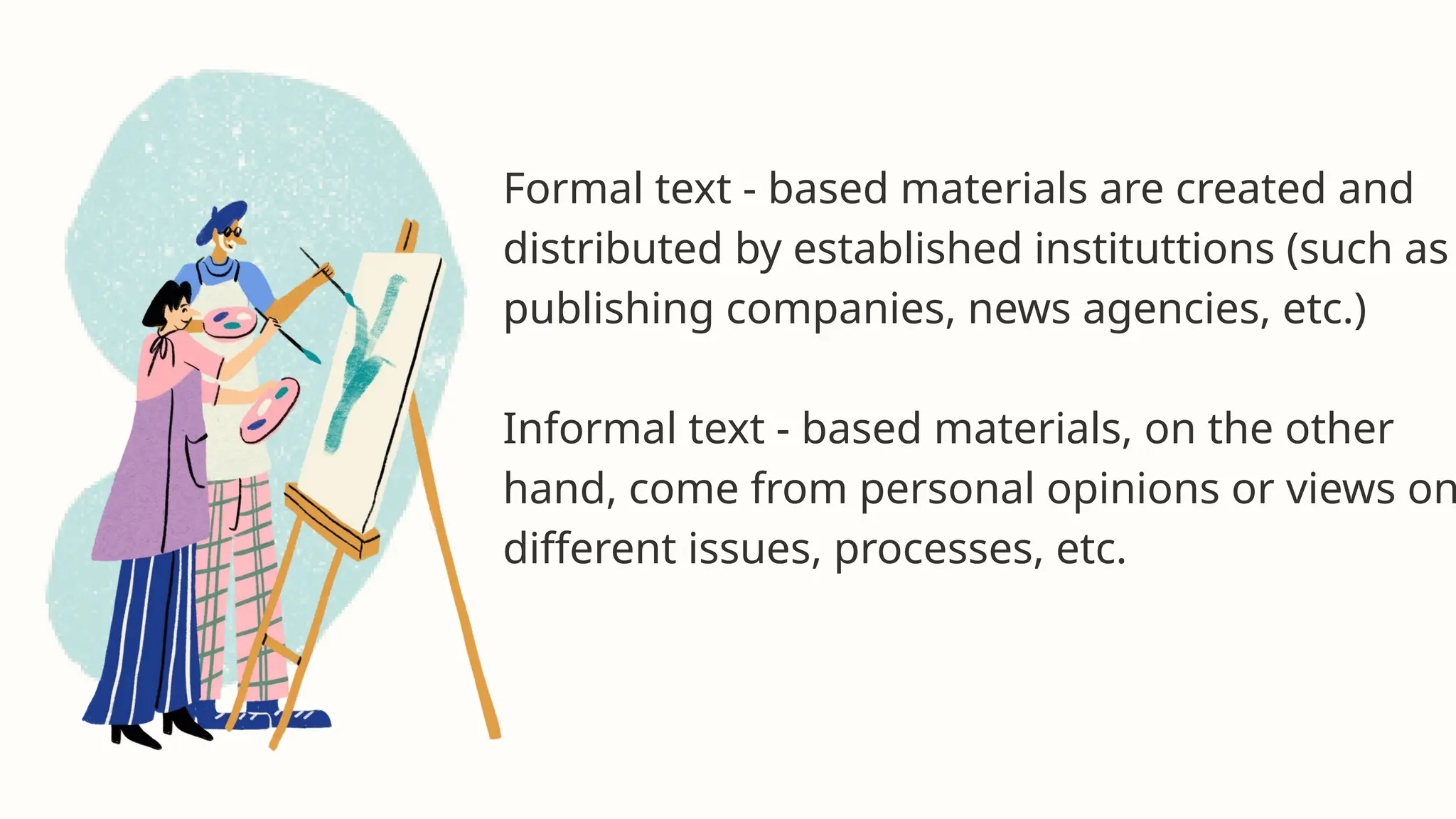
Formal text -based materials are created and
distributed by established instituttions (such as
publishing companies, news agencies, etc.)
Informal text - based materials, on the other
hand, come from personal opinions or views on
different issues, processes, etc.
5.
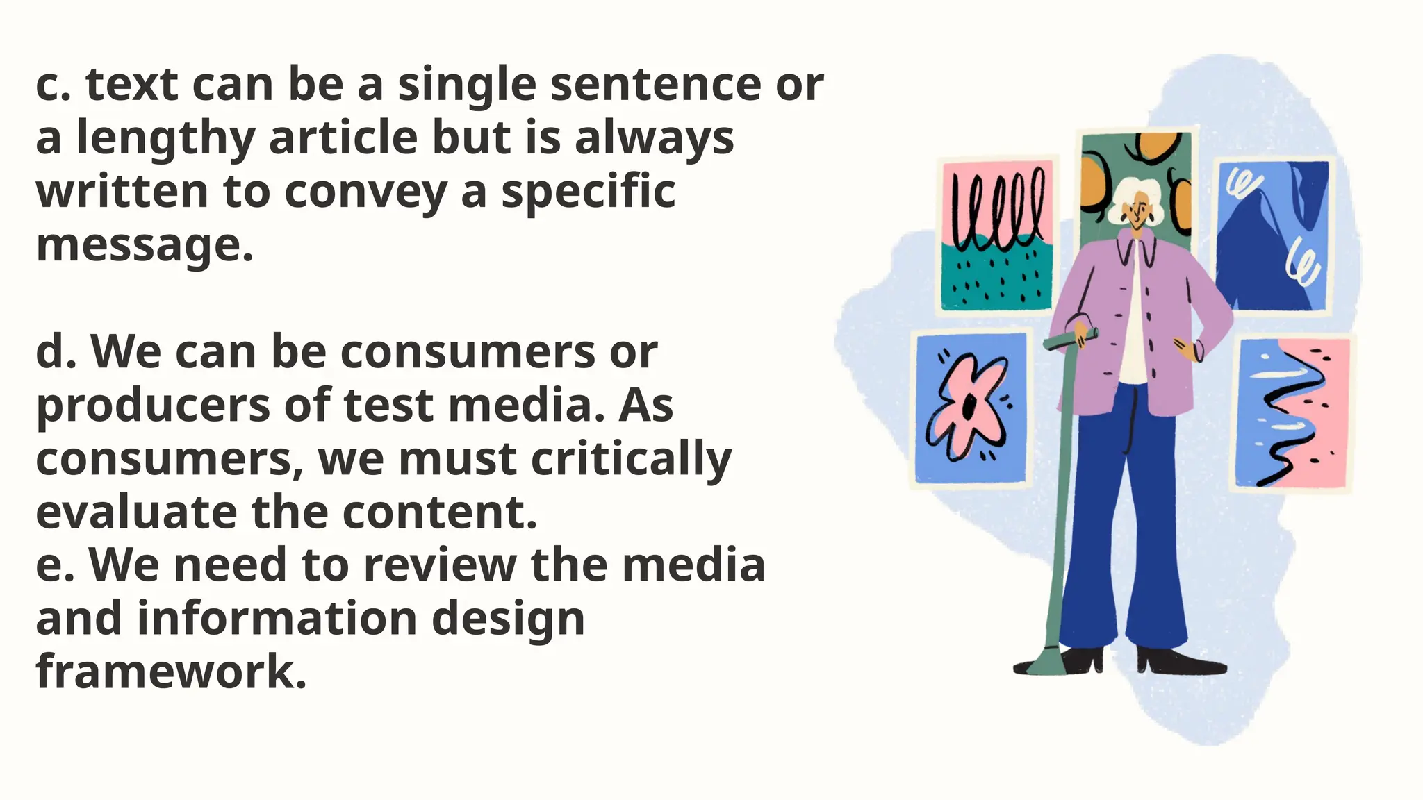
c. text canbe a single sentence or
a lengthy article but is always
written to convey a specific
message.
d. We can be consumers or
producers of test media. As
consumers, we must critically
evaluate the content.
e. We need to review the media
and information design
framework.
6.
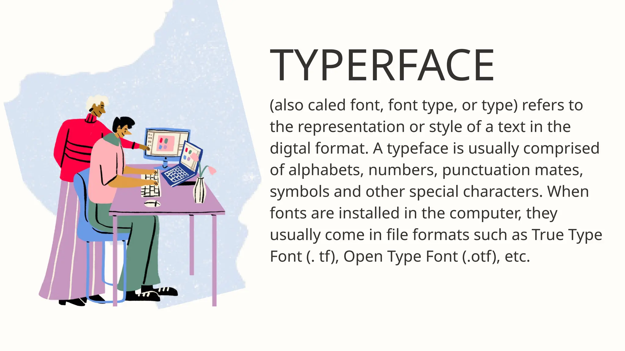
TYPERFACE
(also caled font,font type, or type) refers to
the representation or style of a text in the
digtal format. A typeface is usually comprised
of alphabets, numbers, punctuation mates,
symbols and other special characters. When
fonts are installed in the computer, they
usually come in file formats such as True Type
Font (. tf), Open Type Font (.otf), etc.
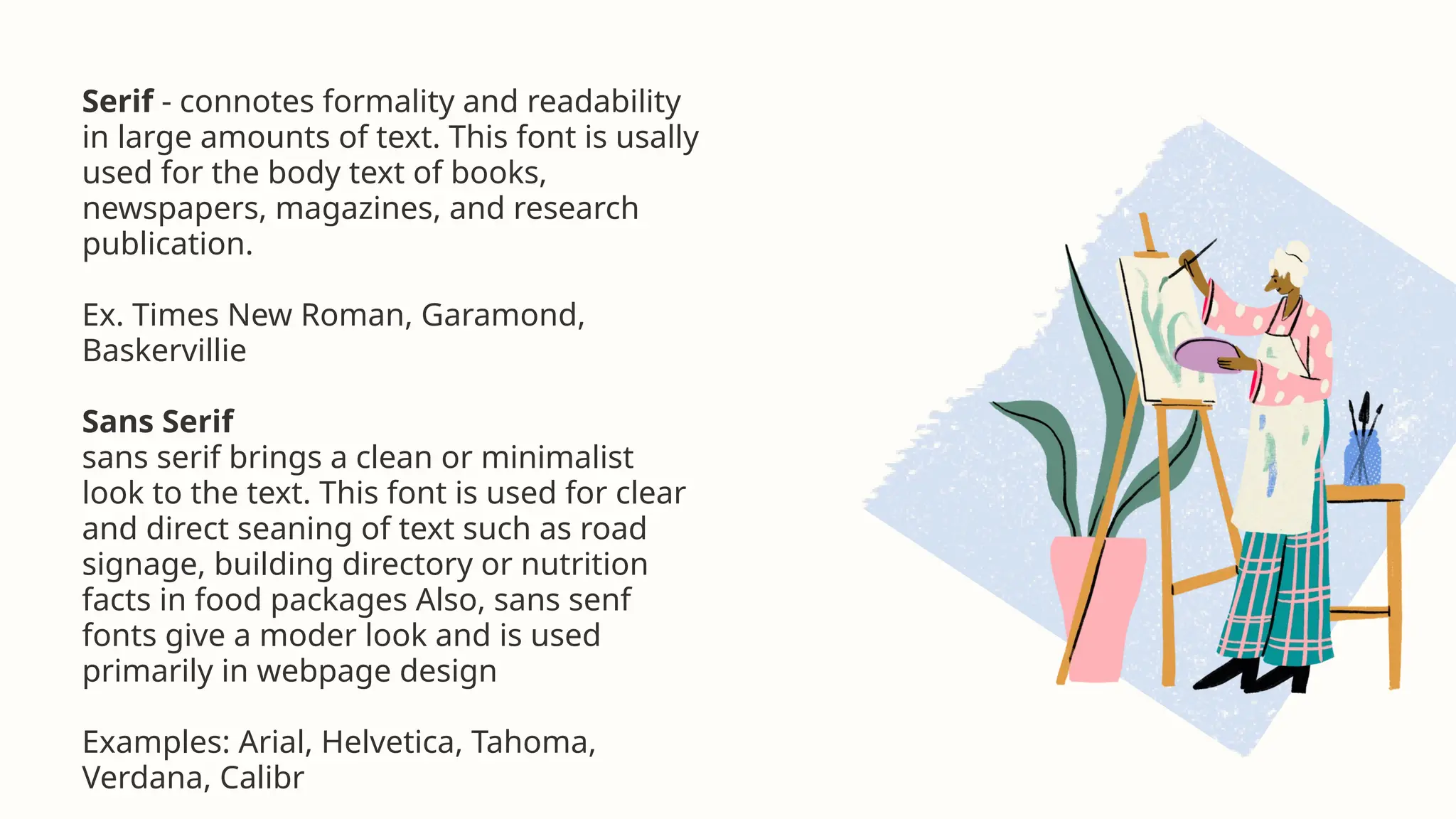
Serif - connotesformality and readability
in large amounts of text. This font is usally
used for the body text of books,
newspapers, magazines, and research
publication.
Ex. Times New Roman, Garamond,
Baskervillie
Sans Serif
sans serif brings a clean or minimalist
look to the text. This font is used for clear
and direct seaning of text such as road
signage, building directory or nutrition
facts in food packages Also, sans senf
fonts give a moder look and is used
primarily in webpage design
Examples: Arial, Helvetica, Tahoma,
Verdana, Calibr
9.
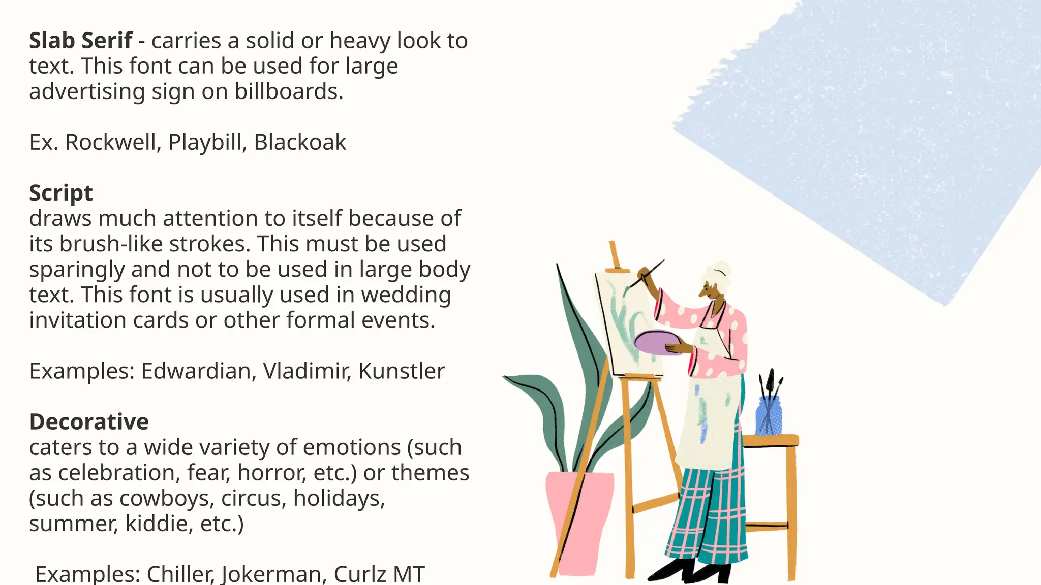
Slab Serif -carries a solid or heavy look to
text. This font can be used for large
advertising sign on billboards.
Ex. Rockwell, Playbill, Blackoak
Script
draws much attention to itself because of
its brush-like strokes. This must be used
sparingly and not to be used in large body
text. This font is usually used in wedding
invitation cards or other formal events.
Examples: Edwardian, Vladimir, Kunstler
Decorative
caters to a wide variety of emotions (such
as celebration, fear, horror, etc.) or themes
(such as cowboys, circus, holidays,
summer, kiddie, etc.)
Examples: Chiller, Jokerman, Curlz MT
1. Emphasis -refers to the importance or value given to a part of the textbased
content.
2. Appropriateness - refers to how fitting or suitable the text is used for a specific
audience, purpose or event. In the creation of text-based content, make sure that the
selection enteria (tone, style, purpose, clarity) is followed.
3. Proximity - refers to how near or how far are the text elements from each other.
When two things are closely related, we bring them close together. Otherwise, we put
text elements far from each other, For example, the main title and subtitie are usually
placed close to each other. or justified.
Alignment - refers to how the text is positioned in the page. This can be left, right,
12.
5. Organization -rolers to a conscious effort to organize the different text elements
in a papa organization ensures that while some text elements are separated from
each other pased on ine principle of proximly), they are still somehow connected with
the rest of the persethis n the page.
6. Repelition- concerns consistency of elements and the unity of the entire design.
Repeltion encourages the use of repeating some typefaces within the page.
7. Contrast- creates visual interest to lext elements. Contrast is achieved when two
elements are different from each other. When you place a white text on a very light
yellow background, contrast is not achieved and the text will be difficult to read, but
when you put a white text on a dark brown background, contrast is created.
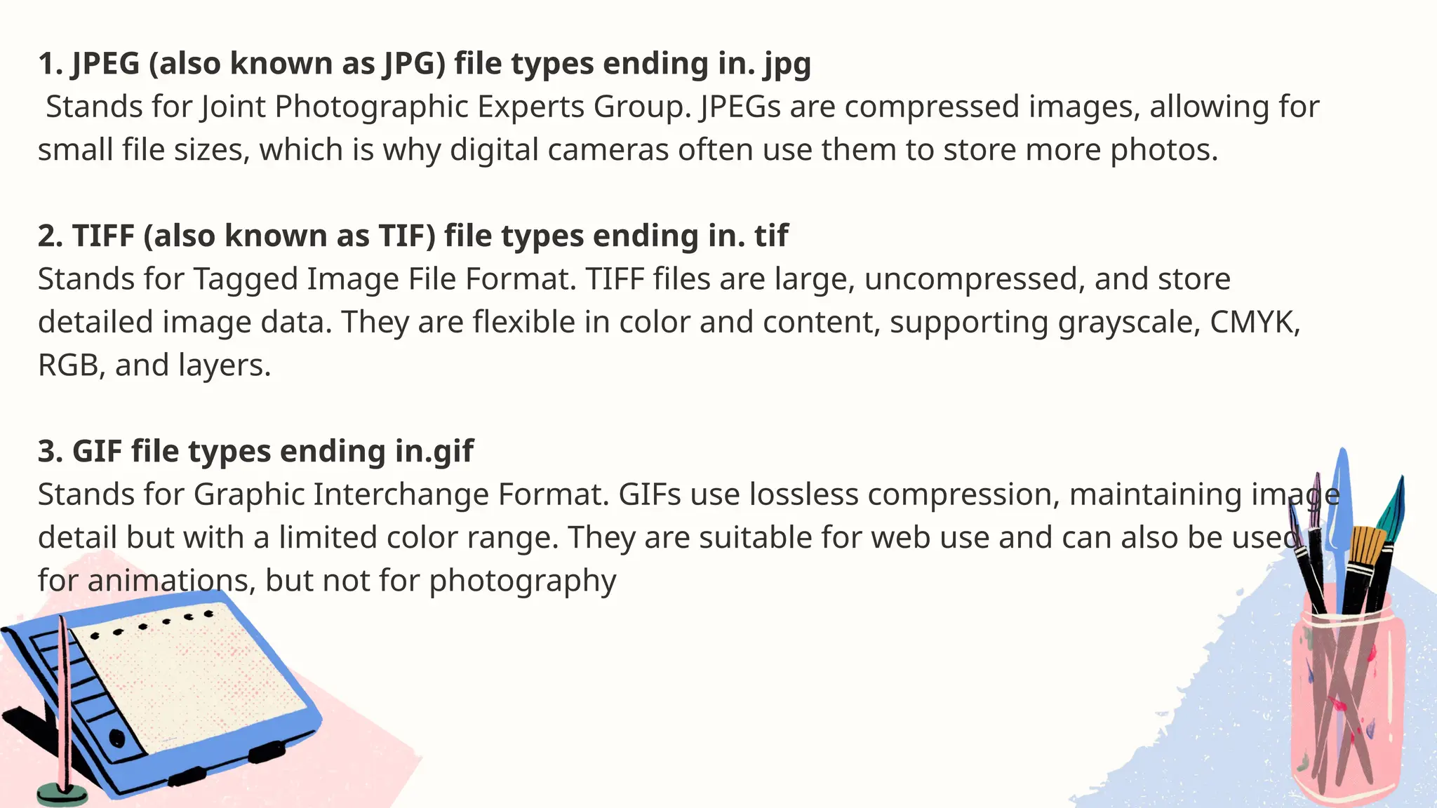
1. JPEG (alsoknown as JPG) file types ending in. jpg
Stands for Joint Photographic Experts Group. JPEGs are compressed images, allowing for
small file sizes, which is why digital cameras often use them to store more photos.
2. TIFF (also known as TIF) file types ending in. tif
Stands for Tagged Image File Format. TIFF files are large, uncompressed, and store
detailed image data. They are flexible in color and content, supporting grayscale, CMYK,
RGB, and layers.
3. GIF file types ending in.gif
Stands for Graphic Interchange Format. GIFs use lossless compression, maintaining image
detail but with a limited color range. They are suitable for web use and can also be used
for animations, but not for photography
15.
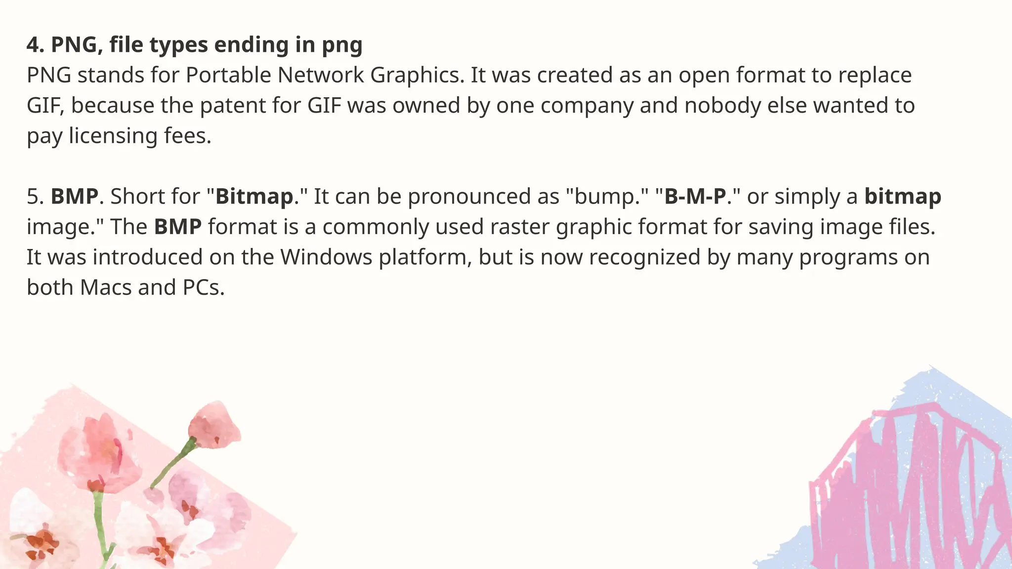
4. PNG, filetypes ending in png
PNG stands for Portable Network Graphics. It was created as an open format to replace
GIF, because the patent for GIF was owned by one company and nobody else wanted to
pay licensing fees.
5. BMP. Short for "Bitmap." It can be pronounced as "bump." "B-M-P." or simply a bitmap
image." The BMP format is a commonly used raster graphic format for saving image files.
It was introduced on the Windows platform, but is now recognized by many programs on
both Macs and PCs.
16.
Formally and informallyproduced visual
media
Visual media produced by formal organizations
such as schools, government, a established
media/publishing outfits are considered formally
produced. Other visual media are considered
informally produced.
Purpose of visual information facilitate
retention
The primary purpose of visual information is to
gain attention, create meaning, facilitate
retention.
17.
VISUAL DESIGN
AND ELEMENTS
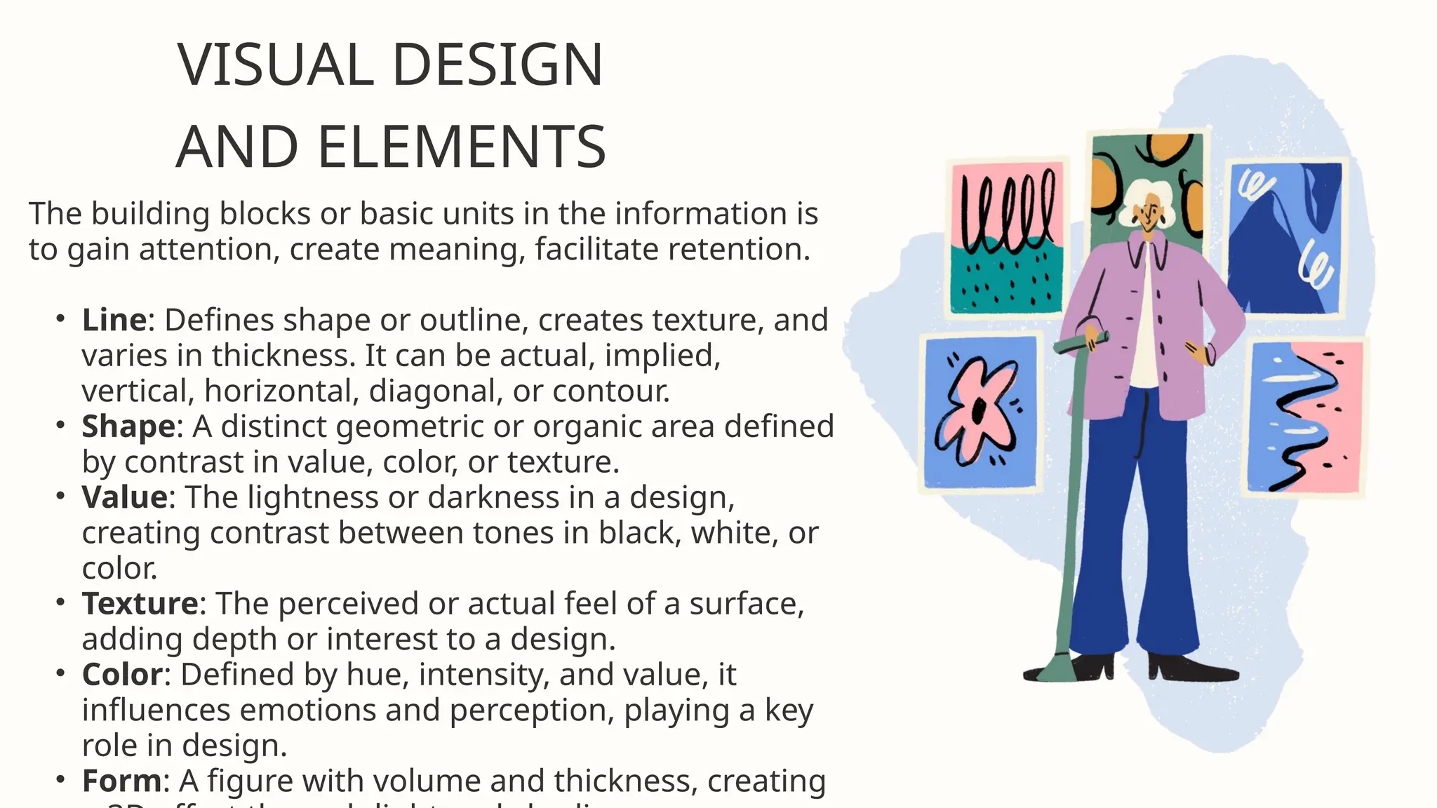
Thebuilding blocks or basic units in the information is
to gain attention, create meaning, facilitate retention.
• Line: Defines shape or outline, creates texture, and
varies in thickness. It can be actual, implied,
vertical, horizontal, diagonal, or contour.
• Shape: A distinct geometric or organic area defined
by contrast in value, color, or texture.
• Value: The lightness or darkness in a design,
creating contrast between tones in black, white, or
color.
• Texture: The perceived or actual feel of a surface,
adding depth or interest to a design.
• Color: Defined by hue, intensity, and value, it
influences emotions and perception, playing a key
role in design.
• Form: A figure with volume and thickness, creating
18.
The elements andprinciples of design are the
building blocks used to create a work of art. The
elements of design can be thought of as the
things that make up a painting, drawing. despn
etc. Good or bad - all paintings will contain most
of if not all, the seven elements of deson The
Pinciples of design can be thought of as what we
do to the elements of design How we apply the
Principles of design determines how successful
we are in creating a work.
DESIGN
PRINCIPLES AND
ELEMENTS
19.
1.Consistency of margins,typeface, typestyle, and colors is
necessary, especially in slide presentations or documents
that are more than one page.
2. Center of interest an area that first attracts attention in
a composition. This area is more important when compared
to the other objects or elements in a composition. This can
be by contrast of values, more colors, and placement in the
format.
3. Balance a feeling of visual equality in shape, form, value,
color, etc. Balance can be symmetrical and evenly balanced,
or asymmetrical and unevenly balanced. Objects, values,
colors, textures, shapes, forms, etc. can be used in creating
balance in a composition.
4. Harmony brings together a composition with similar
units. If for example your composition was using wavy lines
and organic shapes, you would stay with those types of
VISUAL DESIGN
PRINCIPLES
20.
5. Contrast offerssome change in value creating a visual
discord in a composition. Contrast shows the difference
between shapes and can be used as a background to bring
objects out and forward in a design. It can also be used to
create an area of emphasis.
6. Directional Movement a visual flow through the
composition. It can be the suggestion of motion in a design
as you move from object to object by way of placement and
position. Directional movement can be created with a value
pattern. It is with the placement of dark and light areas that
you can move your attention through the format.
7. Rhythm a movement in which some elements recur
regularly. Like a dance, it will have a flow of objects that will
seem to be like the beat of music.
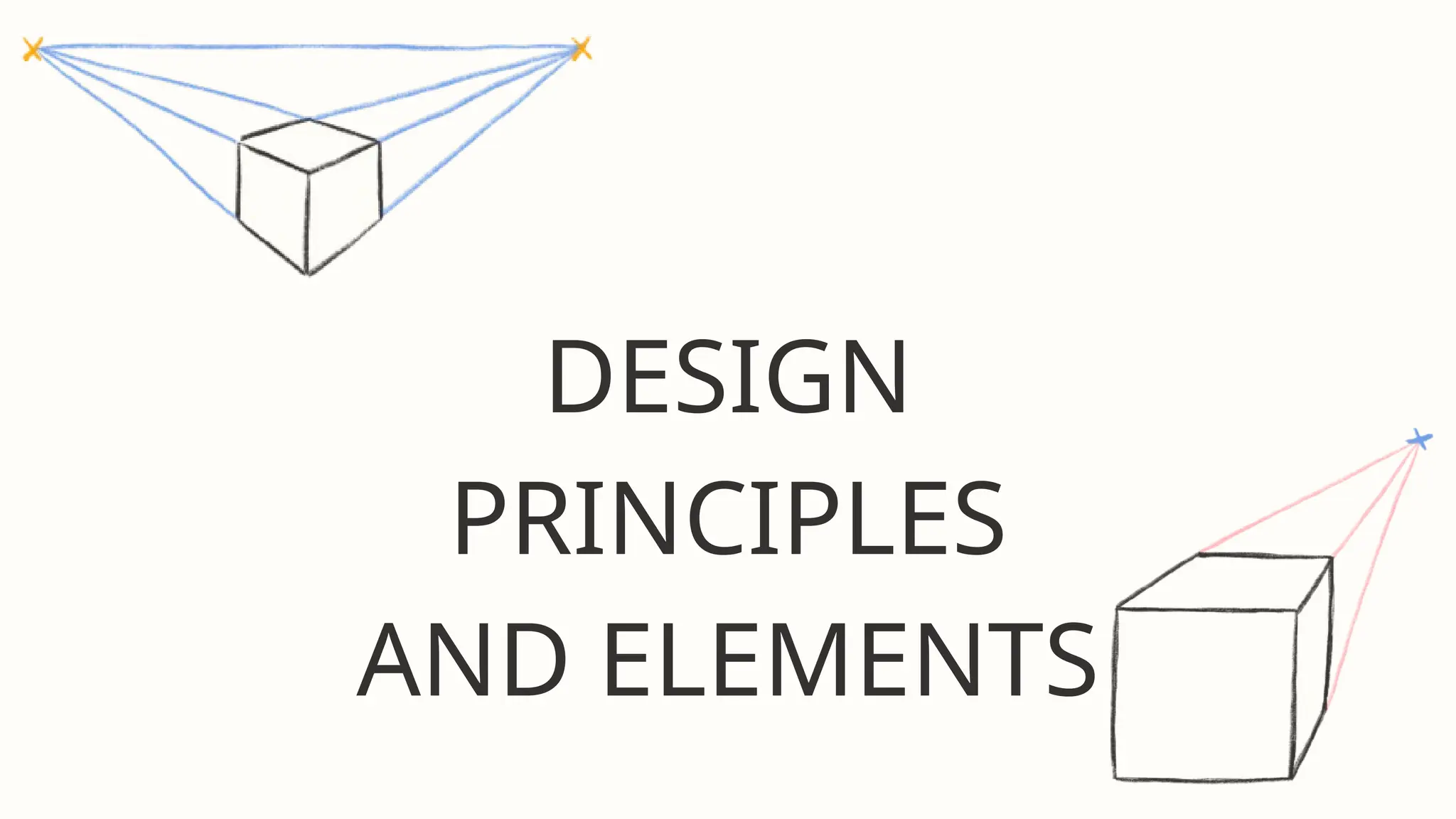
8. Perspective created through the arrangement of objects
in two-dimensional space to look like they appear in real
life. Perspective is a learned meaning of the relationship
between different objects seen in space.


![Reading Techniques [Autosaved].pptxReading Techniques [Autosaved].pptx](https://cdn.slidesharecdn.com/ss_thumbnails/readingtechniquesautosaved-251211193055-b8821f9d-thumbnail.jpg?width=640&height=640&fit=bounds)


