Download as PDF, PPTX
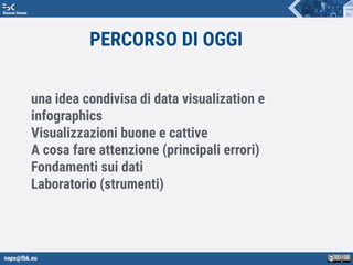
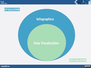

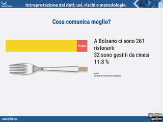

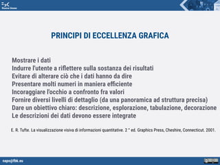


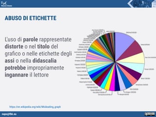
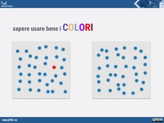
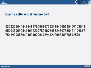
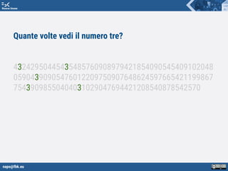
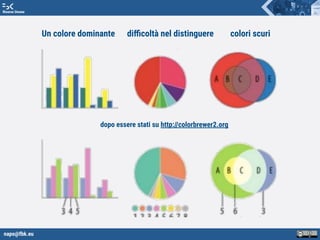
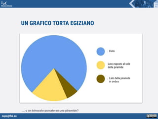
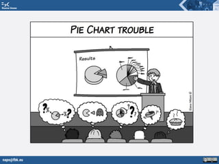
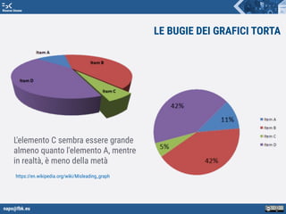

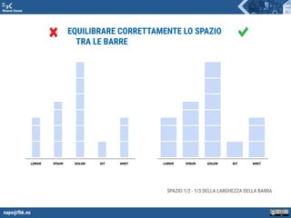
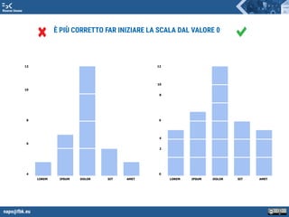
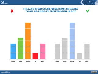
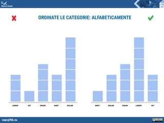
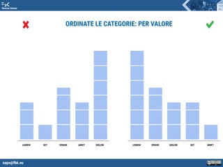
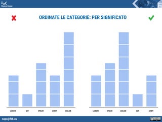
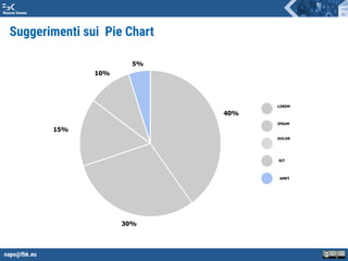
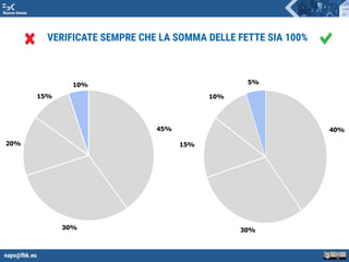
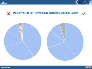
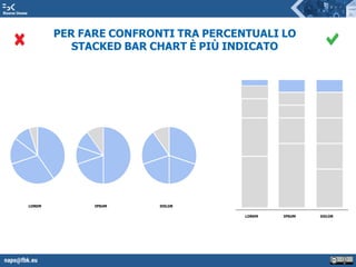
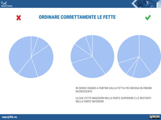
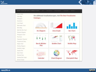
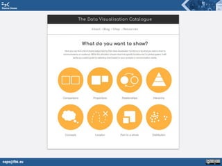
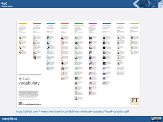
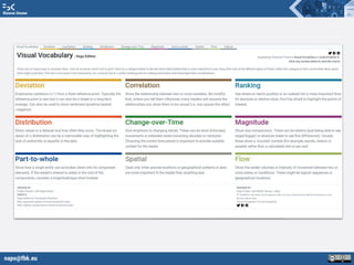

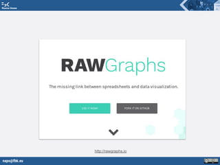


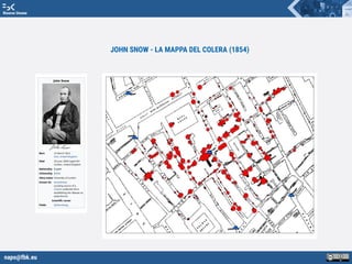

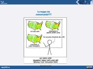
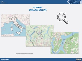


Il documento tratta dell'importanza della visualizzazione dei dati e delle infografiche, evidenziando le buone pratiche e gli errori comuni da evitare. Si discute come le visualizzazioni dovrebbero comunicare chiaramente le informazioni, rispondere a domande e supportare decisioni, evitando complicazioni e distorsioni. Viene inoltre fornito un elenco di strumenti e risorse utili per la creazione di visualizzazioni efficaci.