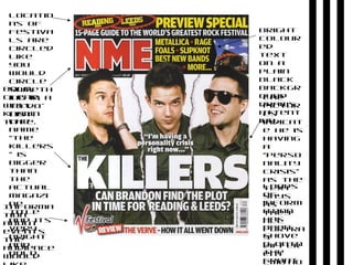
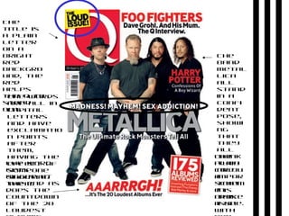
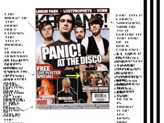
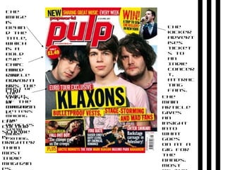
Indie
magazine
research
Bold,
clear,
well
known
title.
Informa
tion
about
events
the
audience
would
The
name
“the
killers
” is
bigger
than
the
actual
magazi
ne
title
and its
very
bright
and
bold.
The
pictur
es
indicat
e he is
having
a
“perso
nality
crisis”
as the
text
says
as
they
all
portra
y
differ
ent
emotio
Bright
colour
ed
text
on a
plain
black
backgr
ound
draws
attent
ion.
Locatio
ns of
festiva
ls are
circled
like
you
would
circle
someth
ing in a
to-do-
list.
Loads
of
inform
ation
has
been
shove
d onto
the
front
The
title is
a plain
letter
on a
bright
red
backgro
und, the
red
helps
the Q to
stand
out.
The words
are all in
capital
letters
and have
exclamatio
n points
after
them,
having the
effect of
someone
shouting
them.
The word
gets
bigger at
the end as
does the
countdown
of the 20
loudest
The
band
metal
lica
all
stand
in a
confi
dent
pose,
showi
ng
that
they
all
think
they
are
impor
tant
in
this
issue.
The
plain
colou
r
schem
e is
broke
n up
with
The
image of
the
band
half
covers
the
title
making
it
almost
unreada
ble, this
shows
how
popular
the
magazin
e it.
Attrac
ting
reader
s by
offerin
g a
free
poster,
which
the
audienc
e will
be
interes
ted in.
The
colou
r
schem
e of
black
is
broke
n up
by
reds
The title
looks
smashed,
similar
to a
guitar at
the end
of a
rock
concert.
It could
also
represen
t loud
music, as
if the
loudness
has
smashed
the
title.
All of
the text
is in
capital
letters
making
everythi
ng seem
more
exiting
and
loud.
Along
he
bottom
of the
magazin
e are
names
of
bands
the
The
colour
scheme
is
brighter
than
most
Indie
magazin
The
kicker
advert
ises
ticket
s to
an
Indie
concer
t,
attrac
ting
fans.
The
main
article
gives
an
insight
into
what
goes
on at a
gig for
the
bands.
Most
The
image
is
behin
d the
title,
which
is a
bold
eye-
catc
hing
red
colo
ur.
The
bold
circle
adverti
ses the
low
price
of the
magazin
e.
Most of
the
text is
in
capital
letters
making
the
articles
seem
more
exiting.
The
colour
scheme
is
brighter
than
most
Indie
magazin
The
kicker
advert
ises
ticket
s to
an
Indie
concer
t,
attrac
ting
fans.
The
main
article
gives
an
insight
into
what
goes
on at a
gig for
the
bands.
Most
The
image
is
behin
d the
title,
which
is a
bold
eye-
catc
hing
red
colo
ur.
The
bold
circle
adverti
ses the
low
price
of the
magazin
e.
Most of
the
text is
in
capital
letters
making
the
articles
seem
more
exiting.

Indie Magazine Research