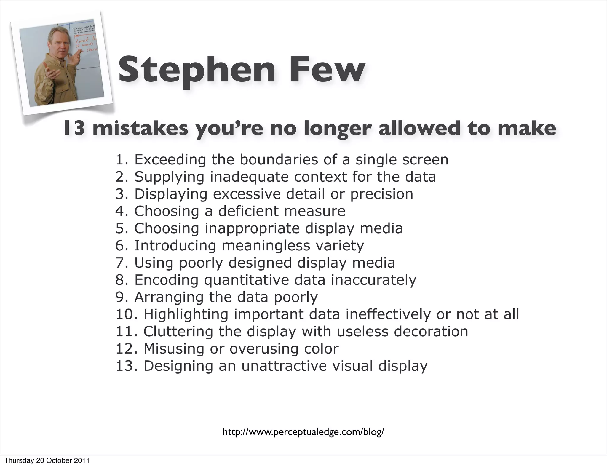
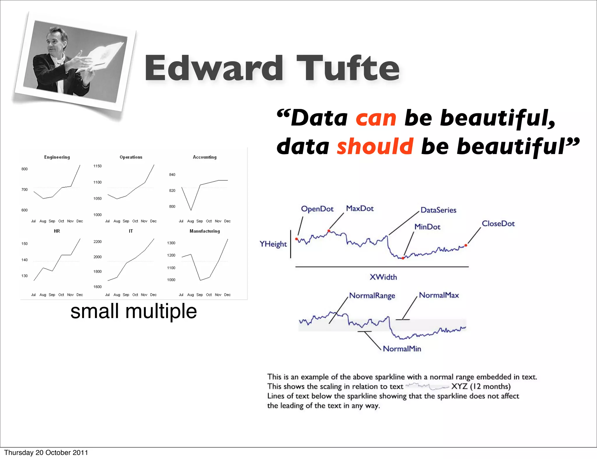
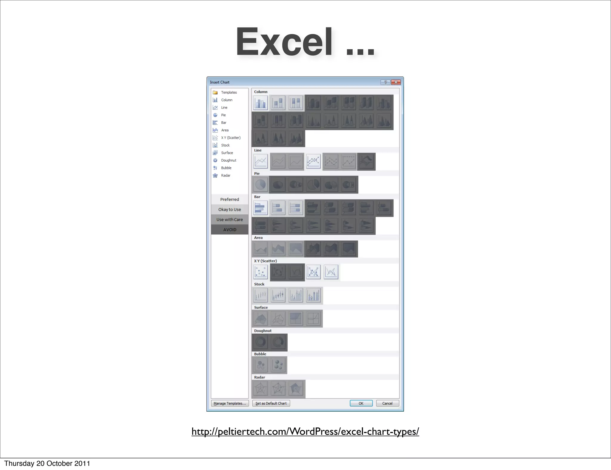
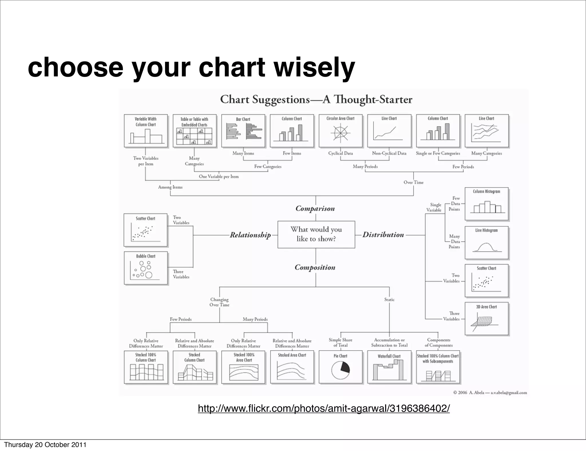
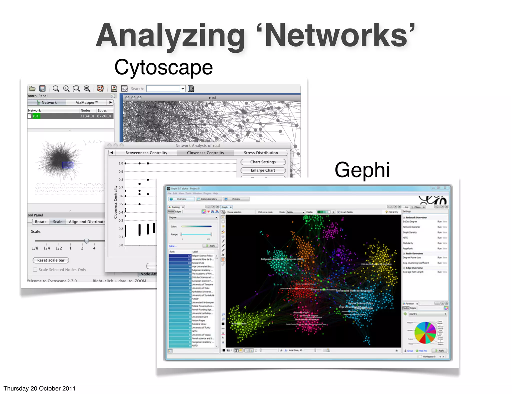
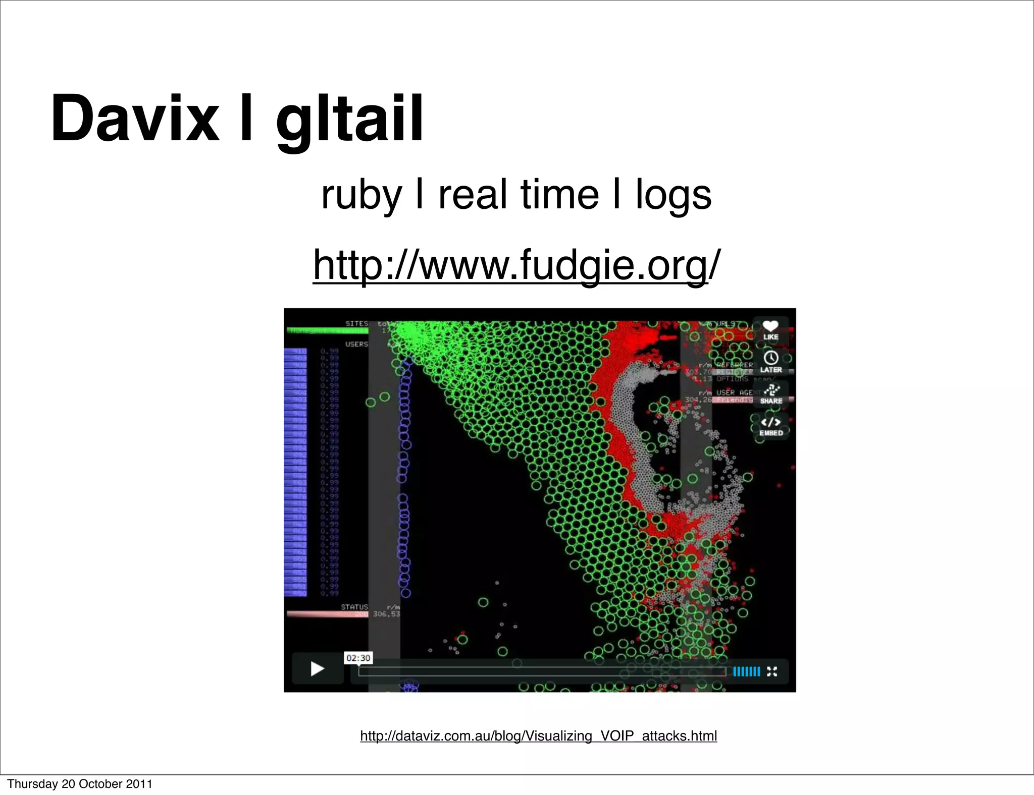
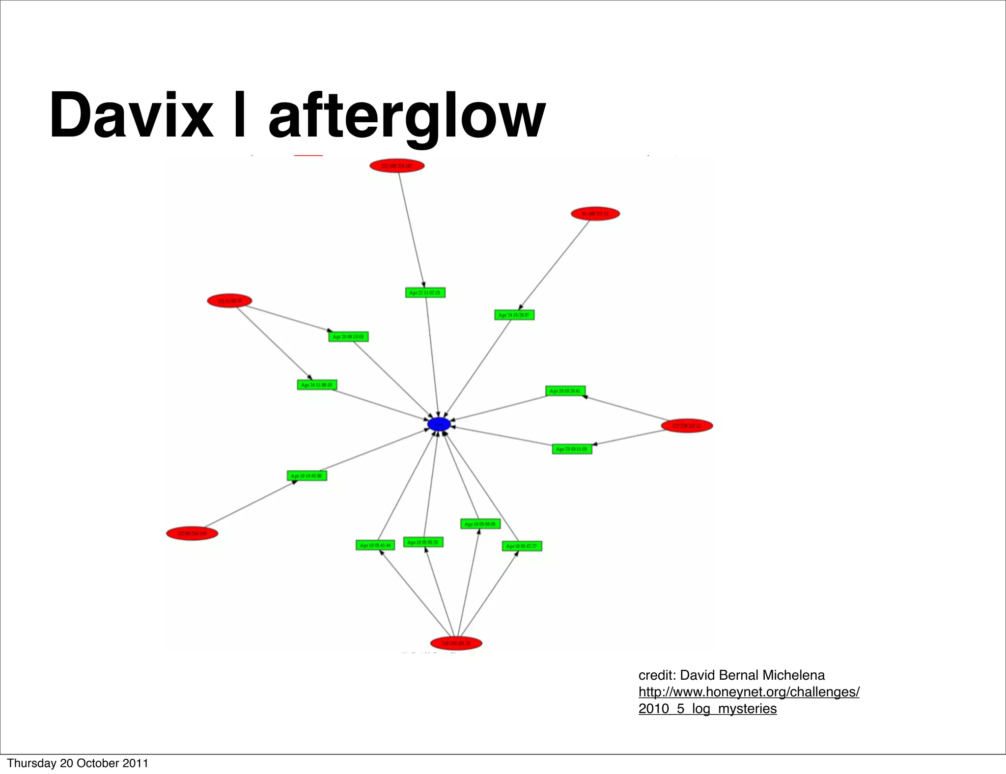
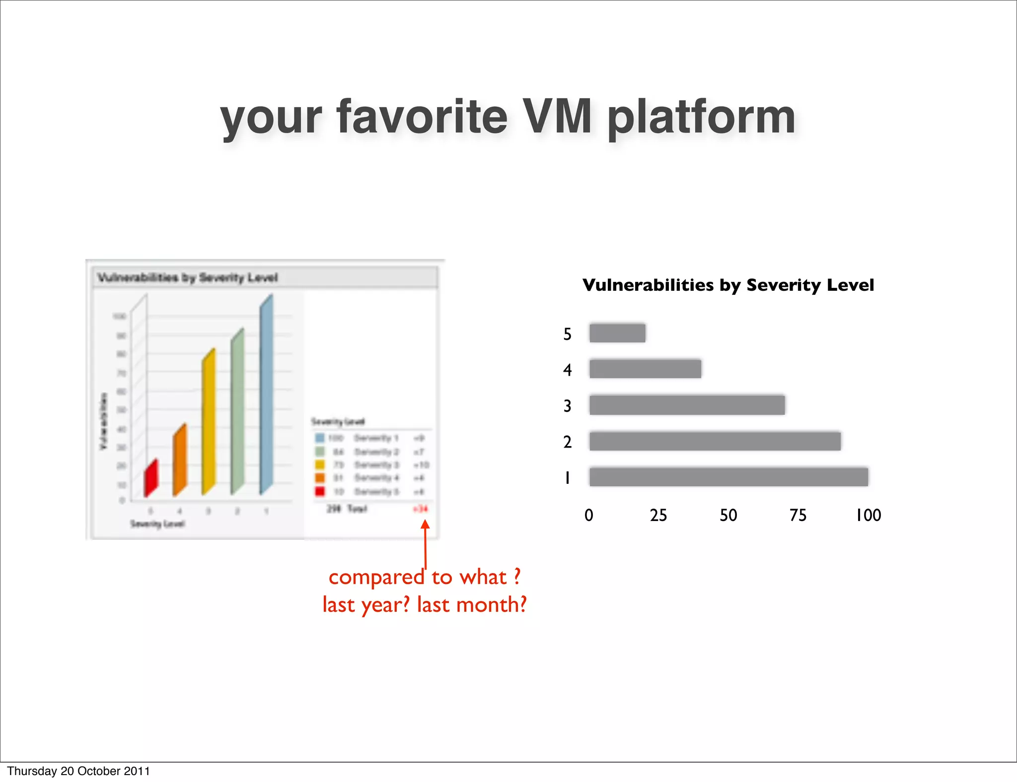
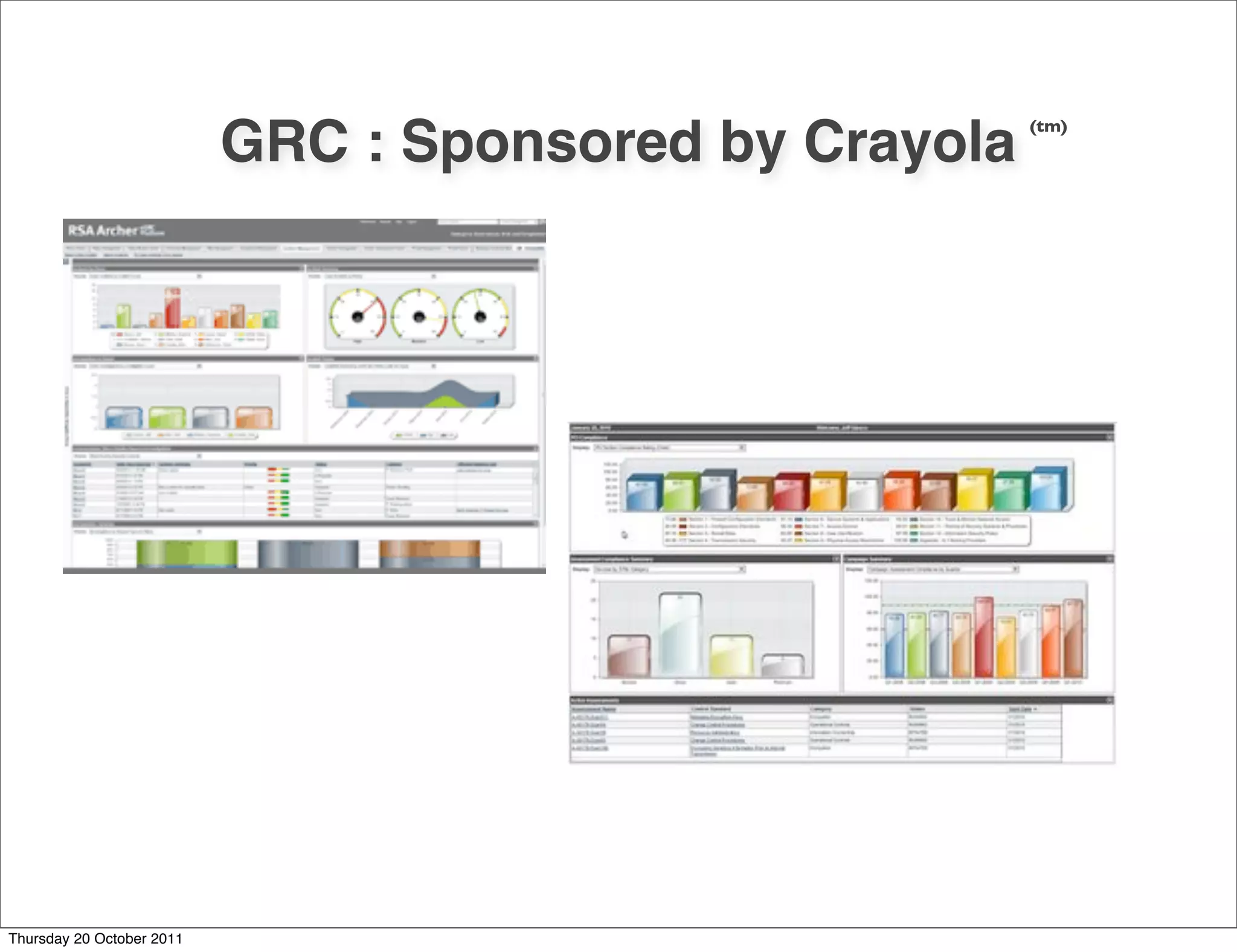
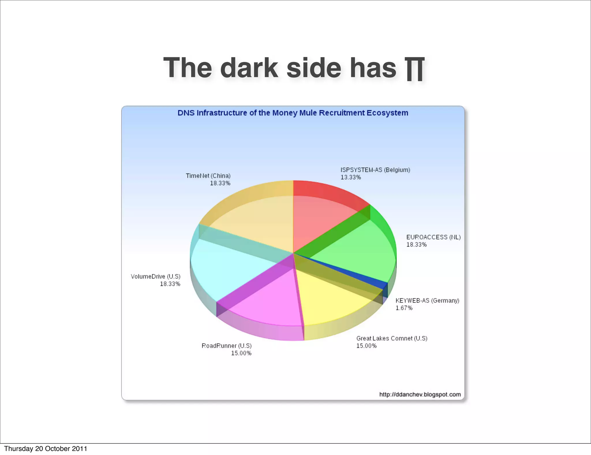
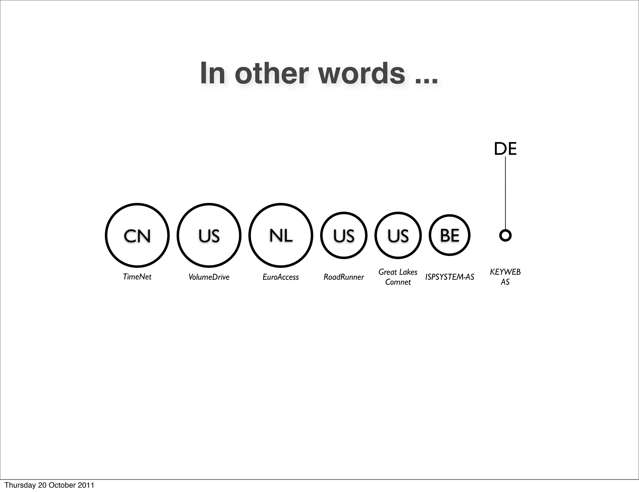
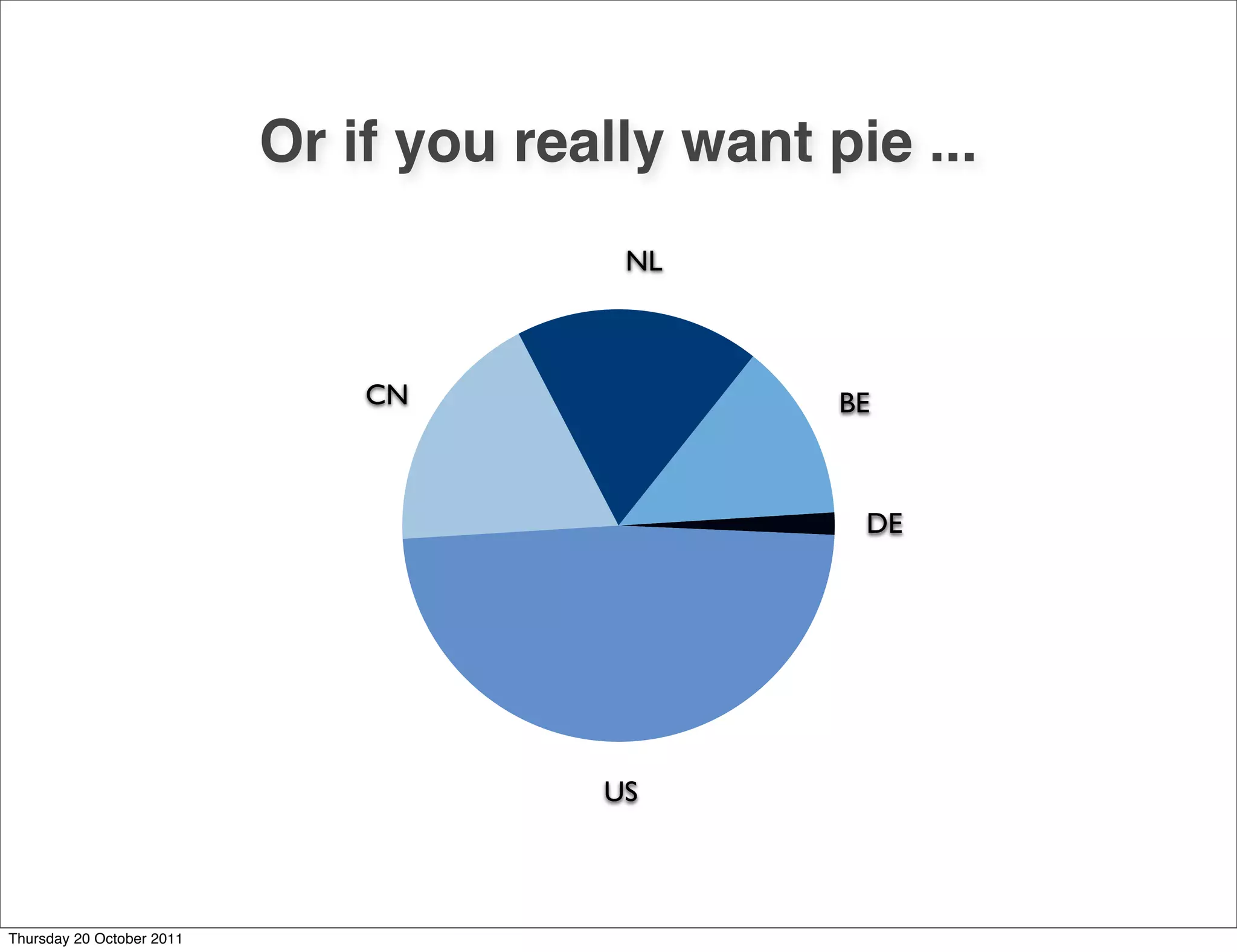
The document discusses common mistakes in data visualization, as identified by Stephen Few, including issues like excessive detail, poor choice of media, and ineffective data arrangement. It also touches upon the importance of choosing appropriate chart types and provides various resources and tools for effective data visualization, including references to websites and software related to data analysis. The content emphasizes the need for clarity and aesthetic appeal in presenting data.


![Coded Agents – with UiPath SDK + LangGraph [Virtual Hands-on Workshop]](https://cdn.slidesharecdn.com/ss_thumbnails/codedagentsdeck-251215155422-5497c599-thumbnail.jpg?width=640&height=640&fit=bounds)


