Download to read offline


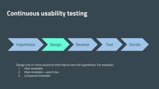
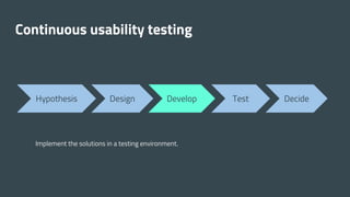
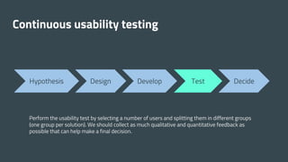
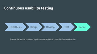
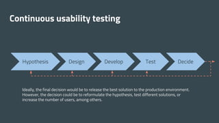


The document discusses improving the usability of transport timetables for mobile devices, focusing on the challenges and strategies in timetable generation and user experience (UX) design. A usability study was conducted to test different timetable formats, gathering both qualitative and quantitative feedback from participants. Key lessons highlight the importance of continuous testing, diverse user representation, and leveraging additional information sources for enhanced user experience.


![[Nux]12 nux](https://cdn.slidesharecdn.com/ss_thumbnails/nux12nux-121212041602-phpapp01-thumbnail.jpg?width=640&height=640&fit=bounds)


