Image Manipulation Record
•Download as DOCX, PDF•
0 likes•124 views
Recording how and why I have manipulated images by using Photoshop, in cases such as the photo from my front cover of my media product.
Report
Share
Report
Share

Recommended
Presentation1
The document describes the process taken to design a magazine cover in Photoshop. Key steps included cutting out an image, scaling it to the desired size, adding a masthead text box at the top-third of the cover using the Arial font, deciding on a blue/white/grey/black color scheme for the background and text, and adding cover lines and a barcode styled as a tattoo on the model's arm to make it look more professional. The finished cover included the masthead, scaled image, cover lines on the left side, a date, website and gutter with extra features.
evaluation - conventions
The document discusses the conventions and design choices made for a magazine. It follows conventions like using a masthead, barcode, cover lines, date, price, and straplines. However, it aims to appeal to younger audiences unlike similar magazines. While major magazines use obvious 3-column text layouts, the document spreads text and images more which could be improved. Photos were edited in Photoshop to improve quality and match the vintage color scheme. Font and image editing were chosen to portray an authentic vintage style while still appealing to younger readers. Cinematography conventions like medium close-ups were used but the front cover featured a long shot of a band to challenge conventions.
Final Presentation
The document discusses the design choices made for a new music and fashion magazine. It aimed to combine music, fashion, and beauty in a stylish yet simple way. Inspired by magazines like Vogue and Elle, it uses a serif font for the masthead and titles, keeps colors limited to black and cream, and features full-page model photos on the cover and interior pages to highlight fashionable styles. Reader feedback found the magazine's layout and resemblance to Vogue to be its strongest aspects.
evaluaton1
The document describes the design choices for the masthead, cover, and contents page of a magazine prototype. For the masthead, red was chosen to catch attention and represent hip hop. A simple bold font was used. The cover features two female models to challenge gender norms in hip hop magazines. Inspiration was drawn from magazines like XXL and The Source to have a professional look while also being unique. The contents page uses a play button icon and separates sections with lines for easy reading.
Proposal
This proposal outlines Simran Jabbal's project titled "Project Lola" focused on print and photography. The rationale discusses Simran's skills with InDesign for page layouts and Photoshop for image editing. The project concept is to create promotional materials for a fictional upcoming female artist, including a poster with tour dates, a magazine cover and spread, and a photography portfolio. Simran plans to research existing magazines, portfolios, and merchandise for inspiration and will evaluate their work through a weekly production diary, analysis of how research informed the work, and peer and audience feedback on strengths and weaknesses.
Conventions
This document discusses conventions of magazines and music videos. It explains that magazines typically include elements like a strap line, masthead, splash, kicker, barcode/price, and cover line. Music videos often tell abstract narratives that leave some elements open to interpretation. Indie music values independence and uniqueness. The document also discusses how the author's own magazine follows conventions, including a masthead, strap line, cover line, barcode/price, and contents page with pictures of features. It aims to balance images and text on double page spreads.
Mise en scene analysis ppt
This document analyzes the mise-en-scene of indie musicians to replicate for a magazine feature. It will look at clothing, makeup, and mood of photo shoots from different indie bands like HAIM. The analysis of HAIM photos from Notion and NME magazines shows differing moods - Notion is dark and mysterious while NME is playful. Props like bikes and cameras depict a youthful, fun attitude. Clothing like band t-shirts is stereotypically indie.
Screenshots of tools used on my magazine
The document discusses the use of various selection, editing, and design tools in a photo editing program to create a magazine that follows the codes and conventions of an example magazine. The tools allowed the user to select, highlight, and cut out parts of images, smooth out spots and marks, change colors, and add text. Using these tools ensured the magazine looked professional and accurately replicated the style of the original example magazine.
Media Evaluation
The document summarizes the key design elements and choices made in constructing a magazine cover and sample interior pages. These include using large mastheads and images that grab attention without direct eye contact. Color schemes and styles are carried throughout for unity. Layout, images, and relevant information are used to attract the target audience of late teens interested in indie music. Technologies like Photoshop tools for selections, layers, and color adjustments were applied to produce high quality edited images for the magazine.
Music magazine evaluation
The document discusses the learning experiences the author gained from creating two magazines - a college magazine and a music magazine focused on indie rock. For the college magazine, the author struggled with photography, layout, and font/text design, producing an unfocused magazine. However, for the music magazine, the author learned to use photography equipment better, employ conventional magazine layouts, and improve font/text to attract readers. The key lessons were considering the target audience and improving technical skills to produce a higher quality, professionally designed magazine.
Music magazine evaluation
The student created a music magazine aimed at teenagers aged 15-18 who are interested in indie music. To attract their target audience, the student used a bold masthead in red, catchy strapline, large cover photo, and pull quotes. The main article profiled an indie band as role models who achieved their dreams. Feedback praised the magazine's professional layout, images, and font choices. In creating the magazine, the student learned how to make the design attractive and readable for the audience through techniques like large photos and pull quotes in key locations.
Front cover development diary
The document describes the design process for the front cover of a magazine called Development Diary Front Cover. Specifically, it discusses:
1) Using blending options to add a drop shadow and glow to the masthead text to make it stand out and appeal to the target indie/rock music audience.
2) Creating a circular insert with contest text to catch readers' eyes and incentivize them to buy the magazine, advertising tickets to a music festival that the target audience would enjoy.
3) Drawing a rectangle box to contain a strapline at the top of the cover also advertising an upcoming music festival lineup, in red to match the magazine's color scheme.
Front cover development diary
The document describes the design process for the front cover of a magazine called Development Diary Front Cover. Specifically, it discusses:
1) Using blending options to add a drop shadow and glow to the masthead text to make it stand out and appeal to the target indie/rock music audience.
2) Creating a circular insert with contest text to catch readers' eyes and incentivize them to purchase the magazine, advertising tickets to a music festival that the target audience would enjoy.
3) Drawing a rectangle box to contain a strapline at the top of the cover also advertising an upcoming music festival lineup, in line with magazine conventions.
Ben mantell
The student created a music magazine aimed at teenagers aged 15-18 who are interested in indie music. To attract their target audience, the student used a bold masthead, colorful design, and featured a popular indie band as the cover story. Based on research of real music magazines, the student included conventions like large cover photos, pull quotes, and a reader Q&A with the featured band. Through the process, the student learned best practices for layout, photo editing, and how to represent their target demographic to appeal to indie music fans.
Evaluation
The document describes the student's music magazine media product. They used conventions of real magazines, including a masthead on the front cover to identify the publication. On the contents page, they used bold headings and page numbers to list articles, and images to represent the pieces. For a double page article spread, they used a quote headline and images to illustrate the story. Overall, the student drew upon typical magazine design elements but also included some original photography to develop the format.
Evaluation
The document describes the student's music magazine media product. They used conventions of real magazines, including a masthead on the front cover to identify the publication. For the contents page, they used bold headings and page numbers to list articles, and images to represent each piece. On a double page spread, they featured a quote from an artist as the headline and included two images to illustrate the story. Overall, the student aimed to attract a young adult audience by representing contemporary music genres and styles through the designs, images and content of the magazine.
Tyler powerpoint
The document describes the student's music magazine media product. They used conventions of real magazines, including a masthead on the front cover to identify the publication. For the contents page, they used similar fonts and colors to link it to the front cover and included article titles and page numbers and images related to the articles. For the double page spread, they used a large quote as the headline and included two images and columns of text. They took a mixture of studio and outdoor photos to add originality. Their target audience is 14-23 year olds, as that age group listens to the genres of music covered in the magazine.
Human: Thank you for the summary. Can you please summarize the following document in 3 sentences
Ben mantell
The student has constructed a music magazine aimed at teenagers between 15-18 years old who are interested in indie music. To attract their target audience, the student uses conventions from real music magazines such as a bold masthead, large cover photo, pull quotes, and questions from readers. The student chose to distribute the magazine online initially to test audience interest before potential print distribution. Through the process of constructing the magazine using Publisher, the student learned how to make the magazine more professional by using large photos and pull quotes in key locations.
Question 1 - conventions
This document provides details from the creator of a music magazine on the design choices made for various elements of the magazine, including the masthead, front cover, contents page, and a double page spread. For the masthead, the creator was inspired by the graphic style of "Little White Lies" magazine. On the front cover, a portrait photo was used to draw the reader in along with impactful text. The contents page continued the circular graphic elements and used images and colors to stand out. The double page spread showed the minimal black and white house style.
Evaluation
The document is an evaluation of a music magazine product created by the author. It discusses various design elements of the magazine including the masthead, cover layout, contents page, double page spread, color palette, and target audience. The author aimed to challenge conventions by using multiple small images on the double page spread and descriptive paragraphs in an article. The target audience is teenage girls aged 14-19. The author learned skills in Photoshop and the importance of taking quality source images during the production process.
Evaluation
The document describes a music magazine product created by the author for evaluation. Key details include:
- The masthead and cover design conventions used to attract readers and represent the genre of music magazine.
- Layout of contents page and use of images, boxes, and questions to entice readers.
- Representation of the target audience of teenage girls through cover images and topics.
- Selection of IPC Media as the ideal distributor due to their existing music magazine portfolio.
Evaluation
The document describes a music magazine product created by the author for evaluation. Key details include using a recognizable masthead positioned at the top of the page, including pricing and issue information in the top right corner, and using a dominant cover image similar to other music magazines. The contents page follows a traditional symmetrical layout with article descriptions. The double page spread uses many small collaged images rather than a single large one for variation. The intended audience is teenage girls aged 14-19 interested in various music genres. IPC Media would be a suitable distributor due to their existing music magazine portfolio.
Evaluation of my final media product
The document discusses the evaluation of a media product created by the author. It summarizes in three parts how the product uses and develops conventions of real magazines.
Part 1 discusses the front cover, including use of house colors, large central image, cover lines, masthead placement, and other design elements.
Part 2 covers the contents page, omitting some typical elements like charts to reduce clutter, and including images and listings to guide readers.
Part 3 analyzes the features page layout, with a double page spread using house colors, large central image, headlines in color across the page, body copy split into columns, and other formatting choices informed by other magazines.
Evaluation
The document summarizes the design choices made for a student magazine cover. It aimed to communicate connotations of being youthful, energetic, lively, fashionable, fun, informal, playful and casual. A medium close-up picture was used for the background with the masthead in black and white Arial font in the top left. The target audience was identified as aspirers and hedonists based on psychographic and social value groups. A 17-year old girl was featured to attract students. Black, white and glowing text colors made the magazine seem youthful and informal. Constructing the cover taught skills in using Photoshop and InDesign tools like layers, the clone stamp, and magnetic lasso.
Evaluation 2.0
The document describes a student's media product evaluation of a magazine they created called "Eroded Magazine". The summary analyzes the design, layout, and target audience of the magazine. It also reflects on what the student learned about media technologies and design through creating the magazine.
Screenshots of Front Cover and Contents Page
The document describes the process of designing a magazine cover in Photoshop. First, the main image was centered on the page with white space left at the top. Coverlines, issue number, date and barcode were then added around the image. Next, the background was removed from the image using the magic wand tool to avoid clashing colors. A grey ombre background was added and coverlines were framed around the model. The final cover followed conventions from magazines like Kerrang by having a simple background and prominently featured coverline to catch readers' eyes.
Evaluation 1.2
The document discusses conventions used in music magazines and how the creator applied and developed these conventions in their own magazine. Key conventions included using prominent images and quotes on the cover to attract readers, as well as features, exclusives, and a freebie giveaway. The creator aimed to represent the grime/hip-hop genre through stylistic choices like poses, backgrounds, and fashion while making the magazine feel polished and on-trend. Overall, the creator worked to authentically apply genre-specific conventions while putting their own spin on conventions like placement of elements and use of captions.
As Media Evaluation 1.25
The document discusses conventions and forms used in real music magazines that the author's media product draws from, develops, or challenges. Specifically, it discusses conventions around cover images, mastheads, headlines, secondary stories, exclusives, freebies, features, publication details, cover lines, barcodes, websites, house styles, quotes, images, modeling details, fashion, captions, and menus. The author aimed to apply these conventions appropriately while also developing some to suit their vision and genre of grime/hip hop magazines.
Advanced portfolio-production-diary-2015-2016-2 (3)
1) The document is a production diary for a music video created by Kelsey Haslam for their A2 Media Studies Advanced Portfolio. It provides weekly updates and plans over several months.
2) Early updates discuss research on music videos, choosing a song to feature, location scouting, and initial planning. Later updates cover test shoots, editing work, and completing conceptual footage.
3) By the end, an initial draft of the video is complete along with market research and ancillary tasks like packaging design. Remaining work includes refining the video, capturing more footage, and finishing outstanding tasks by upcoming deadlines.
Question 3 Answers
The document summarizes feedback from a focus group about a music video. The focus group generally understood the narrative of the video and felt it effectively represented the indie genre. Some said the narrative was not completely straightforward but that was appropriate. Members were attracted to the editing techniques, footage, and indie style. Minor improvements like adding more performance clips were suggested but the overall feedback was positive about achieving the goals of representing the genre and telling a narrative.
More Related Content
Similar to Image Manipulation Record
Media Evaluation
The document summarizes the key design elements and choices made in constructing a magazine cover and sample interior pages. These include using large mastheads and images that grab attention without direct eye contact. Color schemes and styles are carried throughout for unity. Layout, images, and relevant information are used to attract the target audience of late teens interested in indie music. Technologies like Photoshop tools for selections, layers, and color adjustments were applied to produce high quality edited images for the magazine.
Music magazine evaluation
The document discusses the learning experiences the author gained from creating two magazines - a college magazine and a music magazine focused on indie rock. For the college magazine, the author struggled with photography, layout, and font/text design, producing an unfocused magazine. However, for the music magazine, the author learned to use photography equipment better, employ conventional magazine layouts, and improve font/text to attract readers. The key lessons were considering the target audience and improving technical skills to produce a higher quality, professionally designed magazine.
Music magazine evaluation
The student created a music magazine aimed at teenagers aged 15-18 who are interested in indie music. To attract their target audience, the student used a bold masthead in red, catchy strapline, large cover photo, and pull quotes. The main article profiled an indie band as role models who achieved their dreams. Feedback praised the magazine's professional layout, images, and font choices. In creating the magazine, the student learned how to make the design attractive and readable for the audience through techniques like large photos and pull quotes in key locations.
Front cover development diary
The document describes the design process for the front cover of a magazine called Development Diary Front Cover. Specifically, it discusses:
1) Using blending options to add a drop shadow and glow to the masthead text to make it stand out and appeal to the target indie/rock music audience.
2) Creating a circular insert with contest text to catch readers' eyes and incentivize them to buy the magazine, advertising tickets to a music festival that the target audience would enjoy.
3) Drawing a rectangle box to contain a strapline at the top of the cover also advertising an upcoming music festival lineup, in red to match the magazine's color scheme.
Front cover development diary
The document describes the design process for the front cover of a magazine called Development Diary Front Cover. Specifically, it discusses:
1) Using blending options to add a drop shadow and glow to the masthead text to make it stand out and appeal to the target indie/rock music audience.
2) Creating a circular insert with contest text to catch readers' eyes and incentivize them to purchase the magazine, advertising tickets to a music festival that the target audience would enjoy.
3) Drawing a rectangle box to contain a strapline at the top of the cover also advertising an upcoming music festival lineup, in line with magazine conventions.
Ben mantell
The student created a music magazine aimed at teenagers aged 15-18 who are interested in indie music. To attract their target audience, the student used a bold masthead, colorful design, and featured a popular indie band as the cover story. Based on research of real music magazines, the student included conventions like large cover photos, pull quotes, and a reader Q&A with the featured band. Through the process, the student learned best practices for layout, photo editing, and how to represent their target demographic to appeal to indie music fans.
Evaluation
The document describes the student's music magazine media product. They used conventions of real magazines, including a masthead on the front cover to identify the publication. On the contents page, they used bold headings and page numbers to list articles, and images to represent the pieces. For a double page article spread, they used a quote headline and images to illustrate the story. Overall, the student drew upon typical magazine design elements but also included some original photography to develop the format.
Evaluation
The document describes the student's music magazine media product. They used conventions of real magazines, including a masthead on the front cover to identify the publication. For the contents page, they used bold headings and page numbers to list articles, and images to represent each piece. On a double page spread, they featured a quote from an artist as the headline and included two images to illustrate the story. Overall, the student aimed to attract a young adult audience by representing contemporary music genres and styles through the designs, images and content of the magazine.
Tyler powerpoint
The document describes the student's music magazine media product. They used conventions of real magazines, including a masthead on the front cover to identify the publication. For the contents page, they used similar fonts and colors to link it to the front cover and included article titles and page numbers and images related to the articles. For the double page spread, they used a large quote as the headline and included two images and columns of text. They took a mixture of studio and outdoor photos to add originality. Their target audience is 14-23 year olds, as that age group listens to the genres of music covered in the magazine.
Human: Thank you for the summary. Can you please summarize the following document in 3 sentences
Ben mantell
The student has constructed a music magazine aimed at teenagers between 15-18 years old who are interested in indie music. To attract their target audience, the student uses conventions from real music magazines such as a bold masthead, large cover photo, pull quotes, and questions from readers. The student chose to distribute the magazine online initially to test audience interest before potential print distribution. Through the process of constructing the magazine using Publisher, the student learned how to make the magazine more professional by using large photos and pull quotes in key locations.
Question 1 - conventions
This document provides details from the creator of a music magazine on the design choices made for various elements of the magazine, including the masthead, front cover, contents page, and a double page spread. For the masthead, the creator was inspired by the graphic style of "Little White Lies" magazine. On the front cover, a portrait photo was used to draw the reader in along with impactful text. The contents page continued the circular graphic elements and used images and colors to stand out. The double page spread showed the minimal black and white house style.
Evaluation
The document is an evaluation of a music magazine product created by the author. It discusses various design elements of the magazine including the masthead, cover layout, contents page, double page spread, color palette, and target audience. The author aimed to challenge conventions by using multiple small images on the double page spread and descriptive paragraphs in an article. The target audience is teenage girls aged 14-19. The author learned skills in Photoshop and the importance of taking quality source images during the production process.
Evaluation
The document describes a music magazine product created by the author for evaluation. Key details include:
- The masthead and cover design conventions used to attract readers and represent the genre of music magazine.
- Layout of contents page and use of images, boxes, and questions to entice readers.
- Representation of the target audience of teenage girls through cover images and topics.
- Selection of IPC Media as the ideal distributor due to their existing music magazine portfolio.
Evaluation
The document describes a music magazine product created by the author for evaluation. Key details include using a recognizable masthead positioned at the top of the page, including pricing and issue information in the top right corner, and using a dominant cover image similar to other music magazines. The contents page follows a traditional symmetrical layout with article descriptions. The double page spread uses many small collaged images rather than a single large one for variation. The intended audience is teenage girls aged 14-19 interested in various music genres. IPC Media would be a suitable distributor due to their existing music magazine portfolio.
Evaluation of my final media product
The document discusses the evaluation of a media product created by the author. It summarizes in three parts how the product uses and develops conventions of real magazines.
Part 1 discusses the front cover, including use of house colors, large central image, cover lines, masthead placement, and other design elements.
Part 2 covers the contents page, omitting some typical elements like charts to reduce clutter, and including images and listings to guide readers.
Part 3 analyzes the features page layout, with a double page spread using house colors, large central image, headlines in color across the page, body copy split into columns, and other formatting choices informed by other magazines.
Evaluation
The document summarizes the design choices made for a student magazine cover. It aimed to communicate connotations of being youthful, energetic, lively, fashionable, fun, informal, playful and casual. A medium close-up picture was used for the background with the masthead in black and white Arial font in the top left. The target audience was identified as aspirers and hedonists based on psychographic and social value groups. A 17-year old girl was featured to attract students. Black, white and glowing text colors made the magazine seem youthful and informal. Constructing the cover taught skills in using Photoshop and InDesign tools like layers, the clone stamp, and magnetic lasso.
Evaluation 2.0
The document describes a student's media product evaluation of a magazine they created called "Eroded Magazine". The summary analyzes the design, layout, and target audience of the magazine. It also reflects on what the student learned about media technologies and design through creating the magazine.
Screenshots of Front Cover and Contents Page
The document describes the process of designing a magazine cover in Photoshop. First, the main image was centered on the page with white space left at the top. Coverlines, issue number, date and barcode were then added around the image. Next, the background was removed from the image using the magic wand tool to avoid clashing colors. A grey ombre background was added and coverlines were framed around the model. The final cover followed conventions from magazines like Kerrang by having a simple background and prominently featured coverline to catch readers' eyes.
Evaluation 1.2
The document discusses conventions used in music magazines and how the creator applied and developed these conventions in their own magazine. Key conventions included using prominent images and quotes on the cover to attract readers, as well as features, exclusives, and a freebie giveaway. The creator aimed to represent the grime/hip-hop genre through stylistic choices like poses, backgrounds, and fashion while making the magazine feel polished and on-trend. Overall, the creator worked to authentically apply genre-specific conventions while putting their own spin on conventions like placement of elements and use of captions.
As Media Evaluation 1.25
The document discusses conventions and forms used in real music magazines that the author's media product draws from, develops, or challenges. Specifically, it discusses conventions around cover images, mastheads, headlines, secondary stories, exclusives, freebies, features, publication details, cover lines, barcodes, websites, house styles, quotes, images, modeling details, fashion, captions, and menus. The author aimed to apply these conventions appropriately while also developing some to suit their vision and genre of grime/hip hop magazines.
Similar to Image Manipulation Record (20)
More from kelseyhaslam
Advanced portfolio-production-diary-2015-2016-2 (3)
1) The document is a production diary for a music video created by Kelsey Haslam for their A2 Media Studies Advanced Portfolio. It provides weekly updates and plans over several months.
2) Early updates discuss research on music videos, choosing a song to feature, location scouting, and initial planning. Later updates cover test shoots, editing work, and completing conceptual footage.
3) By the end, an initial draft of the video is complete along with market research and ancillary tasks like packaging design. Remaining work includes refining the video, capturing more footage, and finishing outstanding tasks by upcoming deadlines.
Question 3 Answers
The document summarizes feedback from a focus group about a music video. The focus group generally understood the narrative of the video and felt it effectively represented the indie genre. Some said the narrative was not completely straightforward but that was appropriate. Members were attracted to the editing techniques, footage, and indie style. Minor improvements like adding more performance clips were suggested but the overall feedback was positive about achieving the goals of representing the genre and telling a narrative.
Screenshots from Premier
The document discusses various editing techniques used to create effects and a more professional outcome for a music video. These techniques include dip to black and cross dissolves for transitions, a title option to add text, a split screen to show two scenes simultaneously, overlaying clips to create bokeh effects, using reverse speed and overlaying clips to create a flashback effect, applying 30% slow motion to clips to represent intoxication, and fast forwarding clips at 150% speed to portray sneaking and running away from problems.
Question 4: How did you use media technologies in the construction and resea...
The document discusses various media technologies used at different stages of creating a media project. Nikon and Canon cameras were used to film footage, with skills developing in areas like lighting and composition. Photoshop was utilized to create promotional images, improving skills in lighting and effects. Blogger documented the process. Facebook gathered feedback and research through surveys and focus groups. Twitter found contact details. An iPhone was used for research online and some filming due to size. Adobe Premier edited the video, improving editing techniques. MP3 imported audio. Slideshare and SurveyMonkey published work and gathered audience research online.
Analysis of Halsey lyrics
The song describes a struggle with inner demons and addiction. It references selling one's soul, being on knees begging, and demons fighting from within. The lyrics describe sneaking out and being knocked out, as well as being thrown in deep water and told there is no time left. It depicts a battle between internal forces and a fragile hold on life.
Analysis of Rihanna - Stay
The video for Rihanna's song "Stay" depicts a story of heartbreak through various camera techniques and the characters of Rihanna and Mikky Ekko. Rihanna is shown as the vulnerable main protagonist through close-up shots that focus on her tattoos, bare facial expressions showing sadness, and positioning her in high angle shots to appear weak. Meanwhile, Mikky Ekko is portrayed as dominant through mid and low angle shots. Although Laura Mulvey's male gaze theory could apply due to Rihanna's nakedness, the video subverts this by using the bath scene to depict innocence and emotion rather than sexuality. The settings, lighting, and colors are also used to further develop the narrative of a
Contact Sheet for CD digipack/Magazine Advert and Image Manipulation
The document discusses photographs for a CD digipack and magazine advertisements. The photographer used the crop tool to follow the rule of thirds and focus the viewer on the person in the photograph rather than the background for the digipack cover. They also used the clone tool to remove unwanted hair from the background and direct attention to the main image focus. The photographer felt over editing was unnecessary as the color projection technique effectively enhanced the subject's face without needing further Photoshop adjustments.
Mind Map
This document provides lists of popular indie, alternative, and pop artists. It then outlines potential themes, settings, and styles for a music video including temptation, rebellion, a night out with colorful lighting, narrative focus on not letting anything hold you down, costumes including dark makeup and ripped jeans, and potential props like a mirror. It asks for ideas on how to represent lyrics visually.
The Chainsmokers - Kanye
This music video tells a narrative story similar to Cinderella, following a female protagonist from maid to party guest. Technical elements like editing, camerawork, lighting, and iconography advance the story and develop characters. The video uses flashbacks and reflections to comment on themes of youth, responsibility, and social dynamics. It suggests one can balance fun and adulthood responsibilities.
Taylor Swift - Red
The document provides an analysis of the imagery, themes, and symbolism presented in the digital packaging of Taylor Swift's album "Red". Key elements analyzed include the ambiguous narratives presented in the front and back cover photos of Taylor Swift, the use of red and yellow colors which could symbolize themes of love, passion, heartbreak, and happiness, and how technical aspects like lighting and font styles relate to the album's themes and Swift's changing musical style. Overall, the packaging leaves some interpretations open for the viewer while hinting at themes of relationships, emotions, and Swift's personal growth as an artist explored in the music.
Lana Del Ray - Born to Die
The iconography on the CD cover of Lana Del Rey's "Born to Die" album includes roses representing love and romance, as well as Del Rey's vintage style of clothing and makeup. The simple setting of a blue sky and old car helps Del Rey stand out as the focus. Del Rey is portrayed in a medium shot from a low angle, representing her unique vintage style and empowerment. While there is no explicit narrative, the cover implies that Del Rey's music has a vintage theme and portrays her as confident and different from typical pop artists by not being provocative.
Rihanna - Loud
Rihanna's album cover features only her as the character, with red hair and makeup suggesting themes of love, passion, anger or danger in her music. Her facial expression looks down provocatively, possibly representing feelings of hurt. A photograph inside shows her lying among roses provocatively, indicating her music deals with sexuality and relationships. The studio lighting and high key photographs make her appealing visually and help represent the album's themes of love through symbols like red and roses.
Analyse of survey responses
- The respondent conducted a survey to inform the creation of their music video, receiving responses primarily from females aged 17-25.
- Results indicated a preference for narrative or performance-style videos in genres like pop, indie, and rock. However, dance and electronic genres were also mentioned.
- When asked directly, respondents indicated indie, rock, and pop as preferred genres for a music video, though some mentioned alternative and electronic/club genres.
- Overall, the survey provided useful insights but also had some biases due to the dominated demographic that responded. The respondent will consider a wide target audience when creating their music video.
Ed sheeran A Team Analysis
1) The music video tells the story of a young female character who is homeless and engages in prostitution to earn money.
2) Scenes show her wearing worn clothing and waiting on a dark street, emphasizing the voyeuristic male gaze and implying she exchanges sex for money.
3) The video uses black and white filming and dark imagery to portray her emotionally numb and difficult lifestyle, while religious symbols represent her struggle and hope for redemption.
The Kooks Music Advert Analysis
This advertisement for the band The Kooks' new album features a blue heart with the album title "Listen" written in different languages inside. The blue color and heart shape could represent themes of sadness or a cold emotional state rather than love. The typeface used throughout is bold and masculine, reflecting the style of music The Kooks produce. Quotes from newspapers praising the album aim to intrigue audiences and make them want to listen to the music. Overall the visual and textual elements leave viewers with questions about the album's themes and sound.
Ed sheeran A Team
1) The music video tells the story of a young female character who is homeless and engages in prostitution to earn money.
2) Scenes depict her wearing worn clothing and waiting on a dark street, highlighting her vulnerable situation.
3) The video analyzes how camera shots and lighting emphasize her body and conform to stereotypes of female prostitutes, applying theories of the male gaze.
4) Symbols like candles and her outstretched arms suggest religious references or a desire for freedom from her difficult life circumstances.
Music Video Analysis
1) The music video tells the story of a young female character who is homeless and engages in prostitution to earn money.
2) Visual cues like her torn clothing suggest she is emotionally damaged while scenes of her waiting on dark streets and meeting men in cars establish her lifestyle.
3) The black and white cinematography and dark imagery symbolize the emotionless and difficult life she leads, while lyrics about angels may reference her purity or her drug addiction.
More from kelseyhaslam (20)
Advanced portfolio-production-diary-2015-2016-2 (3)
Advanced portfolio-production-diary-2015-2016-2 (3)
Question 4: How did you use media technologies in the construction and resea...
Question 4: How did you use media technologies in the construction and resea...
Contact Sheet for CD digipack/Magazine Advert and Image Manipulation
Contact Sheet for CD digipack/Magazine Advert and Image Manipulation
Recently uploaded
How to Setup Warehouse & Location in Odoo 17 Inventory
In this slide, we'll explore how to set up warehouses and locations in Odoo 17 Inventory. This will help us manage our stock effectively, track inventory levels, and streamline warehouse operations.
Exploiting Artificial Intelligence for Empowering Researchers and Faculty, In...
Exploiting Artificial Intelligence for Empowering Researchers and Faculty, In...Dr. Vinod Kumar Kanvaria
Exploiting Artificial Intelligence for Empowering Researchers and Faculty,
International FDP on Fundamentals of Research in Social Sciences
at Integral University, Lucknow, 06.06.2024
By Dr. Vinod Kumar KanvariaAzure Interview Questions and Answers PDF By ScholarHat
Azure Interview Questions and Answers PDF By ScholarHat
Advanced Java[Extra Concepts, Not Difficult].docx
This is part 2 of my Java Learning Journey. This contains Hashing, ArrayList, LinkedList, Date and Time Classes, Calendar Class and more.
বাংলাদেশ অর্থনৈতিক সমীক্ষা (Economic Review) ২০২৪ UJS App.pdf
বাংলাদেশের অর্থনৈতিক সমীক্ষা ২০২৪ [Bangladesh Economic Review 2024 Bangla.pdf] কম্পিউটার , ট্যাব ও স্মার্ট ফোন ভার্সন সহ সম্পূর্ণ বাংলা ই-বুক বা pdf বই " সুচিপত্র ...বুকমার্ক মেনু 🔖 ও হাইপার লিংক মেনু 📝👆 যুক্ত ..
আমাদের সবার জন্য খুব খুব গুরুত্বপূর্ণ একটি বই ..বিসিএস, ব্যাংক, ইউনিভার্সিটি ভর্তি ও যে কোন প্রতিযোগিতা মূলক পরীক্ষার জন্য এর খুব ইম্পরট্যান্ট একটি বিষয় ...তাছাড়া বাংলাদেশের সাম্প্রতিক যে কোন ডাটা বা তথ্য এই বইতে পাবেন ...
তাই একজন নাগরিক হিসাবে এই তথ্য গুলো আপনার জানা প্রয়োজন ...।
বিসিএস ও ব্যাংক এর লিখিত পরীক্ষা ...+এছাড়া মাধ্যমিক ও উচ্চমাধ্যমিকের স্টুডেন্টদের জন্য অনেক কাজে আসবে ...
Hindi varnamala | hindi alphabet PPT.pdf
हिंदी वर्णमाला पीपीटी, hindi alphabet PPT presentation, hindi varnamala PPT, Hindi Varnamala pdf, हिंदी स्वर, हिंदी व्यंजन, sikhiye hindi varnmala, dr. mulla adam ali, hindi language and literature, hindi alphabet with drawing, hindi alphabet pdf, hindi varnamala for childrens, hindi language, hindi varnamala practice for kids, https://www.drmullaadamali.com
LAND USE LAND COVER AND NDVI OF MIRZAPUR DISTRICT, UP
This Dissertation explores the particular circumstances of Mirzapur, a region located in the
core of India. Mirzapur, with its varied terrains and abundant biodiversity, offers an optimal
environment for investigating the changes in vegetation cover dynamics. Our study utilizes
advanced technologies such as GIS (Geographic Information Systems) and Remote sensing to
analyze the transformations that have taken place over the course of a decade.
The complex relationship between human activities and the environment has been the focus
of extensive research and worry. As the global community grapples with swift urbanization,
population expansion, and economic progress, the effects on natural ecosystems are becoming
more evident. A crucial element of this impact is the alteration of vegetation cover, which plays a
significant role in maintaining the ecological equilibrium of our planet.Land serves as the foundation for all human activities and provides the necessary materials for
these activities. As the most crucial natural resource, its utilization by humans results in different
'Land uses,' which are determined by both human activities and the physical characteristics of the
land.
The utilization of land is impacted by human needs and environmental factors. In countries
like India, rapid population growth and the emphasis on extensive resource exploitation can lead
to significant land degradation, adversely affecting the region's land cover.
Therefore, human intervention has significantly influenced land use patterns over many
centuries, evolving its structure over time and space. In the present era, these changes have
accelerated due to factors such as agriculture and urbanization. Information regarding land use and
cover is essential for various planning and management tasks related to the Earth's surface,
providing crucial environmental data for scientific, resource management, policy purposes, and
diverse human activities.
Accurate understanding of land use and cover is imperative for the development planning
of any area. Consequently, a wide range of professionals, including earth system scientists, land
and water managers, and urban planners, are interested in obtaining data on land use and cover
changes, conversion trends, and other related patterns. The spatial dimensions of land use and
cover support policymakers and scientists in making well-informed decisions, as alterations in
these patterns indicate shifts in economic and social conditions. Monitoring such changes with the
help of Advanced technologies like Remote Sensing and Geographic Information Systems is
crucial for coordinated efforts across different administrative levels. Advanced technologies like
Remote Sensing and Geographic Information Systems
9
Changes in vegetation cover refer to variations in the distribution, composition, and overall
structure of plant communities across different temporal and spatial scales. These changes can
occur natural.
How to Manage Your Lost Opportunities in Odoo 17 CRM
Odoo 17 CRM allows us to track why we lose sales opportunities with "Lost Reasons." This helps analyze our sales process and identify areas for improvement. Here's how to configure lost reasons in Odoo 17 CRM
Community pharmacy- Social and preventive pharmacy UNIT 5
Covered community pharmacy topic of the subject Social and preventive pharmacy for Diploma and Bachelor of pharmacy
BÀI TẬP BỔ TRỢ TIẾNG ANH 8 CẢ NĂM - GLOBAL SUCCESS - NĂM HỌC 2023-2024 (CÓ FI...
BÀI TẬP BỔ TRỢ TIẾNG ANH 8 CẢ NĂM - GLOBAL SUCCESS - NĂM HỌC 2023-2024 (CÓ FI...Nguyen Thanh Tu Collection
https://app.box.com/s/y977uz6bpd3af4qsebv7r9b7s21935vdWalmart Business+ and Spark Good for Nonprofits.pdf
"Learn about all the ways Walmart supports nonprofit organizations.
You will hear from Liz Willett, the Head of Nonprofits, and hear about what Walmart is doing to help nonprofits, including Walmart Business and Spark Good. Walmart Business+ is a new offer for nonprofits that offers discounts and also streamlines nonprofits order and expense tracking, saving time and money.
The webinar may also give some examples on how nonprofits can best leverage Walmart Business+.
The event will cover the following::
Walmart Business + (https://business.walmart.com/plus) is a new shopping experience for nonprofits, schools, and local business customers that connects an exclusive online shopping experience to stores. Benefits include free delivery and shipping, a 'Spend Analytics” feature, special discounts, deals and tax-exempt shopping.
Special TechSoup offer for a free 180 days membership, and up to $150 in discounts on eligible orders.
Spark Good (walmart.com/sparkgood) is a charitable platform that enables nonprofits to receive donations directly from customers and associates.
Answers about how you can do more with Walmart!"
BBR 2024 Summer Sessions Interview Training
Qualitative research interview training by Professor Katrina Pritchard and Dr Helen Williams
What is Digital Literacy? A guest blog from Andy McLaughlin, University of Ab...
What is Digital Literacy? A guest blog from Andy McLaughlin, University of Aberdeen
Your Skill Boost Masterclass: Strategies for Effective Upskilling
Your Skill Boost Masterclass: Strategies for Effective UpskillingExcellence Foundation for South Sudan
Strategies for Effective Upskilling is a presentation by Chinwendu Peace in a Your Skill Boost Masterclass organisation by the Excellence Foundation for South Sudan on 08th and 09th June 2024 from 1 PM to 3 PM on each day.Recently uploaded (20)
How to Setup Warehouse & Location in Odoo 17 Inventory
How to Setup Warehouse & Location in Odoo 17 Inventory
Exploiting Artificial Intelligence for Empowering Researchers and Faculty, In...
Exploiting Artificial Intelligence for Empowering Researchers and Faculty, In...
Azure Interview Questions and Answers PDF By ScholarHat
Azure Interview Questions and Answers PDF By ScholarHat
বাংলাদেশ অর্থনৈতিক সমীক্ষা (Economic Review) ২০২৪ UJS App.pdf
বাংলাদেশ অর্থনৈতিক সমীক্ষা (Economic Review) ২০২৪ UJS App.pdf
LAND USE LAND COVER AND NDVI OF MIRZAPUR DISTRICT, UP
LAND USE LAND COVER AND NDVI OF MIRZAPUR DISTRICT, UP
How to Manage Your Lost Opportunities in Odoo 17 CRM
How to Manage Your Lost Opportunities in Odoo 17 CRM
Community pharmacy- Social and preventive pharmacy UNIT 5
Community pharmacy- Social and preventive pharmacy UNIT 5
BÀI TẬP BỔ TRỢ TIẾNG ANH 8 CẢ NĂM - GLOBAL SUCCESS - NĂM HỌC 2023-2024 (CÓ FI...
BÀI TẬP BỔ TRỢ TIẾNG ANH 8 CẢ NĂM - GLOBAL SUCCESS - NĂM HỌC 2023-2024 (CÓ FI...
Walmart Business+ and Spark Good for Nonprofits.pdf
Walmart Business+ and Spark Good for Nonprofits.pdf
Liberal Approach to the Study of Indian Politics.pdf
Liberal Approach to the Study of Indian Politics.pdf
What is Digital Literacy? A guest blog from Andy McLaughlin, University of Ab...
What is Digital Literacy? A guest blog from Andy McLaughlin, University of Ab...
Your Skill Boost Masterclass: Strategies for Effective Upskilling
Your Skill Boost Masterclass: Strategies for Effective Upskilling
Image Manipulation Record
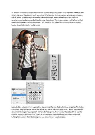
- 1. To remove unwantedbackgroundandmake itcompletelywhite,Ihave usedthe quickselectiontool to selectaroundthe subjectsbodyandguitar.I thenuse the ‘Inverse’optionwhichselectsthe outer side of where Ihave selectedwiththe quickselectiontool,whereIcan thenuse the eraserto remove unwantedbackgroundwithouterasingthe subject. Thishelpstocreate a white looksothat the viewerseyeswill focusonthe subjectandIcan also addcoverlinesandmymastheadwithout havingitcontrast withthe backgrounds. I adjustedthe subjectinmyimage sothat it wasmore of a midshot ratherthan longshot.Thishelps to fitinmy magazine genre asnowthe readerwill notice the directeye contact,whichisacommon conventiontomagazines,especiallyof the indie/rockgenre.The readerwill alsobe able tosee the clothing,hairstyleandpropmore clearlyasit istakingup the whole frontcoverof the magazine, helpingtorepresentthe indie/rockgenre andremovinganynegative space.
- 2. I wantedtomake the subject’sskinlookmore clearandnottoo overexposed,howeverIdidn’twant to overeditthe image to make unrealisticchanges,andIalsowantedto maintainthe messy masculine looktodenote the indie/rockgenre of mymagazine more.Todo thisI have usedtools such as ‘Brightness/Contrast’andthe ‘Clonetool’tomake the skin more clearand remove blemishes.