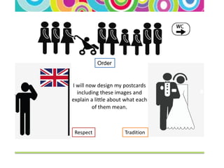
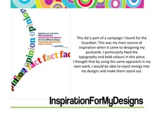
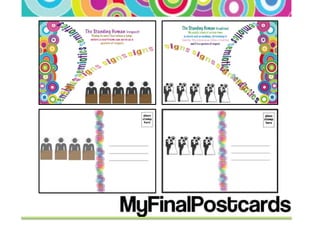
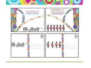
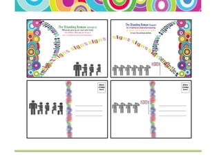
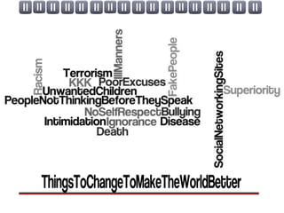
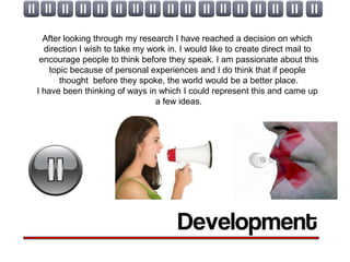
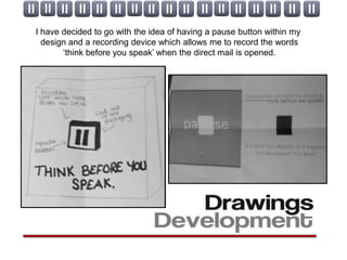
The document describes creating direct mail packaging to encourage people to think before they speak. Some key ideas include:
- Using a pause button design element and recorded message saying "think before you speak" that plays when the packaging is opened.
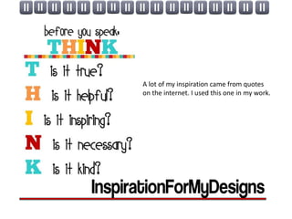
- Inspiration from quotes around thinking before speaking found online.
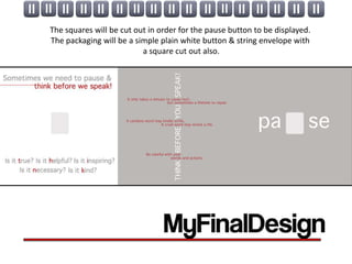
- The packaging will be a simple plain white envelope with a square cut out to reveal the pause button design inside. The goal is to positively impact the world by encouraging thoughtful communication.