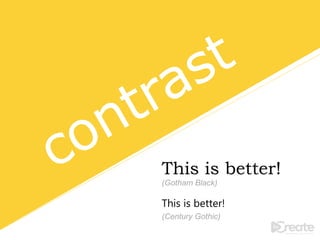
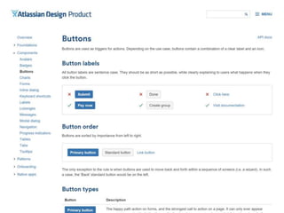
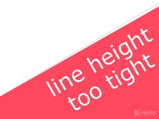
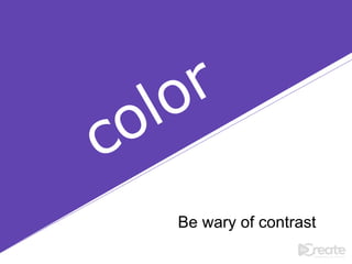
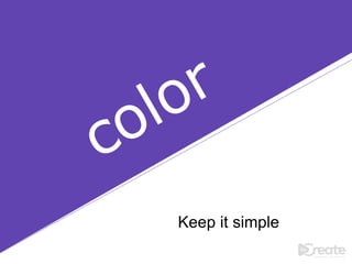
The document provides various principles of effective design, emphasizing the importance of contrast, spacing, and grouping related items to enhance usability. It advises designers to limit font usage, maintain appropriate line length, and consider cultural differences in color meanings. Overall, it underscores simplicity and organization as key components in both graphic and web design.


![ceramic-art-and-pottery [Autosaved].pptx](https://cdn.slidesharecdn.com/ss_thumbnails/ceramic-art-and-potteryautosaved-260113113456-35c55ddb-thumbnail.jpg?width=640&height=640&fit=bounds)