SlideShare a Scribd company logo
CS3216, AY2008/2009, Semester 2—GetHelp!                                                              1

                                National University of Singapore
                                      School of Computing
                       CS3216: Software Development on Evolving Platforms
                                   AY2008/2009, Semester 2

                             GetHelp!: The Inside Story

 Date issued:   2 March 2009


Interaction design is the art of ”defining the behaviour of products and systems that a user can interact
with”. It is the process of simplifying and making the learning curve of a system as flat and intuitive
as possible with a higher focus on usability and less on aesthetics. The term was first proposed by
Bill Moggridge and Bill Verplank to introduce the concepts of industrial design into software interfaces
as well. Today this concept is being practiced not only among systems and softwares but also the
growing space of web applications.
You were asked to evaluate the initial design of GetHelp! as a case study. This document is an
excerpt from the CS3216 Final Project report for the GetHelp! team.


The major problems we faced:

When the application was launched, we faced a few major problems which were mainly from 2 areas:
user interface(UI) and interaction design. This report is a record and account of each of the problems
faced along with our solutions (aka lessons learnt) for them (Note that these solutions may not be the
best solutions but rather one of many possible ones).


Lesson 1: Too many choices and aesthetics cause confusion.


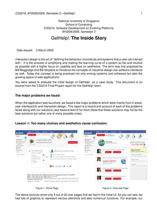
                Figure 1: Home Page                                    Figure 2: Overview Page

The above pictures show only 4 out of 20 over pages that we had in the initial UI. As you can see, we
had lots of graphics to represent various elements and also numerous functions. For example, our
CS3216, AY2008/2009, Semester 2—GetHelp!                                                             2


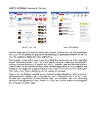
                Figure 3: Project Page                                Figure 4: Statistics Page


Statistics page itself had 5 different sections with 5 different functions which the user could explore
and utilize. We thought that the graphics would make the page aesthetically attractive for the user
while the functions would provide choices and flexibility.
When we came to user testing however, everything failed. One question from our testers was “What
is this? What am I supposed to do?”. Yes, the UI was very attractive. People were attracted to find
out more from the combination of graphics and colours. However, there were too many points of
attraction which left the user confused about which part of the page to focus on. Every page had links
leading to 5 new pages and functions which turned out to be an ”information overload” for the user.
They had too many things to digest and were left clueless and confused.
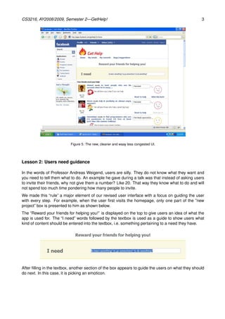
Taking in from the feedback collected, we went back to the drawing board and redid the entire ap-
plication design and ended up with a brand new app that contained only 4 tabs at the top, 3 basic
functions and 5 pages in total (including the invite page). With the new UI, users could immediately
identify what the application was about and how to use it as their attention was focused on the yellow
box at the upper part of the page.
CS3216, AY2008/2009, Semester 2—GetHelp!                                                            3


                           Figure 5: The new, cleaner and waay less congested UI.


Lesson 2: Users need guidance

In the words of Professor Andreas Weigend, users are silly. They do not know what they want and
you need to tell them what to do. An example he gave during a talk was that instead of asking users
to invite their friends, why not give them a number? Like 20. That way they know what to do and will
not spend too much time pondering how many people to invite.
We made this “rule” a major element of our revised user interface with a focus on guiding the user
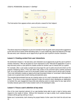
with every step. For example, when the user first visits the homepage, only one part of the ”new
project” box is presented to him as shown below.
The “Reward your friends for helping you!” is displayed on the top to give users an idea of what the
app is used for. The “I need” words followed by the textbox is used as a guide to show users what
kind of content should be entered into the textbox, i.e. something pertaining to a need they have.


After filling in the textbox, another section of the box appears to guide the users on what they should
do next. In this case, it is picking an emoticon.
CS3216, AY2008/2009, Semester 2—GetHelp!                                                                    4


The final section then appears where users will pick a reward for their helpers!


The above sequence of diagrams is just one example of how we guide users and provide suggestions
to the next course of action while educating users, in a very subtle way, about the features of the app.
We see every user interaction as an opportunity to get the user to perform another interaction.


Lesson 3: Creating context from user interactions

As mentioned in lesson 2, “we see every user interaction as an opportunity to get the user to perform
another interaction.” Why do we place so much importance in this? We built the application in such a
way that every action a user performs creates context for another user to interact with our system.
For example, after a user posts a project we encourage the user to poke around and check out the
projects initiated by others. If the user offers help, writes on the comment wall or wishes someone
luck, an e-mail notification is sent out to the project initiator and a feed is sent to all the user’s friends.
The e-mail notification creates an opportunity to get the project initiator to ”come back” while the feeds
create one to spread news to both existing and potential users.
The example demonstrated how we are creating value out of a user’s interaction with the system for
others. To us this is a very important element to take into account when developing an application
to maintain the user engagement loop while also allowing users to create value for your app (which
honestly reduces quite a bit of value-creation work on the developer’s side).


Lesson 4: Focus a user’s attention at key areas

One of the most important element of our app besides being able to post a need is having users
respond to the needs of others. Without this interaction our app is pretty much useless because
initiators will be gaining nothing in return.
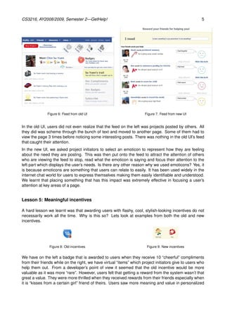
Below are 2 screenshots, both showing the project feeds of other users from both the old and new
UI.
CS3216, AY2008/2009, Semester 2—GetHelp!                                                               5


              Figure 6: Feed from old UI                              Figure 7: Feed from new UI


In the old UI, users did not even realize that the feed on the left was projects posted by others. All
they did was scheme through the bunch of text and moved to another page. Some of them had to
view the page 3 times before noticing some interesting posts. There was nothing in the old UI’s feed
that caught their attention.
In the new UI, we asked project initiators to select an emoticon to represent how they are feeling
about the need they are posting. This was then put onto the feed to attract the attention of others
who are viewing the feed to stop, read what the emoticon is saying and focus their attention to the
left part which displays the user’s needs. Is there any other reason why we used emoticons? Yes, it
is because emoticons are something that users can relate to easily. It has been used widely in the
internet chat world for users to express themselves making them easily identifiable and understood.
We learnt that placing something that has this impact was extremely effective in focusing a user’s
attention at key areas of a page.


Lesson 5: Meaningful incentives

A hard lesson we learnt was that awarding users with flashy, cool, stylish-looking incentives do not
necessarily work all the time. Why is this so? Lets look at examples from both the old and new
incentives.


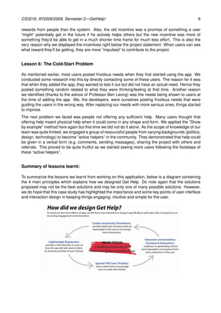
               Figure 8: Old incentives                                 Figure 9: New incentives


We have on the left a badge that is awarded to users when they receive 10 “cheerful” compliments
from their friends while on the right, we have virtual “items” which project initiators give to users who
help them out. From a developer’s point of view it seemed that the old incentive would be more
valuable as it was more “rare”. However, users felt that getting a reward from the system wasn’t that
great a value. They were more thrilled when they received rewards from their friends especially when
it is “kisses from a certain girl” friend of theirs. Users saw more meaning and value in personalized
CS3216, AY2008/2009, Semester 2—GetHelp!                                                            6

rewards from people than the system. Also, the old incentive was a promise of something a user
“might” potentially get in the future if he actively helps others but the new incentive was more of
something they’d be able to get in a much shorter time frame for much less effort. This is also the
very reason why we displayed the incentives right below the project statement. When users can see
what reward they’ll be getting, they are more ”impulsed” to contribute to the project.


Lesson 6: The Cold-Start Problem

As mentioned earlier, most users posted frivolous needs when they first started using the app. We
conducted some research into this by directly contacting some of these users. The reason for it was
that when they added the app, they wanted to test it out but did not have an actual need. Hence they
posted something random related to what they were thinking/feeling at that time. Another reason
we identified (thanks to the advice of Professor Ben Leong) was the needs being shown to users at
the time of adding the app. We, the developers, were ourselves posting frivolous needs that were
guiding the users in the wrong way. After replacing our needs with more serious ones, things started
to improve.
The next problem we faced was people not offering any sufficient help. Many users thought that
offering help meant physical help when it could come in any shape and form. We applied the ”Show
by example” method here again but this time we did not do it alone. As the scope of knowledge of our
team was quite limited, we engaged a group of resourceful people from varying backgrounds (politics,
design, technology) to become ”active helpers” in the community. They demonstrated that help could
be given in a verbal form (e.g. comments, sending messages), sharing the project with others and
referrals. This proved to be quite fruitful as we started seeing more users following the footsteps of
these “active helpers”.


Summary of lessons learnt:

To summarize the lessons we learnt from working on this application, below is a diagram containing
the 4 main principles which explains how we designed Get Help. Do note again that the solutions
proposed may not be the best solutions and may be only one of many possible solutions. However,
we do hope that this case study has highlighted the importance and some key points of user interface
and interaction design in keeping things engaging, intuitive and simple for the user.

More Related Content

What's hot

Mobile UI Design Patterns
Mobile UI Design PatternsMobile UI Design Patterns
Mobile UI Design Patterns
danhermes
 
UI Design - Lessons Learned, Principles, and Best Practices
UI Design - Lessons Learned, Principles, and Best PracticesUI Design - Lessons Learned, Principles, and Best Practices
UI Design - Lessons Learned, Principles, and Best PracticesSamuel Chow
 
Principles of User Interface Design
Principles of User Interface DesignPrinciples of User Interface Design
Principles of User Interface Design
KANKIPATI KISHORE
 
Designing for Digital Magazines - Rob Boynes for Guardian Masterclasses
Designing for Digital Magazines - Rob Boynes for Guardian MasterclassesDesigning for Digital Magazines - Rob Boynes for Guardian Masterclasses
Designing for Digital Magazines - Rob Boynes for Guardian Masterclasses
Rob Boynes
 
Mobile UI / UX Trends
Mobile UI / UX TrendsMobile UI / UX Trends
Mobile UI / UX Trends
Evgeny Tsarkov
 
UX Best Practices
UX Best PracticesUX Best Practices
UX Best Practices
Theresa Neil
 
UX & UI Design behind SDL’s Customer Experience Cloud
UX & UI Design behind SDL’s Customer Experience CloudUX & UI Design behind SDL’s Customer Experience Cloud
UX & UI Design behind SDL’s Customer Experience Cloud
Philipp Engel
 
Academy PRO: UI\UX. Introduction.
Academy PRO: UI\UX. Introduction.Academy PRO: UI\UX. Introduction.
Academy PRO: UI\UX. Introduction.
Binary Studio
 
Brand Identity in UI/UX Design
Brand Identity in UI/UX DesignBrand Identity in UI/UX Design
Brand Identity in UI/UX Design
Adryan Putra
 
IQb project (Rubiks cube size projector)
IQb project (Rubiks cube size projector)IQb project (Rubiks cube size projector)
IQb project (Rubiks cube size projector)
mc04451431
 
IxD & UX Design - Personifying Digital Interactions
IxD & UX Design - Personifying Digital InteractionsIxD & UX Design - Personifying Digital Interactions
IxD & UX Design - Personifying Digital Interactions
Jayan Narayanan
 
Flat Design. Microsoft Story
Flat Design. Microsoft StoryFlat Design. Microsoft Story
Flat Design. Microsoft Story
Nikita Lukianets
 
Hci Prototype Report
Hci Prototype ReportHci Prototype Report
Hci Prototype Report
Yasmin Zahir
 
Web Design Trends e-Book
 Web Design Trends e-Book Web Design Trends e-Book
Web Design Trends e-Book
jesús Santo
 
UX & UI Design 101
UX & UI Design 101UX & UI Design 101
UX & UI Design 101
Kevin Jackson
 
UI Design 101: Day 02 of 07
UI Design 101: Day 02 of 07UI Design 101: Day 02 of 07
UI Design 101: Day 02 of 07
Siegrid Agravante
 
LaSoft | Unique UI/UX design based on your ideas and user’s preferences
LaSoft | Unique UI/UX design based on your ideas and user’s preferencesLaSoft | Unique UI/UX design based on your ideas and user’s preferences
LaSoft | Unique UI/UX design based on your ideas and user’s preferences
Igor Vivchar
 

What's hot (18)

Mobile UI Design Patterns
Mobile UI Design PatternsMobile UI Design Patterns
Mobile UI Design Patterns
 
UI Design - Lessons Learned, Principles, and Best Practices
UI Design - Lessons Learned, Principles, and Best PracticesUI Design - Lessons Learned, Principles, and Best Practices
UI Design - Lessons Learned, Principles, and Best Practices
 
FINAL REPORT
FINAL REPORTFINAL REPORT
FINAL REPORT
 
Principles of User Interface Design
Principles of User Interface DesignPrinciples of User Interface Design
Principles of User Interface Design
 
Designing for Digital Magazines - Rob Boynes for Guardian Masterclasses
Designing for Digital Magazines - Rob Boynes for Guardian MasterclassesDesigning for Digital Magazines - Rob Boynes for Guardian Masterclasses
Designing for Digital Magazines - Rob Boynes for Guardian Masterclasses
 
Mobile UI / UX Trends
Mobile UI / UX TrendsMobile UI / UX Trends
Mobile UI / UX Trends
 
UX Best Practices
UX Best PracticesUX Best Practices
UX Best Practices
 
UX & UI Design behind SDL’s Customer Experience Cloud
UX & UI Design behind SDL’s Customer Experience CloudUX & UI Design behind SDL’s Customer Experience Cloud
UX & UI Design behind SDL’s Customer Experience Cloud
 
Academy PRO: UI\UX. Introduction.
Academy PRO: UI\UX. Introduction.Academy PRO: UI\UX. Introduction.
Academy PRO: UI\UX. Introduction.
 
Brand Identity in UI/UX Design
Brand Identity in UI/UX DesignBrand Identity in UI/UX Design
Brand Identity in UI/UX Design
 
IQb project (Rubiks cube size projector)
IQb project (Rubiks cube size projector)IQb project (Rubiks cube size projector)
IQb project (Rubiks cube size projector)
 
IxD & UX Design - Personifying Digital Interactions
IxD & UX Design - Personifying Digital InteractionsIxD & UX Design - Personifying Digital Interactions
IxD & UX Design - Personifying Digital Interactions
 
Flat Design. Microsoft Story
Flat Design. Microsoft StoryFlat Design. Microsoft Story
Flat Design. Microsoft Story
 
Hci Prototype Report
Hci Prototype ReportHci Prototype Report
Hci Prototype Report
 
Web Design Trends e-Book
 Web Design Trends e-Book Web Design Trends e-Book
Web Design Trends e-Book
 
UX & UI Design 101
UX & UI Design 101UX & UI Design 101
UX & UI Design 101
 
UI Design 101: Day 02 of 07
UI Design 101: Day 02 of 07UI Design 101: Day 02 of 07
UI Design 101: Day 02 of 07
 
LaSoft | Unique UI/UX design based on your ideas and user’s preferences
LaSoft | Unique UI/UX design based on your ideas and user’s preferencesLaSoft | Unique UI/UX design based on your ideas and user’s preferences
LaSoft | Unique UI/UX design based on your ideas and user’s preferences
 

Similar to GetHelp UI Interface and Interaction Design Case Study

Textpert UI Report and Problem
Textpert UI Report and ProblemTextpert UI Report and Problem
Textpert UI Report and ProblemQing Jasmine Ye
 
UIUX Design - report on summer training.docx
UIUX Design - report on summer training.docxUIUX Design - report on summer training.docx
UIUX Design - report on summer training.docx
bhawnamangla2
 
JavaCro'14 - Is there a “user” in your user interface – Ladislav Mačkala
JavaCro'14 - Is there a “user” in your user interface – Ladislav MačkalaJavaCro'14 - Is there a “user” in your user interface – Ladislav Mačkala
JavaCro'14 - Is there a “user” in your user interface – Ladislav Mačkala
HUJAK - Hrvatska udruga Java korisnika / Croatian Java User Association
 
Portfolio bahtiyar
Portfolio bahtiyarPortfolio bahtiyar
Portfolio bahtiyar
Bahtiyar Ahmatjan
 
Nnamdi Massally Design Portfolio
Nnamdi Massally Design PortfolioNnamdi Massally Design Portfolio
Nnamdi Massally Design Portfolio
Nnamdi Massally
 
HCI Group Project Report
HCI Group Project ReportHCI Group Project Report
HCI Group Project Report
weilong1113
 
Latest_Portfolio_Anxiao_chen
Latest_Portfolio_Anxiao_chenLatest_Portfolio_Anxiao_chen
Latest_Portfolio_Anxiao_chenAnxiao Chen
 
Hillside - User Testing Report (EN)
Hillside -  User Testing Report (EN)Hillside -  User Testing Report (EN)
Hillside - User Testing Report (EN)
batukhan taluy
 
Enterprise User Experience in Higher Education
Enterprise User Experience in Higher EducationEnterprise User Experience in Higher Education
Enterprise User Experience in Higher Education
Tarik (Rick) Dzekman
 
AN INTELLIGENT AND DATA-DRIVEN MOBILE VOLUNTEER EVENT MANAGEMENT PLATFORM USI...
AN INTELLIGENT AND DATA-DRIVEN MOBILE VOLUNTEER EVENT MANAGEMENT PLATFORM USI...AN INTELLIGENT AND DATA-DRIVEN MOBILE VOLUNTEER EVENT MANAGEMENT PLATFORM USI...
AN INTELLIGENT AND DATA-DRIVEN MOBILE VOLUNTEER EVENT MANAGEMENT PLATFORM USI...
ijasa
 
Discussion postArchitectural Styles Please respond to the fo.docx
Discussion postArchitectural Styles Please respond to the fo.docxDiscussion postArchitectural Styles Please respond to the fo.docx
Discussion postArchitectural Styles Please respond to the fo.docx
madlynplamondon
 
Snapchat - Google Docs.pdf
Snapchat - Google Docs.pdfSnapchat - Google Docs.pdf
Snapchat - Google Docs.pdf
harikacheluru
 
IRJET- Best Practices of UI Elements Design
IRJET- Best Practices of UI Elements DesignIRJET- Best Practices of UI Elements Design
IRJET- Best Practices of UI Elements Design
IRJET Journal
 
MGT5419 User Experience Design.docx
MGT5419 User Experience Design.docxMGT5419 User Experience Design.docx
MGT5419 User Experience Design.docx
stirlingvwriters
 
I. Intended audience A. American grandparentsB. Other Americ.docx
I. Intended audience A. American grandparentsB.   Other Americ.docxI. Intended audience A. American grandparentsB.   Other Americ.docx
I. Intended audience A. American grandparentsB. Other Americ.docx
wilcockiris
 
Design tips for the non-designer
Design tips for the non-designerDesign tips for the non-designer
Design tips for the non-designer
Fiona Byarugaba
 
Design Tips for the Non-Designer
Design Tips for the Non-DesignerDesign Tips for the Non-Designer
Design Tips for the Non-Designer
Thoughtworks
 
reptProblem
reptProblemreptProblem
reptProblem
Nadra Najib
 
Case Study - Design an Art History App for an Art Gallery.pptx
Case Study - Design an Art History App for an Art Gallery.pptxCase Study - Design an Art History App for an Art Gallery.pptx
Case Study - Design an Art History App for an Art Gallery.pptx
Chan Jia Jun
 
TextMining.pptx
TextMining.pptxTextMining.pptx
TextMining.pptx
Habiba Abderrahim
 

Similar to GetHelp UI Interface and Interaction Design Case Study (20)

Textpert UI Report and Problem
Textpert UI Report and ProblemTextpert UI Report and Problem
Textpert UI Report and Problem
 
UIUX Design - report on summer training.docx
UIUX Design - report on summer training.docxUIUX Design - report on summer training.docx
UIUX Design - report on summer training.docx
 
JavaCro'14 - Is there a “user” in your user interface – Ladislav Mačkala
JavaCro'14 - Is there a “user” in your user interface – Ladislav MačkalaJavaCro'14 - Is there a “user” in your user interface – Ladislav Mačkala
JavaCro'14 - Is there a “user” in your user interface – Ladislav Mačkala
 
Portfolio bahtiyar
Portfolio bahtiyarPortfolio bahtiyar
Portfolio bahtiyar
 
Nnamdi Massally Design Portfolio
Nnamdi Massally Design PortfolioNnamdi Massally Design Portfolio
Nnamdi Massally Design Portfolio
 
HCI Group Project Report
HCI Group Project ReportHCI Group Project Report
HCI Group Project Report
 
Latest_Portfolio_Anxiao_chen
Latest_Portfolio_Anxiao_chenLatest_Portfolio_Anxiao_chen
Latest_Portfolio_Anxiao_chen
 
Hillside - User Testing Report (EN)
Hillside -  User Testing Report (EN)Hillside -  User Testing Report (EN)
Hillside - User Testing Report (EN)
 
Enterprise User Experience in Higher Education
Enterprise User Experience in Higher EducationEnterprise User Experience in Higher Education
Enterprise User Experience in Higher Education
 
AN INTELLIGENT AND DATA-DRIVEN MOBILE VOLUNTEER EVENT MANAGEMENT PLATFORM USI...
AN INTELLIGENT AND DATA-DRIVEN MOBILE VOLUNTEER EVENT MANAGEMENT PLATFORM USI...AN INTELLIGENT AND DATA-DRIVEN MOBILE VOLUNTEER EVENT MANAGEMENT PLATFORM USI...
AN INTELLIGENT AND DATA-DRIVEN MOBILE VOLUNTEER EVENT MANAGEMENT PLATFORM USI...
 
Discussion postArchitectural Styles Please respond to the fo.docx
Discussion postArchitectural Styles Please respond to the fo.docxDiscussion postArchitectural Styles Please respond to the fo.docx
Discussion postArchitectural Styles Please respond to the fo.docx
 
Snapchat - Google Docs.pdf
Snapchat - Google Docs.pdfSnapchat - Google Docs.pdf
Snapchat - Google Docs.pdf
 
IRJET- Best Practices of UI Elements Design
IRJET- Best Practices of UI Elements DesignIRJET- Best Practices of UI Elements Design
IRJET- Best Practices of UI Elements Design
 
MGT5419 User Experience Design.docx
MGT5419 User Experience Design.docxMGT5419 User Experience Design.docx
MGT5419 User Experience Design.docx
 
I. Intended audience A. American grandparentsB. Other Americ.docx
I. Intended audience A. American grandparentsB.   Other Americ.docxI. Intended audience A. American grandparentsB.   Other Americ.docx
I. Intended audience A. American grandparentsB. Other Americ.docx
 
Design tips for the non-designer
Design tips for the non-designerDesign tips for the non-designer
Design tips for the non-designer
 
Design Tips for the Non-Designer
Design Tips for the Non-DesignerDesign Tips for the Non-Designer
Design Tips for the Non-Designer
 
reptProblem
reptProblemreptProblem
reptProblem
 
Case Study - Design an Art History App for an Art Gallery.pptx
Case Study - Design an Art History App for an Art Gallery.pptxCase Study - Design an Art History App for an Art Gallery.pptx
Case Study - Design an Art History App for an Art Gallery.pptx
 
TextMining.pptx
TextMining.pptxTextMining.pptx
TextMining.pptx
 

Recently uploaded

一比一原版(MMU毕业证书)曼彻斯特城市大学毕业证成绩单如何办理
一比一原版(MMU毕业证书)曼彻斯特城市大学毕业证成绩单如何办理一比一原版(MMU毕业证书)曼彻斯特城市大学毕业证成绩单如何办理
一比一原版(MMU毕业证书)曼彻斯特城市大学毕业证成绩单如何办理
7sd8fier
 
一比一原版(Bolton毕业证书)博尔顿大学毕业证成绩单如何办理
一比一原版(Bolton毕业证书)博尔顿大学毕业证成绩单如何办理一比一原版(Bolton毕业证书)博尔顿大学毕业证成绩单如何办理
一比一原版(Bolton毕业证书)博尔顿大学毕业证成绩单如何办理
h7j5io0
 
20 slides of research movie and artists .pdf
20 slides of research movie and artists .pdf20 slides of research movie and artists .pdf
20 slides of research movie and artists .pdf
ameli25062005
 
Game Concept Presentation for Ukrainian Mythology Based Game With Designs
Game Concept Presentation for Ukrainian Mythology Based Game With DesignsGame Concept Presentation for Ukrainian Mythology Based Game With Designs
Game Concept Presentation for Ukrainian Mythology Based Game With Designs
184804
 
Portfolio.pdf
Portfolio.pdfPortfolio.pdf
Portfolio.pdf
garcese
 
一比一原版(BU毕业证)波士顿大学毕业证如何办理
一比一原版(BU毕业证)波士顿大学毕业证如何办理一比一原版(BU毕业证)波士顿大学毕业证如何办理
一比一原版(BU毕业证)波士顿大学毕业证如何办理
peuce
 
Transforming Brand Perception and Boosting Profitability
Transforming Brand Perception and Boosting ProfitabilityTransforming Brand Perception and Boosting Profitability
Transforming Brand Perception and Boosting Profitability
aaryangarg12
 
一比一原版(毕业证)长崎大学毕业证成绩单如何办理
一比一原版(毕业证)长崎大学毕业证成绩单如何办理一比一原版(毕业证)长崎大学毕业证成绩单如何办理
一比一原版(毕业证)长崎大学毕业证成绩单如何办理
taqyed
 
PORTFOLIO FABIANA VILLANI ARCHITECTURE.pdf
PORTFOLIO FABIANA VILLANI ARCHITECTURE.pdfPORTFOLIO FABIANA VILLANI ARCHITECTURE.pdf
PORTFOLIO FABIANA VILLANI ARCHITECTURE.pdf
fabianavillanib
 
Expert Accessory Dwelling Unit (ADU) Drafting Services
Expert Accessory Dwelling Unit (ADU) Drafting ServicesExpert Accessory Dwelling Unit (ADU) Drafting Services
Expert Accessory Dwelling Unit (ADU) Drafting Services
ResDraft
 
White wonder, Work developed by Eva Tschopp
White wonder, Work developed by Eva TschoppWhite wonder, Work developed by Eva Tschopp
White wonder, Work developed by Eva Tschopp
Mansi Shah
 
Between Filth and Fortune- Urban Cattle Foraging Realities by Devi S Nair, An...
Between Filth and Fortune- Urban Cattle Foraging Realities by Devi S Nair, An...Between Filth and Fortune- Urban Cattle Foraging Realities by Devi S Nair, An...
Between Filth and Fortune- Urban Cattle Foraging Realities by Devi S Nair, An...
Mansi Shah
 
一比一原版(Bristol毕业证书)布里斯托大学毕业证成绩单如何办理
一比一原版(Bristol毕业证书)布里斯托大学毕业证成绩单如何办理一比一原版(Bristol毕业证书)布里斯托大学毕业证成绩单如何办理
一比一原版(Bristol毕业证书)布里斯托大学毕业证成绩单如何办理
smpc3nvg
 
projectreportnew-170307082323 nnnnnn(1).pdf
projectreportnew-170307082323 nnnnnn(1).pdfprojectreportnew-170307082323 nnnnnn(1).pdf
projectreportnew-170307082323 nnnnnn(1).pdf
farazahmadas6
 
一比一原版(UAL毕业证书)伦敦艺术大学毕业证成绩单如何办理
一比一原版(UAL毕业证书)伦敦艺术大学毕业证成绩单如何办理一比一原版(UAL毕业证书)伦敦艺术大学毕业证成绩单如何办理
一比一原版(UAL毕业证书)伦敦艺术大学毕业证成绩单如何办理
708pb191
 
一比一原版(CITY毕业证书)谢菲尔德哈勒姆大学毕业证如何办理
一比一原版(CITY毕业证书)谢菲尔德哈勒姆大学毕业证如何办理一比一原版(CITY毕业证书)谢菲尔德哈勒姆大学毕业证如何办理
一比一原版(CITY毕业证书)谢菲尔德哈勒姆大学毕业证如何办理
9a93xvy
 
一比一原版(UW毕业证)西雅图华盛顿大学毕业证如何办理
一比一原版(UW毕业证)西雅图华盛顿大学毕业证如何办理一比一原版(UW毕业证)西雅图华盛顿大学毕业证如何办理
一比一原版(UW毕业证)西雅图华盛顿大学毕业证如何办理
kecekev
 
一比一原版(UNUK毕业证书)诺丁汉大学毕业证如何办理
一比一原版(UNUK毕业证书)诺丁汉大学毕业证如何办理一比一原版(UNUK毕业证书)诺丁汉大学毕业证如何办理
一比一原版(UNUK毕业证书)诺丁汉大学毕业证如何办理
7sd8fier
 
Connect Conference 2022: Passive House - Economic and Environmental Solution...
Connect Conference 2022: Passive House -  Economic and Environmental Solution...Connect Conference 2022: Passive House -  Economic and Environmental Solution...
Connect Conference 2022: Passive House - Economic and Environmental Solution...
TE Studio
 
一比一原版(Columbia毕业证)哥伦比亚大学毕业证如何办理
一比一原版(Columbia毕业证)哥伦比亚大学毕业证如何办理一比一原版(Columbia毕业证)哥伦比亚大学毕业证如何办理
一比一原版(Columbia毕业证)哥伦比亚大学毕业证如何办理
asuzyq
 

Recently uploaded (20)

一比一原版(MMU毕业证书)曼彻斯特城市大学毕业证成绩单如何办理
一比一原版(MMU毕业证书)曼彻斯特城市大学毕业证成绩单如何办理一比一原版(MMU毕业证书)曼彻斯特城市大学毕业证成绩单如何办理
一比一原版(MMU毕业证书)曼彻斯特城市大学毕业证成绩单如何办理
 
一比一原版(Bolton毕业证书)博尔顿大学毕业证成绩单如何办理
一比一原版(Bolton毕业证书)博尔顿大学毕业证成绩单如何办理一比一原版(Bolton毕业证书)博尔顿大学毕业证成绩单如何办理
一比一原版(Bolton毕业证书)博尔顿大学毕业证成绩单如何办理
 
20 slides of research movie and artists .pdf
20 slides of research movie and artists .pdf20 slides of research movie and artists .pdf
20 slides of research movie and artists .pdf
 
Game Concept Presentation for Ukrainian Mythology Based Game With Designs
Game Concept Presentation for Ukrainian Mythology Based Game With DesignsGame Concept Presentation for Ukrainian Mythology Based Game With Designs
Game Concept Presentation for Ukrainian Mythology Based Game With Designs
 
Portfolio.pdf
Portfolio.pdfPortfolio.pdf
Portfolio.pdf
 
一比一原版(BU毕业证)波士顿大学毕业证如何办理
一比一原版(BU毕业证)波士顿大学毕业证如何办理一比一原版(BU毕业证)波士顿大学毕业证如何办理
一比一原版(BU毕业证)波士顿大学毕业证如何办理
 
Transforming Brand Perception and Boosting Profitability
Transforming Brand Perception and Boosting ProfitabilityTransforming Brand Perception and Boosting Profitability
Transforming Brand Perception and Boosting Profitability
 
一比一原版(毕业证)长崎大学毕业证成绩单如何办理
一比一原版(毕业证)长崎大学毕业证成绩单如何办理一比一原版(毕业证)长崎大学毕业证成绩单如何办理
一比一原版(毕业证)长崎大学毕业证成绩单如何办理
 
PORTFOLIO FABIANA VILLANI ARCHITECTURE.pdf
PORTFOLIO FABIANA VILLANI ARCHITECTURE.pdfPORTFOLIO FABIANA VILLANI ARCHITECTURE.pdf
PORTFOLIO FABIANA VILLANI ARCHITECTURE.pdf
 
Expert Accessory Dwelling Unit (ADU) Drafting Services
Expert Accessory Dwelling Unit (ADU) Drafting ServicesExpert Accessory Dwelling Unit (ADU) Drafting Services
Expert Accessory Dwelling Unit (ADU) Drafting Services
 
White wonder, Work developed by Eva Tschopp
White wonder, Work developed by Eva TschoppWhite wonder, Work developed by Eva Tschopp
White wonder, Work developed by Eva Tschopp
 
Between Filth and Fortune- Urban Cattle Foraging Realities by Devi S Nair, An...
Between Filth and Fortune- Urban Cattle Foraging Realities by Devi S Nair, An...Between Filth and Fortune- Urban Cattle Foraging Realities by Devi S Nair, An...
Between Filth and Fortune- Urban Cattle Foraging Realities by Devi S Nair, An...
 
一比一原版(Bristol毕业证书)布里斯托大学毕业证成绩单如何办理
一比一原版(Bristol毕业证书)布里斯托大学毕业证成绩单如何办理一比一原版(Bristol毕业证书)布里斯托大学毕业证成绩单如何办理
一比一原版(Bristol毕业证书)布里斯托大学毕业证成绩单如何办理
 
projectreportnew-170307082323 nnnnnn(1).pdf
projectreportnew-170307082323 nnnnnn(1).pdfprojectreportnew-170307082323 nnnnnn(1).pdf
projectreportnew-170307082323 nnnnnn(1).pdf
 
一比一原版(UAL毕业证书)伦敦艺术大学毕业证成绩单如何办理
一比一原版(UAL毕业证书)伦敦艺术大学毕业证成绩单如何办理一比一原版(UAL毕业证书)伦敦艺术大学毕业证成绩单如何办理
一比一原版(UAL毕业证书)伦敦艺术大学毕业证成绩单如何办理
 
一比一原版(CITY毕业证书)谢菲尔德哈勒姆大学毕业证如何办理
一比一原版(CITY毕业证书)谢菲尔德哈勒姆大学毕业证如何办理一比一原版(CITY毕业证书)谢菲尔德哈勒姆大学毕业证如何办理
一比一原版(CITY毕业证书)谢菲尔德哈勒姆大学毕业证如何办理
 
一比一原版(UW毕业证)西雅图华盛顿大学毕业证如何办理
一比一原版(UW毕业证)西雅图华盛顿大学毕业证如何办理一比一原版(UW毕业证)西雅图华盛顿大学毕业证如何办理
一比一原版(UW毕业证)西雅图华盛顿大学毕业证如何办理
 
一比一原版(UNUK毕业证书)诺丁汉大学毕业证如何办理
一比一原版(UNUK毕业证书)诺丁汉大学毕业证如何办理一比一原版(UNUK毕业证书)诺丁汉大学毕业证如何办理
一比一原版(UNUK毕业证书)诺丁汉大学毕业证如何办理
 
Connect Conference 2022: Passive House - Economic and Environmental Solution...
Connect Conference 2022: Passive House -  Economic and Environmental Solution...Connect Conference 2022: Passive House -  Economic and Environmental Solution...
Connect Conference 2022: Passive House - Economic and Environmental Solution...
 
一比一原版(Columbia毕业证)哥伦比亚大学毕业证如何办理
一比一原版(Columbia毕业证)哥伦比亚大学毕业证如何办理一比一原版(Columbia毕业证)哥伦比亚大学毕业证如何办理
一比一原版(Columbia毕业证)哥伦比亚大学毕业证如何办理
 

GetHelp UI Interface and Interaction Design Case Study

  • 1. CS3216, AY2008/2009, Semester 2—GetHelp! 1 National University of Singapore School of Computing CS3216: Software Development on Evolving Platforms AY2008/2009, Semester 2 GetHelp!: The Inside Story Date issued: 2 March 2009 Interaction design is the art of ”defining the behaviour of products and systems that a user can interact with”. It is the process of simplifying and making the learning curve of a system as flat and intuitive as possible with a higher focus on usability and less on aesthetics. The term was first proposed by Bill Moggridge and Bill Verplank to introduce the concepts of industrial design into software interfaces as well. Today this concept is being practiced not only among systems and softwares but also the growing space of web applications. You were asked to evaluate the initial design of GetHelp! as a case study. This document is an excerpt from the CS3216 Final Project report for the GetHelp! team. The major problems we faced: When the application was launched, we faced a few major problems which were mainly from 2 areas: user interface(UI) and interaction design. This report is a record and account of each of the problems faced along with our solutions (aka lessons learnt) for them (Note that these solutions may not be the best solutions but rather one of many possible ones). Lesson 1: Too many choices and aesthetics cause confusion. Figure 1: Home Page Figure 2: Overview Page The above pictures show only 4 out of 20 over pages that we had in the initial UI. As you can see, we had lots of graphics to represent various elements and also numerous functions. For example, our
  • 2. CS3216, AY2008/2009, Semester 2—GetHelp! 2 Figure 3: Project Page Figure 4: Statistics Page Statistics page itself had 5 different sections with 5 different functions which the user could explore and utilize. We thought that the graphics would make the page aesthetically attractive for the user while the functions would provide choices and flexibility. When we came to user testing however, everything failed. One question from our testers was “What is this? What am I supposed to do?”. Yes, the UI was very attractive. People were attracted to find out more from the combination of graphics and colours. However, there were too many points of attraction which left the user confused about which part of the page to focus on. Every page had links leading to 5 new pages and functions which turned out to be an ”information overload” for the user. They had too many things to digest and were left clueless and confused. Taking in from the feedback collected, we went back to the drawing board and redid the entire ap- plication design and ended up with a brand new app that contained only 4 tabs at the top, 3 basic functions and 5 pages in total (including the invite page). With the new UI, users could immediately identify what the application was about and how to use it as their attention was focused on the yellow box at the upper part of the page.
  • 3. CS3216, AY2008/2009, Semester 2—GetHelp! 3 Figure 5: The new, cleaner and waay less congested UI. Lesson 2: Users need guidance In the words of Professor Andreas Weigend, users are silly. They do not know what they want and you need to tell them what to do. An example he gave during a talk was that instead of asking users to invite their friends, why not give them a number? Like 20. That way they know what to do and will not spend too much time pondering how many people to invite. We made this “rule” a major element of our revised user interface with a focus on guiding the user with every step. For example, when the user first visits the homepage, only one part of the ”new project” box is presented to him as shown below. The “Reward your friends for helping you!” is displayed on the top to give users an idea of what the app is used for. The “I need” words followed by the textbox is used as a guide to show users what kind of content should be entered into the textbox, i.e. something pertaining to a need they have. After filling in the textbox, another section of the box appears to guide the users on what they should do next. In this case, it is picking an emoticon.
  • 4. CS3216, AY2008/2009, Semester 2—GetHelp! 4 The final section then appears where users will pick a reward for their helpers! The above sequence of diagrams is just one example of how we guide users and provide suggestions to the next course of action while educating users, in a very subtle way, about the features of the app. We see every user interaction as an opportunity to get the user to perform another interaction. Lesson 3: Creating context from user interactions As mentioned in lesson 2, “we see every user interaction as an opportunity to get the user to perform another interaction.” Why do we place so much importance in this? We built the application in such a way that every action a user performs creates context for another user to interact with our system. For example, after a user posts a project we encourage the user to poke around and check out the projects initiated by others. If the user offers help, writes on the comment wall or wishes someone luck, an e-mail notification is sent out to the project initiator and a feed is sent to all the user’s friends. The e-mail notification creates an opportunity to get the project initiator to ”come back” while the feeds create one to spread news to both existing and potential users. The example demonstrated how we are creating value out of a user’s interaction with the system for others. To us this is a very important element to take into account when developing an application to maintain the user engagement loop while also allowing users to create value for your app (which honestly reduces quite a bit of value-creation work on the developer’s side). Lesson 4: Focus a user’s attention at key areas One of the most important element of our app besides being able to post a need is having users respond to the needs of others. Without this interaction our app is pretty much useless because initiators will be gaining nothing in return. Below are 2 screenshots, both showing the project feeds of other users from both the old and new UI.
  • 5. CS3216, AY2008/2009, Semester 2—GetHelp! 5 Figure 6: Feed from old UI Figure 7: Feed from new UI In the old UI, users did not even realize that the feed on the left was projects posted by others. All they did was scheme through the bunch of text and moved to another page. Some of them had to view the page 3 times before noticing some interesting posts. There was nothing in the old UI’s feed that caught their attention. In the new UI, we asked project initiators to select an emoticon to represent how they are feeling about the need they are posting. This was then put onto the feed to attract the attention of others who are viewing the feed to stop, read what the emoticon is saying and focus their attention to the left part which displays the user’s needs. Is there any other reason why we used emoticons? Yes, it is because emoticons are something that users can relate to easily. It has been used widely in the internet chat world for users to express themselves making them easily identifiable and understood. We learnt that placing something that has this impact was extremely effective in focusing a user’s attention at key areas of a page. Lesson 5: Meaningful incentives A hard lesson we learnt was that awarding users with flashy, cool, stylish-looking incentives do not necessarily work all the time. Why is this so? Lets look at examples from both the old and new incentives. Figure 8: Old incentives Figure 9: New incentives We have on the left a badge that is awarded to users when they receive 10 “cheerful” compliments from their friends while on the right, we have virtual “items” which project initiators give to users who help them out. From a developer’s point of view it seemed that the old incentive would be more valuable as it was more “rare”. However, users felt that getting a reward from the system wasn’t that great a value. They were more thrilled when they received rewards from their friends especially when it is “kisses from a certain girl” friend of theirs. Users saw more meaning and value in personalized
  • 6. CS3216, AY2008/2009, Semester 2—GetHelp! 6 rewards from people than the system. Also, the old incentive was a promise of something a user “might” potentially get in the future if he actively helps others but the new incentive was more of something they’d be able to get in a much shorter time frame for much less effort. This is also the very reason why we displayed the incentives right below the project statement. When users can see what reward they’ll be getting, they are more ”impulsed” to contribute to the project. Lesson 6: The Cold-Start Problem As mentioned earlier, most users posted frivolous needs when they first started using the app. We conducted some research into this by directly contacting some of these users. The reason for it was that when they added the app, they wanted to test it out but did not have an actual need. Hence they posted something random related to what they were thinking/feeling at that time. Another reason we identified (thanks to the advice of Professor Ben Leong) was the needs being shown to users at the time of adding the app. We, the developers, were ourselves posting frivolous needs that were guiding the users in the wrong way. After replacing our needs with more serious ones, things started to improve. The next problem we faced was people not offering any sufficient help. Many users thought that offering help meant physical help when it could come in any shape and form. We applied the ”Show by example” method here again but this time we did not do it alone. As the scope of knowledge of our team was quite limited, we engaged a group of resourceful people from varying backgrounds (politics, design, technology) to become ”active helpers” in the community. They demonstrated that help could be given in a verbal form (e.g. comments, sending messages), sharing the project with others and referrals. This proved to be quite fruitful as we started seeing more users following the footsteps of these “active helpers”. Summary of lessons learnt: To summarize the lessons we learnt from working on this application, below is a diagram containing the 4 main principles which explains how we designed Get Help. Do note again that the solutions proposed may not be the best solutions and may be only one of many possible solutions. However, we do hope that this case study has highlighted the importance and some key points of user interface and interaction design in keeping things engaging, intuitive and simple for the user.