The document compares the user interfaces of Apple's iPhoto and Microsoft's Windows Live Photo Gallery. Both programs take similar approaches to browsing photos with a navigation pane and photo display area. However, iPhoto uses pull-down menus while Photo Gallery employs Microsoft's ribbon interface. The document examines how various common tasks like editing photos are accomplished in each program. It concludes that both programs make photo management accessible but that Microsoft's ribbon interface is not as cluttered as some claim.
Apple Study: 8 easy steps to beat Microsoft (and Google)Ouriel Ohayon
a comprehensive study on Apple considering strengths and weaknesses against other major contenders in the industry space
The same battle happens in Fintech against banks and crypto players like Binance and ZenGo
Designing for Digital Magazines - Rob Boynes for Guardian MasterclassesRob Boynes
This talk discusses how the magazine and digital magazines in their current guise are preventing innovation. Less prescriptive, and more of a call to action, the lecture discusses the current models in digital magazine UX and asks what a digital magazine could be and where it needs to innovate to in a changing media landscape.
It also looks at the importance of user centric design, user testing and creating experiences outside of what we consider 'magazines' - and how working with our users (and readers) could produce something unique, innovative and valid as a business model.
***********
NB. Notes are on grey slides, White and yellow slides are from the original presentation.
This talk was developed and changed with feedback from an original talk I performed at UX CAMP BRIGHTON in 2013 called "Why the page is killing innovation in magazine UX".
8 Usability Lessons from the UPA Conference by Mark AlvesMark Alves
Eight usability lessons for Freddie Mac from the 2004 Usability Professionals Conference. I presented a poster at the 2004 UPA and came back with these usability and UX tips from other presenters.
App Publishing for Museums - iPhone, iPad and beyondCogapp
What is happening in the world of app publishing for iPhone, iPad and other platforms ? And what does this mean for museums ? What are the opportunities for museums and other arts organisations created by the app publishing revolution and how can we take advantage ?
Why the iPad UI matters, And how it differs from the Tablet PC, but also from...Fabien Marry
A in-depth look at the iPad user interface with guidelines and examples.
What's new, and what lessons were learned from theTablet PC concept and the iPhone own user interface.
If you think the iPad is just a bigger iPod, this presentation is for you.
Slightly updated from the presentation I made at UXCampLondon 2010.
In this talk I shared the experience of the FigureRunning team in developing Apps for the Android platform, starting from Apps that were designed and developed for iOS.
Why the page is killing innovation in magazine UXRob Boynes
This talk was presented at UX CAMP BRIGHTON in 2013.
It discusses how the magazine and digital magazines in their current guise are preventing innovation. Less prescriptive, and more of a call to action, the lecture discusses the shortfall in current digital magazine UX, asks what a digital magazine should be and where it needs to innovate to.
NB Notes are on yellow slides, White slides are from the original presentation.
Want to view the full recording? http://vimeo.com/14078471
Mobile Outlook 2010 – Where Are We?
August 11, 2010 – 11:10 a.m.
We are currently experiencing what will probably be the largest technological shift since the introduction of the internet onto our campuses for widespread use. Powerful mobile devices are expected to increase at a tremendous rate at universities and elsewhere in the world over the next few years to the point that many activities now done via a desktop machine will be enabled on hand-held devices. This holds great promise but also much uncertainty – so where are we now?
Quick introduction to SmartPhones, Operating Systems of phones and also how to write code for it, by Hekmat Sarwarzada, Herat Afghanistan, Ghalib Institute of Higher Education
Slides about Mac operating system and how it is way ahead of other contemporary operating system like windows.It signifies super capability of user interface and environment to its customers and pointed out few keys that distinguish itself as a remarkable working tool
Socialcam is application of week on AppStore. We at SojoSolutions try to analyze Socialcam and highlight the features that apple team must have considered while selecting this app as App of the week. We at SojoSolutions always recommend our clients and development partners to strongly follow these features as these features will help them in a along way establishing a strong user relations and deliver value to end customers
Www.batteryfast.co.uk fujitsu-lifebook-th701-laptop-reviewsbattery-fast. com
The Fujitsu LifeBook TH701 is a tablet convertible laptop with lots of features and a more-than-decent configuration considering its size. It can be used as a regular notebook for long typing sessions and regular work, or as a tablet for when you need to use a touch interface, draw or take down notes.
Www.batteryfast.co.uk asus-u46sv-review-fast-comfortable-enduring-laptopbattery-fast. com
The Asus U46SV all-purpose laptop sets itself apart from the crowd through great performance and outstanding battery life–two attributes that rarely cohabitate.
Www.batteryfast.co.uk how-to-take-care-of-your-apple-laptop-batteries-battery...battery-fast. com
Apple laptop batteries have higher lifespan and better power backup than most other laptop batteries. With a little extra care, one can optimize the longevity of the battery.
Blog.batteryfast.co.uk apple-suggested-for-samsung-don-t-make-rectangular-and...battery-fast. com
Apple proffers design advice on how Samsung could avoid stepping on Apple’s design patent toes, in a legal brief filed as part of its ongoing patent infringement lawsuit against its competitor.
Blog.batteryfast.co.uk 17-developments-ios-5-apps-brings-to-your-iphone-4-camerabattery-fast. com
1. Camera Access From the Lock Screen
Double-tapping the home key now brings up a camera icon on the slide bar. Hit it and you’re straight into the Camera app.
Www.batteryfast.co.uk Battery Problems : FAQ for iPhone and iPod Nano Usersbattery-fast. com
Apple customers have been whipped into a frenzy in recent days by constant reports of battery problems, software hiccups, and overheating issues with popular Apple gizmos from the iPhone to the iPod.
Blog.batteryfast.co.uk 17-developments-ios-5-apps-brings-to-your-iphone-4-camerabattery-fast. com
1. Camera Access From the Lock Screen
Double-tapping the home key now brings up a camera icon on the slide bar. Hit it and you’re straight into the Camera app.
Www.batteryfast.co.uk - 2011 Black Friday : How To Shopping Like A Geekbattery-fast. com
The precursor to the gift-giving season that is this hallowed Friday seems to be now inexorably tied to the industry I cover: consumer technology and gadgets
Www.batteryfast.co.uk - Tech News: How to Sync Your PC, Tablet, and Smartphonebattery-fast. com
A few years ago business people carried a laptop on the road, used a desktop PC in the office, and worked on another PC at home. Maybe they had a BlackBerry, too–but only if they were real big shots.
www.batteryfast.co.uk-Windows 8 to Make Battery Life Much Better Than Windows 7battery-fast. com
As we said a few times now, Nvidia is very enthusiastic about ARM support for Windows 8. Since Windows 8 should be coming in late 2012, companies like Nvdia, Qualcomm, TI and other mobile players are trying to get their drivers and hardware ready for this big day.
GraphRAG is All You need? LLM & Knowledge GraphGuy Korland
Guy Korland, CEO and Co-founder of FalkorDB, will review two articles on the integration of language models with knowledge graphs.
1. Unifying Large Language Models and Knowledge Graphs: A Roadmap.
https://arxiv.org/abs/2306.08302
2. Microsoft Research's GraphRAG paper and a review paper on various uses of knowledge graphs:
https://www.microsoft.com/en-us/research/blog/graphrag-unlocking-llm-discovery-on-narrative-private-data/
Pushing the limits of ePRTC: 100ns holdover for 100 daysAdtran
At WSTS 2024, Alon Stern explored the topic of parametric holdover and explained how recent research findings can be implemented in real-world PNT networks to achieve 100 nanoseconds of accuracy for up to 100 days.
SAP Sapphire 2024 - ASUG301 building better apps with SAP Fiori.pdfPeter Spielvogel
Building better applications for business users with SAP Fiori.
• What is SAP Fiori and why it matters to you
• How a better user experience drives measurable business benefits
• How to get started with SAP Fiori today
• How SAP Fiori elements accelerates application development
• How SAP Build Code includes SAP Fiori tools and other generative artificial intelligence capabilities
• How SAP Fiori paves the way for using AI in SAP apps
LF Energy Webinar: Electrical Grid Modelling and Simulation Through PowSyBl -...DanBrown980551
Do you want to learn how to model and simulate an electrical network from scratch in under an hour?
Then welcome to this PowSyBl workshop, hosted by Rte, the French Transmission System Operator (TSO)!
During the webinar, you will discover the PowSyBl ecosystem as well as handle and study an electrical network through an interactive Python notebook.
PowSyBl is an open source project hosted by LF Energy, which offers a comprehensive set of features for electrical grid modelling and simulation. Among other advanced features, PowSyBl provides:
- A fully editable and extendable library for grid component modelling;
- Visualization tools to display your network;
- Grid simulation tools, such as power flows, security analyses (with or without remedial actions) and sensitivity analyses;
The framework is mostly written in Java, with a Python binding so that Python developers can access PowSyBl functionalities as well.
What you will learn during the webinar:
- For beginners: discover PowSyBl's functionalities through a quick general presentation and the notebook, without needing any expert coding skills;
- For advanced developers: master the skills to efficiently apply PowSyBl functionalities to your real-world scenarios.
Welcome to the first live UiPath Community Day Dubai! Join us for this unique occasion to meet our local and global UiPath Community and leaders. You will get a full view of the MEA region's automation landscape and the AI Powered automation technology capabilities of UiPath. Also, hosted by our local partners Marc Ellis, you will enjoy a half-day packed with industry insights and automation peers networking.
📕 Curious on our agenda? Wait no more!
10:00 Welcome note - UiPath Community in Dubai
Lovely Sinha, UiPath Community Chapter Leader, UiPath MVPx3, Hyper-automation Consultant, First Abu Dhabi Bank
10:20 A UiPath cross-region MEA overview
Ashraf El Zarka, VP and Managing Director MEA, UiPath
10:35: Customer Success Journey
Deepthi Deepak, Head of Intelligent Automation CoE, First Abu Dhabi Bank
11:15 The UiPath approach to GenAI with our three principles: improve accuracy, supercharge productivity, and automate more
Boris Krumrey, Global VP, Automation Innovation, UiPath
12:15 To discover how Marc Ellis leverages tech-driven solutions in recruitment and managed services.
Brendan Lingam, Director of Sales and Business Development, Marc Ellis
Generative AI Deep Dive: Advancing from Proof of Concept to ProductionAggregage
Join Maher Hanafi, VP of Engineering at Betterworks, in this new session where he'll share a practical framework to transform Gen AI prototypes into impactful products! He'll delve into the complexities of data collection and management, model selection and optimization, and ensuring security, scalability, and responsible use.
PHP Frameworks: I want to break free (IPC Berlin 2024)Ralf Eggert
In this presentation, we examine the challenges and limitations of relying too heavily on PHP frameworks in web development. We discuss the history of PHP and its frameworks to understand how this dependence has evolved. The focus will be on providing concrete tips and strategies to reduce reliance on these frameworks, based on real-world examples and practical considerations. The goal is to equip developers with the skills and knowledge to create more flexible and future-proof web applications. We'll explore the importance of maintaining autonomy in a rapidly changing tech landscape and how to make informed decisions in PHP development.
This talk is aimed at encouraging a more independent approach to using PHP frameworks, moving towards a more flexible and future-proof approach to PHP development.
Why You Should Replace Windows 11 with Nitrux Linux 3.5.0 for enhanced perfor...SOFTTECHHUB
The choice of an operating system plays a pivotal role in shaping our computing experience. For decades, Microsoft's Windows has dominated the market, offering a familiar and widely adopted platform for personal and professional use. However, as technological advancements continue to push the boundaries of innovation, alternative operating systems have emerged, challenging the status quo and offering users a fresh perspective on computing.
One such alternative that has garnered significant attention and acclaim is Nitrux Linux 3.5.0, a sleek, powerful, and user-friendly Linux distribution that promises to redefine the way we interact with our devices. With its focus on performance, security, and customization, Nitrux Linux presents a compelling case for those seeking to break free from the constraints of proprietary software and embrace the freedom and flexibility of open-source computing.
Epistemic Interaction - tuning interfaces to provide information for AI supportAlan Dix
Paper presented at SYNERGY workshop at AVI 2024, Genoa, Italy. 3rd June 2024
https://alandix.com/academic/papers/synergy2024-epistemic/
As machine learning integrates deeper into human-computer interactions, the concept of epistemic interaction emerges, aiming to refine these interactions to enhance system adaptability. This approach encourages minor, intentional adjustments in user behaviour to enrich the data available for system learning. This paper introduces epistemic interaction within the context of human-system communication, illustrating how deliberate interaction design can improve system understanding and adaptation. Through concrete examples, we demonstrate the potential of epistemic interaction to significantly advance human-computer interaction by leveraging intuitive human communication strategies to inform system design and functionality, offering a novel pathway for enriching user-system engagements.
Removing Uninteresting Bytes in Software FuzzingAftab Hussain
Imagine a world where software fuzzing, the process of mutating bytes in test seeds to uncover hidden and erroneous program behaviors, becomes faster and more effective. A lot depends on the initial seeds, which can significantly dictate the trajectory of a fuzzing campaign, particularly in terms of how long it takes to uncover interesting behaviour in your code. We introduce DIAR, a technique designed to speedup fuzzing campaigns by pinpointing and eliminating those uninteresting bytes in the seeds. Picture this: instead of wasting valuable resources on meaningless mutations in large, bloated seeds, DIAR removes the unnecessary bytes, streamlining the entire process.
In this work, we equipped AFL, a popular fuzzer, with DIAR and examined two critical Linux libraries -- Libxml's xmllint, a tool for parsing xml documents, and Binutil's readelf, an essential debugging and security analysis command-line tool used to display detailed information about ELF (Executable and Linkable Format). Our preliminary results show that AFL+DIAR does not only discover new paths more quickly but also achieves higher coverage overall. This work thus showcases how starting with lean and optimized seeds can lead to faster, more comprehensive fuzzing campaigns -- and DIAR helps you find such seeds.
- These are slides of the talk given at IEEE International Conference on Software Testing Verification and Validation Workshop, ICSTW 2022.
Dev Dives: Train smarter, not harder – active learning and UiPath LLMs for do...UiPathCommunity
💥 Speed, accuracy, and scaling – discover the superpowers of GenAI in action with UiPath Document Understanding and Communications Mining™:
See how to accelerate model training and optimize model performance with active learning
Learn about the latest enhancements to out-of-the-box document processing – with little to no training required
Get an exclusive demo of the new family of UiPath LLMs – GenAI models specialized for processing different types of documents and messages
This is a hands-on session specifically designed for automation developers and AI enthusiasts seeking to enhance their knowledge in leveraging the latest intelligent document processing capabilities offered by UiPath.
Speakers:
👨🏫 Andras Palfi, Senior Product Manager, UiPath
👩🏫 Lenka Dulovicova, Product Program Manager, UiPath
In his public lecture, Christian Timmerer provides insights into the fascinating history of video streaming, starting from its humble beginnings before YouTube to the groundbreaking technologies that now dominate platforms like Netflix and ORF ON. Timmerer also presents provocative contributions of his own that have significantly influenced the industry. He concludes by looking at future challenges and invites the audience to join in a discussion.
FIDO Alliance Osaka Seminar: Passkeys at Amazon.pdf
Blog.bestlaptopbattery.co.uk-Which user interface do you prefer? Apple vs. Microsoft
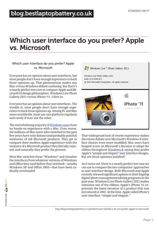
1. 07/09/2011 08:57
blog.bestlaptopbattery.co.uk
Which user interface do you prefer? Apple
vs. Microsoft
Which user interface do you prefer? Apple
vs. Microsoft
Everyone has an opinion about user interfaces, but
most people don’t have enough experience to back
those opinions up. That phenomenon makes any
Mac-versus-Windows debate confusing. But there’s
a nearly perfect test case to compare Apple and Mi-
crosoft UI design philosophies: Windows Live Photo
Gallery 2011 versus iPhoto ‘11. I dive in.
Everyone has an opinion about user interfaces. The
trouble is, most people don’t have enough expe-
rience to back those opinions up. Among PC and Mac
users worldwide, most use one platform regularly
and rarely if ever use the other.
The overwhelming majority of Windows users have
no hands-on experience with a Mac. Even worse,
the millions of Mac users who switched in the past
few years have only distant (and probably painful) That widespread lack of recent experience makes
memories of old Microsoft products. They get to the recent debate over Microsoft’s Windows 8 inter-
compare their modern Apple experience with the face choices even more muddled. Mac users have
memory of a Microsoft product they literally rejec- heaped scorn on Microsoft’s decision to adopt the
ted, and naturally they prefer the present. ribbon throughout Windows 8, saying they prefer
Apple’s “simple and elegant” user interface designs.
Most Mac switchers hear “Windows” and visualize But are those opinions justified?
the interfaces from whatever versions of Windows
and Office they used before they switched—usually As it turns out, there is a nearly perfect test case we
Windows XP and Office 2003—that have been ra- can use to compare the two companies’ approaches
dically overhauled. to user interface design. Both Microsoft and Apple
recently released significant updates to their flagship
digital photo management/editing programs in the
joliprint
past year: Windows Live Photo Gallery 2011 makes
extensive use of the ribbon; Apple’s iPhoto ’11 re-
presents the latest iteration of a product that was
introduced in 2002. At the time, Apple called iPhoto’s
Printed with
user interface “simple and elegant.”
http://blog.bestlaptopbattery.co.uk/which-user-interface-do-you-prefer-apple-vs-microsoft/
Page 1
2. 07/09/2011 08:57
blog.bestlaptopbattery.co.uk
Which user interface do you prefer? Apple vs. Microsoft
At its “Back to the Mac” event in late 2010, Apple Page 3: Changing the view
chose to lead off the announcements with iLife ’11,
and iPhoto was up first. Digital photos figure pro- You really can’t ask for a better head-to-head com-
minently in advertising from both Apple and Mi- parison than this: Microsoft’s ribbon versus the
crosoft. That’s no surprise. Managing digital photos traditional pull-down menus used in iPhoto.
is something everyone everywhere does with their
computer. It’s fair to say both companies have made
major investments and placed big bets here.
In this post, I’ll show you what you have to do to
accomplish specific tasks using these two programs.
My goal isn’t to declare a winner, but rather to pro-
vide a more detailed look at each program’s design
and to discuss the design principles underlying each
one. If you’re a Windows user, you can see where Page 4: Editing photos
Microsoft has “borrowed” from Apple. If you’re a
Mac user, you can see how the Windows UI has This is where the comparison is most interesting.
evolved in the past five years. Microsoft’s design puts every photo-editing tool in
the ribbon. With iPhoto, Apple has editing tools in
Some of the differences between the two programs menus and editing panes, with access to some com-
are purely esthetic, but there are significant func- mon tasks well hidden.
tional differences as well. I’ve taken a task-centric
approach here so that I can show the similarities
and highlight the differences.
I’ve divided the comparison into four distinct areas,
each of which gets its own page. Here’s an index, if
you want to jump straight to a specific page.
Page 2: The main interface
There are a surprising number of similarities Page 5: Simple or cluttered?
between the two programs, and one very large
difference. Ultimately, the decisions that UI designers at Apple
and Microsoft have settled on reflect much larger
design principles. I’ve included a description of those
principles and some conclusions here.
joliprint
Printed with
http://blog.bestlaptopbattery.co.uk/which-user-interface-do-you-prefer-apple-vs-microsoft/
Page 2
3. 07/09/2011 08:57
blog.bestlaptopbattery.co.uk
Which user interface do you prefer? Apple vs. Microsoft
The main interface
Here’s a closer look at the primary user interface
for each program—the part that lets you browse
through your collection of digital photos.
This is what you see when you open Windows Live
Photo Gallery: The similarities are striking. Both programs use a
traditional browsing view, with a navigation pane
on the left and photos from the selected location/
album on the right.
In the navigation pane, Apple’s font palette is thick
and bold; Microsoft’s default fonts are smaller, ligh-
ter, and thinner. Those differences are mostly esthe-
tic, but another aspect of the navigation pane is
functional: In Microsoft’s vision, the primary means
of navigation is through a tree control, in which all
or part of the folder hierarchy can be collapsed or
expanded with a click of the mouse.
joliprint
And this is the main iPhoto window:
Printed with
http://blog.bestlaptopbattery.co.uk/which-user-interface-do-you-prefer-apple-vs-microsoft/
Page 3
4. 07/09/2011 08:57
blog.bestlaptopbattery.co.uk
Which user interface do you prefer? Apple vs. Microsoft
You can think of each tab on the ribbon as the equi-
valent of a pull-down menu. But an old-school menu
is really just a flat list of commands, with cascading
menus listing additional commands for some op-
tions. Using the ribbon, the choices on each tab are
similar, except they’re arranged from side to side, in
groups using a mix of icons and text. Some unique
visual controls are mixed in as well, like this list of
themes for slide shows.
iPhoto uses the standard menu bar for an OS X app,
which is always at the top of the window. That can
be inconvenient on a very large monitor if the iPhoto
window is anywhere other than at the top of the
screen. But most Mac users long ago adapted to
this convention.
You’ll notice the ribbon isn’t visible in the screen for
Photo Gallery above. That’s because I made a simple
customization. It’s a feature included specifically to
address the concerns of those who think the ribbon
is cluttered, ugly, and messy. Double-click any tab
heading to collapse the ribbon so that it looks indis-
tinguishable from a traditional menu bar.
Click any tab heading and the contents of that tab
appear, ready for you to make a selection, after
which the tab’s contents disappear again. In this
configuration, the tab headings work exactly like the
joliprint
top-level choices on a menu bar. Double-click a tab
heading to change the view so the contents of the rib-
bon always appear. This is the Home ribbon, which
contains the most commonly used commands:
Printed with
http://blog.bestlaptopbattery.co.uk/which-user-interface-do-you-prefer-apple-vs-microsoft/
Page 4
5. 07/09/2011 08:57
blog.bestlaptopbattery.co.uk
Which user interface do you prefer? Apple vs. Microsoft
Both programs offer a selection of common com- The Windows 8 blog, with its epic posts from Steven
mands in an always-visible toolbar at the bottom Sinofsky and the Windows team, is just the latest
of the program window. For Windows Live Photo in a long line of similar efforts. Jensen Harris, who
Gallery, these include two Rotate commands (coun- led the development of the original ribbon in Office
terclockwise and clockwise), as well as a Zoom sli- 2007, wrote an eight-part series of blog posts titled
der. iPhoto offers a Search command (click the ma- “Why the UI?”
gnifying glass to reveal a search box) and a Zoom
slider on the left, a Slideshow command (not shown) I am certain that Apple’s designers do just as much
in the center, and five buttons on the right that ex- thinking, research, prototyping, and testing as their
pose different parts of the iPhoto interface. counterparts in Redmond. But they don’t talk about
that work. Instead, the results are described in press
Here’s what you see at the top and bottom of each releases and promotional web pages with terms
program window. like “easier than ever” and“incredibly easy.”
The thing is, those adjectives refer to specific pro-
ducts and activities, and not to the user interface as
a whole. With iPhoto ‘11, Apple lavished a tremen-
dous amount of attention on its revenue-producing
services, like the ability to create cards, calendars,
and books—a lucrative business at a minimum of
$29.99 each.
In the lower right corner of the iPhoto window is
a second menu bar, containing the five commands
shown above. When you include the nine main
menu options, that’s a total of 14 places to click,
compared to five for Windows Live Photo Gallery.
On the next page, we’ll see how well that works.
Simple or cluttered?
If you walk through the process of creating one of
One enormous difference between Microsoft and these products, it is indeed easy, and Microsoft has
joliprint
Apple is the amount of public communication each no competing business.
company puts out. In the last five years, Microsoft
engineers and executives have written the equiva- On tasks that involve free services, Microsoft and
lent of several big books about the process of desi- Apple are more evenly matched. For instance, sha-
Printed with
gning and building the user interface for Windows ring to a Facebook album from Windows Live Photo
and Office. Gallery takes one click from the Create tab and a
trip through this dialog box:
http://blog.bestlaptopbattery.co.uk/which-user-interface-do-you-prefer-apple-vs-microsoft/
Page 5
6. 07/09/2011 08:57
blog.bestlaptopbattery.co.uk
Which user interface do you prefer? Apple vs. Microsoft
terms. I’ve shrunk these screens down so you can
focus on the general layout of controls rather than
the details. Which one looks cluttered to you? For
what should be a simple editing task, there’s an
awful lot of cruft in that iPhoto screen.
From iPhoto, the process is simpler—maybe a little
too much so, in fact, as with one click I inadvertently
uploaded 200 photos from a local folder on my Mac
to the wrong Facebook album. Oops.
Ultimately, my experience with the two programs
Ultimately, I have to disagree with anyone who calls says both do an excellent job of making photo ma-
the Windows Live Photo Gallery interface “messy” nagement and editing tools available to a nontech-
joliprint
or “cluttered.” It might be fair to call it “full”—in- nical audience. Each has its own set of quirks, but
deed, the ability to put a lot of commands into a tab each one also rewards users who spend some time
without appearing bloated is one of the design goals learning the program.
of the people who designed the ribbon.
Printed with
If you go back to 2008 and look at the version of Win-
This side-by-side comparison of the two programs at dows Live Photo Gallery that was available before
work (cropping a photo) makes that point in visual Windows 7 shipped, you can see the tremendous
http://blog.bestlaptopbattery.co.uk/which-user-interface-do-you-prefer-apple-vs-microsoft/
Page 6
7. 07/09/2011 08:57
blog.bestlaptopbattery.co.uk
Which user interface do you prefer? Apple vs. Microsoft
evolution of the user interface. That version used
a hybrid of a menu and toolbar that looks positi-
vely primitive compared to the current incarnation.
The Windows Live programs released in 2009 with
Windows 7 were better looking but still don’t have
the cohesive design that more recent versions do.
See also:
CloudTag: Apple , Microsoft , interface , prefer , Acer
aspire 6935g batteries , Hp 2230s batteries , Acer
as07b41 batteries , Acer aspire 5920 batteries
joliprint
Printed with
http://blog.bestlaptopbattery.co.uk/which-user-interface-do-you-prefer-apple-vs-microsoft/
Page 7