1
Graphic Design and Gestalt
Principles
CS160: User Interfaces
Maneesh Agrawala
Keepin' it Real: Pushing the Desktop Metaphor with Physics, Piles and the Pen [Agarawala 06]
VIDEO
2
Due Soon
Interactive Prototype (due Apr 6)
– Redesign interface based on lofi feedback
– Create first working implementation
• Can include Wizard of Oz parts where justified
• Can include pre-built (canned) functionality but only if
heavily justified
In class Presentations (Apr 13, 15, 20)
– 10 min slide presentation (be careful about timing)
– Focus on showing prototype
– Feedback from class (you will need to provide
feedback on each presentation on the wiki)
Upcoming Lectures
Apr 6: Stephen Few
– Information display
Apr 8: Aaron Marcus
– UI design consultant
– Elected to CHI Academy
this year
3
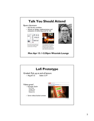
Talk You Should Attend
Bjoern Hartmann
– HCI faculty candidate
– Works on design, implementation and
evaluation of authoring tools for UIs
Mon Apr 13: 1-2:30pm Wozniak Lounge
Lofi Prototype
Graded: Pick up at end of lecture
– Avg 67.13 Stdev: 5.77
Videos great!
– Example: Dashr
Carol Chen
Timofey Titov
David Burban
Matthew Can
– Some videos lacked context
4
Topics
• Graphic design
• Simplicity and elegance
• Color
• Gestalt principles
• Grid-based design
Graphic Design
5
Design is about Communication
Principal organs & vasculature
[Leonardo da Vinci ca. 1490]
Strange immersion of torus in 3-space
[Curtis 92]
6
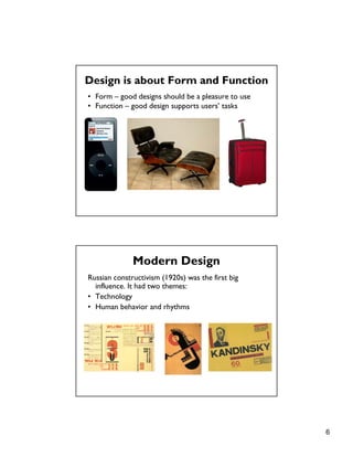
Design is about Form and Function
• Form – good designs should be a pleasure to use
• Function – good design supports users’ tasks
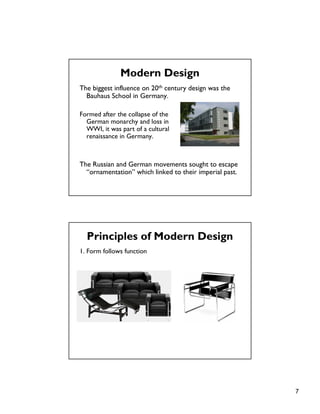
Russian constructivism (1920s) was the first big
influence. It had two themes:
• Technology
• Human behavior and rhythms
Modern Design
7
The biggest influence on 20th century design was the
Bauhaus School in Germany.
Formed after the collapse of the
German monarchy and loss in
WWI, it was part of a cultural
renaissance in Germany.
The Russian and German movements sought to escape
“ornamentation” which linked to their imperial past.
Modern Design
Principles of Modern Design
1. Form follows function
8
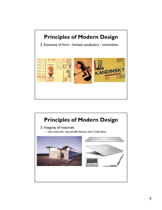
2. Economy of form - limited vocabulary - minimalism
Principles of Modern Design
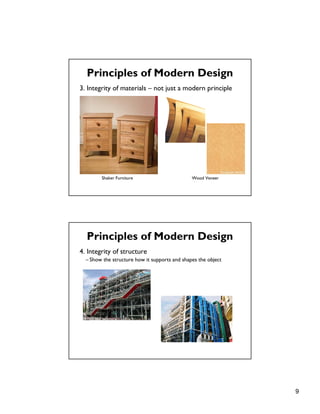
3. Integrity of materials
– Use materials’ natural affordances, don’t hide them
Principles of Modern Design
9
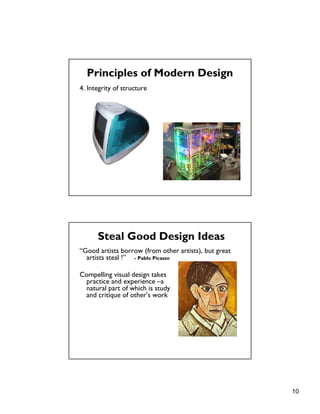
3. Integrity of materials – not just a modern principle
Principles of Modern Design
Shaker Furniture Wood Veneer
4. Integrity of structure
– Show the structure how it supports and shapes the object
Principles of Modern Design
10
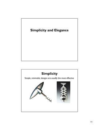
4. Integrity of structure
Principles of Modern Design
Steal Good Design Ideas
“Good artists borrow (from other artists), but great
artists steal !” - Pablo Picasso
Compelling visual design takes
practice and experience –a
natural part of which is study
and critique of other’s work
11
Simplicity and Elegance
Simplicity
Simple, minimalist, designs are usually the most effective
12
Elegance
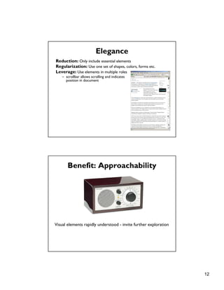
Reduction: Only include essential elements
Regularization: Use one set of shapes, colors, forms etc.
Leverage: Use elements in multiple roles
– scrollbar allows scrolling and indicates
position in document
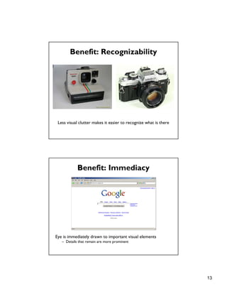
Benefit: Approachability
Visual elements rapidly understood - invite further exploration
13
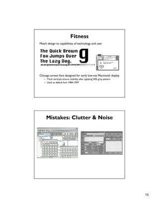
Benefit: Recognizability
Less visual clutter makes it easier to recognize what is there
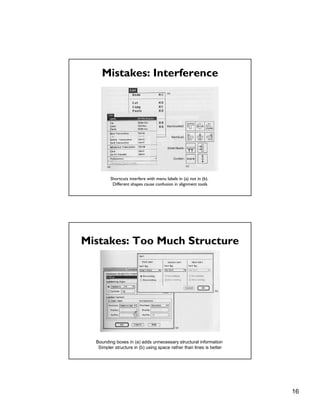
Benefit: Immediacy
Eye is immediately drawn to important visual elements
– Details that remain are more prominent
14
Unity
One path to simplicity & elegance is through unifying themes:
– Forms, colors, components with like qualities
Refinement
London Underground [Beck 33] Geographic version of map
Draw viewers’ attention to essential information
– Straighten subway lines to emphasize sequence of stops
15
Fitness
Match design to capabilities of technology and user
Chicago screen font designed for early low-res Macintosh display
– Thick verticals ensure visibility after applying 50% gray pattern
– Used as default font 1984-1997
Mistakes: Clutter & Noise
16
Mistakes: Interference
Shortcuts interfere with menu labels in (a) not in (b).
Different shapes cause confusion in alignment tools
Mistakes: Too Much Structure
Bounding boxes in (a) adds unnecessary structural information
Simpler structure in (b) using space rather than lines is better
17
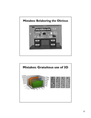
Mistakes: Belaboring the Obvious
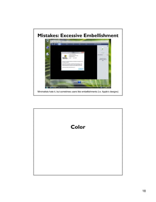
Mistakes: Gratuitous use of 3D
18
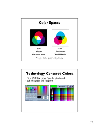
Mistakes: Excessive Embellishment
Minimalists hate it, but sometimes users like embellishments (i.e. Apple’s designs)
Color
19
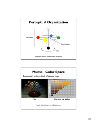
Color Spaces
RGB
Additive
Electronic Media
CMY
Subtractive
Printed Media
Parameters of color space driven by technology
Technology-Centered Colors
• Nice RGB Hex codes, “evenly” distributed
• But, lime green and hot pink?
20
Perceptual Organization
Lightness
Hue
Colorfulness
Parameters of color space driven by perception
Munsell Color Space
Perceptually uniform book of painted chips
Chroma vs. ValueHue
Munsell Color Utility: www.wallkillcolor.com
21
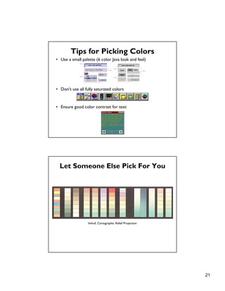
Tips for Picking Colors
• Use a small palette (6 color Java look and feel)
• Don’t use all fully saturated colors
• Ensure good color contrast for text
Let Someone Else Pick For You
Imhof, Cartographic Relief Projection
22
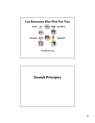
Let Someone Else Pick For You
ColorBrewer.org
Gestalt Principles
23
Principles
• figure/ground
• proximity
• similarity
• symmetry
• connectedness
• continuity
• closure
• common fate
• transparency
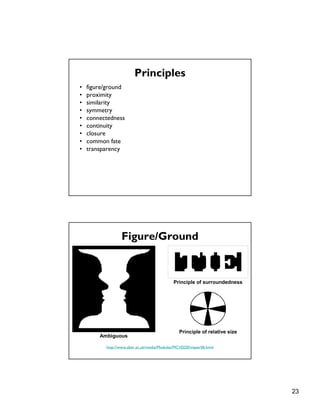
Figure/Ground
http://www.aber.ac.uk/media/Modules/MC10220/visper06.html
Ambiguous
Principle of surroundedness
Principle of relative size
24
Figure/Ground
Ambiguous Unambiguous
http://www.aber.ac.uk/media/Modules/MC10220/visper06.html
Proximity
[from Ware 00]
Dots that are near one another are grouped
Dots that are concentrated are grouped
25
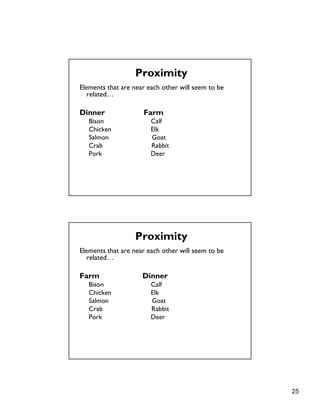
Elements that are near each other will seem to be
related…
Dinner Farm
Bison Calf
Chicken Elk
Salmon Goat
Crab Rabbit
Pork Deer
Proximity
Elements that are near each other will seem to be
related…
Farm Dinner
Bison Calf
Chicken Elk
Salmon Goat
Crab Rabbit
Pork Deer
Proximity
26
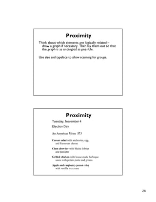
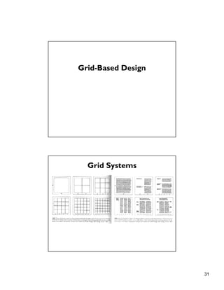
Think about which elements are logically related –
draw a graph if necessary. Then lay them out so that
the graph is as untangled as possible.
Use size and typeface to allow scanning for groups.
Proximity
Tuesday, November 4
Election Day
An American Menu $75
Caesar salad with anchovies, egg,
and Parmesan cheese
Clam chowder with Maine lobster
and pancetta
Grilled chicken with house-made barbeque
sauce with potato purée and greens
Apple and raspberry pecan crisp
with vanilla ice cream
Proximity
27
Similarity
Rows dominate due to similarity [from Ware 04]
Symmetry
Bilateral symmetry gives strong sense of figure [from Ware 04]
28
Connectedness
Connectedness overrules proximity, size, color shape [from Ware 04]
Continuity
We prefer smooth not abrupt changes [from Ware 04]
Connections are clearer with smooth contours [from Ware 04]
29
Continuity: Vector Fields
Prefer field that shows smooth continuous contours [from Ware 04]
Closure
We see a circle behind a rectangle, not a broken circle [from Ware 04]
Illusory contours [from Durand 02]
30
Common Fate
http://coe.sdsu.edu/eet/articles/visualperc1/start.htm
Dots moving together are grouped
Transparency
Requires continuity and proper color
correspondence [from Ware 04]
31
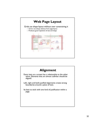
Grid-Based Design
Grid Systems
32
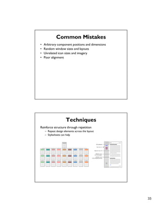
Web Page Layout
Grids can shape layout without over constraining it
– Grid is not always obvious from page layout
– Produces good repetition of size and shape
Every item on a screen has a relationship to the other
items. Elements that are almost collinear should be
aligned.
Left, right and both-justified alignments create strong
boundaries around a piece of text.
Its best to stick with one kind of justification within a
page.
Alignment
33
Common Mistakes
• Arbitrary component positions and dimensions
• Random window sizes and layouts
• Unrelated icon sizes and imagery
• Poor alignment
Techniques
Reinforce structure through repetition
– Repeat design elements across the layout
– Stylesheets can help
34
Techniques
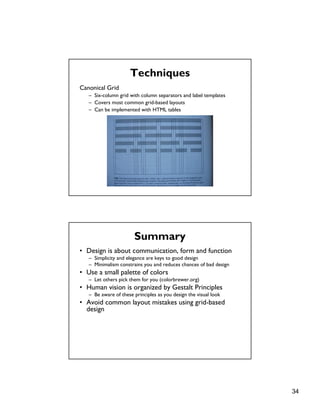
Canonical Grid
– Six-column grid with column separators and label templates
– Covers most common grid-based layouts
– Can be implemented with HTML tables
Summary
• Design is about communication, form and function
– Simplicity and elegance are keys to good design
– Minimalism constrains you and reduces chances of bad design
• Use a small palette of colors
– Let others pick them for you (colorbrewer.org)
• Human vision is organized by Gestalt Principles
– Be aware of these principles as you design the visual look
• Avoid common layout mistakes using grid-based
design
35
Next Time
Visualization
– Information Visualization. Readings in Information
Visualization. Chap 1. Card, Mackinlay, Schneiderman.

Gestalt

  • 1.
    1 Graphic Design andGestalt Principles CS160: User Interfaces Maneesh Agrawala Keepin' it Real: Pushing the Desktop Metaphor with Physics, Piles and the Pen [Agarawala 06] VIDEO
  • 2.
    2 Due Soon Interactive Prototype(due Apr 6) – Redesign interface based on lofi feedback – Create first working implementation • Can include Wizard of Oz parts where justified • Can include pre-built (canned) functionality but only if heavily justified In class Presentations (Apr 13, 15, 20) – 10 min slide presentation (be careful about timing) – Focus on showing prototype – Feedback from class (you will need to provide feedback on each presentation on the wiki) Upcoming Lectures Apr 6: Stephen Few – Information display Apr 8: Aaron Marcus – UI design consultant – Elected to CHI Academy this year
  • 3.
    3 Talk You ShouldAttend Bjoern Hartmann – HCI faculty candidate – Works on design, implementation and evaluation of authoring tools for UIs Mon Apr 13: 1-2:30pm Wozniak Lounge Lofi Prototype Graded: Pick up at end of lecture – Avg 67.13 Stdev: 5.77 Videos great! – Example: Dashr Carol Chen Timofey Titov David Burban Matthew Can – Some videos lacked context
  • 4.
    4 Topics • Graphic design •Simplicity and elegance • Color • Gestalt principles • Grid-based design Graphic Design
  • 5.
    5 Design is aboutCommunication Design is about Communication Principal organs & vasculature [Leonardo da Vinci ca. 1490] Strange immersion of torus in 3-space [Curtis 92]
  • 6.
    6 Design is aboutForm and Function • Form – good designs should be a pleasure to use • Function – good design supports users’ tasks Russian constructivism (1920s) was the first big influence. It had two themes: • Technology • Human behavior and rhythms Modern Design
  • 7.
    7 The biggest influenceon 20th century design was the Bauhaus School in Germany. Formed after the collapse of the German monarchy and loss in WWI, it was part of a cultural renaissance in Germany. The Russian and German movements sought to escape “ornamentation” which linked to their imperial past. Modern Design Principles of Modern Design 1. Form follows function
  • 8.
    8 2. Economy ofform - limited vocabulary - minimalism Principles of Modern Design 3. Integrity of materials – Use materials’ natural affordances, don’t hide them Principles of Modern Design
  • 9.
    9 3. Integrity ofmaterials – not just a modern principle Principles of Modern Design Shaker Furniture Wood Veneer 4. Integrity of structure – Show the structure how it supports and shapes the object Principles of Modern Design
  • 10.
    10 4. Integrity ofstructure Principles of Modern Design Steal Good Design Ideas “Good artists borrow (from other artists), but great artists steal !” - Pablo Picasso Compelling visual design takes practice and experience –a natural part of which is study and critique of other’s work
  • 11.
    11 Simplicity and Elegance Simplicity Simple,minimalist, designs are usually the most effective
  • 12.
    12 Elegance Reduction: Only includeessential elements Regularization: Use one set of shapes, colors, forms etc. Leverage: Use elements in multiple roles – scrollbar allows scrolling and indicates position in document Benefit: Approachability Visual elements rapidly understood - invite further exploration
  • 13.
    13 Benefit: Recognizability Less visualclutter makes it easier to recognize what is there Benefit: Immediacy Eye is immediately drawn to important visual elements – Details that remain are more prominent
  • 14.
    14 Unity One path tosimplicity & elegance is through unifying themes: – Forms, colors, components with like qualities Refinement London Underground [Beck 33] Geographic version of map Draw viewers’ attention to essential information – Straighten subway lines to emphasize sequence of stops
  • 15.
    15 Fitness Match design tocapabilities of technology and user Chicago screen font designed for early low-res Macintosh display – Thick verticals ensure visibility after applying 50% gray pattern – Used as default font 1984-1997 Mistakes: Clutter & Noise
  • 16.
    16 Mistakes: Interference Shortcuts interferewith menu labels in (a) not in (b). Different shapes cause confusion in alignment tools Mistakes: Too Much Structure Bounding boxes in (a) adds unnecessary structural information Simpler structure in (b) using space rather than lines is better
  • 17.
    17 Mistakes: Belaboring theObvious Mistakes: Gratuitous use of 3D
  • 18.
    18 Mistakes: Excessive Embellishment Minimalistshate it, but sometimes users like embellishments (i.e. Apple’s designs) Color
  • 19.
    19 Color Spaces RGB Additive Electronic Media CMY Subtractive PrintedMedia Parameters of color space driven by technology Technology-Centered Colors • Nice RGB Hex codes, “evenly” distributed • But, lime green and hot pink?
  • 20.
    20 Perceptual Organization Lightness Hue Colorfulness Parameters ofcolor space driven by perception Munsell Color Space Perceptually uniform book of painted chips Chroma vs. ValueHue Munsell Color Utility: www.wallkillcolor.com
  • 21.
    21 Tips for PickingColors • Use a small palette (6 color Java look and feel) • Don’t use all fully saturated colors • Ensure good color contrast for text Let Someone Else Pick For You Imhof, Cartographic Relief Projection
  • 22.
    22 Let Someone ElsePick For You ColorBrewer.org Gestalt Principles
  • 23.
    23 Principles • figure/ground • proximity •similarity • symmetry • connectedness • continuity • closure • common fate • transparency Figure/Ground http://www.aber.ac.uk/media/Modules/MC10220/visper06.html Ambiguous Principle of surroundedness Principle of relative size
  • 24.
    24 Figure/Ground Ambiguous Unambiguous http://www.aber.ac.uk/media/Modules/MC10220/visper06.html Proximity [from Ware00] Dots that are near one another are grouped Dots that are concentrated are grouped
  • 25.
    25 Elements that arenear each other will seem to be related… Dinner Farm Bison Calf Chicken Elk Salmon Goat Crab Rabbit Pork Deer Proximity Elements that are near each other will seem to be related… Farm Dinner Bison Calf Chicken Elk Salmon Goat Crab Rabbit Pork Deer Proximity
  • 26.
    26 Think about whichelements are logically related – draw a graph if necessary. Then lay them out so that the graph is as untangled as possible. Use size and typeface to allow scanning for groups. Proximity Tuesday, November 4 Election Day An American Menu $75 Caesar salad with anchovies, egg, and Parmesan cheese Clam chowder with Maine lobster and pancetta Grilled chicken with house-made barbeque sauce with potato purée and greens Apple and raspberry pecan crisp with vanilla ice cream Proximity
  • 27.
    27 Similarity Rows dominate dueto similarity [from Ware 04] Symmetry Bilateral symmetry gives strong sense of figure [from Ware 04]
  • 28.
    28 Connectedness Connectedness overrules proximity,size, color shape [from Ware 04] Continuity We prefer smooth not abrupt changes [from Ware 04] Connections are clearer with smooth contours [from Ware 04]
  • 29.
    29 Continuity: Vector Fields Preferfield that shows smooth continuous contours [from Ware 04] Closure We see a circle behind a rectangle, not a broken circle [from Ware 04] Illusory contours [from Durand 02]
  • 30.
    30 Common Fate http://coe.sdsu.edu/eet/articles/visualperc1/start.htm Dots movingtogether are grouped Transparency Requires continuity and proper color correspondence [from Ware 04]
  • 31.
  • 32.
    32 Web Page Layout Gridscan shape layout without over constraining it – Grid is not always obvious from page layout – Produces good repetition of size and shape Every item on a screen has a relationship to the other items. Elements that are almost collinear should be aligned. Left, right and both-justified alignments create strong boundaries around a piece of text. Its best to stick with one kind of justification within a page. Alignment
  • 33.
    33 Common Mistakes • Arbitrarycomponent positions and dimensions • Random window sizes and layouts • Unrelated icon sizes and imagery • Poor alignment Techniques Reinforce structure through repetition – Repeat design elements across the layout – Stylesheets can help
  • 34.
    34 Techniques Canonical Grid – Six-columngrid with column separators and label templates – Covers most common grid-based layouts – Can be implemented with HTML tables Summary • Design is about communication, form and function – Simplicity and elegance are keys to good design – Minimalism constrains you and reduces chances of bad design • Use a small palette of colors – Let others pick them for you (colorbrewer.org) • Human vision is organized by Gestalt Principles – Be aware of these principles as you design the visual look • Avoid common layout mistakes using grid-based design
  • 35.
    35 Next Time Visualization – InformationVisualization. Readings in Information Visualization. Chap 1. Card, Mackinlay, Schneiderman.