SlideShare a Scribd company logo
1 of 135
Geostatistical Analyst
Summarized by – Dr. Danny M. Vaughn
(08/14/06)
Spatial Analysis by Visual & Statistical Description
• Contour Map – lines delineating values of equality (p42).
• Symbol Map – Symbols posted representing a class of data values
(p43).
• Grayscale Map – Similar to symbol map, but uses gradations of
gray values (p44).
• Indicator Maps – Binary raster plots delineating class
values (p45).
• Each plot represents a different range or thresholds of
values, e,g, concentrations of dissolved solids in a lake.
• Distribution of values above or below a threshold are
displayed & their spatial patterns may be analyzed for
trends (directional bias).
• Moving Window Statistics – used to assess
anomalies of average values and variability
(heteroscedasticity) of values throughout a region (p46).
• Create a grid whose size is dependent upon the size of
the data set.
• Analogous to a raster spacing (spatial resolution).
• Given a data set with a 1 meter grid spacing and 100
points:
• Select a window (search neighborhood) that is
not too large to over-generalize, yet not too small
that anomalies are not picked up.
• Search neighborhoods are used to compute
mean and standard deviations.
• If local means (based upon the number of values used
in the grid) are heavily influenced by erratic values, use
the median.
• Mean (top value) & standard deviations (bottom value)
for moving windows posted (p47).
• Note patterns; higher standard deviations where
variability of values is greatest in a window, Higher
means correspond to highest values in a window.
• Standard deviations vary more than means throughout
the region.
Proportional Effect
• Anomalies in the local variability have an impact on
the accuracy of estimations in spatial statistical
techniques.
• Areas of uniform values (low variability) render the
most credible estimates.
• Consider four relationships between local mean and
local variability (p49).
Graph A - Local mean (straight line) and variability
are constant. Data values fluctuate about the local
mean, but no obvious change in variability.
Graph B – A trend in the local mean, but the
variability remains constant w/ rising & falling
mean.
Graph C – Constant local mean while the variability
exhibits a trend (rises).
Graph D – A trend in both the local mean and
variability (both mean and standard deviation rise).
Most common case in Earth Science data.
• Ideally, data should be as A or B (relatively constant
variability), but D is acceptable since variability changes
noticeably, but it is related to local mean, therefore
somewhat predicable.
• When a relationship exists between the local mean and
local standard deviation, a proportional effect exists.
• A scatterplot (mean vs. standard deviation) shows a
visual means for assessing this relationship (p51).
• A low correlation coefficient indicates a low
relationship.
• Univariate, normally distributed data can be spatially
arranged to render a proportional effect.
Geostatistical Analysis - an ArcGIS extension used to create a
statistically valid, continuous surface.
Basic steps to creating a surface
• Add layers in ArcGIS.
• Explore statistical properties of data through:
• Histogram (univariate distribution).
• Voronoi polygons – analyze spatial
variability.
• Normal QQPlot – Check for normality.
• Trend Analysis – identify global trends.
• Semi-variogram/covariance cloud – analyze spatial dependencies
(autocorrelation) in the data.
• General QQPlot – explore whether two datasets have the same
distributions.
• Cross-covariance cloud – analyze cross-covariance between two
datasets.
• Select a surface model to create a surface.
• Assess the output surface.
• Compare other models for optimal fit.
• Two basic methods of interpolation –
• Deterministic – use mathematical functions.
• Geostatistical – use statistical & mathematical
functions.
Deterministic Methods
• Sample points (observed) of phenomena are established at
locations.
• Algorithms interpolate (predict) other (unmeasured) points &
create a continuous surface.
• Premise – objects that are close to each other tend to be more alike
than objects further apart (Tobler, 1970).
• Inverse distance weighted method – based upon Local similarity.
• General inverse weighted formula – Z’(so) = S lZ(si)
• Weight formula - li = dio
-p / S dio
-p
Z’(so) = a predicted value for location (so).
li = weights assigned to each measured point.
Z (si) = an observed value at location (si).
dio
-p = distance between prediction location (so) & each
measured location (si).
p = a power function (higher powers plot as a steeper
curve on the left end of a graph of relative weight (y
axis), distance (x axis).
• Weights decrease rapidly w/ distance. Scaled so that Sl = 1.
• Optimal p values are derived as the minimum RMS prediction error.
• Cross-validation process computes the difference from a
measured vs. predicted value for that location.
• An exact (predicts a value identical to the measured
value at a known location w/o prediction standard error, & forces the
surface to pass through data values) interpolator.
• An output surface is sensitive to clustering & outliers.
• Works best when the data is evenly distributed.
• A predicted surface can not extend above a maximum or below a
minimum value.
• IDW assumes the surface is driven by local variation captured by
neighborhood values.
• Use the Validation option by creating training (contains measured
locations) & test datasets (used to validate the predictions).
• Global & Local Polynomial Interpreters – modeled by polynomial
equations.
• First order – linear.
• Second order – one bend in the plane (Quadratic).
• Third order – two bends (cubic).
• An inexact (doe not predict a value identical to the measured value
at a measured location, & does not force the surface to pass through
data values) interpolator.
• Points will plot above & below the fitted plane.
Global Interpolation.
• Use for gradually varied surfaces.
• To examine & remove global trends (trend analysis).
• Surfaces are highly susceptible to extreme values,
especially near edges.
• Anisotropic* (ellipse) or Isotropic* (circle) distributed
data can be modeled.
• Anisotropic – spatial dependence (autocorrelation) changes
w/ distance & direction between two locations.
• Isotropic - spatial dependence (autocorrelation) changes
w/ only distance between two locations.
Local Interpolation.
• Accuracy of any surface increases w/ an ability to
identify local trends.
• Fits many polynomials w/in overlapping neighborhoods.
• Accounts for local variation in a surface.
• Fits a surface using all points in a defined neighborhood.
• Provides a smooth fit for short range variation in longer range
trends.
• Successive iterations cross-validate an output surface using
optimal parameters based upon a minimum RMS predicted error.
• Local polynomials are sensitive to neighborhood distance.
• Anisotropic (ellipse) or Isotropic (circle) distributed data can be
modeled.
• Radial basis functions – (Local/neighborhood) polynomial
interpolation (smoothing).
• An exact (forces the surface to pass through data values)
interpolator.
• Thin-plate spline, spline w/ tension, completely
regularized spline, multiquadric spline, & inverse
multiquadric spline.
• Conceptually like rubber sheeting through points w/ minimum
curvature.
• A predicted surface can extend above a maximum or below a
minimum value.
• Uses smaller, overlapping planes.
• Thin-plate splines.
• Splines w/ tension.
• Optimal parameter is derived as the minimum RMS prediction
error. Higher values produce smoother surfaces.
• Use to create smooth surfaces from large sets of points.
• Best for gently varied surfaces.
• Not good for irregular, highly varied data, & data prone to error or
uncertainty.
Geostatistical Methods
• Regionalized variable in geostatistics – consists of: Structured
aspect reflecting large scale tendencies, and a random aspect
reflecting local irregularities.
• The accuracy of any surface increases w/ an ability to identify
local trends.
• Must characterize error & variability of the predicted surface.
• Based on statistical models.
• Geostatistical methods provide measures of error & uncertainty
(accuracy of predictions).
Basic Principles of Geostatistical Methods
• Assumes all values are a result of random processes w/ dependence
(as opposed to an independent random process, e.g. a coin toss).
• Dependent random process - a coin is tossed three times, tails,
heads, & heads. A fourth position is determined by a rule: since the
second & third flips are heads, assign the fourth the same as the first
(tails).
• Reality is represented by introducing randomness through local
fluctuations termed, drift, (as opposed to errors in Trend analysis)
around a fixed surface.
• Fluctuations are not errors in Geostatistical analysis, rather actual
features with their own structure
• Autocorrelation – statistical correlation between spatial random
variables of the same type where correlation is dependent upon
distance and/or direction (spatially dependent) separating the
locations.
• In geostatistics, knowing spatial locations allows distances to be
computed between observations & autocorrelation modeled as a
function of distance through the semi-variogram.
• Observe scatter of points in the semi-variogram. If points are
close to the line of best fit on one side, yet spread out more on the
other side, directional autocorrelation may exist.
Spatial Continuity
• Exists for most Earth Science data (similar values with
data close to each other, positive spatial autocorrelation).
• Scatterplots may be employed in semivariograms to
show the value of one variable and the value of the same
variable, but at a nearby location.
h – Scatterplots
• Shows all possible pairs of data values whose locations
are separated by a distance in a direction.
• The location of any point can be described by a vector
as can the separation between two points (p52).
• Given an origin at 0,0. Point xi,yi can be written as
vector ti, and point xj,yj can be written as vector tj.
• The separation between point i & j is ti - tj. This can
also be expressed as:
(xi - yi, xj- yj). The vector (distance) between these two
points (i to j) will now be referred as, hij.
• On a h - scatterplot, the x axis is labeled V(t), & the y
axis is labeled V(t+h).
• The x coordinate of a point is a value at a particular
location, and the y coordinate is a value a distance and
direction h away.
• Recall an h value is a vector, thus we can express it as
h = (0,1), where we have taken each data location and
paired it with the data location whose easting is the same,
and whose northing is 1 m larger to the north (p53,A).
• The shape of the cloud of points on an h – scatterplot
delineates how continuous the data values are over a
certain distance in a specific direction (p54).
• If data values at locations separated by h are similar,
then the pairs will plot close to the line x = y (1, 1), or a
45˚degree slope through the data cloud (p54).
• As the separation distance increases (y increases), the
similarity between pairs of values decreases, and the
points on the h - scatterplot spread out further from the
diagonal line.
Correlation Functions, Covariance functions, and
Variograms
• h – scatterplots require some quantitative summary
of the information contained within them.
• One essential feature is fatness of the cloud of points.
• Summarized by a correlation coefficient (p(h)).
• As the cloud gets thicker (y increases), coefficient gets
smaller.
h Correlation Covar. Moment of Inertia
(ppm2) (ppm2)
(0, 1) 0.742 448.8 312.8
(0, 2) 0.590 341.0 479.2
(0, 3) 0.560 323.8 521.4
(0, 4) 0.478 291.5 652.9
• The relation between the correlation coefficient of an
h – scatterplot (p(h)) and h is termed a correlation
function or correlogram (p57).
• The correlation coefficient is dependent on h which is
vector defined as having magnitude (visual angle
varying inversely w/ distance from the eye) and
direction.
• Covariance (C(h)) – an alternative index for spatial
continuity, & termed covariance function (C(h)).
• A covariance function is also plotted as the covariance
(C(h)) against h, & is also inversely related to thickness
(y increases) (p57).
• Moment of inertia (g(h))– computed as, 1/2n S (xi –
yi)2 about x = y (45˚).
• As h increases, points drift away from the 45˚ line,
thus the moment of inertia is a measure of the flatness
of the cloud – it increases as the cloud gets fatter.
• The relationship between the moment of inertia of an h
– scatterplot and h is termed a semivariogram
(variogram for short) (p57).
• Aberrant points can have a pronounced impact on
summary statistics.
• Note the significant difference in a correlation
coefficient w/ & w/out a single point value.
Correlation Coefficient
h All Points 19 ppm Excluded
(0, 1) 0.742 0.761
(0, 2) 0.590 0.625
(0, 3) 0.560 0.551
(0, 4) 0.478 0.559
Components of the Semivariogram
A Semi-variogram surface is controlled by the lag size and numbe
of lags.
Lag – distance between pairs of points.
• If the lag is too large, short-range autocorrelation is masked. If
the lag is too small, many empty bins will result.
• Lag - Multiply lag size x number of lags. This value should be <1/2
the largest distance among all points.
• Lag (bin) size – a limit of the distance (width) defining a bin into
which pairs of locations of approx. equal distance & direction are
placed to reduce the number of combinations.
• Increase or decrease lag based on a small or large range of points.
Binning (classification of lag size)- reduces the number of points plotted
making the semivariogram easier to interpret.
• Locations are grouped by distance & direction.
• Semivariogram average distance (h) =
0.5 * average [(value at a location Z(si) – value at location Z(sj)2].
• Only average distance & semi-variance for all pairs in a bin are plotted
as a single point on the empirical semivariogram.
• An empirical semivariogram value (from the y axis) for each bin for
each direction is plotted as a red dot. X axis is a distance from the center
of the bin to the center of the semivariogram surface).
• A semivariogram surface is plotted for each bin value (average
distance & semi-variance for all pairs in a bin) represented as color-
coded pixels.
Range – the distance where the semivariogram model
levels out.
• Sample points with distances closer (within) than the
range are spatially autocorrelated. Points beyond the
range make no useful contribution to the interpolation.
• The range defines the “zone of influence.”
Sill – The value on the y axis that defines the semi-
variance at the range.
• The flattened line from this point represents no change
in variation w/ increases in distance.
Nugget – The point where the semi-variogram model
intercepts the y axis.
• Due to measurement error, and/or variation at
distances smaller than the sampling interval.
Modeling the Semivariogram - Assuming stationarity,
autocorrelation can be examined & quantified (spatial modeling).
Stationarity
• Statistics relies on some notion of replication.
• It follows, estimates can be derived, & variation & uncertainty of an
estimate understood from repeated observations.
• Through continued observations of many samples,
dependencies become apparent.
• Statistics relies upon replication.
• Estimates derived with variation & uncertainty understood from
repeated observations.
• Stationarity is used to obtain replication in a spatial setting.
• A variogram is only used for a given practical distance.
• Stationarity – a variable is stationary if its distribution is
invariant (does not change) under translation (the entire
distribution is shifted through coordinate space in mass).
• Normally only the mean and covariance are required to
satisfy this requirement.
• Mean stationarity – constant (no spatial drift) between samples &
independent of location.
• Also, constant variance (no outliers) across space.
• Second-order stationarity – assumes covariance is the same between
two points that are the same distance & direction apart regardless of
points chosen.
• Covariance is dependent on the distance between any two
values, not location.
• For semi-variograms, intrinsic (genuine, essential, real) stationarity
is the assumption that the variance of the difference is the same
between any two points that are the same distance apart (increments)
regardless of which two points are chose. Also referred to as, quasi-
stationarity.
• Local fluctuations dominate the overall trend.
• This is exhibited within a natural increase in the variance beyond
these shorter sections (observations) of the distribution of a regional
variable as distance increases from each observation.
• Similar distance between points that provides replication to
estimate dependence rules & allow predictions to be made.
Assuming intrinsic stationarity, autocorrelation can be
quantified.
• Termed spatial modeling, structural analysis, or variography.
• A line is fitted in the empirical semivariogram similar to a least
squares line in regression analysis.
• Parameters of the curve should minimize the
deviations from the points by some criterion
• Used to quantify spatial autocorrelation – assumes
closer points (left side, x axis) are more similar (lower
semi-variance on y axis) than points further away (right
side, x axis).
• Semivariogram Model – defined as one-half the variance of the
difference between two variables at two locations.
where, • g (si sj) = ½ var(Z(si) - Z(sj)) where,
g (si sj) = semivariogram (predicted values).
var = variance.
(si sj) = two locations.
(Z(s) = observed (measured) values.
• This is a dissimilarity function of increased variability (semi-
variance, y axis) w/ increased distance.
• Semivariogram fuction – average[(Z(si) - Z(sj))2].
• With observed values close to each other, the average
is small.
• As observed values get further apart, their values become
more dissimilar w/ higher variability & higher averages.
Calculating the Empirical Semivariogram
Step 1 – Given a data set of five locations [(1,5), (3,4), (1,3), (4,5),
(5,1)]and their associated values [(100), (105), (105), (100), (115)],
calculate the distance (x values) between each pair of locations
using the Pythagorean theorem.
Table 1
Value Locations Distance Cal. Distances
100 & 105 (1,5), (3,4) √[(1-32) + (5-42) 2.236
100 & 105 (1,5) , (1,3) √[(02) + (22)] 2
100 & 100 (1,5) , (4,5) √[(32) + (02)] 3
100 & 115 (1,5) , (5,1) √[(42) + (42)] 5.657
105 & 105 (3,4) , (1,3) √[(22) + (12)] 2.236
105 & 100 (3,4) , (4,5) √[(12) + (12)] 1.414
105 & 115 (3,4) , (5,1) √[(22) + (32)] 3.606
105 & 100 (1,3) , (4,5) √[(32) + (22)] 3.606
105 & 115 (1,3) , (5,1) √[(42) + (22)] 4.472
100 & 115 (4,5) , (5,1) √[(12) + (42)] 4.123
Step 2 – Calculate the empirical semivariance (y values) as
0.5 * [(value at location i – value at location j) 2], or one-half times
the difference squared for the values of the paired locations (empirical
semivariance).
Increasing the number of points (five in this example) can soon result
in a very large number of paired combinations (Table 1), since each of
the five point locations has an accompanying point to form a vector.
Table 2
Value Diff. Diff.2 Empirical Semivariance
5 (5)2 = 25 12.5
5 (5)2 = 25 12.5
0 (0)2 = 0 0
15 (15)2 = 225 112.5
0 (0)2 = 0 0
5 (5)2 = 25 12.5
10 (10)2 = 100 50
5 (5)2 = 25 12.5
10 (10)2 = 100 50
15 (15)2 = 225 122.5
Step 3 – Binning the Empirical Semivariogram. Since a
data set can consist of 100’s to 10,000’s of control points,
the individual vectors (delineated by two ordered
coordinate pairs) and the empirical semivariance values
associated with each pair, will quickly result in a cloud of
points in the semivariogram that will be unintelligible to
interpret.
• Binning reduces the total number of points plotted in
the semivariogram by assigning a bin (storage
compartment) based upon the lag size (distance) and
number of lags.
• Binning classifies locations grouped by distance &
direction.
• Only the average distance and average semivariance for
all pairs included in the bin are plotted as a single point.
• The basic equation would now be – Semivariogram
(distance h) = 0.5 * average [(value at location i – value at
location j) 2].
• This equation is interpreted as, compute one-half the
average of the differences squared of the values for all
paired locations separated by a distance h. Distance is
the lag distance.
• Considering a lag distance of some unit measure (e.g.
1), we create 5 bins, & will compute the average
semivariance for all pairs of points falling within the
distance limits (lag distance) assigned for each bin.
• Only an average distance & average semivariance for
all pairs in a bin are plotted as a single point on the
empirical semivariogram.
Table 3
Lag Dist. (Bin) Pairs Dist. Avg. Dist. Semivar. Avg.
1-2 1.414, 2 1.707 12.5, 12.5 12.5
2-3 2.236, 2.236, 3 2.491 12.5, 0, 0 4.167
3-4 3.606, 3.606 3.606 50, 12.5 31.25
4-5 4.472, 4.123 4.298 50, 112.5 81.25
5+ 5.657 5.657 112.5 112.5
Trend Analysis in Geostatistics
• A trend surface is made-up of global (structured or deterministic) &
random (uncorrelated, local irregularities referred to errors in Trend
Analysis) short-range variation.
• Global trend – all measurements are controlled by some (non-
random) deterministic factor. (a physical process, e.g. prevailing wind,
data collected along a transect, etc.).
• May be represented by a polynomial formula & removed from the
analysis, then returned before predictions are made.
• Modeling long-range or coarse scale variation.
• Note asymmetry of the trend model and variance in change across
each axis.
• Global trends are plotted as a 3-D box diagram.
• Plotted as sideways views along the x, z & y, z planes.
• Polynomials (best fit line) are created for each plane.
• Flat lines indicate no trend.
• A definite pattern to the polynomial suggests a global trend.
• Rotating the model enables an enhanced visual distribution.
• Model the residuals & reintroduce the trend in the prediction model.
• Used to examine local characteristics of spatial autocorrelation.
Removing the Global Trend
• Zk
j(si) = the jth measurement of variable type k at the ith
spatial location si decomposed into:
m(s) = a deterministic (predicted mean) trend.
e(s) = random, autocorrelated errors (distance dependent).
Si = a location.
• Employed to satisfy normality, stationarity assumptions & to
model local, short-range variations.
• Stick to Ordinary Kriging unless there are strong reasons to
remove the trend surface.
• More parameters must be estimated when a trend is removed,
reducing the precision of the surface model.
• Keep the surfaces simple. i.e. 1st or 2nd order polynomials.
• Always check w/ cross-validation, & especially validation.
Random Trends
• Random implies governed by rules of probability, including
dependence of neighboring values (autocorrelation).
• Alignment of block-faulted mountain system is a global trend, but a
specific time-event surficial processes (volcanism) may affect short-
term variations in the mountain’s morphology.
• The shape of the semivariogram/covariance curve may vary (be
influenced) with direction (anisotropy) after the global trend has
been removed, or if no global trend exists at all.
• Anisotropy– spatial dependence (autocorrelation) changes w/ both
distance & direction between two locations.
• Usually not a deterministic process.
• Modeled as a random process (Random error usually of an
unknown cause) w/ higher autocorrelation in a preferred direction.
• Observe scatter of points in the semivariogram. If points are close
to the line of best fit on one side, yet spread out more on the other
side, directional autocorrelation may exist.
• When the data is anisotropic (the anisotropic box checked), the
yellow line becomes several lines indicating many directions).
• The surface cloud is elliptical (w/ an angular component) in shape.
• The outline of the range is displayed as a blue line throughout the
semivariogram/covariance surface cloud.
• The lengths of the semi-minor & semi-major axes determine the
ranges in the surface cloud, & define the search neighborhood.
• Once the shape is determined, establish constraints (number of
points, & partition the shape into bins to avoid directional bias due to
clustering or transected points w/in the shape).
• Ensure there are enough points to account for a meaningful
prediction.
• If enough points are not available for the bins, outside points
(uncorrelated) will be used which degrades the model.
• Distance greater than the range are not correlated.
• When the pairs of points in the semivariogram yield a straight
(horizontal) line (no variability), there is no spatial autocorrelation in
the data, thus a surface would be meaningless.
• The length of the semi-minor axis (minor range) from the center of
the cloud will reach the sill sooner (plot as a steeper grade) than the
semi-major (major range) axis.
• Directional Binning (Anisotropy)
Under the Semivariogram/Covariance Modeling dialog box –
• Use the Show Search Direction box under the
Semivariogram/Covariance Cloud dialog, and rotate or type in angle
(search) direction, angle tolerance, bandwidth, and lag
(distance/width).
• An angle of tolerance determines how close points will be included
from an observed point to the bandwidth.
• Bandwidth is the width of the search.
• Bins (lag distance/width) contain pairs of locations with a
predetermined distance (interval) & direction apart.
• Isotropic - spatial dependence (autocorrelation) changes only w/
changes in distance between two locations.
• When the data is isotropic, the shape of the semivariogram will be a
circle.
• The outline of the range is displayed as a blue line throughout the
semivariogram/covariance surface cloud.
• The length of any axis from the center of the semi-
variogram/covariance cloud will always be the same.
• The range will always be the same in all directions.
• Thus, the sill is equidistant in any direction.
Covariance – a statistical tendency of two variables
to vary in ways related to each other.
• A scaled version of correlation.
• A similarity function of decreased variability (semi-
variance, y axis) w/ increased distance (along the
x axis).
• C (si sj) = covar(Z(si), Z(sj))where,
C (si sj) = covariance (predicted values).
covar = covariance.
(si sj) = two locations.
(Z(s) = observed (measured) values.
Z’ = mean of all the data.
• Covariance function – average[ (Z(si) –Z’) (Z(sj) – Z’) .
• With two variables close to each other (approaching 0
distance on the x axis), they are expected to be similar
w/ a large covariance & correlation.
• Positive covariance – when both variables tend to be
above their respective means together.
• Negative covariance - when one variable tends to be
below & the other variable above its mean.
Summary Statements on Modeling the
Semivariogram
• The semivariogram & covariance functions quantify
autocorrelation by measuring the statistical correlation
as a function of distance.
• A relationship between the semivariogram &
covariance function is expressed as:
g (si sj) = sill - C (si sj) where,
g (si sj) = semi-variogram (predicted values).
C (si sj) = covariance (predicted values).
• Predictions are made using either function because of
their equivalence.
• Finally, a line of best fit (a continuous function or
curve) is fitted through the cloud of points plotted in the
semivariogram from which predictions of attribute
values at unsampled locations can be made through the
Kriging steps.
• When the curve is steep near the origin (short range),
closer neighbors have a pronounced influence on the
prediction.
Exploratory Spatial Data Analysis (ESDA)
• ESDA provides interactive graphical models of the dataset.
Histogram - shows a frequency distribution.
• Shows the shape (skewness & kurtosis) of the distribution.
• Normal distributions are required for quantile & probability maps
using ordinary, simple, and universal Kriging.
Properties include –
• Variances of data values are more constant & the variance
approaches the mean.
• Mean, median, and mode are nearly equal in a normal distribution.
• Variance & standard deviation should approach 1.
• Skewness should approach 0, & kurtosis 3.
• Outliers in a skewed distribution can be global or local.
• Global – high or low value in the distribution.
• Local – a value w/in the normal range of the dataset, yet
locally it is unusually high.
• Both outliers may indicate real abnormalities in the measured
phenomena, or incorrect measurements.
• Trend removal helps justify assumptions of normality &
stationarity.
Normal Score Transformation (NST)
• Goal is to normally distribute all random errors for the entire
population, & make the variances more constant throughout the study
area.
• Perform this step after detrending since covariance & variograms
are calculated on residuals after trend correction.
• Ranks the dataset from low to high by creating an observed
cumulative histogram (OCH).
• Then matches the ranks of the OCH to equivalent ranks from a
cumulative standard normal distribution.
• Transformation is defined by taking values from the normal
distribution at that rank.
Three methods for NCT –
• Direct – uses the OCD (least smooth w/ least assumptions).
• Linear – fits lines between each step of the cumulative
distribution (middle of the road for smoothness & assumptions).
• Gaussian kernels – approximates the probability distribution by
fitting a linear combination of density cumulative distributions
(smoothest back transformation w/ strongest assumptions).
• Must back-transform to bring values back to their original scale.
Other transformations (BAL) to Normality
• Any relationship between the variance & the trend are removed w/
these transformations.
• Hence, trend & model autocorrelation are removed (optionally).
• Box-Cox (B) – Small counts in a region of a distribution w/ low
variability (variance). If variance approaches the mean, it approaches
a normal distribution.
• Square Root – as a power function of the data variances will be
made more constant with trends to normality.
• Log (L) – Used as part of the Box-Cox transformation w/
positively skewed distributions & few large values in the dataset.
• Arcsine (A) – used for data that is a proportion (percentage). Again,
makes the variances in the data set more constant.
Declustering Preferential Data -
• Use when data are not random or regular spaced, i.e. higher
concentration of points in some regions.
• May weight the data w/ denser points receiving less weight.
• Cell declustering –
• A grid of rectangular cells is assigned over the data locations.
• A weight is attached to each data location, & inversely proportional
to the number of points in a cell.
• Optimal cell size by –
1.Use a minimum weighted mean if data is preferentially sampled in
areas of high values.
2.Use a maximum weighted mean if data is preferentially sampled in
areas of low values.
• Voronoi Map –
• All locations w/in the polygon are closer to the sample point than
any other sample point.
• Weight each polygon in proportion to the area it represents.
• Border polygons are often given more weight since the borders are
composed of truncated rectangular sides.
Normal & General QQPlot
• QQPlots are quantiles from two distributions.
• Normal QQPlot – a plot of data values (y axis) versus
standardized units (x axis).
• Points that do not fall on a straight line represent
departures from the normal trend & the data is
asymmetric.
• General QQPlot – used to assess the similarity of the
distributions of two sets of data, one set on each axis.
• Two identical distributions are plotted as a straight
line.
Kriging Methodology
Kriging family – Does not require a normal distribution, except for
obtaining probability and quantile maps in Ordinary, Simple, &
Universal Kriging.
• Data collected as point events.
• Values are actually spatially continuous (values occur everywhere
on a surface).
• Continuous (Real) numbers, integers, ordered
categorical, unordered categorical, or binary.
• Weighted surrounding measured values (like
IDW).
• Quantifies closeness of objects & spatial arrangement (spatial
autocorrelation) by variography.
• Weights are statistically determined by the spatial structure
expressed in the semi-variogram.
• Point pairs closer in distance (to a predicted location) have smaller
variability.
• Must minimize the weighted least-square differences.
• Optimize the locations contributing w/ a search neighborhood.
• Circle if there is no directional bias.
• Ellipse for directional bias.
• Assumes all random errors are 2nd order stationarity, &
random errors have a mean = 0, & covariance
between any two random errors is distance & direction
dependent, not by exact locations.
• Also capable of producing maps of:
• Kriging standard errors associated w/ predicted values.
• Probability whether a critical level is exceeded.
• Subsets to assess the quality of the output surface.
• Quantiles* for a predetermined probability level.
* Quantile – the pth quantile is a value between 0-1, &
represents the proportion p (of unity) of the data below
this value.
• Basic Kriging equation – Zk
j(si) = m(s) + e(s) where,
Zk
j(si) = the jth measurement of variable type k at the ith spatial
location si decomposed into:
m(s) = a deterministic (predicted mean) trend.
e(s) = random, autocorrelated errors (distance dependent).
Si = a location.
• Trend removal helps justify assumptions of normality &
stationarity.
Kriging Methods
• While sampling provides accurate information at data points, it
does not tell us what values exist between them.
• Kriging – an estimation (weighted average) method yielding the
best (minimum variance) unbiased linear estimates of point values.
• Accuracy is based upon:
• Number of samples & data quality.
• Geometry of the sample points (Dispersed
distributions are optimal).
• Distance between sample points.
• Spatial continuity (regularity) of a variable.
Ordinary Kriging - Use if m (mean) is unknown.
• Must have data points sampled from continuous phenomena.
• May be used for data that have a trend.
• May create training & test datasets for validation.
• May de-trend & perform Kriging on the residuals.
• Simple Kriging – when the trend is completely known (all
parameters & covariates known), whether constant or not.
• m (mean) is a known constant.
• Must have data points sampled from continuous phenomena.
• It follows, you also know e(s) as deviations from the mean.
• May produce quantile, probability, prediction, or standard error
maps.
• May create training & test datasets for validation.
• Consider checking for bivariate normality.
• Consider declustering when using the normal score transform &
data has been preferentially resampled with denser points in some
areas.
• Consider parameters for semivariogram/covariance modeling
(mathematically expresses autocorrelation), search neighborhoods, &
cross validation.
• Changing Z(s) = 0 (an indicator variable, 0 or 1), if Z(s) is below
some value, e.g. 0.12 ppm ozone concentrations, or 1 if it is above
this value. A probability map is developed to assess the degree a
value exceeds a given threshold using Indicator Kriging.
• Uses a binary variable.
• A threshold is computed to establish limits for binary assignments.
• Assumes an unknown constant mean.
• Creates a probability or standard error map from 0-1.
• Consider parameters for semivariogram/covariance (mathematically
expresses autocorrelation) & search neighborhoods, although
estimation is difficult w/ 0’s & 1’s.
• Probability Kriging – form an indicator variable of Z(s) & predict
it using the original transformed data Z(s) in a cokriging model.
• Like indicator Kriging, only uses cokriging since there are two
types of random errors (e1(s) & e2(s)) generated from two constants
(m1 &m2).
• Assumes unknown constant means.
• Creates a probability or standard error map from 0-1.
• Consider parameters for semivariogram/covariance
(mathematically expresses autocorrelation) & search
neighborhoods, although estimation is difficult w/ 0’s & 1’s.
• Probability kriging tries to exploit the extra information in the
original data in addition to the binary variable.
• Results in more autocorrelation estimations per variable & cross-
correlation creating more uncertainty.
• Disjunctive Kriging – used to form predictors of functions of
variables.
• Ordinary Kriging uses linear combinations of data to find the final
predictor.
• Disjunctive Kriging can predict either the value (predictor), or an
indicator (derived from the threshold) by generalizing the Indicator
Kriging method to form the predictor.
• Assumes a model - f(Z(s)) = m1 + e(s) where,
• m (mean) is an unknown constant.
• f(Z(s)) is some arbitrary function of Z(s).
• e(s) = random, autocorrelated errors (distance
dependent).
• May produce prediction, probability, standard error of indicators,
or standard error maps.
• A standard error map quantifies uncertainty of the prediction.
• In a normal distribution, the true value is w/in plus/minas 2x the
prediction standard error 95% of the time.
• An appropriate transformation & detrending, semi-
variogram/covariance models (mathematically expresses
autocorrelation), & search neighborhoods.
• Decluster when the data has been preferentially sampled.
• Assumes a bivariate normality which should be examined.
• Universal Kriging – operates like polynomial regression, only the
regression is w/ spatial coordinates as explanatory variables & the
errors are assumed auto-correlated, rather than independent.
• If m(s) is a second order polynomial trend, subtract (detrend) it
from the original data (Z(s)) & Krig the random errors e(s)).
• The mean of e(s) is 0.
• The autocorrelation is now modeled from the random errors.
• Consider parameters for semivariogram &/covariance modeling
(mathematically expresses autocorrelation), search neighborhoods,
& cross validation.
• May produce quantile, probability, prediction, or standard error
maps.
• Cokriging – a family of Kriging methods using multiple
variables.
• Considers different trends on multiple variables (Z1(s) &
Z2(s), (e.g. ozone & particulate materials) & measures
autocorrelation for errors & cross-correlation between
errors e1(s) & e2(s) between two variables.
• Ordinary Cokriging models:
• Z1(s) = m1 + e1(s)
• Z2(s) = m2 + e2(s) where,
m1 & m2 = unknown constants.
e1(s) & e2(s) = random errors.
Z1(s) & Z2(s) = predicted measurement
variables.
• Requires estimating auto-correlation & cross-correlation for each
variable.
• Each estimate for auto-correlation introduces additional variability.
Gains in precision of predictions may not be defensible.
• Consider parameters for semivariogram/covariance (mathematically
expresses autocorrelation), search neighborhoods, & cross-covariance
(mathematically expresses cross-correlation) validation, & detrending.
• May produce prediction, probability, quantile, standard error of
indicators, or standard error maps.
Cross-covariance – Correlation between spatial random variables of
different types with correlation dependent upon distance &/or
direction separating the locations (e.g. NO2 & Ozone).
• Positive cross-covariance – both variables are above their respective
means.
• Negative cross-covariance – when one variable is above & the other
below their its mean.
• Cross-covariance cloud – shows empirical cross-covariance for all
pairs of locations between two datasets placed in bins as a function of
distance between the two locations.
• Bins are averaged & smoothed to create a cross-covariance
surface. Controlled by the lag size and number of lags.
• A global outlier (unusually high value) identified in the histogram
is also visible with all pairings of points in the semi-variogram
cloud, regardless of distance.
• Two distinct groups of points occur in the semi-
variogram cloud for global outliers.
• A local outlier will have high semivariogram values (approaching
the top of the y axis) associated with a single point at close
distances (left side along x axis) in the semi-variogram cloud.
• Both types of outliers can have detrimental effects on a prediction
surface.
• Use the Show Search Direction box under the Semi-
variogram/Covariance Cloud dialog, and rotate or type in angle
direction, angle tolerance, bandwidth, and lag.
Cross-Validation & Validation
• Seeks to establish how well any surfacing model predicts
the values at unknown locations.
• Cross Validation – uses all data points to estimate the
autocorrelation model.
• Each data location is selected, & the remaining known
locations are used to predict its value.
• The predicted & actual (known measurement) are
compared & graphed.
• Ideally, they should be close to the same value.
• Unusual points are set aside, & may require refitting the
autocorrelation model.
• Validation – creates a model for a subset of the data set.
• Used to check the validity of a protocol of decisions.
• Choice of semivariogram model, lag size, search
neighborhood.
• Predicted plot – scatterplot of predicted vs. measured values.
• Kriging tends to under predict large values, & over
predict small values.
• Thus, the slope of the solid blue line is usually less than
1 (black dashed line).
• Error plot – same as the predicted plot, except true values are
subtracted from the predicted values.
• Standardized Error plot – measurement values are subtracted from
the predicted values, then divided by the estimated Kriging standard
errors.
•All three plots show strength of Kriging predictions.
• With autocorrelation & a good model, the predicted line (blue)
should be close to the measured (dashed black) line.
• If all the data were independent (no autocorrelation), all predictions
would equal the mean of the measured data, & the plot would be a
horizontal line.
• QQPlot – quantiles of the difference between predicted &
measurement values divided by the estimated Kriging standard
errors, & quantiles from the standard normal distribution.
• If the predicted errors from the observed (measured) values are
normally distributed, points should lie close to the dashed black line.
• Obtaining probability and quantile maps in Ordinary, Simple, &
Universal Kriging methods that rely on a normal distribution can be
used with confidence.
Summary of Cross-Validation & Validation Analysis
• Predictions should be unbiased w/ a mean prediction error near 0.
• Standardized prediction errors – prediction errors divided by their
prediction standard errors to standardize (scale). The mean
standardized prediction error should approach 0.
• RMS prediction error (Root-Mean-Square in dialog box) should be
small. Shorter green lines indicate closer predictions to their true
values.
• Average (estimated) standard errors should be close to RMS
prediction errors to correctly assess the variability in a prediction.
• If average standard errors are > RMS prediction errors, variability is
overestimated.
• If average standard errors are < RMS prediction errors, variability is
underestimated.
• If RSM standardized errors are >1, variability is underestimated.
• If RSM standardized errors are <1, variability is overestimated.
Cross Validation & Validation Comparison
• Assesses two surfacing models (e.g. IDW vs. Ordinary Kriging) w/
statistics & scatterplots for each model in a single dialog box.
• Generally, the best model has the parameters as per those listed in
the previous summary.
• Average (estimated) standard errors should be close to RMS
prediction errors for a more valid model. This comparison
supercedes a model even if it has an RMS prediction error lower than
the second model.
Measurement Error
• Occur when it is possible to have several different observations at
the same location.
• A soils series description from a survey document & actual field
measurements.
• Measurement error model is expressed as:
• Z(s) = m(s) + e(s) + d(s) where,
• Z(s) = a variable of interest.
• d(s) = measurement error.
• m(s) = deterministic trend.
• e(s) = autocorrelated errors (microscale variation or
nugget effect in this model).
• W/ no measurement error, Kriging is an exact interpolator.
• When errors exist, consider predicting only the filtered value
(m(s) + e(s)) that does not contain the measurement error (d(s)).
• It follows, where data have been collected (actually measured), the
filtered values will not be the same.
• Thus the final map will be more smoothed & an inexact
interpolator.

More Related Content

What's hot

Components of Spatial Data Quality in GIS
Components of Spatial Data Quality in GISComponents of Spatial Data Quality in GIS
Components of Spatial Data Quality in GISKaium Chowdhury
 
Spatial Autocorrelation
Spatial AutocorrelationSpatial Autocorrelation
Spatial AutocorrelationEhsan Hamzei
 
Spatial analysis and modeling
Spatial analysis and modelingSpatial analysis and modeling
Spatial analysis and modelingTolasa_F
 
Mineral potential mapping
Mineral potential mappingMineral potential mapping
Mineral potential mappingKenex Ltd
 
Spatial analysis & interpolation in ARC GIS
Spatial analysis & interpolation in ARC GISSpatial analysis & interpolation in ARC GIS
Spatial analysis & interpolation in ARC GISKU Leuven
 
Coordinate systems, datum & map projections
Coordinate systems, datum & map projectionsCoordinate systems, datum & map projections
Coordinate systems, datum & map projectionsKU Leuven
 
Gis Geographical Information System Fundamentals
Gis Geographical Information System FundamentalsGis Geographical Information System Fundamentals
Gis Geographical Information System FundamentalsUroosa Samman
 
The Mother of All Sciences: Geography As A Holistic Homeschool Framework
The Mother of All Sciences: Geography As A Holistic Homeschool FrameworkThe Mother of All Sciences: Geography As A Holistic Homeschool Framework
The Mother of All Sciences: Geography As A Holistic Homeschool Frameworkangelaorr
 
Geomorphology m waseem noonari salu khirpur
Geomorphology m waseem noonari salu khirpurGeomorphology m waseem noonari salu khirpur
Geomorphology m waseem noonari salu khirpurm waseem noonari
 
QUERY AND NETWORK ANALYSIS IN GIS
QUERY AND NETWORK ANALYSIS IN GISQUERY AND NETWORK ANALYSIS IN GIS
QUERY AND NETWORK ANALYSIS IN GISDEVANG KAPADIA
 

What's hot (20)

Components of Spatial Data Quality in GIS
Components of Spatial Data Quality in GISComponents of Spatial Data Quality in GIS
Components of Spatial Data Quality in GIS
 
Spatial Autocorrelation
Spatial AutocorrelationSpatial Autocorrelation
Spatial Autocorrelation
 
Landslide aw
Landslide aw Landslide aw
Landslide aw
 
Spatial analysis and modeling
Spatial analysis and modelingSpatial analysis and modeling
Spatial analysis and modeling
 
georeference
georeferencegeoreference
georeference
 
Mineral potential mapping
Mineral potential mappingMineral potential mapping
Mineral potential mapping
 
Spatial analysis & interpolation in ARC GIS
Spatial analysis & interpolation in ARC GISSpatial analysis & interpolation in ARC GIS
Spatial analysis & interpolation in ARC GIS
 
Raster
RasterRaster
Raster
 
Spatial Data Model
Spatial Data ModelSpatial Data Model
Spatial Data Model
 
Network analysis in gis , part 5 geometric network
Network analysis in gis , part 5  geometric networkNetwork analysis in gis , part 5  geometric network
Network analysis in gis , part 5 geometric network
 
GIS - lecture-1.ppt
GIS - lecture-1.pptGIS - lecture-1.ppt
GIS - lecture-1.ppt
 
Gis functions
Gis functionsGis functions
Gis functions
 
Remote sensing & gis
Remote sensing & gisRemote sensing & gis
Remote sensing & gis
 
Coordinate systems, datum & map projections
Coordinate systems, datum & map projectionsCoordinate systems, datum & map projections
Coordinate systems, datum & map projections
 
Gis Geographical Information System Fundamentals
Gis Geographical Information System FundamentalsGis Geographical Information System Fundamentals
Gis Geographical Information System Fundamentals
 
Types of GIS Data
Types of GIS DataTypes of GIS Data
Types of GIS Data
 
Fundamentals of GIS
Fundamentals of GISFundamentals of GIS
Fundamentals of GIS
 
The Mother of All Sciences: Geography As A Holistic Homeschool Framework
The Mother of All Sciences: Geography As A Holistic Homeschool FrameworkThe Mother of All Sciences: Geography As A Holistic Homeschool Framework
The Mother of All Sciences: Geography As A Holistic Homeschool Framework
 
Geomorphology m waseem noonari salu khirpur
Geomorphology m waseem noonari salu khirpurGeomorphology m waseem noonari salu khirpur
Geomorphology m waseem noonari salu khirpur
 
QUERY AND NETWORK ANALYSIS IN GIS
QUERY AND NETWORK ANALYSIS IN GISQUERY AND NETWORK ANALYSIS IN GIS
QUERY AND NETWORK ANALYSIS IN GIS
 

Similar to Geostatistical Analyst Summary

Building maps with analysis
Building maps with analysisBuilding maps with analysis
Building maps with analysisLindaBeale
 
Interpolation 2013
Interpolation 2013Interpolation 2013
Interpolation 2013Atiqa khan
 
Interpolation 2013
Interpolation 2013Interpolation 2013
Interpolation 2013Atiqa Khan
 
ODSC India 2018: Topological space creation &amp; Clustering at BigData scale
ODSC India 2018: Topological space creation &amp; Clustering at BigData scaleODSC India 2018: Topological space creation &amp; Clustering at BigData scale
ODSC India 2018: Topological space creation &amp; Clustering at BigData scaleKuldeep Jiwani
 
GIS in Public Health Research: Understanding Spatial Analysis and Interpretin...
GIS in Public Health Research: Understanding Spatial Analysis and Interpretin...GIS in Public Health Research: Understanding Spatial Analysis and Interpretin...
GIS in Public Health Research: Understanding Spatial Analysis and Interpretin...hpaocec
 
STATISTICAL_SURFACES.ppt
STATISTICAL_SURFACES.pptSTATISTICAL_SURFACES.ppt
STATISTICAL_SURFACES.pptAtikaParvaz1
 
Spatial interpolation techniques
Spatial interpolation techniquesSpatial interpolation techniques
Spatial interpolation techniquesManisha Shrivastava
 
Interpolation
InterpolationInterpolation
Interpolationseidmmd
 
Combined gis 2(GEOGRAPHIC INFORMATION SYSTEM)
Combined gis 2(GEOGRAPHIC INFORMATION SYSTEM)Combined gis 2(GEOGRAPHIC INFORMATION SYSTEM)
Combined gis 2(GEOGRAPHIC INFORMATION SYSTEM)musadoto
 
Map Projections ―concepts, classes and usage
Map Projections ―concepts, classes and usage Map Projections ―concepts, classes and usage
Map Projections ―concepts, classes and usage Prof Ashis Sarkar
 
Ekreg ho-11-spatial ec 231112
Ekreg ho-11-spatial ec 231112Ekreg ho-11-spatial ec 231112
Ekreg ho-11-spatial ec 231112Catur Purnomo
 
Week1 introductiontobasicsurveying
Week1 introductiontobasicsurveyingWeek1 introductiontobasicsurveying
Week1 introductiontobasicsurveyingJackie Arul
 
Applied GIS - 3022.pptx
Applied GIS - 3022.pptxApplied GIS - 3022.pptx
Applied GIS - 3022.pptxtemesgenabebe1
 
SPATIAL POINT PATTERNS
SPATIAL POINT PATTERNSSPATIAL POINT PATTERNS
SPATIAL POINT PATTERNSLiemNguyenDuy
 
Finding Meaning in Points, Areas and Surfaces: Spatial Analysis in R
Finding Meaning in Points, Areas and Surfaces: Spatial Analysis in RFinding Meaning in Points, Areas and Surfaces: Spatial Analysis in R
Finding Meaning in Points, Areas and Surfaces: Spatial Analysis in RRevolution Analytics
 
Outlier Detection.pptx
Outlier Detection.pptxOutlier Detection.pptx
Outlier Detection.pptxAtulSVivek2
 

Similar to Geostatistical Analyst Summary (20)

Building maps with analysis
Building maps with analysisBuilding maps with analysis
Building maps with analysis
 
Interpolation 2013
Interpolation 2013Interpolation 2013
Interpolation 2013
 
Interpolation 2013
Interpolation 2013Interpolation 2013
Interpolation 2013
 
ODSC India 2018: Topological space creation &amp; Clustering at BigData scale
ODSC India 2018: Topological space creation &amp; Clustering at BigData scaleODSC India 2018: Topological space creation &amp; Clustering at BigData scale
ODSC India 2018: Topological space creation &amp; Clustering at BigData scale
 
GIS in Public Health Research: Understanding Spatial Analysis and Interpretin...
GIS in Public Health Research: Understanding Spatial Analysis and Interpretin...GIS in Public Health Research: Understanding Spatial Analysis and Interpretin...
GIS in Public Health Research: Understanding Spatial Analysis and Interpretin...
 
STATISTICAL_SURFACES.ppt
STATISTICAL_SURFACES.pptSTATISTICAL_SURFACES.ppt
STATISTICAL_SURFACES.ppt
 
Spatial interpolation techniques
Spatial interpolation techniquesSpatial interpolation techniques
Spatial interpolation techniques
 
Interpolation
InterpolationInterpolation
Interpolation
 
Combined gis 2(GEOGRAPHIC INFORMATION SYSTEM)
Combined gis 2(GEOGRAPHIC INFORMATION SYSTEM)Combined gis 2(GEOGRAPHIC INFORMATION SYSTEM)
Combined gis 2(GEOGRAPHIC INFORMATION SYSTEM)
 
projections.ppt
projections.pptprojections.ppt
projections.ppt
 
projections.ppt
projections.pptprojections.ppt
projections.ppt
 
projections.ppt
projections.pptprojections.ppt
projections.ppt
 
Map Projections ―concepts, classes and usage
Map Projections ―concepts, classes and usage Map Projections ―concepts, classes and usage
Map Projections ―concepts, classes and usage
 
Ekreg ho-11-spatial ec 231112
Ekreg ho-11-spatial ec 231112Ekreg ho-11-spatial ec 231112
Ekreg ho-11-spatial ec 231112
 
Week1 introductiontobasicsurveying
Week1 introductiontobasicsurveyingWeek1 introductiontobasicsurveying
Week1 introductiontobasicsurveying
 
Applied GIS - 3022.pptx
Applied GIS - 3022.pptxApplied GIS - 3022.pptx
Applied GIS - 3022.pptx
 
SPATIAL POINT PATTERNS
SPATIAL POINT PATTERNSSPATIAL POINT PATTERNS
SPATIAL POINT PATTERNS
 
Finding Meaning in Points, Areas and Surfaces: Spatial Analysis in R
Finding Meaning in Points, Areas and Surfaces: Spatial Analysis in RFinding Meaning in Points, Areas and Surfaces: Spatial Analysis in R
Finding Meaning in Points, Areas and Surfaces: Spatial Analysis in R
 
surveying and levelling.pptx
surveying and levelling.pptxsurveying and levelling.pptx
surveying and levelling.pptx
 
Outlier Detection.pptx
Outlier Detection.pptxOutlier Detection.pptx
Outlier Detection.pptx
 

Recently uploaded

Enzyme, Pharmaceutical Aids, Miscellaneous Last Part of Chapter no 5th.pdf
Enzyme, Pharmaceutical Aids, Miscellaneous Last Part of Chapter no 5th.pdfEnzyme, Pharmaceutical Aids, Miscellaneous Last Part of Chapter no 5th.pdf
Enzyme, Pharmaceutical Aids, Miscellaneous Last Part of Chapter no 5th.pdfSumit Tiwari
 
_Math 4-Q4 Week 5.pptx Steps in Collecting Data
_Math 4-Q4 Week 5.pptx Steps in Collecting Data_Math 4-Q4 Week 5.pptx Steps in Collecting Data
_Math 4-Q4 Week 5.pptx Steps in Collecting DataJhengPantaleon
 
Incoming and Outgoing Shipments in 1 STEP Using Odoo 17
Incoming and Outgoing Shipments in 1 STEP Using Odoo 17Incoming and Outgoing Shipments in 1 STEP Using Odoo 17
Incoming and Outgoing Shipments in 1 STEP Using Odoo 17Celine George
 
POINT- BIOCHEMISTRY SEM 2 ENZYMES UNIT 5.pptx
POINT- BIOCHEMISTRY SEM 2 ENZYMES UNIT 5.pptxPOINT- BIOCHEMISTRY SEM 2 ENZYMES UNIT 5.pptx
POINT- BIOCHEMISTRY SEM 2 ENZYMES UNIT 5.pptxSayali Powar
 
Organic Name Reactions for the students and aspirants of Chemistry12th.pptx
Organic Name Reactions  for the students and aspirants of Chemistry12th.pptxOrganic Name Reactions  for the students and aspirants of Chemistry12th.pptx
Organic Name Reactions for the students and aspirants of Chemistry12th.pptxVS Mahajan Coaching Centre
 
EPANDING THE CONTENT OF AN OUTLINE using notes.pptx
EPANDING THE CONTENT OF AN OUTLINE using notes.pptxEPANDING THE CONTENT OF AN OUTLINE using notes.pptx
EPANDING THE CONTENT OF AN OUTLINE using notes.pptxRaymartEstabillo3
 
Hybridoma Technology ( Production , Purification , and Application )
Hybridoma Technology  ( Production , Purification , and Application  ) Hybridoma Technology  ( Production , Purification , and Application  )
Hybridoma Technology ( Production , Purification , and Application ) Sakshi Ghasle
 
Biting mechanism of poisonous snakes.pdf
Biting mechanism of poisonous snakes.pdfBiting mechanism of poisonous snakes.pdf
Biting mechanism of poisonous snakes.pdfadityarao40181
 
CARE OF CHILD IN INCUBATOR..........pptx
CARE OF CHILD IN INCUBATOR..........pptxCARE OF CHILD IN INCUBATOR..........pptx
CARE OF CHILD IN INCUBATOR..........pptxGaneshChakor2
 
Presiding Officer Training module 2024 lok sabha elections
Presiding Officer Training module 2024 lok sabha electionsPresiding Officer Training module 2024 lok sabha elections
Presiding Officer Training module 2024 lok sabha electionsanshu789521
 
ECONOMIC CONTEXT - LONG FORM TV DRAMA - PPT
ECONOMIC CONTEXT - LONG FORM TV DRAMA - PPTECONOMIC CONTEXT - LONG FORM TV DRAMA - PPT
ECONOMIC CONTEXT - LONG FORM TV DRAMA - PPTiammrhaywood
 
History Class XII Ch. 3 Kinship, Caste and Class (1).pptx
History Class XII Ch. 3 Kinship, Caste and Class (1).pptxHistory Class XII Ch. 3 Kinship, Caste and Class (1).pptx
History Class XII Ch. 3 Kinship, Caste and Class (1).pptxsocialsciencegdgrohi
 
Introduction to AI in Higher Education_draft.pptx
Introduction to AI in Higher Education_draft.pptxIntroduction to AI in Higher Education_draft.pptx
Introduction to AI in Higher Education_draft.pptxpboyjonauth
 
Proudly South Africa powerpoint Thorisha.pptx
Proudly South Africa powerpoint Thorisha.pptxProudly South Africa powerpoint Thorisha.pptx
Proudly South Africa powerpoint Thorisha.pptxthorishapillay1
 
Science 7 - LAND and SEA BREEZE and its Characteristics
Science 7 - LAND and SEA BREEZE and its CharacteristicsScience 7 - LAND and SEA BREEZE and its Characteristics
Science 7 - LAND and SEA BREEZE and its CharacteristicsKarinaGenton
 
Final demo Grade 9 for demo Plan dessert.pptx
Final demo Grade 9 for demo Plan dessert.pptxFinal demo Grade 9 for demo Plan dessert.pptx
Final demo Grade 9 for demo Plan dessert.pptxAvyJaneVismanos
 

Recently uploaded (20)

Enzyme, Pharmaceutical Aids, Miscellaneous Last Part of Chapter no 5th.pdf
Enzyme, Pharmaceutical Aids, Miscellaneous Last Part of Chapter no 5th.pdfEnzyme, Pharmaceutical Aids, Miscellaneous Last Part of Chapter no 5th.pdf
Enzyme, Pharmaceutical Aids, Miscellaneous Last Part of Chapter no 5th.pdf
 
_Math 4-Q4 Week 5.pptx Steps in Collecting Data
_Math 4-Q4 Week 5.pptx Steps in Collecting Data_Math 4-Q4 Week 5.pptx Steps in Collecting Data
_Math 4-Q4 Week 5.pptx Steps in Collecting Data
 
Incoming and Outgoing Shipments in 1 STEP Using Odoo 17
Incoming and Outgoing Shipments in 1 STEP Using Odoo 17Incoming and Outgoing Shipments in 1 STEP Using Odoo 17
Incoming and Outgoing Shipments in 1 STEP Using Odoo 17
 
POINT- BIOCHEMISTRY SEM 2 ENZYMES UNIT 5.pptx
POINT- BIOCHEMISTRY SEM 2 ENZYMES UNIT 5.pptxPOINT- BIOCHEMISTRY SEM 2 ENZYMES UNIT 5.pptx
POINT- BIOCHEMISTRY SEM 2 ENZYMES UNIT 5.pptx
 
Model Call Girl in Tilak Nagar Delhi reach out to us at 🔝9953056974🔝
Model Call Girl in Tilak Nagar Delhi reach out to us at 🔝9953056974🔝Model Call Girl in Tilak Nagar Delhi reach out to us at 🔝9953056974🔝
Model Call Girl in Tilak Nagar Delhi reach out to us at 🔝9953056974🔝
 
Organic Name Reactions for the students and aspirants of Chemistry12th.pptx
Organic Name Reactions  for the students and aspirants of Chemistry12th.pptxOrganic Name Reactions  for the students and aspirants of Chemistry12th.pptx
Organic Name Reactions for the students and aspirants of Chemistry12th.pptx
 
EPANDING THE CONTENT OF AN OUTLINE using notes.pptx
EPANDING THE CONTENT OF AN OUTLINE using notes.pptxEPANDING THE CONTENT OF AN OUTLINE using notes.pptx
EPANDING THE CONTENT OF AN OUTLINE using notes.pptx
 
Hybridoma Technology ( Production , Purification , and Application )
Hybridoma Technology  ( Production , Purification , and Application  ) Hybridoma Technology  ( Production , Purification , and Application  )
Hybridoma Technology ( Production , Purification , and Application )
 
Biting mechanism of poisonous snakes.pdf
Biting mechanism of poisonous snakes.pdfBiting mechanism of poisonous snakes.pdf
Biting mechanism of poisonous snakes.pdf
 
TataKelola dan KamSiber Kecerdasan Buatan v022.pdf
TataKelola dan KamSiber Kecerdasan Buatan v022.pdfTataKelola dan KamSiber Kecerdasan Buatan v022.pdf
TataKelola dan KamSiber Kecerdasan Buatan v022.pdf
 
Model Call Girl in Bikash Puri Delhi reach out to us at 🔝9953056974🔝
Model Call Girl in Bikash Puri  Delhi reach out to us at 🔝9953056974🔝Model Call Girl in Bikash Puri  Delhi reach out to us at 🔝9953056974🔝
Model Call Girl in Bikash Puri Delhi reach out to us at 🔝9953056974🔝
 
CARE OF CHILD IN INCUBATOR..........pptx
CARE OF CHILD IN INCUBATOR..........pptxCARE OF CHILD IN INCUBATOR..........pptx
CARE OF CHILD IN INCUBATOR..........pptx
 
Presiding Officer Training module 2024 lok sabha elections
Presiding Officer Training module 2024 lok sabha electionsPresiding Officer Training module 2024 lok sabha elections
Presiding Officer Training module 2024 lok sabha elections
 
9953330565 Low Rate Call Girls In Rohini Delhi NCR
9953330565 Low Rate Call Girls In Rohini  Delhi NCR9953330565 Low Rate Call Girls In Rohini  Delhi NCR
9953330565 Low Rate Call Girls In Rohini Delhi NCR
 
ECONOMIC CONTEXT - LONG FORM TV DRAMA - PPT
ECONOMIC CONTEXT - LONG FORM TV DRAMA - PPTECONOMIC CONTEXT - LONG FORM TV DRAMA - PPT
ECONOMIC CONTEXT - LONG FORM TV DRAMA - PPT
 
History Class XII Ch. 3 Kinship, Caste and Class (1).pptx
History Class XII Ch. 3 Kinship, Caste and Class (1).pptxHistory Class XII Ch. 3 Kinship, Caste and Class (1).pptx
History Class XII Ch. 3 Kinship, Caste and Class (1).pptx
 
Introduction to AI in Higher Education_draft.pptx
Introduction to AI in Higher Education_draft.pptxIntroduction to AI in Higher Education_draft.pptx
Introduction to AI in Higher Education_draft.pptx
 
Proudly South Africa powerpoint Thorisha.pptx
Proudly South Africa powerpoint Thorisha.pptxProudly South Africa powerpoint Thorisha.pptx
Proudly South Africa powerpoint Thorisha.pptx
 
Science 7 - LAND and SEA BREEZE and its Characteristics
Science 7 - LAND and SEA BREEZE and its CharacteristicsScience 7 - LAND and SEA BREEZE and its Characteristics
Science 7 - LAND and SEA BREEZE and its Characteristics
 
Final demo Grade 9 for demo Plan dessert.pptx
Final demo Grade 9 for demo Plan dessert.pptxFinal demo Grade 9 for demo Plan dessert.pptx
Final demo Grade 9 for demo Plan dessert.pptx
 

Geostatistical Analyst Summary

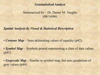
  • 1. Geostatistical Analyst Summarized by – Dr. Danny M. Vaughn (08/14/06) Spatial Analysis by Visual & Statistical Description • Contour Map – lines delineating values of equality (p42). • Symbol Map – Symbols posted representing a class of data values (p43). • Grayscale Map – Similar to symbol map, but uses gradations of gray values (p44).
  • 2.
  • 3.
  • 4.
  • 5. • Indicator Maps – Binary raster plots delineating class values (p45). • Each plot represents a different range or thresholds of values, e,g, concentrations of dissolved solids in a lake. • Distribution of values above or below a threshold are displayed & their spatial patterns may be analyzed for trends (directional bias).
  • 6.
  • 7. • Moving Window Statistics – used to assess anomalies of average values and variability (heteroscedasticity) of values throughout a region (p46). • Create a grid whose size is dependent upon the size of the data set. • Analogous to a raster spacing (spatial resolution). • Given a data set with a 1 meter grid spacing and 100 points: • Select a window (search neighborhood) that is not too large to over-generalize, yet not too small that anomalies are not picked up. • Search neighborhoods are used to compute mean and standard deviations.
  • 8.
  • 9. • If local means (based upon the number of values used in the grid) are heavily influenced by erratic values, use the median. • Mean (top value) & standard deviations (bottom value) for moving windows posted (p47). • Note patterns; higher standard deviations where variability of values is greatest in a window, Higher means correspond to highest values in a window. • Standard deviations vary more than means throughout the region.
  • 10.
  • 11. Proportional Effect • Anomalies in the local variability have an impact on the accuracy of estimations in spatial statistical techniques. • Areas of uniform values (low variability) render the most credible estimates. • Consider four relationships between local mean and local variability (p49). Graph A - Local mean (straight line) and variability are constant. Data values fluctuate about the local mean, but no obvious change in variability. Graph B – A trend in the local mean, but the variability remains constant w/ rising & falling mean.
  • 12.
  • 13. Graph C – Constant local mean while the variability exhibits a trend (rises). Graph D – A trend in both the local mean and variability (both mean and standard deviation rise). Most common case in Earth Science data. • Ideally, data should be as A or B (relatively constant variability), but D is acceptable since variability changes noticeably, but it is related to local mean, therefore somewhat predicable. • When a relationship exists between the local mean and local standard deviation, a proportional effect exists.
  • 14. • A scatterplot (mean vs. standard deviation) shows a visual means for assessing this relationship (p51). • A low correlation coefficient indicates a low relationship. • Univariate, normally distributed data can be spatially arranged to render a proportional effect.
  • 15.
  • 16. Geostatistical Analysis - an ArcGIS extension used to create a statistically valid, continuous surface. Basic steps to creating a surface • Add layers in ArcGIS. • Explore statistical properties of data through: • Histogram (univariate distribution). • Voronoi polygons – analyze spatial variability. • Normal QQPlot – Check for normality. • Trend Analysis – identify global trends.
  • 17. • Semi-variogram/covariance cloud – analyze spatial dependencies (autocorrelation) in the data. • General QQPlot – explore whether two datasets have the same distributions. • Cross-covariance cloud – analyze cross-covariance between two datasets. • Select a surface model to create a surface. • Assess the output surface. • Compare other models for optimal fit.
  • 18. • Two basic methods of interpolation – • Deterministic – use mathematical functions. • Geostatistical – use statistical & mathematical functions. Deterministic Methods • Sample points (observed) of phenomena are established at locations. • Algorithms interpolate (predict) other (unmeasured) points & create a continuous surface. • Premise – objects that are close to each other tend to be more alike than objects further apart (Tobler, 1970).
  • 19. • Inverse distance weighted method – based upon Local similarity. • General inverse weighted formula – Z’(so) = S lZ(si) • Weight formula - li = dio -p / S dio -p Z’(so) = a predicted value for location (so). li = weights assigned to each measured point. Z (si) = an observed value at location (si). dio -p = distance between prediction location (so) & each measured location (si). p = a power function (higher powers plot as a steeper curve on the left end of a graph of relative weight (y axis), distance (x axis).
  • 20. • Weights decrease rapidly w/ distance. Scaled so that Sl = 1. • Optimal p values are derived as the minimum RMS prediction error. • Cross-validation process computes the difference from a measured vs. predicted value for that location. • An exact (predicts a value identical to the measured value at a known location w/o prediction standard error, & forces the surface to pass through data values) interpolator. • An output surface is sensitive to clustering & outliers.
  • 21. • Works best when the data is evenly distributed. • A predicted surface can not extend above a maximum or below a minimum value. • IDW assumes the surface is driven by local variation captured by neighborhood values. • Use the Validation option by creating training (contains measured locations) & test datasets (used to validate the predictions).
  • 22. • Global & Local Polynomial Interpreters – modeled by polynomial equations. • First order – linear. • Second order – one bend in the plane (Quadratic). • Third order – two bends (cubic). • An inexact (doe not predict a value identical to the measured value at a measured location, & does not force the surface to pass through data values) interpolator. • Points will plot above & below the fitted plane.
  • 23. Global Interpolation. • Use for gradually varied surfaces. • To examine & remove global trends (trend analysis). • Surfaces are highly susceptible to extreme values, especially near edges. • Anisotropic* (ellipse) or Isotropic* (circle) distributed data can be modeled. • Anisotropic – spatial dependence (autocorrelation) changes w/ distance & direction between two locations. • Isotropic - spatial dependence (autocorrelation) changes w/ only distance between two locations.
  • 24. Local Interpolation. • Accuracy of any surface increases w/ an ability to identify local trends. • Fits many polynomials w/in overlapping neighborhoods. • Accounts for local variation in a surface. • Fits a surface using all points in a defined neighborhood.
  • 25. • Provides a smooth fit for short range variation in longer range trends. • Successive iterations cross-validate an output surface using optimal parameters based upon a minimum RMS predicted error. • Local polynomials are sensitive to neighborhood distance. • Anisotropic (ellipse) or Isotropic (circle) distributed data can be modeled.
  • 26. • Radial basis functions – (Local/neighborhood) polynomial interpolation (smoothing). • An exact (forces the surface to pass through data values) interpolator. • Thin-plate spline, spline w/ tension, completely regularized spline, multiquadric spline, & inverse multiquadric spline. • Conceptually like rubber sheeting through points w/ minimum curvature.
  • 27. • A predicted surface can extend above a maximum or below a minimum value. • Uses smaller, overlapping planes. • Thin-plate splines. • Splines w/ tension. • Optimal parameter is derived as the minimum RMS prediction error. Higher values produce smoother surfaces. • Use to create smooth surfaces from large sets of points. • Best for gently varied surfaces. • Not good for irregular, highly varied data, & data prone to error or uncertainty.
  • 28. Geostatistical Methods • Regionalized variable in geostatistics – consists of: Structured aspect reflecting large scale tendencies, and a random aspect reflecting local irregularities. • The accuracy of any surface increases w/ an ability to identify local trends. • Must characterize error & variability of the predicted surface. • Based on statistical models. • Geostatistical methods provide measures of error & uncertainty (accuracy of predictions).
  • 29. Basic Principles of Geostatistical Methods • Assumes all values are a result of random processes w/ dependence (as opposed to an independent random process, e.g. a coin toss). • Dependent random process - a coin is tossed three times, tails, heads, & heads. A fourth position is determined by a rule: since the second & third flips are heads, assign the fourth the same as the first (tails). • Reality is represented by introducing randomness through local fluctuations termed, drift, (as opposed to errors in Trend analysis) around a fixed surface. • Fluctuations are not errors in Geostatistical analysis, rather actual features with their own structure
  • 30. • Autocorrelation – statistical correlation between spatial random variables of the same type where correlation is dependent upon distance and/or direction (spatially dependent) separating the locations. • In geostatistics, knowing spatial locations allows distances to be computed between observations & autocorrelation modeled as a function of distance through the semi-variogram. • Observe scatter of points in the semi-variogram. If points are close to the line of best fit on one side, yet spread out more on the other side, directional autocorrelation may exist.
  • 31. Spatial Continuity • Exists for most Earth Science data (similar values with data close to each other, positive spatial autocorrelation). • Scatterplots may be employed in semivariograms to show the value of one variable and the value of the same variable, but at a nearby location. h – Scatterplots • Shows all possible pairs of data values whose locations are separated by a distance in a direction. • The location of any point can be described by a vector as can the separation between two points (p52).
  • 32.
  • 33. • Given an origin at 0,0. Point xi,yi can be written as vector ti, and point xj,yj can be written as vector tj. • The separation between point i & j is ti - tj. This can also be expressed as: (xi - yi, xj- yj). The vector (distance) between these two points (i to j) will now be referred as, hij. • On a h - scatterplot, the x axis is labeled V(t), & the y axis is labeled V(t+h). • The x coordinate of a point is a value at a particular location, and the y coordinate is a value a distance and direction h away.
  • 34. • Recall an h value is a vector, thus we can express it as h = (0,1), where we have taken each data location and paired it with the data location whose easting is the same, and whose northing is 1 m larger to the north (p53,A). • The shape of the cloud of points on an h – scatterplot delineates how continuous the data values are over a certain distance in a specific direction (p54). • If data values at locations separated by h are similar, then the pairs will plot close to the line x = y (1, 1), or a 45˚degree slope through the data cloud (p54). • As the separation distance increases (y increases), the similarity between pairs of values decreases, and the points on the h - scatterplot spread out further from the diagonal line.
  • 35.
  • 36.
  • 37. Correlation Functions, Covariance functions, and Variograms • h – scatterplots require some quantitative summary of the information contained within them. • One essential feature is fatness of the cloud of points. • Summarized by a correlation coefficient (p(h)). • As the cloud gets thicker (y increases), coefficient gets smaller.
  • 38. h Correlation Covar. Moment of Inertia (ppm2) (ppm2) (0, 1) 0.742 448.8 312.8 (0, 2) 0.590 341.0 479.2 (0, 3) 0.560 323.8 521.4 (0, 4) 0.478 291.5 652.9
  • 39. • The relation between the correlation coefficient of an h – scatterplot (p(h)) and h is termed a correlation function or correlogram (p57). • The correlation coefficient is dependent on h which is vector defined as having magnitude (visual angle varying inversely w/ distance from the eye) and direction. • Covariance (C(h)) – an alternative index for spatial continuity, & termed covariance function (C(h)). • A covariance function is also plotted as the covariance (C(h)) against h, & is also inversely related to thickness (y increases) (p57).
  • 40.
  • 41. • Moment of inertia (g(h))– computed as, 1/2n S (xi – yi)2 about x = y (45˚). • As h increases, points drift away from the 45˚ line, thus the moment of inertia is a measure of the flatness of the cloud – it increases as the cloud gets fatter. • The relationship between the moment of inertia of an h – scatterplot and h is termed a semivariogram (variogram for short) (p57). • Aberrant points can have a pronounced impact on summary statistics. • Note the significant difference in a correlation coefficient w/ & w/out a single point value.
  • 42. Correlation Coefficient h All Points 19 ppm Excluded (0, 1) 0.742 0.761 (0, 2) 0.590 0.625 (0, 3) 0.560 0.551 (0, 4) 0.478 0.559
  • 43. Components of the Semivariogram A Semi-variogram surface is controlled by the lag size and numbe of lags. Lag – distance between pairs of points. • If the lag is too large, short-range autocorrelation is masked. If the lag is too small, many empty bins will result. • Lag - Multiply lag size x number of lags. This value should be <1/2 the largest distance among all points. • Lag (bin) size – a limit of the distance (width) defining a bin into which pairs of locations of approx. equal distance & direction are placed to reduce the number of combinations. • Increase or decrease lag based on a small or large range of points.
  • 44. Binning (classification of lag size)- reduces the number of points plotted making the semivariogram easier to interpret. • Locations are grouped by distance & direction. • Semivariogram average distance (h) = 0.5 * average [(value at a location Z(si) – value at location Z(sj)2]. • Only average distance & semi-variance for all pairs in a bin are plotted as a single point on the empirical semivariogram. • An empirical semivariogram value (from the y axis) for each bin for each direction is plotted as a red dot. X axis is a distance from the center of the bin to the center of the semivariogram surface). • A semivariogram surface is plotted for each bin value (average distance & semi-variance for all pairs in a bin) represented as color- coded pixels.
  • 45.
  • 46. Range – the distance where the semivariogram model levels out. • Sample points with distances closer (within) than the range are spatially autocorrelated. Points beyond the range make no useful contribution to the interpolation. • The range defines the “zone of influence.” Sill – The value on the y axis that defines the semi- variance at the range. • The flattened line from this point represents no change in variation w/ increases in distance. Nugget – The point where the semi-variogram model intercepts the y axis. • Due to measurement error, and/or variation at distances smaller than the sampling interval.
  • 47. Modeling the Semivariogram - Assuming stationarity, autocorrelation can be examined & quantified (spatial modeling). Stationarity • Statistics relies on some notion of replication. • It follows, estimates can be derived, & variation & uncertainty of an estimate understood from repeated observations. • Through continued observations of many samples, dependencies become apparent. • Statistics relies upon replication. • Estimates derived with variation & uncertainty understood from repeated observations.
  • 48. • Stationarity is used to obtain replication in a spatial setting. • A variogram is only used for a given practical distance. • Stationarity – a variable is stationary if its distribution is invariant (does not change) under translation (the entire distribution is shifted through coordinate space in mass). • Normally only the mean and covariance are required to satisfy this requirement.
  • 49. • Mean stationarity – constant (no spatial drift) between samples & independent of location. • Also, constant variance (no outliers) across space. • Second-order stationarity – assumes covariance is the same between two points that are the same distance & direction apart regardless of points chosen. • Covariance is dependent on the distance between any two values, not location. • For semi-variograms, intrinsic (genuine, essential, real) stationarity is the assumption that the variance of the difference is the same between any two points that are the same distance apart (increments) regardless of which two points are chose. Also referred to as, quasi- stationarity.
  • 50. • Local fluctuations dominate the overall trend. • This is exhibited within a natural increase in the variance beyond these shorter sections (observations) of the distribution of a regional variable as distance increases from each observation. • Similar distance between points that provides replication to estimate dependence rules & allow predictions to be made. Assuming intrinsic stationarity, autocorrelation can be quantified. • Termed spatial modeling, structural analysis, or variography. • A line is fitted in the empirical semivariogram similar to a least squares line in regression analysis.
  • 51. • Parameters of the curve should minimize the deviations from the points by some criterion • Used to quantify spatial autocorrelation – assumes closer points (left side, x axis) are more similar (lower semi-variance on y axis) than points further away (right side, x axis).
  • 52. • Semivariogram Model – defined as one-half the variance of the difference between two variables at two locations. where, • g (si sj) = ½ var(Z(si) - Z(sj)) where, g (si sj) = semivariogram (predicted values). var = variance. (si sj) = two locations. (Z(s) = observed (measured) values. • This is a dissimilarity function of increased variability (semi- variance, y axis) w/ increased distance.
  • 53. • Semivariogram fuction – average[(Z(si) - Z(sj))2]. • With observed values close to each other, the average is small. • As observed values get further apart, their values become more dissimilar w/ higher variability & higher averages.
  • 54. Calculating the Empirical Semivariogram Step 1 – Given a data set of five locations [(1,5), (3,4), (1,3), (4,5), (5,1)]and their associated values [(100), (105), (105), (100), (115)], calculate the distance (x values) between each pair of locations using the Pythagorean theorem.
  • 55. Table 1 Value Locations Distance Cal. Distances 100 & 105 (1,5), (3,4) √[(1-32) + (5-42) 2.236 100 & 105 (1,5) , (1,3) √[(02) + (22)] 2 100 & 100 (1,5) , (4,5) √[(32) + (02)] 3 100 & 115 (1,5) , (5,1) √[(42) + (42)] 5.657 105 & 105 (3,4) , (1,3) √[(22) + (12)] 2.236 105 & 100 (3,4) , (4,5) √[(12) + (12)] 1.414 105 & 115 (3,4) , (5,1) √[(22) + (32)] 3.606 105 & 100 (1,3) , (4,5) √[(32) + (22)] 3.606 105 & 115 (1,3) , (5,1) √[(42) + (22)] 4.472 100 & 115 (4,5) , (5,1) √[(12) + (42)] 4.123
  • 56. Step 2 – Calculate the empirical semivariance (y values) as 0.5 * [(value at location i – value at location j) 2], or one-half times the difference squared for the values of the paired locations (empirical semivariance). Increasing the number of points (five in this example) can soon result in a very large number of paired combinations (Table 1), since each of the five point locations has an accompanying point to form a vector.
  • 57. Table 2 Value Diff. Diff.2 Empirical Semivariance 5 (5)2 = 25 12.5 5 (5)2 = 25 12.5 0 (0)2 = 0 0 15 (15)2 = 225 112.5 0 (0)2 = 0 0 5 (5)2 = 25 12.5 10 (10)2 = 100 50 5 (5)2 = 25 12.5 10 (10)2 = 100 50 15 (15)2 = 225 122.5
  • 58. Step 3 – Binning the Empirical Semivariogram. Since a data set can consist of 100’s to 10,000’s of control points, the individual vectors (delineated by two ordered coordinate pairs) and the empirical semivariance values associated with each pair, will quickly result in a cloud of points in the semivariogram that will be unintelligible to interpret. • Binning reduces the total number of points plotted in the semivariogram by assigning a bin (storage compartment) based upon the lag size (distance) and number of lags. • Binning classifies locations grouped by distance & direction. • Only the average distance and average semivariance for all pairs included in the bin are plotted as a single point.
  • 59. • The basic equation would now be – Semivariogram (distance h) = 0.5 * average [(value at location i – value at location j) 2]. • This equation is interpreted as, compute one-half the average of the differences squared of the values for all paired locations separated by a distance h. Distance is the lag distance. • Considering a lag distance of some unit measure (e.g. 1), we create 5 bins, & will compute the average semivariance for all pairs of points falling within the distance limits (lag distance) assigned for each bin. • Only an average distance & average semivariance for all pairs in a bin are plotted as a single point on the empirical semivariogram.
  • 60. Table 3 Lag Dist. (Bin) Pairs Dist. Avg. Dist. Semivar. Avg. 1-2 1.414, 2 1.707 12.5, 12.5 12.5 2-3 2.236, 2.236, 3 2.491 12.5, 0, 0 4.167 3-4 3.606, 3.606 3.606 50, 12.5 31.25 4-5 4.472, 4.123 4.298 50, 112.5 81.25 5+ 5.657 5.657 112.5 112.5
  • 61. Trend Analysis in Geostatistics • A trend surface is made-up of global (structured or deterministic) & random (uncorrelated, local irregularities referred to errors in Trend Analysis) short-range variation. • Global trend – all measurements are controlled by some (non- random) deterministic factor. (a physical process, e.g. prevailing wind, data collected along a transect, etc.). • May be represented by a polynomial formula & removed from the analysis, then returned before predictions are made. • Modeling long-range or coarse scale variation. • Note asymmetry of the trend model and variance in change across each axis.
  • 62. • Global trends are plotted as a 3-D box diagram. • Plotted as sideways views along the x, z & y, z planes. • Polynomials (best fit line) are created for each plane. • Flat lines indicate no trend. • A definite pattern to the polynomial suggests a global trend. • Rotating the model enables an enhanced visual distribution. • Model the residuals & reintroduce the trend in the prediction model. • Used to examine local characteristics of spatial autocorrelation.
  • 63.
  • 64.
  • 65. Removing the Global Trend • Zk j(si) = the jth measurement of variable type k at the ith spatial location si decomposed into: m(s) = a deterministic (predicted mean) trend. e(s) = random, autocorrelated errors (distance dependent). Si = a location.
  • 66. • Employed to satisfy normality, stationarity assumptions & to model local, short-range variations. • Stick to Ordinary Kriging unless there are strong reasons to remove the trend surface. • More parameters must be estimated when a trend is removed, reducing the precision of the surface model. • Keep the surfaces simple. i.e. 1st or 2nd order polynomials. • Always check w/ cross-validation, & especially validation.
  • 67. Random Trends • Random implies governed by rules of probability, including dependence of neighboring values (autocorrelation). • Alignment of block-faulted mountain system is a global trend, but a specific time-event surficial processes (volcanism) may affect short- term variations in the mountain’s morphology. • The shape of the semivariogram/covariance curve may vary (be influenced) with direction (anisotropy) after the global trend has been removed, or if no global trend exists at all.
  • 68. • Anisotropy– spatial dependence (autocorrelation) changes w/ both distance & direction between two locations. • Usually not a deterministic process. • Modeled as a random process (Random error usually of an unknown cause) w/ higher autocorrelation in a preferred direction. • Observe scatter of points in the semivariogram. If points are close to the line of best fit on one side, yet spread out more on the other side, directional autocorrelation may exist. • When the data is anisotropic (the anisotropic box checked), the yellow line becomes several lines indicating many directions).
  • 69.
  • 70. • The surface cloud is elliptical (w/ an angular component) in shape. • The outline of the range is displayed as a blue line throughout the semivariogram/covariance surface cloud. • The lengths of the semi-minor & semi-major axes determine the ranges in the surface cloud, & define the search neighborhood. • Once the shape is determined, establish constraints (number of points, & partition the shape into bins to avoid directional bias due to clustering or transected points w/in the shape). • Ensure there are enough points to account for a meaningful prediction.
  • 71.
  • 72. • If enough points are not available for the bins, outside points (uncorrelated) will be used which degrades the model. • Distance greater than the range are not correlated. • When the pairs of points in the semivariogram yield a straight (horizontal) line (no variability), there is no spatial autocorrelation in the data, thus a surface would be meaningless. • The length of the semi-minor axis (minor range) from the center of the cloud will reach the sill sooner (plot as a steeper grade) than the semi-major (major range) axis.
  • 73. • Directional Binning (Anisotropy) Under the Semivariogram/Covariance Modeling dialog box – • Use the Show Search Direction box under the Semivariogram/Covariance Cloud dialog, and rotate or type in angle (search) direction, angle tolerance, bandwidth, and lag (distance/width). • An angle of tolerance determines how close points will be included from an observed point to the bandwidth. • Bandwidth is the width of the search. • Bins (lag distance/width) contain pairs of locations with a predetermined distance (interval) & direction apart.
  • 74. • Isotropic - spatial dependence (autocorrelation) changes only w/ changes in distance between two locations. • When the data is isotropic, the shape of the semivariogram will be a circle. • The outline of the range is displayed as a blue line throughout the semivariogram/covariance surface cloud. • The length of any axis from the center of the semi- variogram/covariance cloud will always be the same. • The range will always be the same in all directions. • Thus, the sill is equidistant in any direction.
  • 75.
  • 76. Covariance – a statistical tendency of two variables to vary in ways related to each other. • A scaled version of correlation. • A similarity function of decreased variability (semi- variance, y axis) w/ increased distance (along the x axis). • C (si sj) = covar(Z(si), Z(sj))where, C (si sj) = covariance (predicted values). covar = covariance. (si sj) = two locations. (Z(s) = observed (measured) values. Z’ = mean of all the data. • Covariance function – average[ (Z(si) –Z’) (Z(sj) – Z’) .
  • 77. • With two variables close to each other (approaching 0 distance on the x axis), they are expected to be similar w/ a large covariance & correlation. • Positive covariance – when both variables tend to be above their respective means together. • Negative covariance - when one variable tends to be below & the other variable above its mean.
  • 78. Summary Statements on Modeling the Semivariogram • The semivariogram & covariance functions quantify autocorrelation by measuring the statistical correlation as a function of distance. • A relationship between the semivariogram & covariance function is expressed as: g (si sj) = sill - C (si sj) where, g (si sj) = semi-variogram (predicted values). C (si sj) = covariance (predicted values).
  • 79. • Predictions are made using either function because of their equivalence. • Finally, a line of best fit (a continuous function or curve) is fitted through the cloud of points plotted in the semivariogram from which predictions of attribute values at unsampled locations can be made through the Kriging steps. • When the curve is steep near the origin (short range), closer neighbors have a pronounced influence on the prediction.
  • 80. Exploratory Spatial Data Analysis (ESDA) • ESDA provides interactive graphical models of the dataset. Histogram - shows a frequency distribution. • Shows the shape (skewness & kurtosis) of the distribution. • Normal distributions are required for quantile & probability maps using ordinary, simple, and universal Kriging. Properties include – • Variances of data values are more constant & the variance approaches the mean. • Mean, median, and mode are nearly equal in a normal distribution.
  • 81.
  • 82. • Variance & standard deviation should approach 1. • Skewness should approach 0, & kurtosis 3. • Outliers in a skewed distribution can be global or local. • Global – high or low value in the distribution. • Local – a value w/in the normal range of the dataset, yet locally it is unusually high. • Both outliers may indicate real abnormalities in the measured phenomena, or incorrect measurements. • Trend removal helps justify assumptions of normality & stationarity.
  • 83. Normal Score Transformation (NST) • Goal is to normally distribute all random errors for the entire population, & make the variances more constant throughout the study area. • Perform this step after detrending since covariance & variograms are calculated on residuals after trend correction. • Ranks the dataset from low to high by creating an observed cumulative histogram (OCH). • Then matches the ranks of the OCH to equivalent ranks from a cumulative standard normal distribution.
  • 84.
  • 85.
  • 86. • Transformation is defined by taking values from the normal distribution at that rank. Three methods for NCT – • Direct – uses the OCD (least smooth w/ least assumptions). • Linear – fits lines between each step of the cumulative distribution (middle of the road for smoothness & assumptions). • Gaussian kernels – approximates the probability distribution by fitting a linear combination of density cumulative distributions (smoothest back transformation w/ strongest assumptions). • Must back-transform to bring values back to their original scale.
  • 87.
  • 88.
  • 89. Other transformations (BAL) to Normality • Any relationship between the variance & the trend are removed w/ these transformations. • Hence, trend & model autocorrelation are removed (optionally). • Box-Cox (B) – Small counts in a region of a distribution w/ low variability (variance). If variance approaches the mean, it approaches a normal distribution.
  • 90. • Square Root – as a power function of the data variances will be made more constant with trends to normality. • Log (L) – Used as part of the Box-Cox transformation w/ positively skewed distributions & few large values in the dataset. • Arcsine (A) – used for data that is a proportion (percentage). Again, makes the variances in the data set more constant.
  • 91. Declustering Preferential Data - • Use when data are not random or regular spaced, i.e. higher concentration of points in some regions. • May weight the data w/ denser points receiving less weight. • Cell declustering – • A grid of rectangular cells is assigned over the data locations. • A weight is attached to each data location, & inversely proportional to the number of points in a cell.
  • 92.
  • 93. • Optimal cell size by – 1.Use a minimum weighted mean if data is preferentially sampled in areas of high values. 2.Use a maximum weighted mean if data is preferentially sampled in areas of low values. • Voronoi Map – • All locations w/in the polygon are closer to the sample point than any other sample point. • Weight each polygon in proportion to the area it represents. • Border polygons are often given more weight since the borders are composed of truncated rectangular sides.
  • 94.
  • 95. Normal & General QQPlot • QQPlots are quantiles from two distributions. • Normal QQPlot – a plot of data values (y axis) versus standardized units (x axis). • Points that do not fall on a straight line represent departures from the normal trend & the data is asymmetric. • General QQPlot – used to assess the similarity of the distributions of two sets of data, one set on each axis. • Two identical distributions are plotted as a straight line.
  • 96.
  • 97. Kriging Methodology Kriging family – Does not require a normal distribution, except for obtaining probability and quantile maps in Ordinary, Simple, & Universal Kriging. • Data collected as point events. • Values are actually spatially continuous (values occur everywhere on a surface). • Continuous (Real) numbers, integers, ordered categorical, unordered categorical, or binary. • Weighted surrounding measured values (like IDW).
  • 98. • Quantifies closeness of objects & spatial arrangement (spatial autocorrelation) by variography. • Weights are statistically determined by the spatial structure expressed in the semi-variogram. • Point pairs closer in distance (to a predicted location) have smaller variability. • Must minimize the weighted least-square differences. • Optimize the locations contributing w/ a search neighborhood. • Circle if there is no directional bias. • Ellipse for directional bias.
  • 99.
  • 100. • Assumes all random errors are 2nd order stationarity, & random errors have a mean = 0, & covariance between any two random errors is distance & direction dependent, not by exact locations. • Also capable of producing maps of: • Kriging standard errors associated w/ predicted values. • Probability whether a critical level is exceeded. • Subsets to assess the quality of the output surface. • Quantiles* for a predetermined probability level. * Quantile – the pth quantile is a value between 0-1, & represents the proportion p (of unity) of the data below this value.
  • 101. • Basic Kriging equation – Zk j(si) = m(s) + e(s) where, Zk j(si) = the jth measurement of variable type k at the ith spatial location si decomposed into: m(s) = a deterministic (predicted mean) trend. e(s) = random, autocorrelated errors (distance dependent). Si = a location. • Trend removal helps justify assumptions of normality & stationarity.
  • 102. Kriging Methods • While sampling provides accurate information at data points, it does not tell us what values exist between them. • Kriging – an estimation (weighted average) method yielding the best (minimum variance) unbiased linear estimates of point values. • Accuracy is based upon: • Number of samples & data quality. • Geometry of the sample points (Dispersed distributions are optimal). • Distance between sample points. • Spatial continuity (regularity) of a variable.
  • 103. Ordinary Kriging - Use if m (mean) is unknown. • Must have data points sampled from continuous phenomena. • May be used for data that have a trend. • May create training & test datasets for validation. • May de-trend & perform Kriging on the residuals.
  • 104. • Simple Kriging – when the trend is completely known (all parameters & covariates known), whether constant or not. • m (mean) is a known constant. • Must have data points sampled from continuous phenomena. • It follows, you also know e(s) as deviations from the mean. • May produce quantile, probability, prediction, or standard error maps. • May create training & test datasets for validation.
  • 105. • Consider checking for bivariate normality. • Consider declustering when using the normal score transform & data has been preferentially resampled with denser points in some areas. • Consider parameters for semivariogram/covariance modeling (mathematically expresses autocorrelation), search neighborhoods, & cross validation.
  • 106. • Changing Z(s) = 0 (an indicator variable, 0 or 1), if Z(s) is below some value, e.g. 0.12 ppm ozone concentrations, or 1 if it is above this value. A probability map is developed to assess the degree a value exceeds a given threshold using Indicator Kriging. • Uses a binary variable. • A threshold is computed to establish limits for binary assignments. • Assumes an unknown constant mean. • Creates a probability or standard error map from 0-1. • Consider parameters for semivariogram/covariance (mathematically expresses autocorrelation) & search neighborhoods, although estimation is difficult w/ 0’s & 1’s.
  • 107. • Probability Kriging – form an indicator variable of Z(s) & predict it using the original transformed data Z(s) in a cokriging model. • Like indicator Kriging, only uses cokriging since there are two types of random errors (e1(s) & e2(s)) generated from two constants (m1 &m2). • Assumes unknown constant means. • Creates a probability or standard error map from 0-1.
  • 108. • Consider parameters for semivariogram/covariance (mathematically expresses autocorrelation) & search neighborhoods, although estimation is difficult w/ 0’s & 1’s. • Probability kriging tries to exploit the extra information in the original data in addition to the binary variable. • Results in more autocorrelation estimations per variable & cross- correlation creating more uncertainty.
  • 109. • Disjunctive Kriging – used to form predictors of functions of variables. • Ordinary Kriging uses linear combinations of data to find the final predictor. • Disjunctive Kriging can predict either the value (predictor), or an indicator (derived from the threshold) by generalizing the Indicator Kriging method to form the predictor. • Assumes a model - f(Z(s)) = m1 + e(s) where, • m (mean) is an unknown constant. • f(Z(s)) is some arbitrary function of Z(s). • e(s) = random, autocorrelated errors (distance dependent).
  • 110. • May produce prediction, probability, standard error of indicators, or standard error maps. • A standard error map quantifies uncertainty of the prediction. • In a normal distribution, the true value is w/in plus/minas 2x the prediction standard error 95% of the time. • An appropriate transformation & detrending, semi- variogram/covariance models (mathematically expresses autocorrelation), & search neighborhoods. • Decluster when the data has been preferentially sampled. • Assumes a bivariate normality which should be examined.
  • 111. • Universal Kriging – operates like polynomial regression, only the regression is w/ spatial coordinates as explanatory variables & the errors are assumed auto-correlated, rather than independent. • If m(s) is a second order polynomial trend, subtract (detrend) it from the original data (Z(s)) & Krig the random errors e(s)). • The mean of e(s) is 0. • The autocorrelation is now modeled from the random errors. • Consider parameters for semivariogram &/covariance modeling (mathematically expresses autocorrelation), search neighborhoods, & cross validation. • May produce quantile, probability, prediction, or standard error maps.
  • 112. • Cokriging – a family of Kriging methods using multiple variables. • Considers different trends on multiple variables (Z1(s) & Z2(s), (e.g. ozone & particulate materials) & measures autocorrelation for errors & cross-correlation between errors e1(s) & e2(s) between two variables. • Ordinary Cokriging models: • Z1(s) = m1 + e1(s) • Z2(s) = m2 + e2(s) where, m1 & m2 = unknown constants. e1(s) & e2(s) = random errors. Z1(s) & Z2(s) = predicted measurement variables.
  • 113. • Requires estimating auto-correlation & cross-correlation for each variable. • Each estimate for auto-correlation introduces additional variability. Gains in precision of predictions may not be defensible. • Consider parameters for semivariogram/covariance (mathematically expresses autocorrelation), search neighborhoods, & cross-covariance (mathematically expresses cross-correlation) validation, & detrending. • May produce prediction, probability, quantile, standard error of indicators, or standard error maps.
  • 114. Cross-covariance – Correlation between spatial random variables of different types with correlation dependent upon distance &/or direction separating the locations (e.g. NO2 & Ozone). • Positive cross-covariance – both variables are above their respective means. • Negative cross-covariance – when one variable is above & the other below their its mean. • Cross-covariance cloud – shows empirical cross-covariance for all pairs of locations between two datasets placed in bins as a function of distance between the two locations.
  • 115. • Bins are averaged & smoothed to create a cross-covariance surface. Controlled by the lag size and number of lags. • A global outlier (unusually high value) identified in the histogram is also visible with all pairings of points in the semi-variogram cloud, regardless of distance. • Two distinct groups of points occur in the semi- variogram cloud for global outliers. • A local outlier will have high semivariogram values (approaching the top of the y axis) associated with a single point at close distances (left side along x axis) in the semi-variogram cloud.
  • 116.
  • 117. • Both types of outliers can have detrimental effects on a prediction surface. • Use the Show Search Direction box under the Semi- variogram/Covariance Cloud dialog, and rotate or type in angle direction, angle tolerance, bandwidth, and lag.
  • 118. Cross-Validation & Validation • Seeks to establish how well any surfacing model predicts the values at unknown locations. • Cross Validation – uses all data points to estimate the autocorrelation model. • Each data location is selected, & the remaining known locations are used to predict its value. • The predicted & actual (known measurement) are compared & graphed. • Ideally, they should be close to the same value. • Unusual points are set aside, & may require refitting the autocorrelation model.
  • 119. • Validation – creates a model for a subset of the data set. • Used to check the validity of a protocol of decisions. • Choice of semivariogram model, lag size, search neighborhood. • Predicted plot – scatterplot of predicted vs. measured values. • Kriging tends to under predict large values, & over predict small values. • Thus, the slope of the solid blue line is usually less than 1 (black dashed line). • Error plot – same as the predicted plot, except true values are subtracted from the predicted values.
  • 120.
  • 121.
  • 122.
  • 123. • Standardized Error plot – measurement values are subtracted from the predicted values, then divided by the estimated Kriging standard errors. •All three plots show strength of Kriging predictions. • With autocorrelation & a good model, the predicted line (blue) should be close to the measured (dashed black) line. • If all the data were independent (no autocorrelation), all predictions would equal the mean of the measured data, & the plot would be a horizontal line.
  • 124.
  • 125. • QQPlot – quantiles of the difference between predicted & measurement values divided by the estimated Kriging standard errors, & quantiles from the standard normal distribution. • If the predicted errors from the observed (measured) values are normally distributed, points should lie close to the dashed black line. • Obtaining probability and quantile maps in Ordinary, Simple, & Universal Kriging methods that rely on a normal distribution can be used with confidence.
  • 126.
  • 127. Summary of Cross-Validation & Validation Analysis • Predictions should be unbiased w/ a mean prediction error near 0. • Standardized prediction errors – prediction errors divided by their prediction standard errors to standardize (scale). The mean standardized prediction error should approach 0. • RMS prediction error (Root-Mean-Square in dialog box) should be small. Shorter green lines indicate closer predictions to their true values.
  • 128. • Average (estimated) standard errors should be close to RMS prediction errors to correctly assess the variability in a prediction. • If average standard errors are > RMS prediction errors, variability is overestimated. • If average standard errors are < RMS prediction errors, variability is underestimated. • If RSM standardized errors are >1, variability is underestimated. • If RSM standardized errors are <1, variability is overestimated.
  • 129. Cross Validation & Validation Comparison • Assesses two surfacing models (e.g. IDW vs. Ordinary Kriging) w/ statistics & scatterplots for each model in a single dialog box. • Generally, the best model has the parameters as per those listed in the previous summary. • Average (estimated) standard errors should be close to RMS prediction errors for a more valid model. This comparison supercedes a model even if it has an RMS prediction error lower than the second model.
  • 130.
  • 131.
  • 132.
  • 133.
  • 134. Measurement Error • Occur when it is possible to have several different observations at the same location. • A soils series description from a survey document & actual field measurements. • Measurement error model is expressed as: • Z(s) = m(s) + e(s) + d(s) where, • Z(s) = a variable of interest. • d(s) = measurement error. • m(s) = deterministic trend. • e(s) = autocorrelated errors (microscale variation or nugget effect in this model).
  • 135. • W/ no measurement error, Kriging is an exact interpolator. • When errors exist, consider predicting only the filtered value (m(s) + e(s)) that does not contain the measurement error (d(s)). • It follows, where data have been collected (actually measured), the filtered values will not be the same. • Thus the final map will be more smoothed & an inexact interpolator.