The document summarizes different design elements of a magazine contents page. It finds that the masthead font is dull but works well given the black and white format. Secondary images surrounding the main photo are effective and include helpful details like quotes and page numbers. The cover photo on the contents page is properly sized and the layout overall looks neat, professional and easy to navigate. A subscription box is also praised for having a neat, professional design.
1. Contents Review 2
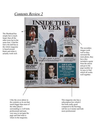
The Masthead has
simple but is much
larger than all the
other texts but in the
same font. I find the
font a bit dull but as
the whole magazine
The secondary
is based around
images work
black and white it
well as they
actually work well.
surround the
main photo, they
have also
included a quote
from the article
and gives the
page number so
its easy to find
which all works
well together.
I like the cover photo in This magazine also has a
the contents as its not that subscription box which I
much bigger than most of feel look really good
the other photo's compared to the Kerrang
surrounding it, it all looks sub box as it neater and look
professional and neat, more professional.
very easy to navigate the
page and find what is
where in the magazine.