
More Related Content
Similar to Front cover Analysis
Similar to Front cover Analysis (20)
More from tyronedevereaux
Front cover Analysis
- 2. Flowing colour Very Pale – contrast Scheme – yellow, with the blood Pink and black Direct Address ‘You’ Incentives that Are exclusive to The magazine Masthead Key Image Magazine Blood could connote Slogan and reflect the audience characteristics and interest (audience of mainstream rock and pop) Sell Lines The font re-enforces feminity, looks as Change of if its been written Font to attract with lipstick attention upon the Main feature story Month/ Edition Question to entice the reader To want to read Price The magazine Barcode Pun – ‘blood’ relates to image Genre: Rock/Pop
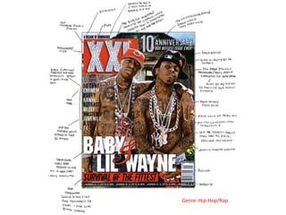
- 3. Puff/ Special Issue Background Picture of ‘the streets’ could relate to the top Masthead story His head position connotes a very confident attitude Main Feature which is Story ; with the commonly known Celebrity name for the hip-hop Enlarged – this will and R&B audience attract the target audience as they will be able to Sell Lines indentify with the name. Key Image; where Issue Edition Info his clothing match the colour scheme of the cover which is green, white and Barcode red. Website Genre: R&B/ Hip-Hop
- 4. Competitions Price Quotes from celebrities Masthead Key Image The layout is spilt into 3 sections – easy to Main Cover line follow Which is positioned In the centre of the page – this pulls the attention of the audience Sell Lines – Barcode positioned along The bottom of the magazine – this doesn’t really make you want to Genre: read the stories Rock/Indie