
Recommended
More Related Content
What's hot
What's hot (15)
Viewers also liked
Viewers also liked (20)
More from Hishamh27
More from Hishamh27 (20)
Recently uploaded
Recently uploaded (13)
Front cover
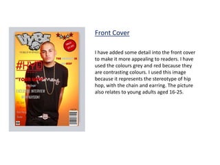
- 1. Front Cover I have added some detail into the front cover to make it more appealing to readers. I have used the colours grey and red because they are contrasting colours. I used this image because it represents the stereotype of hip hop, with the chain and earring. The picture also relates to young adults aged 16-25.