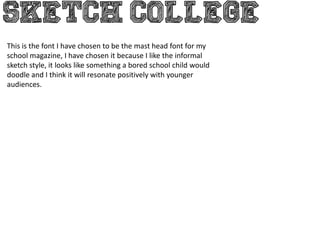
1. This is the font I have chosen to be the mast head font for my
school magazine, I have chosen it because I like the informal
sketch style, it looks like something a bored school child would
doodle and I think it will resonate positively with younger
audiences.
2. This is another font I was considering for my school magazine
masthead, I liked how it had a faded effect and I thought the effect
would be quite appealing to younger audiences. However, on the
advice of my peers I have come to the conclusion that SKETCH
COLLEGE is the more appropriate font.
3. This font is called TEAM 401 and it was a potential candidate for the
masthead font of my school front cover.
It was a candidate because it had a distinctive look about it and I felt that
this would make it look more appealing on the shelf rack and thus more
likely to be purchased.
However, on the advice of my peers I have decided to not use this
particular font because theyfwlt that it was not immediately identifiable
with a typical school magazine layout.