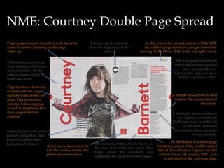
Double Page Spread Research
By Ayer Ozsagiroglu

1

1
NME: Chance The Rapper Double Page Spread
•A

big clear white background is used to show make the
other colours clear and visible.

•A

main figure of the artist shows a full
body shot showing the rapper from
head to toe in a unnatural position.

• Who

it is about is
evident as it has the title
in a large san serif font
of ‘Chance The Rapper’.
The three worded title is
separated across the
double page spread.

•A

reference is evident with the
red box in which is
states’Chance The Rapper
photographed exclusively for
NME’. This is a page furniture
element.

•A

single page is typically split
into three columns as indicated
by the lines annotated on page
19.

• Page

furniture design elements
are present with the page
numbers on the right pane of
page 19 and the left pane of
page 18.

•A

bold red font is
used to differentiate
the title from the rest
of the text which is
in accordance with
the NME colour
theme.

• Subtle

arrow to show
that there is more of
the story on the next
page.

• Design elements such as drop caps is present
magazine name and edition date is
to make the article look more appealing and
evident here with ‘New Musical Express’ and a line to
gives the reader a start point.
separate the two and ’11 January 2014’
•
• A bold red pull quote is evident showing standard A ‘vital stats’ section is used to break up the article to
give a break almost and gives the consumer
codes and conventions with a reference to who is
information of the rapper and some general
saying the quote.
information.

• Unabbreviated

2
Q Magazine: The Smiths Double Page Spread
•A

little page design element in the
form of a box with the band name
‘The Smiths’ and a little caption
underneath.

• The

white box that acts as a background for
the writing so that it is readable, is slightly
transparent showing the rest of the image.

• Blue

and red colour scheme is carried
through the The Smiths pages.
•A

box annotation of
the picture describing
the event.

• It

shows the title in a
great big sans serif font
in black with a
underlining of pink to go
with the colour theme of
the ‘2014 Special’edition.

• One

single image is
shown of the band in
action and appears to
be only in the top left
where in actual fact it
takes up the whole
screen .

•A

brief, saying who the
writer is.
(‘Words: Victoria Segal’)

• It

shows standard codes
and conventions at the
bottom corner of each
page the page number,
’70’, The magazine title,
‘Q’ in it’s traditional font
of a serif style in red and
the month edition of
‘February 2014’.
•A

brief introduction to the band and
article is shown underneath the title
to give the audience a brief
background on the band.

•A

• The

page is typically set
into three columns as
indicated by the lines on
the right page.

3

double head arrow is
evident as a page
furniture indicating
more content on the
next page.
• Similar to a drops cap it highlights the first
two words similar to a drops cap adding a
design element to the article giving the
reader a starting point to read the article.
Q Magazine: Arctic Monkeys Double Page Spread
A red box  is evident in the top left indicating to the
reader this is the 'Q Interview' and it is based on
Arctic Monkey's this is for it's interview pages. 
At the top we have a
introduction to the article,
this is known as it is in a
larger font and has a large
drops cap covering 10 of the
13 lines.

Four images are
In the bottom right hand corner of the top
right image you have a name of all the band constructed and grouped
members indicating who is who by stating together of each individual
band member. This is
'clock wise from left' giving the reader a start
point and then telling the names.  different from the previous
two articles as it uses 4
pictures as oppose to one.
This is different to other
magazines which usually
adopt the idea of using one
large image.

Behind this is a smoky red
background acting as a
design element in which
shows the magazine main
colour of red.
A divide is also evident
with the the line separating
the two as well as showing
that the page is split into 2
columns. This is the same
for the arctic monkeys page
with two images in a row In the bottom left hand corner it indicates it is
showing the divide. 
page '40' along with the 'Q' name as well as
date of the edition, 'November 2013'. This is a
page furniture element in the every page.

All shots used are
mid/close up shots in
which emphasises their
facial expressions..
A pull quote is taken and
placed in the centre and
shows who's said it ('Alex
Turner'). This is all placed in
a box which highlights the Q
colour scheme of black, red
and white. A black border is
added around the white box
to help it stand out. 
Another drops cap of the letter 'T' is
present dividing the article and showing
4
the third part of the article. 
NME: Courtney Double Page Spread
Page design element is evident with the artist
name ‘Courtney’ running up the page
sideways.

A drops cap is present to
show the beginning of the
article.

As this is only the second edition of 2014 NME
has added a page furniture/design element by
having ‘NME Music 2014’ in the top right corner.
The pull quote is shown in
red to help it stand out and
show is embedded inbetween the article to show
that the artist has said it.

White background to go
in accordance with house
style and stick with the
colour scheme of red,
black and white.
Page furniture element is
evident with the page
number in the centre left
pane. This is mirrored
onto the following page
as well to emphasise that
it is a page furniture
element.

A description of the artist is
evident with a bold black
font with a white filler
background behind.
A red box is shown here to
tell the reader where the
photo shoot was taken.

A double head arrow is used
to show the continuation of
the article.
A vital stats section is shown
as a regular occurrence in
NME interviews in which all
of the most important
information about the artist
is summarised.
The surname of the artist is shown in
the same style as her first name. This
helps create the structure and
emphasise the structure of the pages.

At the bottom is another page
furniture element of the unabbreviated
title of ‘New Musical Express’ and the
edition date of ’11 January 2014’. This
5
is mirrored on the previous page.

Double Page Spread Research

  • 1.
    Double Page SpreadResearch By Ayer Ozsagiroglu 1 1
  • 2.
    NME: Chance TheRapper Double Page Spread •A big clear white background is used to show make the other colours clear and visible. •A main figure of the artist shows a full body shot showing the rapper from head to toe in a unnatural position. • Who it is about is evident as it has the title in a large san serif font of ‘Chance The Rapper’. The three worded title is separated across the double page spread. •A reference is evident with the red box in which is states’Chance The Rapper photographed exclusively for NME’. This is a page furniture element. •A single page is typically split into three columns as indicated by the lines annotated on page 19. • Page furniture design elements are present with the page numbers on the right pane of page 19 and the left pane of page 18. •A bold red font is used to differentiate the title from the rest of the text which is in accordance with the NME colour theme. • Subtle arrow to show that there is more of the story on the next page. • Design elements such as drop caps is present magazine name and edition date is to make the article look more appealing and evident here with ‘New Musical Express’ and a line to gives the reader a start point. separate the two and ’11 January 2014’ • • A bold red pull quote is evident showing standard A ‘vital stats’ section is used to break up the article to give a break almost and gives the consumer codes and conventions with a reference to who is information of the rapper and some general saying the quote. information. • Unabbreviated 2
  • 3.
    Q Magazine: TheSmiths Double Page Spread •A little page design element in the form of a box with the band name ‘The Smiths’ and a little caption underneath. • The white box that acts as a background for the writing so that it is readable, is slightly transparent showing the rest of the image. • Blue and red colour scheme is carried through the The Smiths pages. •A box annotation of the picture describing the event. • It shows the title in a great big sans serif font in black with a underlining of pink to go with the colour theme of the ‘2014 Special’edition. • One single image is shown of the band in action and appears to be only in the top left where in actual fact it takes up the whole screen . •A brief, saying who the writer is. (‘Words: Victoria Segal’) • It shows standard codes and conventions at the bottom corner of each page the page number, ’70’, The magazine title, ‘Q’ in it’s traditional font of a serif style in red and the month edition of ‘February 2014’. •A brief introduction to the band and article is shown underneath the title to give the audience a brief background on the band. •A • The page is typically set into three columns as indicated by the lines on the right page. 3 double head arrow is evident as a page furniture indicating more content on the next page. • Similar to a drops cap it highlights the first two words similar to a drops cap adding a design element to the article giving the reader a starting point to read the article.
  • 4.
    Q Magazine: ArcticMonkeys Double Page Spread A red box  is evident in the top left indicating to the reader this is the 'Q Interview' and it is based on Arctic Monkey's this is for it's interview pages.  At the top we have a introduction to the article, this is known as it is in a larger font and has a large drops cap covering 10 of the 13 lines. Four images are In the bottom right hand corner of the top right image you have a name of all the band constructed and grouped members indicating who is who by stating together of each individual band member. This is 'clock wise from left' giving the reader a start point and then telling the names.  different from the previous two articles as it uses 4 pictures as oppose to one. This is different to other magazines which usually adopt the idea of using one large image. Behind this is a smoky red background acting as a design element in which shows the magazine main colour of red. A divide is also evident with the the line separating the two as well as showing that the page is split into 2 columns. This is the same for the arctic monkeys page with two images in a row In the bottom left hand corner it indicates it is showing the divide.  page '40' along with the 'Q' name as well as date of the edition, 'November 2013'. This is a page furniture element in the every page. All shots used are mid/close up shots in which emphasises their facial expressions.. A pull quote is taken and placed in the centre and shows who's said it ('Alex Turner'). This is all placed in a box which highlights the Q colour scheme of black, red and white. A black border is added around the white box to help it stand out.  Another drops cap of the letter 'T' is present dividing the article and showing 4 the third part of the article. 
  • 5.
    NME: Courtney DoublePage Spread Page design element is evident with the artist name ‘Courtney’ running up the page sideways. A drops cap is present to show the beginning of the article. As this is only the second edition of 2014 NME has added a page furniture/design element by having ‘NME Music 2014’ in the top right corner. The pull quote is shown in red to help it stand out and show is embedded inbetween the article to show that the artist has said it. White background to go in accordance with house style and stick with the colour scheme of red, black and white. Page furniture element is evident with the page number in the centre left pane. This is mirrored onto the following page as well to emphasise that it is a page furniture element. A description of the artist is evident with a bold black font with a white filler background behind. A red box is shown here to tell the reader where the photo shoot was taken. A double head arrow is used to show the continuation of the article. A vital stats section is shown as a regular occurrence in NME interviews in which all of the most important information about the artist is summarised. The surname of the artist is shown in the same style as her first name. This helps create the structure and emphasise the structure of the pages. At the bottom is another page furniture element of the unabbreviated title of ‘New Musical Express’ and the edition date of ’11 January 2014’. This 5 is mirrored on the previous page.
  • 6.
    NME: Courtney DoublePage Spread Page design element is evident with the artist name ‘Courtney’ running up the page sideways. A drops cap is present to show the beginning of the article. As this is only the second edition of 2014 NME has added a page furniture/design element by having ‘NME Music 2014’ in the top right corner. The pull quote is shown in red to help it stand out and show is embedded inbetween the article to show that the artist has said it. White background to go in accordance with house style and stick with the colour scheme of red, black and white. Page furniture element is evident with the page number in the centre left pane. This is mirrored onto the following page as well to emphasise that it is a page furniture element. A description of the artist is evident with a bold black font with a white filler background behind. A red box is shown here to tell the reader where the photo shoot was taken. A double head arrow is used to show the continuation of the article. A vital stats section is shown as a regular occurrence in NME interviews in which all of the most important information about the artist is summarised. The surname of the artist is shown in the same style as her first name. This helps create the structure and emphasise the structure of the pages. At the bottom is another page furniture element of the unabbreviated title of ‘New Musical Express’ and the edition date of ’11 January 2014’. This 5 is mirrored on the previous page.