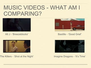
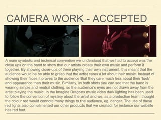
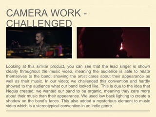
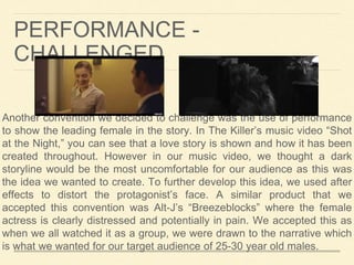
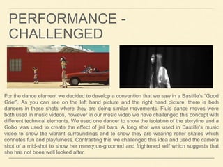
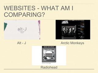
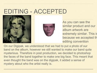
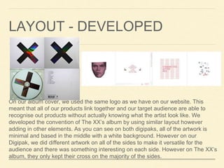
FULL ENJOY - 9953040155 Call Girls in Paschim Vihar | Delhi
Evaluation Task 1
1. EVALUATION TASK 1: IN WHAT WAYS DOES YOUR
MEDIA PRODUCT USE, DEVELOP OR CHALLENGE
FORMS AND CONVENTIONS OF REAL MEDIA
PRODUCTS?
2. FORMS AND CONVENTIONS
Form is a certain way in which something is created. A
convention is the familiar and predictable form and techniques
used by the media to communicate certain ideas or to convey
a desired impression. During my music campaign I have
looked at how it is possible to develop, challenge and accept
conventions of an Indie Rock genre.
3. MUSIC VIDEOS - WHAT AM I
COMPARING?
The Killers - ‘Shot at the Night’
Bastille - ‘Good Grief’
Imagine Dragons - ‘It’s Time’
Alt J - ‘Breezeblocks'
4. A main symbolic and technical convention we understood that we had to accept was the
close ups on the band to show that our artists create their own music and perform it
together. By showing close-ups of them playing their own instrument, this meant that the
audience would be be able to grasp that the artist cares a lot about their music. Instead of
showing their faces it proves to the audience that they care much less about their ‘look’
and appearance than their music. Similarly, in both shots you can see that the band is
wearing simple and neutral clothing, so the audience’s eyes are not drawn away from the
artist playing the music. In the Imagine Dragons music video dark lighting has been used
to follow the convention of mystery about the artist and we, as a production team, thought
the colour red would connote many things to the audience, eg. danger. The use of these
red lights also complimented our other products that we created, for instance our website
has red font.
CAMERA WORK - ACCEPTED
5. CAMERA WORK -
CHALLENGED
Looking at this similar product, you can see that the lead singer is shown
clearly throughout the music video, meaning the audience is able to relate
themselves to the band; showing the artist cares about their appearance as
well as their music. In our video; we challenged this convention and hardly
showed to the audience what our band looked like. This is due to the idea that
Negus created; we wanted our band to be organic, meaning they care more
about their music than their appearance. We used low back lighting to create a
shadow on the band’s faces. This also added a mysterious element to music
video which is a stereotypical convention in an indie genre.
6. PERFORMANCE -
CHALLENGED
Another convention we decided to challenge was the use of performance
to show the leading female in the story. In The Killer’s music video “Shot
at the Night,” you can see that a love story is shown and how it has been
created throughout. However in our music video, we thought a dark
storyline would be the most uncomfortable for our audience as this was
the idea we wanted to create. To further develop this idea, we used after
effects to distort the protagonist’s face. A similar product that we
accepted this convention was Alt-J’s “Breezeblocks” where the female
actress is clearly distressed and potentially in pain. We accepted this as
when we all watched it as a group, we were drawn to the narrative which
is what we wanted for our target audience of 25-30 year old males.
7. For the dance element we decided to develop a convention that we saw in a Bastille’s “Good
Grief”. As you can see on the left hand picture and the right hand picture, there is both
dancers in these shots where they are doing similar movements. Fluid dance moves were
both used in music videos, however in our music video we have challenged this concept with
different technical elements. We used one dancer to show the isolation of the storyline and a
Gobo was used to create the effect of jail bars. A long shot was used in Bastille’s music
video to show the vibrant surroundings and to show they are wearing roller skates which
connotes fun and playfulness. Contrasting this we challenged this idea and used the camera
shot of a mid-shot to show her messy,un-groomed and frightened self which suggests that
she has not been well looked after.
PERFORMANCE -
CHALLENGED
8. WEBSITES - WHAT AM I
COMPARING?
Alt - J Arctic Monkeys
Radiohead
9. By looking at Alt-J’s website, you can see
that we accepted the conventions for an Indie
website. As you can see from Alt-J’s website,
it is a very minimalistic design meaning that it
is easy to navigate. There is no pictures of
the band on the front screen which is similarly
what we did on our website. As soon as
audience click onto the website, you can see
immediately the name of the band is centre of
the webpage which is an idea we decided to
accept.
For our website we made sure that it was
simplistic for our website to navigate so the
audience can use it easily. We have also
attached links to our social media sights
(similarly like Alt-J’s website) which enables
the audiences to get to know our band even
more. However, we did decide to develop on
the idea of the front page. We create a
moving GIF of the band’s name to make it
more eye-catching for the audience. From
looking at other similar products, I saw that
there was a lot of moving elements on their
website in order to make it more interesting.
Therefore the moving GIF helped to attract
the audience.
POSITIONING -
ACCEPTED/DEVELOPED
10. COSTUME - CHALLENGED
Looking at the similar product of The Arctic Monkeys, you can see that the band are dressed
smartly and in suits. Also the photos look very staged where they are all looking in the same
direction and during post-production editing, they have put a black and white edit on it which
suggests that they care about their appearance. On our website we have put a gallery of our
band of a simple photoshoot. We have challenged the costume convention where all of the
band members are wearing casual clothing to make them seem ‘ordinary’ so our target
audience will be able to associate with them. Also the photos are very casual where they
look like a close and fun band who are really good friends. We did this to create the
impression for our target audience that our band are extremely organic.
11. COLOUR SCHEME -
ACCEPTED
Radiohead’s website have a page that is primarily for tour dates;
much like our website. You can see from the similar product that
the colour scheme is extremely minimalistic which does not make
it confusing for the audience. We decided that this convention of
an indie website would be appropriate to accept as our organic
band cares mostly about their music and not their appearance,
therefore it would be best to stick to neutral colours throughout the
website.
12. DIGIPAK - WHAT AM I
COMPARING
The XX - “Coexist” Kings of Leon - “Only by the Night”
13. EDITING - ACCEPTED
On our Digipak, we understood that we had to put a photo of our
band on the album, however we still wanted to make our band quite
mysterious. Therefore in post production, we decided to photoshop
the faces of the band together to make one big face. This meant that
even thought the band was on the digipak, it added a sense of
mystery about who the artist really is.
As you can see the
similar product and our
album artwork are
extremely similar. This is
because we accepted th
editing convention
14. LAYOUT - DEVELOPED
On our album cover, we used the same logo as we have on our website. This
meant that all of our products link together and our target audience are able to
recognise out products without actually knowing what the artist look like. We
developed the convention of The XX’s album by using similar layout however
adding in other elements. As you can see on both digipaks, all of the artwork is
minimal and based in the middle with a white background. However on our
Digipak, we did different artwork on all of the sides to make it versatile for the
audience and there was something interesting on each side. However on The XX’s
album, they only kept their cross on the majority of the sides.