M edia   E valuation   By Amy Sparks
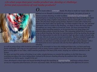
1.In what ways does your media product use, develop or challenge forms and conventions of real media products? O ur music video is  concept  based. We chose to make our music video more abstract as we thought it would fit the genre of music. Our piece of music is about a woman cheating, in order to follow  Goodwin’s principals , we matched lyrics to visuals by having red hands that have been carefully set alight in the palm by using a lighter and perfume, this is a great effect in our music video. We also have images of my partner Alanah in a bed with a hand print placed on her back when our lyrics say  ’  I’ve been caught in the act ‘   the red hand represents   who is a victim in the cheating., we chose to have the niche of lights throughout our music video to brand our music. We have conveyed this by having a light travelling upstairs, on its journey there the lamp plugs into different plug sockets around the house. The reasoning behind this is because our song is about cheating, the lamp is a representation of this by stealing the energy from the plug sockets in order for its spark to light up when really it should only have one, this can be seen as a sexual connotation.  We have included images of a male character and my partners feet in a close up walking away from the bedroom, we also have a variety of people who hold up a piece of paper with a red hand print on it to represent who else has been effected by this person cheating. As well as going along with Goodwins principals to be successful we have also challenged them also, we have used stop frame animation, this way we can experiment with as many camera angles as we like, and the quick shots we have taken gives a jerky effect to our video, which matches perfectly to the beat of the music, keeping our audience attention to the screen. We have not used the notion of looking in our video, simply because we wanted the audience to feel like they were watching secretly at the crime taking place, instead of the person cheating showing the audience their story, which matches to our lyrics again, ‘caught in the act’. I have developed a visual style and brand identity through the matching of  typography  and house colours chosen across our magazine advertisement, CD cover and music video. We have many experiments with different CD covers.
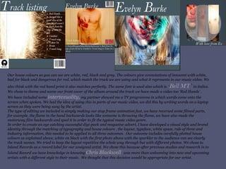
Our house colours as you can see are white, red, black and grey. The colours give connotations of innocent with white, bad for black and dangerous for red, which match the track we are using and what it represents in our music video. We also think with the red hand print it also matches perfectly. The same font is used also which is  ‘ Bell MT ’  in italics. We chose to theme and name our front cover of the album around the track we have made a video too ‘Red Hands’ . We have included some  intertexuality,  my partner showed me a TV programme in which words come onto the screen when spoken. We had the idea of using this in parts of our music video, we did this by writing words on a laptop screen as they were being sung by the artist. The type of editing we included is simply making our stop frame animation fast, we have reversed some filmed parts, for example, the flame in the hand backwards looks like someone is throwing the flame, we have also made the motorway film backwards and sped it in order to fit the typical music video genre. In order to create an eye catching successful digi-pack and magazine advert,   I have developed a visual style and brand identity through the matching of typography and house colours , the layout, typeface, white space, rule of three and industry information, this needed to be applied to all three outcomes.  Our outcome includes carefully plotted house colours as explained above, white on black with the first photo above with the sparkler to the audience can see clearly the track names. We tried to keep the layout repetitive the whole way through but with different photos. We chose to  Island Records as a record label for our unsigned artist. We chose this because after previous studies and research in to Island Record we have knowledge in knowing  Chris Blackwell  was more than welcoming into new and upcoming artists with a different style to their music.   We thought that this decision would be appropriate for our artist.
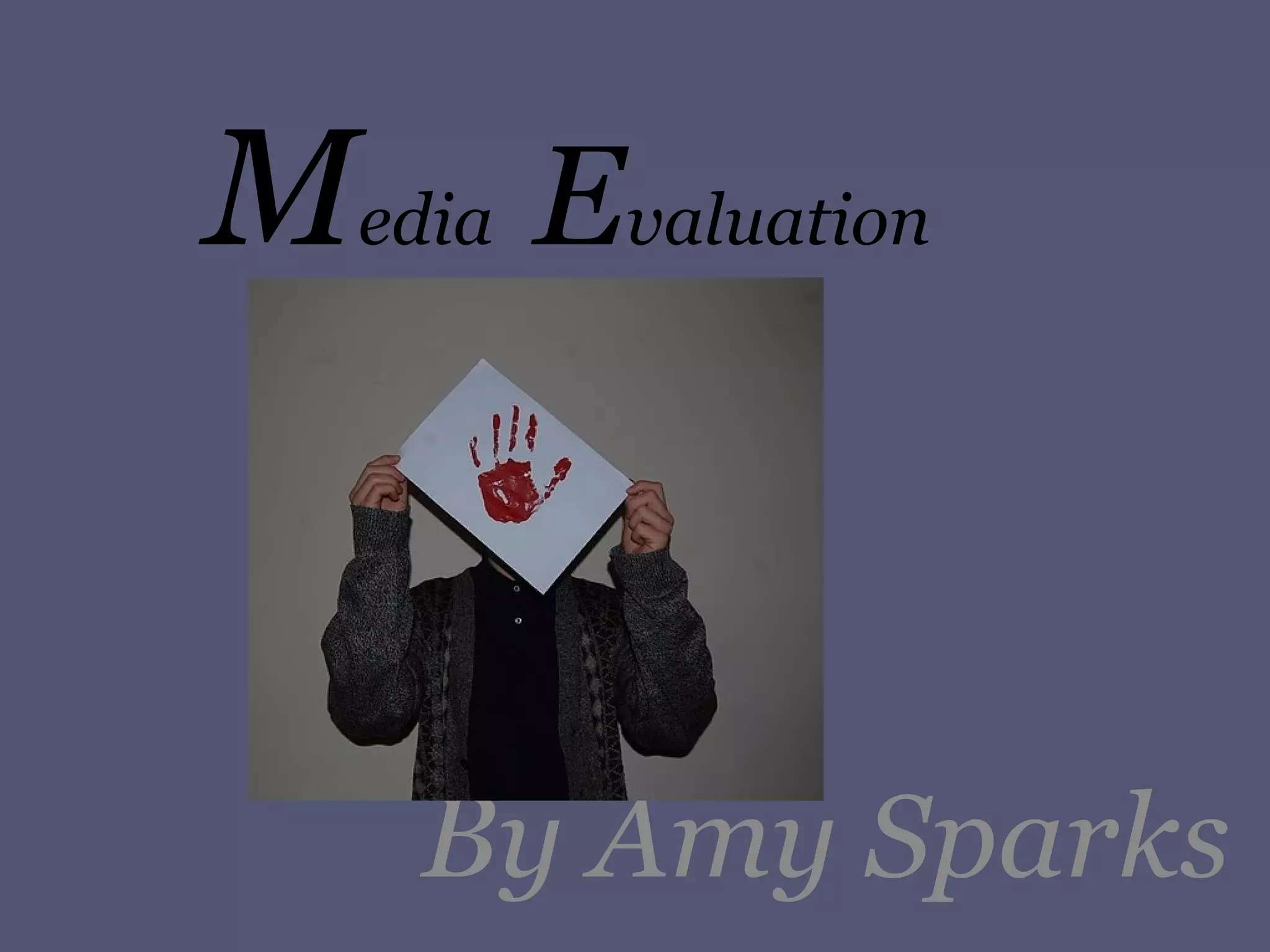
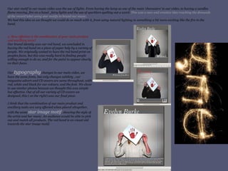
Our star motif in our music video was the use of lights. From having the lamp as one of the main ‘characters’ to our video, to having a candles flame moving, fire on a hand , fairy lights and the use of sparklers spelling out a word.  This was a new and creative idea reaching the demands of the record label using star motifs to brand our music. We had this idea as we thought we could do so much with it, from using natural lighting to something a bit more exciting like the fire in the hand.  2. How effective is the combination of your main product and ancillary texts? Our brand identity was our red hand, we concluded in having the red hand on a piece of paper help by a variety of people. We originally waned to have the red hand print on peoples faces, but this was really hard in finding people willing enough to do so, and for the paint to appear clearly on their faces. Our  typography  changes in our main video, we have the same fonts, but only changes subtlety , our magazine advert and CD covers are same throughout, with red, white and black for our colours, and the font. We chose to use similar photos because we thought this was simple but effective. Out of all our variety of CD covers we designed, this ( on the right) was our final piece. I think that the combination of our main product and ancillary tasks are very effected when placed altogether, with the same  star image motif , showing the style of the artist and her music. An audience would be able to pick out and match all products. The red hand is an visual aid towards the star image motif.
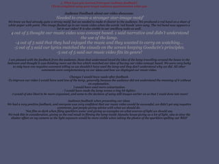
3. What have you learned from your audience feedback?  (To be completed using your target audience questionnaires when you Audience Feedback about our video showcase. - ‘ Needed to create a stronger star-image motif’ We knew we had already quite a strong motif, but we needed to make it clearer to the audience. We produced a red hand on a sheet of white paper with paint. This image flashed up in our music video when the words ‘red hands’ were sung. The red hand now appears a lot in our video! It is also visible in our ancillary tasks as well. - 4 out of 5 thought our music video was concept based. 1 said narrative and didn’t understand the use of the lamp. -4 out of 5 said that they had enjoyed the music and they wanted to carry on watching... -5 out of 5 said our lyrics matched the visuals on the screen keeping Goodwin's principles. -5 out of 5 said our music video fits its genre! I am pleased with the feedback from the audience, those that understood loved the idea of the lamp travelling around the house to the bedroom and thought it was thinking more out the box which matched our idea of having our video concept based. We were very lucky to only have one negative comment telling us we shouldn’t have used the lamp and they don’t understand why we did. All other comments were complementary on our ideas and how we displayed our music video. Changes I would have made after feedback. -To improve our video I would have used less of the lamp, generally because the audience did not understand the meaning of it without an explanation.  - I would have used more colourisation.  - I would have made the lamp scenes a tiny bit lighter. - I would of also liked to be more organised, and came to the decision of using still images earlier on so that I could done lots more! Audience feedback when presenting our ideas  We had a very positive feedback, and everyone was very confident that our music video would be successful, we didn’t get any negative comments, just people giving advice with what we should do.  ‘Not film so dark when filing sparklers scene’ and giving us examples on what sources of light we should use. We took this in consideration, giving us the end result in filming the lamp inside Alanahs house giving us a lot of light, also to slow the shutter effect on my camera so the light exposure would be more visible when taking the photos of the sparklers spelling out ‘RED’
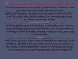
H ow did you use new media technologies in the construction and research, planning and evaluation stages? We used many new media technologies in the construction of our research, planning and evaluation to gain the outcome we have from our music video. We worked on Apple Mac computers, they have a Movie Editing Software; IMovie. This programme had many effects we could apply in constructing our music video. Originally we used the software to match our lip synching by adjusting the time, speeding parts up and slowing them down. We then changed our idea to still shots, for this we did not need to use many effects such as transitions. We have been able to use colourisation in making a part of our video black and white for effect. We adjusted the little short videos we have still in their and reversed them, for example the car driving through a street. We have also reversed a film where we have fire in a hand to look like the fire is being thrown out of the red hand.  Desktop publishing software . In order to create our ancillary tasks, I used the programme Serif PhotoPlus to manipulate my photos we are using in our video itself, this is where most our time and effort went into, also to match images with lyrics at the right time without our video looking like we have randomly slotted images in anywhere we please.  The images used for our CD covers and Magazine have also been edited in this programme. I used Photo Publisher to create the magazine and CD, setting the layout and applying all the necessary details, such as the bar code, house colours and so on. This is a very easy and effective site to use and I feel has given us a good outcome. The tools on this programme I used were simple ones such as Text box to write the artists name on the cover , tracking list and a little message inside for her audience to read when purchasing the CD. Equipment. Originally we used the schools Conon Digital Video Cameras and tripod for filming, me and my partner thought the quality of the camera were terrible! So we took our own action into purchasing our own video camera, we then went on to using Canon mini DV film camera, which worked really nicely, all the video footages we still have left amongst our still images in our music video was filmed by this. When me and my partner decided to do a lot of experiments with capturing the lamp switched off in dim natural lighting, the footage was not very good, it was grainy where the camera could not focus. We really wanted to capture the light in dim lighting to get a big impact when the lamp did actually light up. This is when we chose to do stop frame. We used Alanahs Cannon camera and my Nikon D40 & Sony DSC-T300. We also used these cameras for our digipack and magazine adverts. We chose to do this because both of our cameras were really good quality, it picked up on all the detail and didn’t make the music video look too dark.
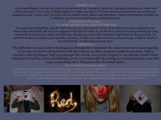
blogger.com I also used blogger.com as my diary to document all our research, planning, changes, decisions we made and final outcomes. I have also included software within my blog to be more creative and present my work in an appealing way!  I have used YouTube.com to embed music videos and slideshare. These programmes enabled me to display my work in a much more satisfactory way. Lighting technology? - To create spotlighting / filtered lighting?  We used natural lighting, and the light lamp as our main source. Some of the photos we have applied to our music video look dark, but they are suppose to be dark in order to get the story behind the lamp looking for plug sockets for it to feel alive again and light up. Because we knew the examiners might look at this as a fault, we used the camera as it gave good quality outcomes, so that we would not have grainy footage, which is what we were faulted for our film opening last year. Difficulties The difficulties we had with technology has already been explained, the camera was not at good quality, it was also hard from limited time with the cameras as other students needed to use them, I had a problem with my blogger half way through this course, every time I logged in my internet would crash, which set me back to weeks of publishing work. I overcame this by writing in a word document, and then copy and pasting into a blog post when it worked again. If I created this project again. To be honest, I would use all the same technology I already have, I think there easy to use and give a good outcome. They also give you lots of choice and effects to use. The only thing I would change is I would use much more technologies such as Flickr.com to publish my photos onto my blog and basically display my work in different ways. I just feel I did not have time to explore this as the change in our ideas were made towards the end and near our deadline!

Media Evaluation 1-4 by Amy Sparks

  • 1.
    M edia E valuation By Amy Sparks
  • 2.
    1.In what waysdoes your media product use, develop or challenge forms and conventions of real media products? O ur music video is concept based. We chose to make our music video more abstract as we thought it would fit the genre of music. Our piece of music is about a woman cheating, in order to follow Goodwin’s principals , we matched lyrics to visuals by having red hands that have been carefully set alight in the palm by using a lighter and perfume, this is a great effect in our music video. We also have images of my partner Alanah in a bed with a hand print placed on her back when our lyrics say ’ I’ve been caught in the act ‘ the red hand represents who is a victim in the cheating., we chose to have the niche of lights throughout our music video to brand our music. We have conveyed this by having a light travelling upstairs, on its journey there the lamp plugs into different plug sockets around the house. The reasoning behind this is because our song is about cheating, the lamp is a representation of this by stealing the energy from the plug sockets in order for its spark to light up when really it should only have one, this can be seen as a sexual connotation. We have included images of a male character and my partners feet in a close up walking away from the bedroom, we also have a variety of people who hold up a piece of paper with a red hand print on it to represent who else has been effected by this person cheating. As well as going along with Goodwins principals to be successful we have also challenged them also, we have used stop frame animation, this way we can experiment with as many camera angles as we like, and the quick shots we have taken gives a jerky effect to our video, which matches perfectly to the beat of the music, keeping our audience attention to the screen. We have not used the notion of looking in our video, simply because we wanted the audience to feel like they were watching secretly at the crime taking place, instead of the person cheating showing the audience their story, which matches to our lyrics again, ‘caught in the act’. I have developed a visual style and brand identity through the matching of typography and house colours chosen across our magazine advertisement, CD cover and music video. We have many experiments with different CD covers.
  • 3.
    Our house coloursas you can see are white, red, black and grey. The colours give connotations of innocent with white, bad for black and dangerous for red, which match the track we are using and what it represents in our music video. We also think with the red hand print it also matches perfectly. The same font is used also which is ‘ Bell MT ’ in italics. We chose to theme and name our front cover of the album around the track we have made a video too ‘Red Hands’ . We have included some intertexuality, my partner showed me a TV programme in which words come onto the screen when spoken. We had the idea of using this in parts of our music video, we did this by writing words on a laptop screen as they were being sung by the artist. The type of editing we included is simply making our stop frame animation fast, we have reversed some filmed parts, for example, the flame in the hand backwards looks like someone is throwing the flame, we have also made the motorway film backwards and sped it in order to fit the typical music video genre. In order to create an eye catching successful digi-pack and magazine advert, I have developed a visual style and brand identity through the matching of typography and house colours , the layout, typeface, white space, rule of three and industry information, this needed to be applied to all three outcomes. Our outcome includes carefully plotted house colours as explained above, white on black with the first photo above with the sparkler to the audience can see clearly the track names. We tried to keep the layout repetitive the whole way through but with different photos. We chose to Island Records as a record label for our unsigned artist. We chose this because after previous studies and research in to Island Record we have knowledge in knowing Chris Blackwell was more than welcoming into new and upcoming artists with a different style to their music. We thought that this decision would be appropriate for our artist.
  • 4.
    Our star motifin our music video was the use of lights. From having the lamp as one of the main ‘characters’ to our video, to having a candles flame moving, fire on a hand , fairy lights and the use of sparklers spelling out a word. This was a new and creative idea reaching the demands of the record label using star motifs to brand our music. We had this idea as we thought we could do so much with it, from using natural lighting to something a bit more exciting like the fire in the hand. 2. How effective is the combination of your main product and ancillary texts? Our brand identity was our red hand, we concluded in having the red hand on a piece of paper help by a variety of people. We originally waned to have the red hand print on peoples faces, but this was really hard in finding people willing enough to do so, and for the paint to appear clearly on their faces. Our typography changes in our main video, we have the same fonts, but only changes subtlety , our magazine advert and CD covers are same throughout, with red, white and black for our colours, and the font. We chose to use similar photos because we thought this was simple but effective. Out of all our variety of CD covers we designed, this ( on the right) was our final piece. I think that the combination of our main product and ancillary tasks are very effected when placed altogether, with the same star image motif , showing the style of the artist and her music. An audience would be able to pick out and match all products. The red hand is an visual aid towards the star image motif.
  • 5.
    3. What haveyou learned from your audience feedback? (To be completed using your target audience questionnaires when you Audience Feedback about our video showcase. - ‘ Needed to create a stronger star-image motif’ We knew we had already quite a strong motif, but we needed to make it clearer to the audience. We produced a red hand on a sheet of white paper with paint. This image flashed up in our music video when the words ‘red hands’ were sung. The red hand now appears a lot in our video! It is also visible in our ancillary tasks as well. - 4 out of 5 thought our music video was concept based. 1 said narrative and didn’t understand the use of the lamp. -4 out of 5 said that they had enjoyed the music and they wanted to carry on watching... -5 out of 5 said our lyrics matched the visuals on the screen keeping Goodwin's principles. -5 out of 5 said our music video fits its genre! I am pleased with the feedback from the audience, those that understood loved the idea of the lamp travelling around the house to the bedroom and thought it was thinking more out the box which matched our idea of having our video concept based. We were very lucky to only have one negative comment telling us we shouldn’t have used the lamp and they don’t understand why we did. All other comments were complementary on our ideas and how we displayed our music video. Changes I would have made after feedback. -To improve our video I would have used less of the lamp, generally because the audience did not understand the meaning of it without an explanation. - I would have used more colourisation. - I would have made the lamp scenes a tiny bit lighter. - I would of also liked to be more organised, and came to the decision of using still images earlier on so that I could done lots more! Audience feedback when presenting our ideas We had a very positive feedback, and everyone was very confident that our music video would be successful, we didn’t get any negative comments, just people giving advice with what we should do. ‘Not film so dark when filing sparklers scene’ and giving us examples on what sources of light we should use. We took this in consideration, giving us the end result in filming the lamp inside Alanahs house giving us a lot of light, also to slow the shutter effect on my camera so the light exposure would be more visible when taking the photos of the sparklers spelling out ‘RED’
  • 6.
    H ow didyou use new media technologies in the construction and research, planning and evaluation stages? We used many new media technologies in the construction of our research, planning and evaluation to gain the outcome we have from our music video. We worked on Apple Mac computers, they have a Movie Editing Software; IMovie. This programme had many effects we could apply in constructing our music video. Originally we used the software to match our lip synching by adjusting the time, speeding parts up and slowing them down. We then changed our idea to still shots, for this we did not need to use many effects such as transitions. We have been able to use colourisation in making a part of our video black and white for effect. We adjusted the little short videos we have still in their and reversed them, for example the car driving through a street. We have also reversed a film where we have fire in a hand to look like the fire is being thrown out of the red hand. Desktop publishing software . In order to create our ancillary tasks, I used the programme Serif PhotoPlus to manipulate my photos we are using in our video itself, this is where most our time and effort went into, also to match images with lyrics at the right time without our video looking like we have randomly slotted images in anywhere we please. The images used for our CD covers and Magazine have also been edited in this programme. I used Photo Publisher to create the magazine and CD, setting the layout and applying all the necessary details, such as the bar code, house colours and so on. This is a very easy and effective site to use and I feel has given us a good outcome. The tools on this programme I used were simple ones such as Text box to write the artists name on the cover , tracking list and a little message inside for her audience to read when purchasing the CD. Equipment. Originally we used the schools Conon Digital Video Cameras and tripod for filming, me and my partner thought the quality of the camera were terrible! So we took our own action into purchasing our own video camera, we then went on to using Canon mini DV film camera, which worked really nicely, all the video footages we still have left amongst our still images in our music video was filmed by this. When me and my partner decided to do a lot of experiments with capturing the lamp switched off in dim natural lighting, the footage was not very good, it was grainy where the camera could not focus. We really wanted to capture the light in dim lighting to get a big impact when the lamp did actually light up. This is when we chose to do stop frame. We used Alanahs Cannon camera and my Nikon D40 & Sony DSC-T300. We also used these cameras for our digipack and magazine adverts. We chose to do this because both of our cameras were really good quality, it picked up on all the detail and didn’t make the music video look too dark.
  • 7.
    blogger.com I alsoused blogger.com as my diary to document all our research, planning, changes, decisions we made and final outcomes. I have also included software within my blog to be more creative and present my work in an appealing way! I have used YouTube.com to embed music videos and slideshare. These programmes enabled me to display my work in a much more satisfactory way. Lighting technology? - To create spotlighting / filtered lighting? We used natural lighting, and the light lamp as our main source. Some of the photos we have applied to our music video look dark, but they are suppose to be dark in order to get the story behind the lamp looking for plug sockets for it to feel alive again and light up. Because we knew the examiners might look at this as a fault, we used the camera as it gave good quality outcomes, so that we would not have grainy footage, which is what we were faulted for our film opening last year. Difficulties The difficulties we had with technology has already been explained, the camera was not at good quality, it was also hard from limited time with the cameras as other students needed to use them, I had a problem with my blogger half way through this course, every time I logged in my internet would crash, which set me back to weeks of publishing work. I overcame this by writing in a word document, and then copy and pasting into a blog post when it worked again. If I created this project again. To be honest, I would use all the same technology I already have, I think there easy to use and give a good outcome. They also give you lots of choice and effects to use. The only thing I would change is I would use much more technologies such as Flickr.com to publish my photos onto my blog and basically display my work in different ways. I just feel I did not have time to explore this as the change in our ideas were made towards the end and near our deadline!